
senangwebs-photobooth
v2.1.1
Published
A browser-based image editor featuring layers, drawing tools, and filters
Maintainers
 a-hakim
Readme
SenangWebs Photobooth
A browser-based image editor featuring layers, drawing tools, and filters.
| example 1 | example 2 |
| ---------------------------------------------------------------------------------------------------------------- | ---------------------------------------------------------------------------------------------------------------- |
| 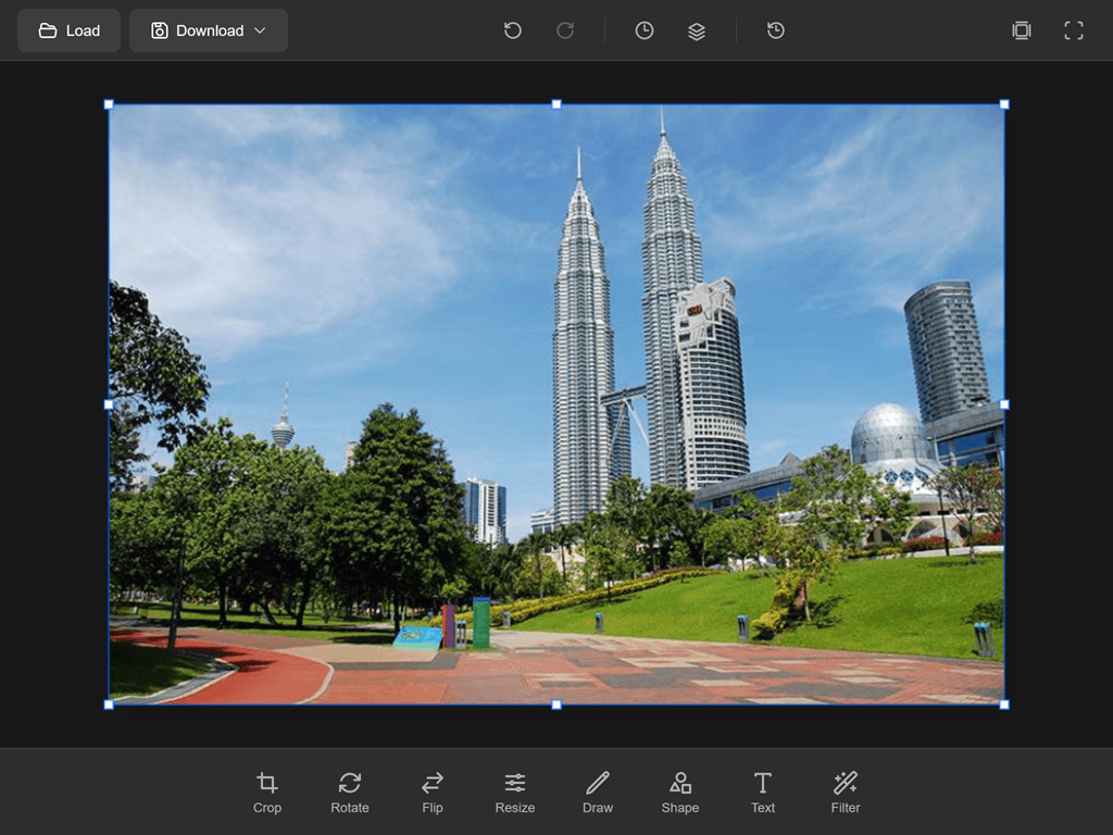 |
| 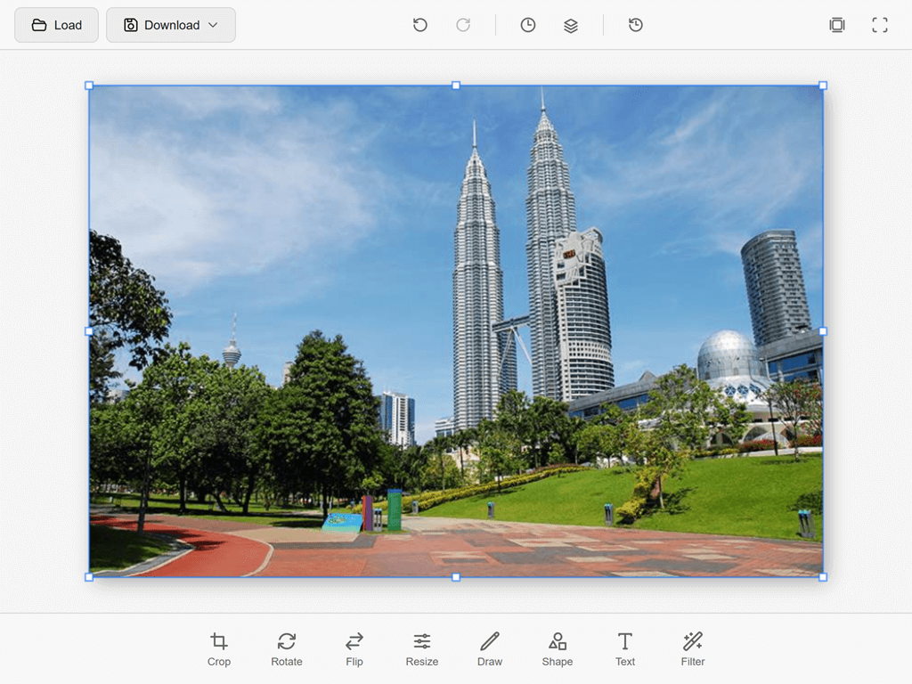 |
|
Features
Layer System
- Multiple layers with full compositing
- 24 blend modes (Normal, Multiply, Screen, Overlay, etc.)
- Layer opacity, visibility, and locking
- Merge, duplicate, and reorder layers
- Per-layer positioning (x, y offset)
- Layer types: raster, text, shape
- Layer serialization (toJSON / fromJSON)
- Layers panel with real-time updates
History & Layers Panels
- History Panel - View and navigate undo/redo history (up to 20 states)
- Layers Panel - Manage layers with visibility toggles and selection
- Collapsible side panels with clean UI
Editing Tools
| Menu | Shortcut | Description |
|------|----------|-------------|
| Move | V | Move layers with snap-to-edges and auto-select |
| Marquee | M | Rectangle and ellipse selections with feather option |
| Crop | C | Crop with aspect ratio presets (Free, 1:1, 4:3, 16:9, 3:4, 9:16, Original) |
| Rotate | - | Rotate by ±90° or custom angle slider |
| Flip | - | Flip horizontal or vertical |
| Resize | - | Resize canvas with presets and aspect ratio lock |
| Brush | B | Brush tool with size, hardness, opacity, flow, smoothing, and pressure support |
| Eraser | E | Eraser with brush/block modes, adjustable size, hardness, and opacity |
| Gradient | G | Linear, radial, and angle gradients with opacity and reverse options |
| Fill | G | Flood fill with tolerance and contiguous/non-contiguous modes |
| Shape | U | Rectangle, ellipse, line with fill, stroke, and corner radius options |
| Text | T | Add text with font, size, color, and style controls |
| Eyedropper | I | Color picker with point/3×3/5×5 sampling and layer Scope |
| Zoom | Z | Zoom in/out with fit-to-screen and 100% buttons |
| Hand | H | Pan the canvas viewport |
| Filter | - | Apply filters with intensity control |
Selection System
- Rectangular and elliptical selections
- Freeform path selections
- Select All (
Ctrl+A), Deselect (Ctrl+D), Invert Selection (Ctrl+Shift+I) - Marching ants animation
- Selection-aware copy, cut, and paste
Filters & Adjustments
- Brightness, Contrast
- Saturation, Hue Rotation
- Blur, Sharpen
- Grayscale, Sepia, Invert
Keyboard Shortcuts
General
| Shortcut | Action |
|----------|--------|
| Ctrl+Z | Undo |
| Ctrl+Shift+Z / Ctrl+Y | Redo |
| Ctrl+N | New document |
| Ctrl+O | Open image |
| Ctrl+S | Save project |
| Ctrl+Shift+S | Save As |
| Ctrl+E | Export image |
| Ctrl+Shift+E | Export As |
| F | Toggle fullscreen |
| Tab | Toggle panels |
| Space | Temporary hand tool |
Tools
| Shortcut | Action |
|----------|--------|
| V | Move tool |
| M | Marquee tool |
| C | Crop tool |
| B | Brush tool |
| E | Eraser tool |
| G | Gradient / Fill tool |
| T | Text tool |
| U | Shape tool |
| I | Eyedropper tool |
| Z | Zoom tool |
| H | Hand tool |
Editing
| Shortcut | Action |
|----------|--------|
| Ctrl+A | Select All |
| Ctrl+D | Deselect |
| Ctrl+Shift+I | Invert Selection |
| Ctrl+C | Copy |
| Ctrl+V | Paste |
| Ctrl+X | Cut |
| Ctrl+Shift+N | Add new layer |
| Ctrl+J | Duplicate layer |
| Ctrl+Shift+M | Merge down |
| Ctrl+Shift+V | Merge visible layers |
| DEL / Backspace | Delete selected layer or content |
| Enter | Confirm action (crop, text) |
| Escape | Cancel current action |
View
| Shortcut | Action |
|----------|--------|
| Ctrl+0 | Fit to screen |
| Ctrl+1 | Zoom to 100% |
| Ctrl+Plus | Zoom in |
| Ctrl+Minus | Zoom out |
| [ / ] | Decrease / Increase brush size |
| Shift+[ / Shift+] | Decrease / Increase brush hardness |
| X | Swap foreground / background colors |
| D | Reset colors to black / white |
File Operations
- Load images (PNG, JPEG, WebP)
- Download with format selection (PNG, JPEG, WebP)
- Save projects as
.swsfiles - Export to PNG, JPEG, WebP
Installation
NPM
npm install senangwebs-photoboothCDN
<link rel="stylesheet" href="https://unpkg.com/[email protected]/dist/swp.css">
<script src="https://unpkg.com/[email protected]/dist/swp.js"></script>
Manual Download
Download swp.js and swp.css from the dist folder.
Quick Start
SenangWebs Photobooth supports two initialization methods: JavaScript API and data attributes.
JavaScript API
<!DOCTYPE html>
<html>
<head>
  <link rel="stylesheet" href="https://unpkg.com/[email protected]/dist/swp.css">
  <style>
    #editor { width: 100%; height: 100vh; }
  </style>
</head>
<body>
  <div id="editor"></div>
  <script src="https://unpkg.com/[email protected]/dist/swp.js"></script>
  <script>
    const editor = new SWP('#editor', {
      width: 1920,
      height: 1080,
      theme: 'dark',
      accentColor: '#00FF99'
    });

    editor.on('ready', () => {
      console.log('Editor ready!');
    });
  </script>
</body>
</html>
Data Attribute Initialization
You can also initialize the editor using data attributes for a no-code setup:
<!DOCTYPE html>
<html>
<head>
  <link rel="stylesheet" href="https://unpkg.com/[email protected]/dist/swp.css">
  <style>
    #editor { width: 100%; height: 100vh; }
  </style>
</head>
<body>
  <div id="editor"
       data-swp
       data-swp-width="1920"
       data-swp-height="1080"
       data-swp-theme="dark"
       data-swp-accent-color="#00FF99">
  </div>
  <script src="https://unpkg.com/[email protected]/dist/swp.js"></script>
</body>
</html>
Any data-swp-* attribute is automatically converted from kebab-case to camelCase and passed as an option, so custom options are supported.
Accessing Data Attribute Instances
// Access via element property
const editor = document.getElementById('editor').swpInstance;

// Access all auto-initialized instances
const allEditors = SWP.instances;

// Initialize and register editors added after page load
const newEditors = SWP.autoInit();
Available Data Attributes
| Attribute | Type | Default | Description |
|-----------|------|---------|-------------|
| data-swp | - | - | Required. Marks element for auto-initialization |
| data-swp-width | number | 1920 | Canvas width in pixels |
| data-swp-height | number | 1080 | Canvas height in pixels |
| data-swp-theme | string | 'dark' | UI theme ('dark' or 'light') |
| data-swp-accent-color | string | '#00FF99' | UI accent color (hex format) |
API Reference
Constructor
const editor = new SWP(container, options);| Option | Type | Default | Description |
|--------|------|---------|-------------|
| width | number | 1920 | Canvas width |
| height | number | 1080 | Canvas height |
| theme | string | 'dark' | UI theme ('dark' or 'light') |
| accentColor | string | '#00FF99' | UI accent color |
Top-Level Methods
Document Operations
// Create new document
editor.newDocument({ width: 1920, height: 1080, background: '#ffffff' });

// Load image from URL
await editor.loadImage('path/to/image.jpg');

// Export as data URL (format: 'png'/'image/png', 'jpeg'/'image/jpeg', 'webp'/'image/webp')
const dataURL = editor.getImageData('png', 1.0);

// Download export (format: 'png', 'jpeg', or 'webp')
editor.export('png', 1.0);
History
editor.undo();
editor.redo();
Tools
editor.setTool('brush');
editor.setTool('move');
Filters
editor.applyFilter('brightness', { value: 20 });
editor.applyFilter('saturation', { value: 50 });
editor.applyFilter('hueRotate', { angle: 90 });
editor.applyFilter('blur', { radius: 5 });
editor.applyFilter('grayscale');
Theming
editor.setTheme('light');       // or 'dark' (emits 'change' event)
editor.setAccentColor('#FF6B6B'); // (emits 'change' event)
Lifecycle
// Cancel current action (filter preview, crop, text)
editor.cancelCurrentAction();

// Confirm current action (crop, text)
editor.confirmCurrentAction();

// Destroy editor and clean up DOM
editor.destroy();

// destroy() is idempotent and clears auto-init references. This is useful
// for data-swp views that may be unmounted and initialized again.
const element = document.querySelector('[data-swp]');
const autoEditor = element.swpInstance;
autoEditor.destroy();
autoEditor.destroy();
const [replacementEditor] = SWP.autoInit();
Events
editor.on('ready', () => { });
editor.on('tool:select', (data) => { });

// Unsubscribe
editor.off('ready', callback);

// Listen once
const unsubscribe = editor.once('ready', () => { });

// Wildcard listeners receive an object with the event name and payload
editor.on('*', ({ event, data }) => { });
Sub-System APIs
Layers (editor.layers)
// Query
editor.layers.getLayers();                // Array of all layers
editor.layers.getActiveLayer();           // Current active layer
editor.layers.getLayer(layerId);          // Get layer by ID
editor.layers.getVisibleLayers();         // Get all visible layers

// Modify
editor.layers.addLayer(options);          // Add new layer
editor.layers.removeLayer(layerId);       // Remove layer
editor.layers.setActiveLayer(layerId);    // Set active layer
editor.layers.renameLayer(layerId, name);  // Rename layer
editor.layers.setLayerVisibility(layerId, visible);  // Toggle visibility
editor.layers.setLayerOpacity(layerId, opacity);     // Set opacity (0-100)
editor.layers.setLayerBlendMode(layerId, blendMode); // Set blend mode
editor.layers.setLayerLocked(layerId, locked);        // Lock/unlock layer

// Reorder
editor.layers.moveLayer(layerId, newIndex);
editor.layers.moveLayerUp(layerId);
editor.layers.moveLayerDown(layerId);

// Merge & Flatten
editor.layers.duplicateLayer(layerId);   // Duplicate a layer
editor.layers.mergeDown(layerId);        // Merge with layer below
editor.layers.mergeVisible();            // Merge all visible layers
editor.layers.flatten();                 // Flatten all layers

// Selection
editor.layers.deleteSelection();         // Delete active layer or selection content

// Serialization
const data = editor.layers.toJSON();     // Serialize all layers
editor.layers.fromJSON(data);            // Load layers from JSON
Canvas (editor.canvas)
editor.canvas.setZoom(zoom, centerX, centerY);  // Set zoom level with focal point
editor.canvas.zoomIn();                          // Zoom in
editor.canvas.zoomOut();                         // Zoom out
editor.canvas.fitToScreen();                     // Fit canvas to viewport
editor.canvas.pan(dx, dy);                       // Pan the canvas

// Coordinate conversion
const canvasPos = editor.canvas.viewportToCanvas(viewX, viewY);
const viewPos = editor.canvas.canvasToViewport(canvasX, canvasY);

// Export
const blob = await editor.canvas.toBlob('image/png', 1.0);

// Resize
editor.canvas.resize(width, height);

// Render
editor.canvas.render();
Selection (editor.selection)
editor.selection.setRect(x, y, w, h, shape);  // Create rect/ellipse selection
editor.selection.setPath(points);               // Create freeform selection
editor.selection.selectAll();                   // Select entire canvas
editor.selection.deselect();                    // Clear selection
editor.selection.invert();                      // Invert selection
editor.selection.hasSelection();                // Check if selection exists
editor.selection.isPointInSelection(x, y);      // Test if point is in selection
Clipboard (editor.clipboard)
editor.clipboard.copy();   // Copy active layer/selection to clipboard
editor.clipboard.cut();    // Copy then delete
editor.clipboard.paste();  // Paste clipboard data as new layer
Colors (editor.colors)
editor.colors.setForeground('#ff0000');  // Set foreground color
editor.colors.setBackground('#0000ff');  // Set background color
editor.colors.swap();                     // Swap foreground/background
editor.colors.reset();                    // Reset to black/white

// Swatches
editor.colors.addSwatch('#ff6b6b');      // Add color swatch
editor.colors.removeSwatch(index);        // Remove swatch by index
editor.colors.foreground;                // Current foreground color
editor.colors.background;                // Current background color
Filters (editor.filters)
editor.applyFilter('brightness', { value: 20 });  // Apply and commit

// Preview without committing
editor.filters.previewFilter('brightness', { value: 30 });
editor.filters.cancelPreview();
editor.filters.getAvailableFilters();  // List all filter descriptors
History (editor.history)
editor.history.canUndo();              // Check if undo available
editor.history.canRedo();              // Check if redo available
editor.history.goToState(index);       // Jump to specific state
editor.history.getStates();            // Get all state entries
editor.history.getCurrentIndex();      // Get current state index
editor.history.clear();                 // Clear all history
editor.history.count;                  // Number of history states
Keyboard (editor.keyboard)
editor.keyboard.register('Ctrl+Shift+K', (e) => { }, { description: 'Custom action' });
editor.keyboard.unregister('Ctrl+Shift+K');
editor.keyboard.setEnabled(false);      // Disable all shortcuts
editor.keyboard.setEnabled(true);       // Re-enable shortcuts
editor.keyboard.getShortcuts();          // List all registered shortcuts
Tools (editor.tools)
editor.tools.registerTool('customTool', toolInstance);  // Register custom tool
editor.tools.getTool('brush');                           // Get tool instance
editor.tools.getAllTools();                               // Get all tools
editor.tools.getCurrentToolName();                        // Get current tool name
editor.tools.switchToPreviousTool();                      // Switch to previous tool
Available Events
| Event | Description |
|-------|-------------|
| ready | Editor initialized |
| change | Theme or accent color changed |
| error | Error occurred |
| Document | |
| document:new | New document created |
| document:open | Image or project opened |
| document:save | Project saved |
| document:export | Image exported |
| document:resize | Canvas resized |
| Tools | |
| tool:select | Tool changed |
| tool:start | Tool action started |
| tool:end | Tool action ended |
| tool:optionsChange | Tool options changed |
| tool:move | Tool pointer move |
| Layers | |
| layer:add | Layer added |
| layer:remove | Layer removed |
| layer:select | Layer selected |
| layer:rename | Layer renamed |
| layer:reorder | Layer reordered |
| layer:visibility | Layer visibility changed |
| layer:opacity | Layer opacity changed |
| layer:blendMode | Layer blend mode changed |
| layer:lock | Layer lock state changed |
| layer:merge | Layers merged |
| layer:duplicate | Layer duplicated |
| layer:update | Layer updated |
| History | |
| history:push | History state added |
| history:undo | Undo performed |
| history:redo | Redo performed |
| history:clear | History cleared |
| Canvas | |
| canvas:zoom | Zoom changed |
| canvas:pan | Canvas panned |
| canvas:render | Canvas rendered |
| Selection | |
| selection:create | Selection created |
| selection:clear | Selection cleared |
| selection:invert | Selection inverted |
| Filters | |
| filter:apply | Filter applied |
| filter:preview | Filter preview started |
| filter:cancel | Filter preview cancelled |
| Colors | |
| color:foreground | Foreground color changed |
| color:background | Background color changed |
| color:swap | Foreground/background swapped |
UI Overview
Header Bar
- Load - Open image file
- Download - Export with format selection (PNG/JPEG/WebP)
- Undo/Redo - History navigation
- History - Toggle history panel
- Layers - Toggle layers panel
- Reset - Reset canvas
- Center - Fit canvas to screen
- Fullscreen - Toggle fullscreen mode
Menu Bar (Bottom)
- Move - Move and reposition layers
- Marquee - Rectangle and ellipse selections
- Crop - Crop with aspect ratio presets
- Rotate - Rotate canvas by angle
- Flip - Flip horizontal/vertical
- Resize - Resize canvas dimensions
- Brush - Paint with customizable brush
- Eraser - Erase with adjustable settings
- Gradient - Linear, radial, and angle gradients
- Fill - Flood fill with tolerance control
- Shape - Draw shapes (rectangle, ellipse, line)
- Text - Add and style text
- Eyedropper - Pick colors from canvas
- Zoom - Zoom in/out and fit to screen
- Hand - Pan the canvas
- Filter - Apply image filters
Development
# Install dependencies
npm install

# Development mode with watch
npm run dev

# Production build
npm run build
License
MIT License