
shamsi-calendar
v0.3.0
Published
A Persian/Jalaali (Shamsi) date picker for React, styled to match shadcn/ui.

Maintainers
 amirjaz
Readme
shamsi-calendar




A Persian/Jalaali (Shamsi) date picker for React, styled to match shadcn/ui — no Tailwind required at runtime, automatic dark mode, RTL by default, and full keyboard accessibility.
Why
Most Persian calendar packages for React are either unstyled, styled for a specific design system you're not using, or don't play well with an app that already has a shadcn/ui theme. shamsi-calendar reads your existing shadcn CSS variables (--primary, --background, --border, ...) directly, so it matches your app's theme — including dark mode — with zero configuration. Drop it into an app with no theme at all and it still looks like a proper shadcn component out of the box.
Features
- 🗓️ Accurate Jalaali calendar math — built on
jalaali-js, correctly handles leap years, month lengths, and year rollovers - 🎨 Matches your shadcn theme automatically — including dark mode, with zero config, via CSS variables (no Tailwind needed at runtime)
- 🕹️ Two components —
ShamsiDatePicker(popover + trigger) andShamsiCalendar(the bare grid, for inline use) - ⌨️ Full keyboard navigation — WAI-ARIA grid pattern, RTL-aware arrow keys,
Home/End,PageUp/PageDown,Shift+PageUp/Downfor year jumps - 🕌 Iranian holidays — both fixed-date civil holidays (Nowruz, etc.) and lunar Hijri holidays (Eid al-Fitr, Ashura, Eid al-Ghadir, etc.) highlighted out of the box
- 🔢 Persian or Latin numerals — switch with a single prop
- 🚫
minDate/maxDate/disabledDates— full date-constraint support - 🎯 Deeply customizable — per-part
classNamesoverrides and anasChildtrigger so you can drop in your own button - ⚛️ SSR-safe — works with Next.js App Router (
"use client"where needed) - 📦 Small and dependency-light —
jalaali-js+ Radix UI Popover/Select,react/react-domare peer dependencies - 🌍 RTL by default — reads correctly regardless of your app's own text direction
Screenshots
| Light | Dark |
| --- | --- |
| 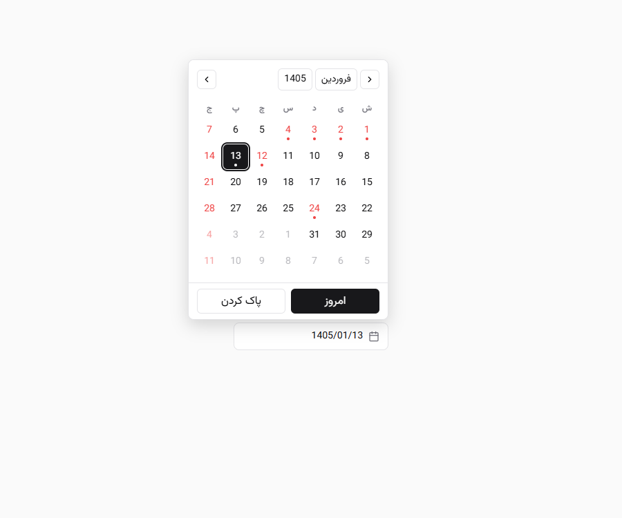 |
| 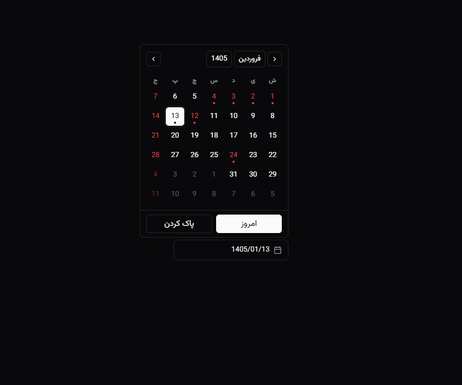 |
|
| Persian numerals | Standalone calendar |
| --- | --- |
| 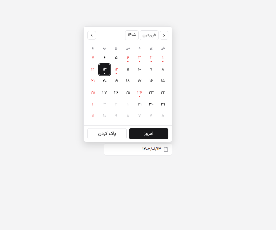 |
| 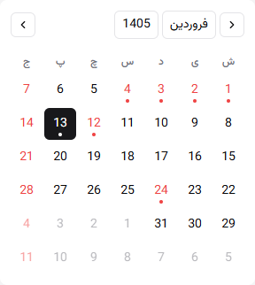 |
|
Installation
npm install shamsi-calendar
# or
pnpm add shamsi-calendar
# or
yarn add shamsi-calendar
react and react-dom (18 or 19) are peer dependencies — install them if your project doesn't already have them.
Import the stylesheet once, anywhere in your app (e.g. your root layout):
import "shamsi-calendar/style.css";That's it — no Tailwind config, no components.json, no build step required. If your app already has a shadcn/ui theme, the calendar matches it automatically.
Quick start
import { useState } from "react";
import { ShamsiDatePicker } from "shamsi-calendar";
import "shamsi-calendar/style.css";

export function BirthdateField() {
  const [date, setDate] = useState<Date | undefined>();

  return <ShamsiDatePicker value={date} onChange={setDate} placeholder="تاریخ تولد" />;
}value/onChange use plain JS Date objects — the Gregorian-equivalent instant of the picked Jalaali day — so they compose naturally with anything expecting a Date (forms, zod, native inputs after conversion, etc.).
Standalone calendar (no popover)
Use ShamsiCalendar directly when you want the grid inline — e.g. in a sidebar or a custom layout:
import { ShamsiCalendar } from "shamsi-calendar";

<ShamsiCalendar value={date} onChange={setDate} />;
Configuration
Constraints
<ShamsiDatePicker
  value={date}
  onChange={setDate}
  minDate={new Date(2020, 0, 1)}
  maxDate={new Date()}
  disabledDates={(d) => d.getDay() === 5} // disable all Fridays
/>
Numerals
<ShamsiDatePicker numerals="persian" /> {/* ۱۴۰۵/۰۴/۱۹ (default) */}
<ShamsiDatePicker numerals="latin" />   {/* 1405/04/19 */}
Holidays
Both fixed-date Iranian civil holidays (Nowruz, etc.) and lunar Hijri holidays (Eid al-Fitr, Ashura, Eid al-Ghadir, etc. — computed via an arithmetic Hijri calendar) are highlighted by default. Turn them off per-instance:
<ShamsiDatePicker showHolidays={false} />Lunar holiday dates can land up to a day off from the date officially announced in a given year, since they're computed arithmetically rather than by moon-sighting — see Limitations.
Year range for the year dropdown
Defaults to 100 years back / 10 forward from the current Jalaali year (covers birthdate pickers out of the box):
<ShamsiDatePicker yearRange={{ back: 50, forward: 5 }} />Footer, labels, and placeholder
<ShamsiDatePicker
  placeholder="انتخاب تاریخ"
  todayLabel="امروز"
  clearLabel="پاک کردن"
  showFooter={false} // hide the Today/Clear buttons entirely
/>
Custom trigger (asChild)
Swap in your own trigger element — your own shadcn Button, for instance — instead of the built-in one. Radix's asChild/Slot pattern wires up the click handler, ref, and aria-* attributes for you:
<ShamsiDatePicker asChild value={date} onChange={setDate}>
  <Button variant="outline">{date ? formatDate(date) : "Pick a date"}</Button>
</ShamsiDatePicker>
Per-part styling (classNames)
Every meaningful part of the calendar can be restyled individually, without fighting the built-in sc-* class specificity:
<ShamsiDatePicker
  classNames={{
    trigger: "my-trigger",
    daySelected: "my-selected-day",
    dayHoliday: "my-holiday-day",
    footer: "my-footer",
  }}
/>
See Styling API below for the full list of keys.
Controlled month navigation
const [month, setMonth] = useState(new Date());

<ShamsiCalendar month={month} onMonthChange={setMonth} value={date} onChange={setDate} />;
Styling API
shamsi-calendar ships plain CSS built entirely on hsl(var(--token, fallback)), matching the standard shadcn/ui CSS-variable convention (--primary, --background, --border, --radius, etc.). If your app already defines these — the default output of shadcn init — the calendar matches your theme automatically, dark mode included, with no extra setup.
classNames keys
| Key | Applies to |
| --- | --- |
| root | Outer wrapper (ShamsiCalendar) |
| header | Month/year navigation header |
| navButtonPrev / navButtonNext | Chevron buttons |
| monthSelectTrigger / yearSelectTrigger | Month/year dropdown triggers |
| weekdays / weekday | Weekday label row / individual label |
| grid | The day-cell grid |
| day | Every day cell |
| dayToday | Today's cell |
| daySelected | The selected cell |
| dayOutside | Leading/trailing days from adjacent months |
| dayDisabled | Disabled cells (minDate/maxDate/disabledDates) |
| dayWeekend | Friday cells |
| dayHoliday | Holiday cells |
| trigger / triggerPlaceholder | ShamsiDatePicker's trigger button (ShamsiDatePicker only) |
| content | The popover panel (ShamsiDatePicker only) |
| footer | Today/Clear footer row (ShamsiDatePicker only) |
| todayButton / clearButton | Footer buttons (ShamsiDatePicker only) |
API reference
ShamsiCalendarProps
| Prop | Type | Default | Description |
| --- | --- | --- | --- |
| value | Date | — | Controlled selected date |
| defaultValue | Date | — | Uncontrolled initial value |
| onChange | (date: Date \| undefined) => void | — | Fires on select, or with undefined on clear |
| month / defaultMonth / onMonthChange | Date / Date / (month: Date) => void | — | Controlled/uncontrolled displayed month |
| minDate / maxDate | Date | — | Inclusive date bounds |
| disabledDates | (date: Date) => boolean | — | Custom disable predicate |
| showHolidays | boolean | true | Highlight fixed-date and lunar Hijri Iranian holidays |
| numerals | "latin" \| "persian" | "latin" | Digit glyphs |
| weekStartsOn | 0 \| 6 | 6 (Saturday) | Week start day |
| yearRange | { back?: number; forward?: number } | { back: 100, forward: 10 } | Year dropdown range |
| id / className / classNames / style | — | — | Standard styling escape hatches |
| autoFocus | boolean | — | Focus the grid on mount |
ShamsiDatePickerProps
Extends ShamsiCalendarProps (minus autoFocus), plus:
| Prop | Type | Default | Description |
| --- | --- | --- | --- |
| placeholder | string | "انتخاب تاریخ" | Trigger text when empty |
| disabled | boolean | — | Disable the trigger |
| open / defaultOpen / onOpenChange | boolean / boolean / (open: boolean) => void | — | Controlled/uncontrolled popover state |
| asChild / children | boolean / ReactNode | — | Use your own trigger element |
| showFooter | boolean | true | Show Today/Clear buttons |
| todayLabel / clearLabel | ReactNode | "امروز" / "پاک کردن" | Footer button labels |
| name | string | — | Renders a hidden <input> for native form submission |
Keyboard navigation
The day grid follows the WAI-ARIA grid pattern, with arrow keys mapped for RTL reading direction:
| Key | Action |
| --- | --- |
| ArrowUp / ArrowDown | ±7 days |
| ArrowRight | Previous day (RTL: right = earlier) |
| ArrowLeft | Next day (RTL: left = later) |
| Home / End | Jump to Saturday / Friday of the current week |
| PageUp / PageDown | Previous / next month |
| Shift+PageUp / Shift+PageDown | Previous / next year |
| Enter / Space | Select the focused day |
| Escape | Close the popover, return focus to the trigger |
Next.js / SSR
Works out of the box with the App Router — the package ships its own "use client" boundary, so you can import and render it directly in a Server Component tree without adding the directive yourself.
Limitations
- Lunar Hijri holidays are computed via an arithmetic (tabular/civil) Hijri calendar, not a moon-sighting calendar — dates can differ by up to a day from the date officially announced in a given year, the same variance every non-observational digital Hijri calendar has.
- Locale: only Iranian Farsi month/day names are included in v1 (no Afghan Dari names yet).
- Theme convention: the CSS assumes your
--primary/--background/etc. use shadcn's standard unitless-HSL-triplet convention (the default fromshadcn init). Newer CSS-first (Tailwind v4 / OKLCH-value) shadcn setups aren't auto-detected — seesrc/styles/tokens.cssfor the override path. - Range selection is not yet supported — only single-date selection.
Contributing
git clone https://github.com/Amirjaz/Shamsi-Calendar.git
cd Shamsi-Calendar
pnpm install
pnpm dev        # dev harness at http://localhost:5173
pnpm test       # Vitest suite
pnpm typecheck
pnpm build      # tsup -> dist/
Issues and PRs welcome.
License
MIT © Amirjaz