
shooting-star
v2.2.1
Published
ApostropheCMS Star Rating Field
Maintainers
 ammein
Readme
Shooting-Star ApostropheCMS Schema :star2: :star2: :star2: :star: :star:

An ApostropheCMS Custom Schema for your own shooting star (Rating) field.
Install
From within your apostrophe project npm install --save shooting-star
Include in app.js:
// In app.js
  modules: {
    'shooting-star': {},
    // ... other modules
}
Enable Shooting Star Schema
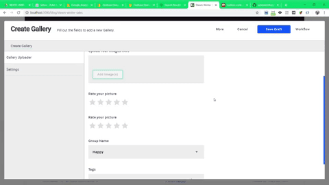
Simple :
addFields : [
    {
        type : 'shooting-star',
        name : 'rating',
        label : 'Rate Your Picture'
    }
]
Widget.html Get shooting-star Value
This shooting-star schema returns an object.
{
    priority : '<low|medium|high>',
    value : '<float value>'
}
If you did an example above , in widget.html you can simply get an object like this :
{{ data.widget.rating.priority }}
{{ data.widget.rating.value }}
or you can simply use apos.log() to see what's available on shooting-star objects :
{{ apos.log(data.widget.rating) }}How priority works and what does it for ?
For example , let say we have 5 stars in total. But we have 3 rates available which is low , medium and high. Each star will be divided on each rates available so that you can use your nunjucks grouping each element OR you can put some inline style css on each rate. For example
<div style="{% if data.widget.rating.priority === 'medium' %}width : 66.67%;{% elif data.widget.rating.priority === 'high' %}width : 100%;{% endif %}">Shooting Star Options Available
// in lib/modules/shooting-star/index.js
module.exports = {
    star : {
        size : "<Number or String>", // Star Size - Default : 30px
        color : "<String>", // Star Base Color - Default : #ddd
        highlightColor : "<String>", // Star Color when Click - Default : #FFD700
        hoverColor : "<String>" // Star Color when Hover - Default : #FFED85
        total : "<Number>" // Total Number Of Stars - Default : 5
    }
}
How to Override/Change Existing Rate Tooltip ?
Easy , make sure the name of the rate is similar to default rate. Here is the default rate & tooltip(Mouse Hover Tooltip) :
// In lib/modules/shooting-star/index.js
module.exports = {
    star : {
        tooltip : [
            {
                rate: "low",
                value: "Low - $ Star"
            }, {
                rate: "medium",
                value: "Medium - $ Star"
            }, {
                rate: "high",
                value: "High - $ Star"
            }
        ]
    }
}
Once Hover your mouse on stars , you will see the tooltip :smile:
What is '$' sign available in tooltip.value ?
That is my friend , is a value of star replace with that dollar sign . When ever you hover on each stars available , the number will be shown on that tooltip. If not, it will not show the number when hover. :wink:
Specific Field Customization
What if I want to customize differently on each fields ? I don't want every styles apply TO ALL. How can I make different number of stars on each field ? Well , I figured you might say that. Here's the override technique . Let say you want your second field to have 10 stars available instead of default 5 :
addFields : [
    // Output default options
    {
        type : 'shooting-star',
        name : 'firstStar',
        label : "Rate your first star"
    },
    // Output additional options and merge with default
    {
        type : 'shooting-star',
        name : 'secondStar',
        label : "Rate your second customized star",
        star : {
            total : 10,
            size : "50px"
        }
    }
]
Your
secondStarwill produce 10 stars and 50px size of that star instead of 5 stars and 30px size. Awesome right ? No need to scratch your head :laughing:
You only can customized on specific field with these options only :
    {
        type : 'shooting-star',
        name : 'secondStar',
        label : "Rate your second customized star",
        star : {
            size : "<Number or String>", // Star Size - Default : 30px
            color : "<String>", // Star Base Color - Default : #ddd
            highlightColor : "<String>", // Star Color when Click - Default : #FFD700
            hoverColor : "<String>" // Star Color when Hover - Default : #FFED85
            total : "<Number>" // Total Number Of Stars - Default : 5
        }
    }
WARNING : You cannot add
tooltiphere. Make your tooltip inside project level module which islib/modules/shooting-star/index.js
Browser
Browser Object
How can I get this schema browser object for my shooting-star ?
Simply you can find it on :
apos.shootingStarGet Star Browser Options
You can get it via browser scripting
apos.shootingStar.starGet Multiple Star Browser Options in Single Schema
Oops ! How can I get specific Star browser options object if I have two fields in a same schema ? I made a simple for you , let say you have this fields :
addFields : [
    {
        type : 'shooting-star',
        name : 'firstStar',
        label : 'Rate Your First Picture'
    },
    {
        type : 'shooting-star',
        name : 'secondStar',
        label : 'Rate Your Second Picture'
    }
]
Next, simply get the name property to get specific schema in browser object :
// First Editor
apos.shootingStar.firstStar.star

// Second Editor
apos.shootingStar.secondStar.star
Easy right ? Hell yeah it is ! :laughing:
Changelog
2.2.1
- Add Unit Tests.
- Adjust README with build tests link.
2.2.0
- Fixed for click star issue on both mode whether they have apostrophe-workflow or not in the project. If they do not have, well . Use normal get
checkedattribute on radio button input.
2.0.0
- Fixed for workflow problem that contains two type of fields. Live & Draft mode. Now you can see the UI changes beautifully when you change your mode.
1.0.4
- README Changed and adjusted codes to minimize it.
1.0.3
- Fixed when on browser Edge cannot automatically checked the input by using jQuery. Therefore, use oldschool technique where
.checkedattribute is use to set a boolean value on it. - README Changed