
shopisticate-css
v2.2.0
Published
A lightweight and responsive CSS framework.
Maintainers
 prasoon896
Readme
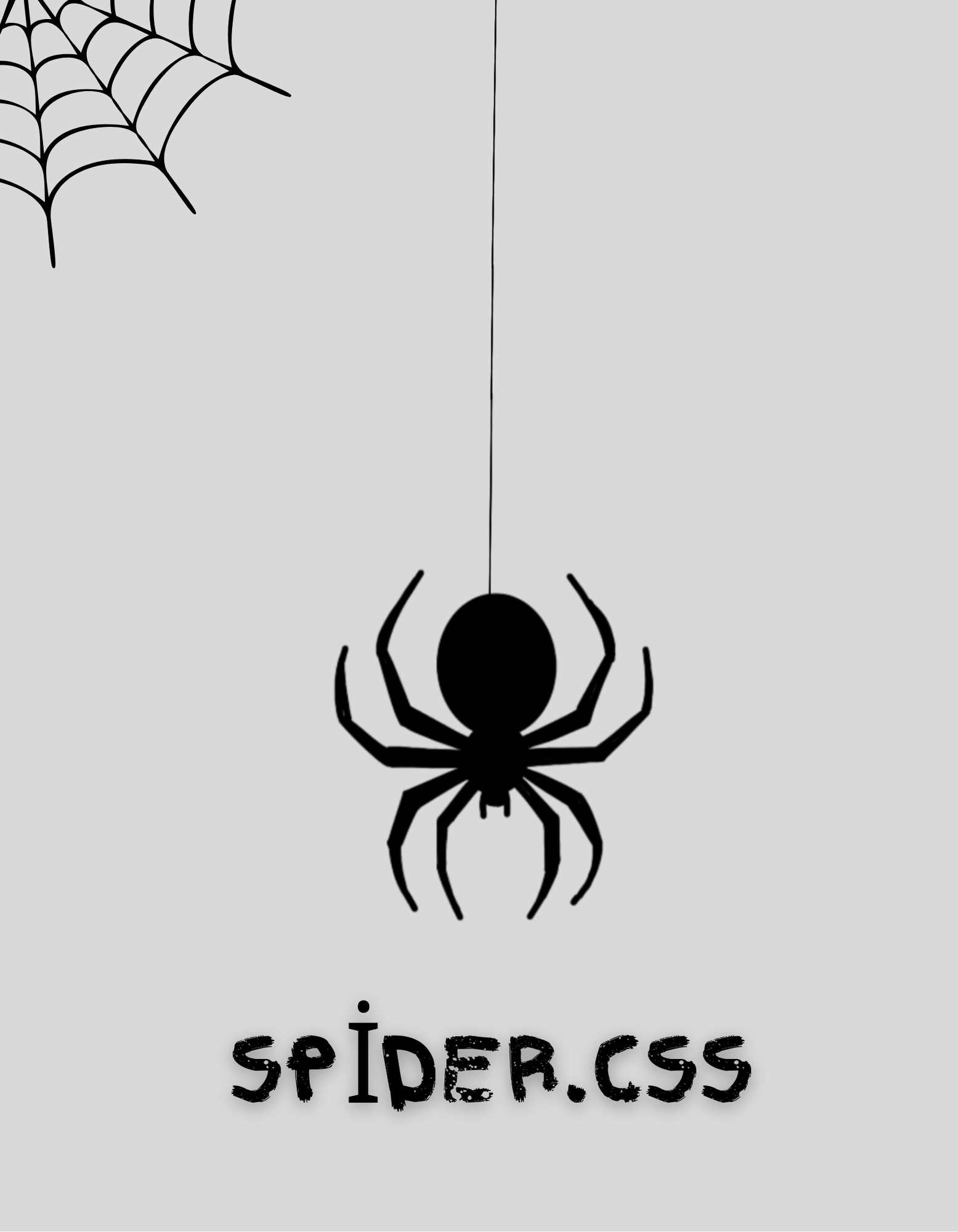
🕷️ Spider.css
Spider.css is a lightweight, modular, and utility-first CSS framework designed for modern web development. It offers rapid styling, responsive design, custom effects, dark mode, and advanced component support—all in a single file. Use it standalone or integrate it with your favorite JavaScript frameworks. CDN-ready and beginner-friendly.
🚀 Features
- 🎨 Design Tokens — Built-in color, spacing, and typography variables.
- ⚡ Utility-First Classes — Apply styling with simple class names.
- 🌗 Dark Mode Support — Native dark mode via
data-theme="dark". - 🎞️ Built-in Animations — Fade, bounce, pulse, and more.
- 🧩 Component Utilities — Cards, buttons, layout helpers.
- 🧠 Custom Attributes (Upcoming) — Attributes like
spy,shop. - 🌐 CDN-Ready — Easy integration via GitHub or jsDelivr.
- 🧪 Effects Module (v1.5.0+) — 3D cards, gradient text, morphing blobs, glass blur, holographic effects, etc.
- 🧠 Button.js Module — JS-powered dynamic buttons with custom colors and animations.
📦 Installation
✅ CDN (jsDelivr)
<link rel="stylesheet" href="https://cdn.jsdelivr.net/gh/pjdeveloper896/Spider.css/dist/Spider.css">✅ GitHub Pages CDN
<link rel="stylesheet" href="https://pjdeveloper896.github.io/Spider.css/dist/Spider.css">✅ JavaScript Module (Optional)
<script src="https://pjdeveloper896.github.io/Spider.css/dist/Spider.js"></script>🧪 Example Usage
<!DOCTYPE html>
<html lang="en">
<head>
  <meta charset="UTF-8">
  <title>Spider.css Demo</title>
  <link rel="stylesheet" href="https://cdn.jsdelivr.net/gh/pjdeveloper896/Spider.css/dist/Spider.css">
</head>
<body class="p-2">
  <h1 class="text-center text-primary">Welcome to Spider.css</h1>

  <div class="card shadow m-2 p-2">
    <p>This is a styled card using Spider.css utilities.</p>
    <button class="bg-primary text-white rounded p-1">Click Me</button>
  </div>
</body>
</html>
📺 Live Demo 📺 Playground
🧰 Utility Classes Overview
Spacing
.m-1,.m-2,.p-1,.p-2, ...
Colors
.bg-primary,.bg-secondary,.text-primary, ...
Layout
.d-flex,.d-grid,.flex-row,.grid-cols-2, ...
Text & Alignment
.text-center,.text-left,.text-right, ...
Effects (v1.5.0+)
.fade,.bounce,.glass-blur,.animated-grid, ...
🌗 Dark Mode
Set dark mode globally:
<html data-theme="dark">Or toggle dynamically:
document.documentElement.setAttribute("data-theme", "dark");✨ Effects Module (v1.5.0)
Advanced visual styles and animations:
bgtext-ocean,bgtext-tomato— Text clip backgroundsholographic-text,morph-blob,glass-blurcard-3d,pulse-shadow,animated-gradient-btn
🔘 Button.js (v1.5.0)
JavaScript module to dynamically create styled buttons:
SpiderButton.create({
  text: "Buy Now",
  color: "success",
  effect: "pulse-shadow"
});
Supports:
- Custom themes
- Hover/animated effects
- Icon injection
📁 Folder Structure
Spider.css/
├── dist/               # Compiled CSS and JS
├── src/                # SCSS source files
├── docs/               # Demo and documentation
└── README.md # This file🧑💻 Author
Made with ❤️ by PJ Developer
📃 License
ISC License — Free to use, customize, and contribute.
🛍️ shopisticate-css
⚡ Instant starter setup for Spider.css
shopisticate-css is a companion package to scaffold a complete development environment with Spider.css already configured.
📦 Installation
npm install shopisticate-css📁 What You Get
- 📄
doc/folder with HTML usage examples - 🎨 Ready-to-use
spider.css - ✅ Pre-configured
package.jsonand structure
🧑🏫 Usage Steps
- Create an HTML file.
- Add this in
<head>:
<link rel="stylesheet" href="/node_modules/shopisticate-css/spider.css">- Start using Spider.css classes and effects.
✅ Ideal For
- Beginners looking for structured CSS
- Frontend devs wanting quick prototypes
- Pure HTML + CSS workflows
© pjdeveloper896 — Built with 🕷️ and ❤️ official site https://spidercss.netlify.app/
Official site for Spider.css 2.0.0 https://683c54f0ebdce2b7d6a3dcba--silly-pithivier-6cf59f.netlify.app/
Spider.css 2.0.0
A lightweight, modern CSS framework combined with a JavaScript utility library designed for rapid UI development with custom attributes, component toggles, responsive layouts, and advanced interactive elements.
Table of Contents
- About
- Features
- Installation
- Usage
- JavaScript Modules
- UI Components
- Customization
- Contributing
- License
- Contact
About
Spider.css 2.0.0 is a modern, attribute-driven CSS framework paired with a JavaScript utility library to empower developers to build responsive, accessible, and dynamic web interfaces quickly. It leverages custom HTML attributes (spy, shop, and others) to declaratively control UI animations, layouts, and interactive components like modals, toasts, dropdowns, and tabs.
Features
Attribute-driven Styling Apply dynamic styles and animations using
[spy]and[shop]attributes.Responsive Layout Utilities Simple grid and flexbox layout controls for quick responsive design.
Dark Mode Support Toggle dark/light themes easily with built-in support.
JavaScript UI Components Modular components including modals, toasts, dropdowns, tabs, alerts, and navigation toggles.
Auto Binding Automatically activate components via HTML attributes (
data-spider) without manual JS calls.SVG Component Library Integrated scalable icons and graphics with customizable styling.
Professional UI Components Prebuilt navbar, buttons, cards, forms, and footer components for rapid prototyping.
Installation
Add Spider.css and Spider.js to your project by downloading or linking CDN (replace with your CDN or local path):
<link rel="stylesheet" href="spider.css">
<script src="spider.js"></script>
Usage
Basic Example
<button data-spider="toast" data-message="Hello Spider!" data-type="success">Show Toast</button>Attribute-Driven Styling
<div spy="fade rounded shadow bg-primary text-center m1">
  Stylish Box with Spider.css
</div>

<div shop="grid">
  <div>Item 1</div>
  <div>Item 2</div>
  <div>Item 3</div>
</div>
Dark Mode Toggle
<button data-toggle="dark-mode">Toggle Dark Mode</button>JavaScript Modules
Spider.css 2.0.0 comes with a modular JavaScript library providing:
| Feature | Function | Description |
| ------------ | ------------------ | ----------------------------------- |
| Modal | spiderModal() | Display popup modal windows |
| Toast | spiderToast() | Show temporary notification toasts |
| Dropdown | spiderDropdown() | Toggle dropdown menus |
| Tabs | spiderTabs() | Switch between tabbed content |
| Alert Modal | spiderAlert() | Confirmation dialogs with callbacks |
| Auto Binding | spiderAutoBind() | Auto-initialize components |
| Nav Toggle | toggleNav() | Show/hide navigation menus |
Example:
spiderComponent.init(); // Initialize dropdowns and tabs
spiderAutoBind();       // Bind UI elements automatically
UI Components
Spider.css 2.0.0 includes a professional UI component library with:
- Responsive Navbar with toggle
- Buttons (primary, secondary, disabled, icon buttons)
- Cards with images and content
- Forms with validation styles
- Footers with social media links
All components are fully customizable via CSS variables and attribute options.
Customization
- Modify CSS variables inside
spider.cssfor theme colors, spacing, fonts. - Extend JavaScript modules by adding custom event handlers or UI logic.
- Use
spyandshopattributes liberally for fast, maintainable styling.
Contributing
Contributions are welcome! Please fork the repo, create a branch for your feature or fix, and submit a pull request. Make sure your code is clean, documented, and follows the project’s style.
License
This project is licensed under the Isc License. See the LICENSE file for details.
Contact
Created by Prasoon singh jadon
- GitHub: https://github.com/Pjdeveloper896
- Email: [email protected]
🎮 Try Spider.css Live
Explore Spider.css 2.0.0 in action using the online playground:
✨ Write HTML with Spider.css classes and see instant preview in real-time.