
showfer-tv-guide
v1.0.3
Published
React component for displaying TV program schedules from XMLTV/EPG data.
Maintainers
 maxim_mamontov
Readme
Showfer Media - EPG
React component for displaying TV schedules from XMLTV/EPG.
Install
npm i showfer-tv-guidePeer dependencies: react and react-dom (18+ or 19+).
Usage (React)
import { ShowferSchedule, type ShowferScheduleMode } from 'showfer-tv-guide';
import 'showfer-tv-guide/style.css';

export function App() {
  const mode: ShowferScheduleMode = 'horizontalTimelinePoster';

  return (
    <div style={{ width: 1100 }}>
      <ShowferSchedule
        url="https://epg.showfer.com/Big_Cinema/dBsh2.xml"
        timeZone="America/Los_Angeles"
        theme="system"
        mode={mode}
      />
    </div>
  );
}
Usage (standalone / <script> without bundler)
This project provides a UMD bundle that you can load via a plain <script> tag and render the schedule into a DOM container.
- Bundle:
https://cdn.jsdelivr.net/npm/showfer-tv-guide@latest/dist/showfer-tv-guide.standalone.min.js - Global function:
renderShowferSchedule(container, props)
Important: url is fetched in the browser. If the XMLTV host does not allow your page origin via CORS (e.g. only allows https://admin.showfer.com), the request will fail with Failed to fetch and the schedule will render an empty state. In that case, fetch the XMLTV from your own backend / reverse-proxy (same origin as your page) and point url to that proxy endpoint.
Example:
<!doctype html>
<html lang="en">
  <head>
    <meta charset="UTF-8" />
    <meta name="viewport" content="width=device-width, initial-scale=1.0" />
    <title>ShowferSchedule standalone</title>
    <link
      rel="stylesheet"
      href="https://cdn.jsdelivr.net/npm/[email protected]/dist/showfer-tv-guide.css"
    />
  </head>
  <body>
    <div id="epg" style="width: 1100px"></div>

    <script src="https://cdn.jsdelivr.net/npm/[email protected]/dist/showfer-tv-guide.standalone.min.js"></script>
    <script>
      const { unmount } = renderShowferSchedule(document.getElementById('epg'), {
        url: 'https://epg.showfer.com/Big_Cinema/dBsh2.xml',
        timeZone: 'America/Los_Angeles',
        theme: 'system',
        mode: 'horizontalTimelinePoster',
      });

      // unmount();
    </script>
  </body>
</html>
Themes
theme="light": force light themetheme="dark": force dark themetheme="system"(default): follows OS color scheme
Light vs dark comparison (same mode):
Modes, hardcoded size, and required container size
mode is a layout preset. Each preset has hardcoded root sizing, so when embedding you must provide a container that matches the preset’s expectations.
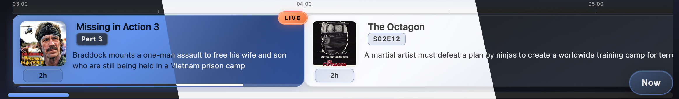
1) Horizontal day timeline (with time axis)
These modes render a 24h horizontal track (scrollable). Component width is 100% (fills parent), height is auto (fits content).
| Mode | Hardcoded component size (width × height) | Required container size | Screenshot |
|-----------------------------|-----------------------------------------------|-----------------------------|-----------------------------------------------------------------------------------------------------------------------------|
| horizontalTimelinePoster | 100% × 174px | parent should set width | 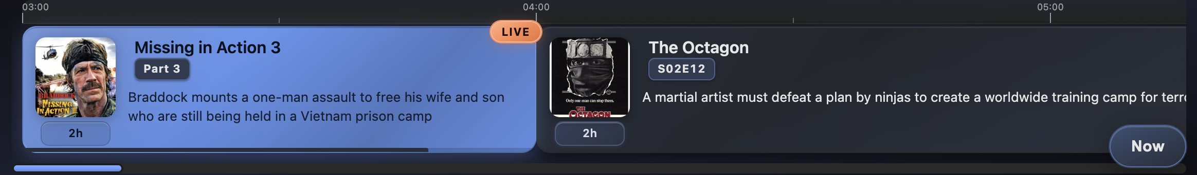 |
|
|
| horizontalTimeline | 100% × 174px | parent should set width |  |
|
|
| horizontalTimelineCompact | 100% × 114px | parent should set width |  |
|
2) Horizontal grid (equal-width cards, no time axis)
These modes render equal-width cards in a horizontal scroll container. Component width is 100% (fills parent), height is auto (fits content).
| Mode | Hardcoded component size (width × height) | Required container size | Screenshot |
|---------------------------|-----------------------------------------------|-----------------------------|---------------------------------------------------------------------------------------------------------------------|
| horizontalGridPoster | 100% × 152px | parent should set width | 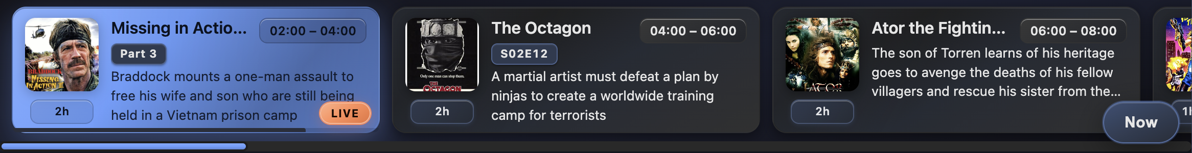 |
|
|
| horizontalGrid | 100% × 152px | parent should set width | 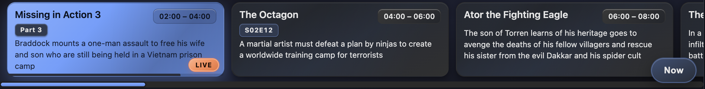 |
|
|
| horizontalGridCompact | 100% × 92px | parent should set width |  |
|
3) Vertical list (fixed column width)
These modes render a vertical list that scrolls vertically. Width is hardcoded and height is 100%, so the parent container must define the height.
| Mode | Hardcoded component size (width × height) | Required container size | Screenshot |
|-----------------------|-----------------------------------------------|-----------------------------------------------------------|-----------------------------------------------------------------------------------------------------------------|
| verticalListPoster | 400px × 100% | parent must set height and be at least 400px wide | 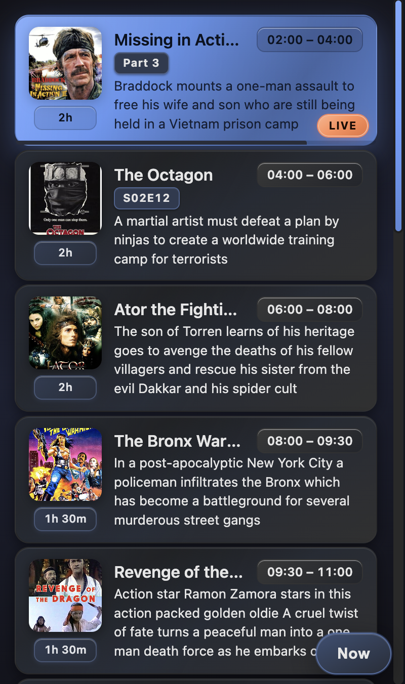 |
|
|
| verticalList | 400px × 100% | parent must set height and be at least 400px wide | 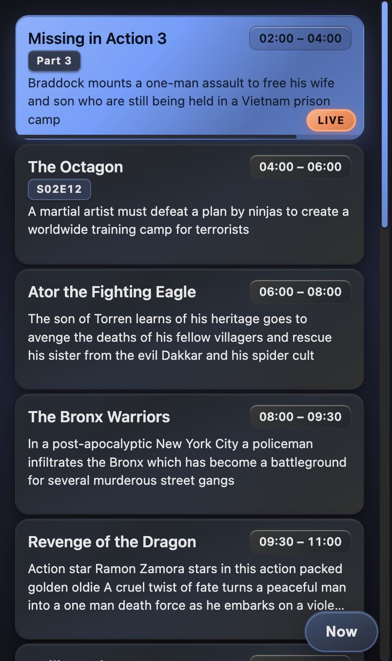 |
|
|
| verticalListCompact | 320px × 100% | parent must set height and be at least 320px wide | 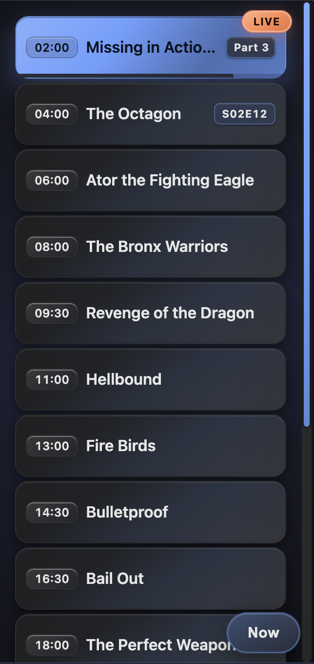 |
|
Props
ShowferScheduleProps:
url: URL of an XMLTV file (the component fetches it in the browser)timeZone: IANA time zone (e.g.America/Los_Angeles)theme:light|dark|system(optional)mode:ShowferScheduleMode(required)