
signalk-nearlcrews-ui
v0.5.0
Published
Accessible, theme-aware React primitives for Signal K administration panels.

Maintainers
 nearlcrews
Readme
Signal K NearlCrews UI





signalk-nearlcrews-ui provides accessible, theme-aware React primitives for NearlCrews Signal K administration panels. It standardizes common panel behavior without taking ownership of plugin data, Signal K APIs, units, validation, or save workflows.
The package is intentionally distinct from the official Signal K user interface and its internal component systems.
Status
The package is a public npm dependency for NearlCrews Signal K projects. It is not a Signal K plugin, webapp, or marketplace package. The initial API may change during the 0.x series, so consumers should pin an exact version.
What's new in 0.5.0
This release significantly expands the component library and modernizes its React 19.2 foundations. The Disclosure component has been removed (merged into CollapsibleSection), and several APIs have changed. See the adoption note in the docs directory before upgrading.
- Composite widgets: Added
Accordion,DataGrid,Dialog,EmptyState,Menu,Popover,RadioGroup,Switch, andToastRegion, built on React Aria Components for robust accessibility and keyboard behavior. - Form and field upgrades:
SegmentedControlsupports form participation, uncontrolled mode, and vertical layout.LabeledFieldinjectsnameanddisabled, and supports optional markers.RangeInputandCheckboxnatively synchronize their fill and indeterminate states after a form reset. - Modernized internals: Components use React 19.2
<Activity>to pause effects in collapsed content, anduseEffectEventfor stable event handlers. ZeroforwardReforuseImperativeHandleshims remain; refs compose cleanly. - Theme and token enhancements:
ThemeTogglesupports restricting choices, and the night theme provides red-preserving elevations. Token scales for z-index, motion, and typography are now public API. - Forced colors and contrast: State distinctions for buttons, banners, badges, and invalid controls survive in forced-colors mode, and
prefers-contrast: morestrengthens borders and focus outlines.
Compatibility
| Package | React | JavaScript | Remote output | Browser verification | Signal K boundary |
| ------- | ------------ | ---------- | ---------------------------------------- | --------------------------------------------------------- | ------------------------------------------------------------------------------ |
| 0.5.x | >=19.2 <20 | ES2022 | Classic global and ESM Module Federation | Playwright Chromium, Firefox, WebKit, and mobile Chromium | Presentational only; each consumer verifies its own Signal K Admin integration |
| 0.4.x | >=19.2 <20 | ES2022 | Classic global and ESM Module Federation | Playwright Chromium, Firefox, WebKit, and mobile Chromium | Presentational only; each consumer verifies its own Signal K Admin integration |
| 0.3.x | >=19.2 <20 | ES2022 | Classic global and ESM Module Federation | Playwright Chromium, Firefox, WebKit, and mobile Chromium | Presentational only; each consumer verifies its own Signal K Admin integration |
| 0.2.x | >=19.2 <20 | ES2022 | Classic global and ESM Module Federation | Playwright Chromium, Firefox, WebKit, and mobile Chromium | Presentational only; each consumer verifies its own Signal K Admin integration |
| 0.1.x | >=19.2 <20 | ES2022 | Classic global and ESM Module Federation | Playwright Chromium, Firefox, WebKit, and mobile Chromium | Presentational only; each consumer verifies its own Signal K Admin integration |
Requirements
- React 19.2 or newer within the React 19 release line
- Chromium or Edge 118 or newer, Firefox 146 or newer, or Safari 17.4 or newer
- A consumer build that bundles this package into its configuration-panel remote
The browser floors come from native CSS @scope, which became available in Chromium and Edge 118, Firefox 146, and Safari 17.4. PanelRoot throws a clear compatibility error when CSSScopeRule is unavailable instead of silently rendering unstyled controls. Signal K installations that embed an older browser engine must update that engine before adopting this package. Right-to-left caret mirroring, select indicator placement, and the range fill direction additionally use :dir(), which Chromium added in 120; Chromium and Edge 118 and 119 skip those cosmetic rules while everything else renders correctly.
The package renders in the browser only. Theme resolution reads window interfaces such as localStorage while mounting, so the components are not intended for server-side rendering.
Consumers that need to choose a fallback before rendering may call supportsNativeCssScope(window). A failed PanelRoot installation throws the exported UnsupportedBrowserError, whose feature property is CSS @scope. The package does not ship an unscoped fallback because that would weaken style isolation between independently bundled panels.
React is a peer dependency. react-dom is not required by the library. Consumer bundles may contain React's small production JSX helper, but they must consume React itself from the host singleton and must not bundle React or React DOM implementations.
The repository builds real production Webpack remotes in classic global and ESM formats. Its browser harness initializes those containers with a minimal host-equivalent React share scope. It does not reproduce the complete Signal K Admin bootstrap, so each consumer must retain a production remote-load check against its supported Signal K host.
Installation
Install an exact version as a development dependency because the consumer bundles the package into its panel remote:
npm install --save-dev --save-exact [email protected]For unpublished local changes, build and pack this repository, then install the resulting tarball:
npm run build
npm pack --ignore-scripts
npm install --save-dev --save-exact ../signalk-nearlcrews-ui/signalk-nearlcrews-ui-0.5.0.tgz
Do not configure this package as a runtime Module Federation share. Each plugin should embed the selected package version in its own remote while continuing to share React with the Signal K Admin host.
Basic use
import {
  ActionBar,
  Button,
  LabeledField,
  PanelRoot,
  Section,
  Stack,
  StatusIndicator,
  TextInput,
  ThemeToggle,
} from "signalk-nearlcrews-ui";

export function PluginConfigurationPanel() {
  return (
    <PanelRoot>
      <Stack gap={4}>
        <ThemeToggle />
        <Section title="Connection">
          <LabeledField label="Server URL" required>
            <TextInput type="url" />
          </LabeledField>
        </Section>
        <ActionBar
          status={<StatusIndicator>Unsaved changes</StatusIndicator>}
          actions={<Button variant="primary">Save</Button>}
        />
      </Stack>
    </PanelRoot>
  );
}
PanelRoot installs one deduplicated style element per package version and CSP nonce in its rendered root's owner document for the lifetime of its mounted roots. Separately bundled remotes share the same document registry. Native CSS scopes limit styles to the nearest exact package-version root, including nested version re-entry. Styles are removed after the last root using that version and nonce unmounts and are never written to :root. Consumers do not need a CSS loader. Panels use full width by default so the themed surface covers data-dense administration content. Set width="standard" or width="wide" when a bounded reading width is appropriate.
For a strict Content Security Policy, pass the nonce that authorizes inline styles:
<PanelRoot styleNonce={styleNonce}>Panel content</PanelRoot>The host must supply the nonce through its own trusted bootstrap. Do not read it from untrusted panel data.
Components
PanelRootprovides scoped styles and theme state.ThemeToggleselects Auto, Light, Dark, or Night and accepts per-instance labels for localization.choiceslimits the offered themes, andonChangereports each selection.Buttonsupplies primary, secondary, ghost, and danger presentation, plus compact and pill options.as="a"renders an anchor form with a requiredhref,fullWidthstretches the control to its container, andiconOnlysquares it for icon content with a required accessible name.ariaDisabledkeeps a control focusable while suppressing activation at a list boundary. A loading button uses the same focus-preserving behavior and acceptsloadingLabelfor its accessible state name.SegmentedControlimplements a single-choice radio group with roving focus, Home, End, and direction-aware arrow keys. It runs controlled throughvalueor uncontrolled throughdefaultValue, lays out horizontally or vertically throughorientation, shows its legend throughlegendVisibility, and carries the selection into native form submission and reset throughname.RadioGroupandRadioprovide a native radio group with label, description, validation messages with opt-in live announcement, and horizontal or vertical orientation.nameapplies to every radio input so native form submission and reset work.Switchtoggles a single setting and mirrors theCheckboxnaming:checkedanddefaultCheckedmap to the selected state.LabeledField,InputGroup,InputGroupControl,InputGroupAddon,TextInput,NumberInput,RangeInput,Select,Textarea, andCheckboxprovide accessible form structure. Render-prop fields identify the primary labeled control while allowing paired inputs, unit suffixes, and adjacent actions, and the render-prop control props carrydescriptionIdanderrorIdso paired controls can reference field text directly. Fields forwardnameanddisabledto their control, andoptionalLabelmarks optional fields beside the required marker. Fields and checkboxes accept validation messages and opt-in live announcement modes.TextInputcovers text, email, password, search, tel, url, date, time, datetime-local, month, and week entry.Checkboxdrives the native mixed state throughindeterminate, andRangeInputshows a filled progress track in every supported engine.FieldGroupprovides a native fieldset and legend with description, action, validation error, and disabled support.SectionandCollapsibleSectionprovide semantic content grouping.CollapsibleSectionwraps the native details element: controlled or uncontrolled state, heading navigation, below-content or header-trailing summaries that stay visible while open throughsummaryVisibility, sibling actions, retained, lazily retained, or unmounted content throughmountStrategy, and focus restoration.AccordioncoordinatesCollapsibleSectionchildren so at most one section stays open at a time.BannerandStatusIndicatorprovide text-backed feedback that does not rely on color alone. Banners span the neutral tone plus the semantic tones, and accept actions, dismissal, a post-dismissal focus destination, localized severity text, and consumer-selected roles such asnote.StatusIndicatorvaries its dot shape per tone and acceptslivefor opt-in announcements, and both accepttoneLabelto localize the announced severity.Progressreports determinate or indeterminate progress with a required label, an optional tone, andvalueTextfor assistive technology.ToastRegionrenders queued toasts into the panel's portal container.createToastQueuebuilds a queue, the sharedtoastqueue covers the common single-region setup, and each toast carries a tone, an auto-dismiss delay, and an announcement mode.Stack,Cluster,Card,MetricGrid,Metric, andBadgestandardize rhythm and presentational status shells while leaving status interpretation local.Stack,Cluster,Card, andMetricGridacceptasto render a semantic element, andCardadds compact density and header and footer slots. Each metric is a named semantic group.MetricandBadgerender a tone glyph for non-neutral tones and accepttoneLabel.Metricalso accepts aunitsuffix beside the value andlivefor opt-in announcements.DataGridrenders an accessible grid with sortable headers, single or multiple selection, compact density, zebra striping, anEmptyState-backed empty view, and windowed rows above a virtualization threshold. Sorting is controlled: paironSortChangewithsortDescriptorand sortitemsin the consumer.Column,Row, andCellare re-exported from react-aria-components for its collection API.EmptyStatepresents an empty view with a decorative icon, a title, a description, and an action. The title is a styled div, not a heading, so consumers own the surrounding outline.ActionBarlays out consumer-owned state and actions, andstickypins it to the top or bottom of its scroll container. PassstatusRefto move focus to the status after save or discard disables the initiating control.InlineConfirmreplaces blocking browser confirmations with a named, focus-managed inline region that supports Escape and announces its message on open. It runs controlled throughopenor uncontrolled throughdefaultOpen. SetheadingLevelto preserve the surrounding heading hierarchy,landmark={false}to drop the region landmark, andinitialFocusRefandreturnFocusRefto steer focus on open and close.Dialogrenders a modal surface with a scrim, focus management, Escape and scrim dismissal, a title and description, and an actions footer. It supports controlled or uncontrolled open state and a standard or wide width.AlertDialogshares theDialogAPI and renders with thealertdialogrole for confirmations that demand acknowledgement.Menupairs aButtontrigger with a popover list ofMenuItemactions, grouped byMenuSectionand divided byMenuSeparator, with destructive styling for irreversible actions.Popoveranchors free-form overlay content to a trigger with logical placement, collision flipping, and an optional fixed width.
LabeledField children must accept and forward id, required, aria-describedby, aria-errormessage, and aria-invalid. The exported FieldControlProps interface defines that contract for custom controls. Required field labels, checkbox labels, radio group labels, legends, section titles, collapsible titles, and metric labels must contain rendered, non-whitespace content.
Refs
Refs are ordinary props. Each component below forwards to the native element named, and supports object refs, callback refs, and React 19 callback-ref cleanup.
| Component | Ref element | Prop |
| ------------------ | --------------------- | ----- |
| Button | HTMLButtonElement | ref |
| Banner | HTMLDivElement | ref |
| FieldGroup | HTMLFieldSetElement | ref |
| TextInput | HTMLInputElement | ref |
| NumberInput | HTMLInputElement | ref |
| RangeInput | HTMLInputElement | ref |
| Select | HTMLSelectElement | ref |
| Textarea | HTMLTextAreaElement | ref |
| Checkbox | HTMLInputElement | ref |
| PanelRoot | HTMLDivElement | ref |
| SegmentedControl | HTMLDivElement | ref |
| InlineConfirm | HTMLElement | ref |
Every component takes a plain ref. Banner additionally accepts dismissFocusRef, which names where focus should land after dismissal rather than exposing the banner itself.
Every user-visible default string is overridable for localization: Button.loadingLabel, Banner.dismissLabel, Banner.toneLabel, InlineConfirm.cancelLabel, InlineConfirm.confirmLabel, InlineConfirm.fallbackTitle, ThemeToggle.legend, and toneLabel on Badge, Metric, and StatusIndicator.
Persistent validation text defaults to errorLive="off". Use polite or assertive only when a newly inserted message must be announced after an interaction:
<LabeledField
  label="Server URL"
  error={serverError}
  errorLive={submitted ? "polite" : "off"}
>
  <TextInput type="url" />
</LabeledField>

<Checkbox
  label="Enable provider"
  error={providerError}
  errorLive={submitted ? "polite" : "off"}
/>
Loading buttons remain in the focus order and suppress repeat activation. Keep the action label stable and localize the state prefix when needed:
<Button loading={saving} loadingLabel="Saving" onClick={save}>
  Configuration
</Button>
For a composite field, spread the render-prop contract onto the primary control and copy only its aria-describedby value to secondary controls. Use a growing slot for the flexible control and a fixed slot to keep an exact input and its addon together:
<LabeledField label="Cache limit" description="Whole GiB" layout="inline">
  {(controlProps) => (
    <InputGroup density="compact">
      <InputGroupControl width="grow">
        <RangeInput {...controlProps} min={4} max={32} />
      </InputGroupControl>
      <InputGroupControl width="fixed">
        <NumberInput
          aria-label="Cache limit exact value"
          aria-describedby={controlProps["aria-describedby"]}
          min={4}
          max={32}
        />
        <InputGroupAddon>GiB</InputGroupAddon>
      </InputGroupControl>
    </InputGroup>
  )}
</LabeledField>
All color, spacing, radius, typography, control-size, content-width, and transition tokens listed in the design contract are public CSS API. PUBLIC_TOKEN_NAMES exposes the same names to tooling. Override tokens through PanelRoot.style so the values stay attached to the versioned root instead of depending on private classes or DOM nesting:
<PanelRoot
  style={
    {
      "--snui-color-accent-fill": "#0f766e",
      "--snui-color-interactive-hover": "#ecfdf5",
    } as React.CSSProperties
  }
>
  Panel content
</PanelRoot>
An inline token override applies in every selected theme. Use it only when that behavior is intentional and verify contrast in Light, Dark, and Night.
Showcase
The repository ships a fixture page that renders every exported component. The top of that page in each theme:
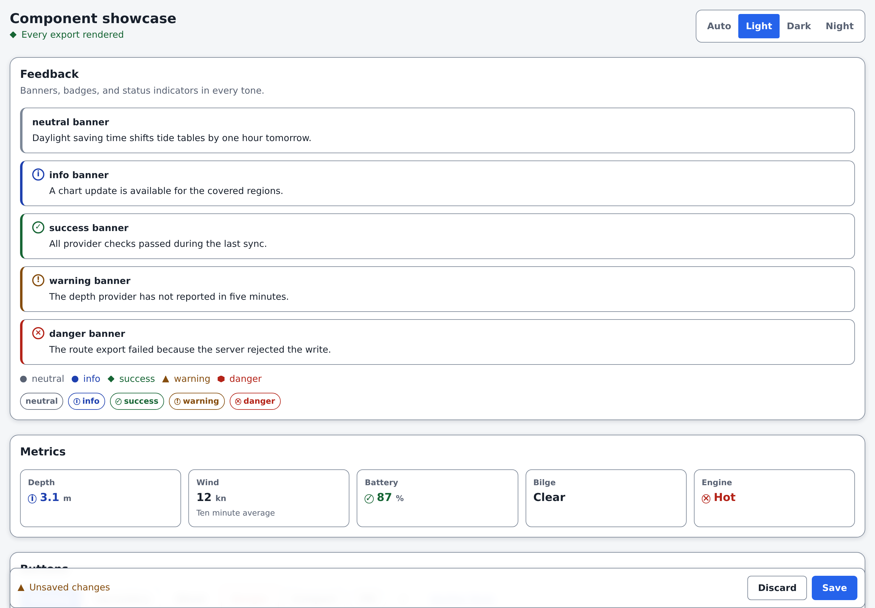
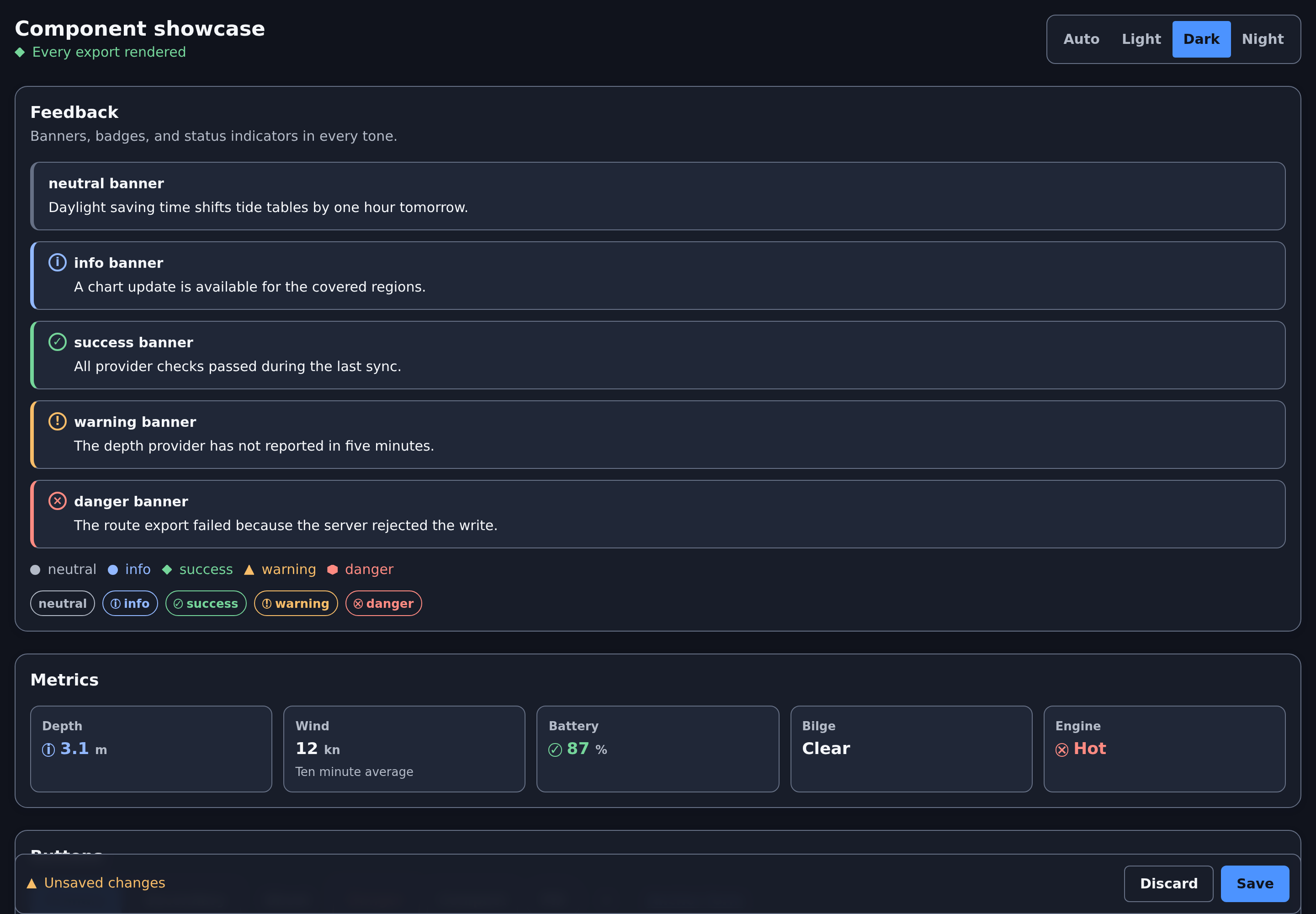
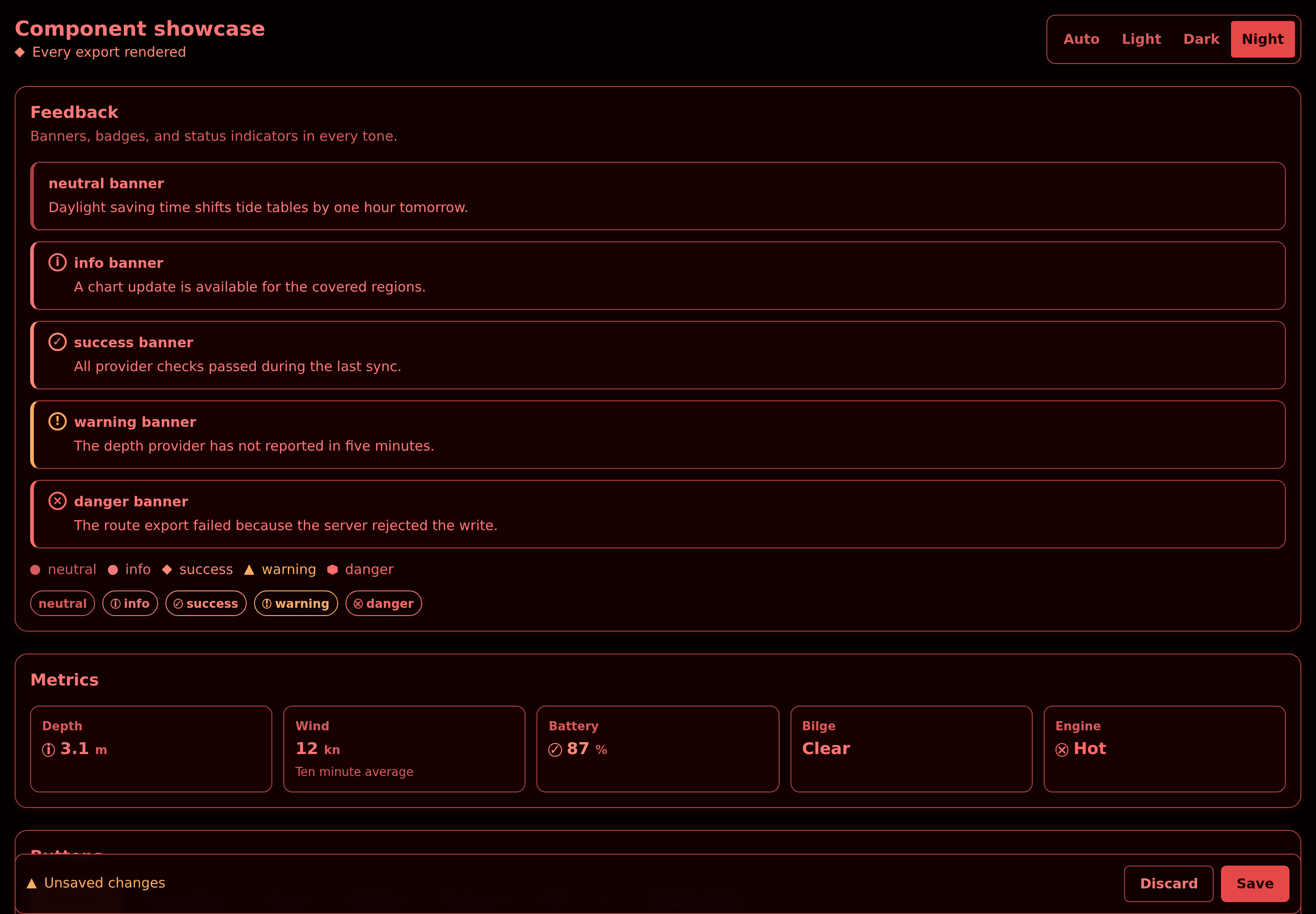
The Night palette preserves red for dark-adapted vision at the helm. The showcase page itself lives in the fixtures directory of the repository and builds with the browser fixture bundle.
Theme preference
The shared preference key is signalk-nearlcrews-ui.theme.v1, the only storage key the package reads or writes. On first resolution, PanelRoot uses this order:
- Read the shared key when it contains a valid value.
- Otherwise, use Auto without writing an implicit preference. Auto leaves
data-snui-themeoff the root, which is what allows the host-following andprefers-color-schemerules to apply, so a fresh panel inside a dark Signal K Admin renders dark.
Selecting a theme writes the shared key and broadcasts the choice to panels in the same document, while open panels in other tabs follow the browser storage event. If the write fails, the selection remains current in the mounted panels for the page session but is not durable. Existing valid values, including Auto, otherwise remain authoritative. Auto follows explicit Bootstrap or CoreUI host themes, legacy .dark-mode, and then the operating-system color preference. The Night theme uses a red-preserving palette inside the panel. It does not recolor Signal K host chrome or surrounding page gutters, so a host that needs full-surface night adaptation must coordinate those surfaces separately.
Package boundary
Keep these concerns in each plugin:
- Fetching and Signal K API calls
- Configuration state and normalization
- SI storage, display-boundary conversion, and server unit preferences
- Save status and save orchestration
- Domain validation and provider behavior
- Plugin-specific tables, cards, and workflows
See the design contract, the migration guide, and the release policy for the complete rules.
Development
npm ci
npm run validate
npm run test:browser
Development supports Node 22.22.2 or newer in the Node 22 release line, Node 24.15.0 or newer in the Node 24 release line, or Node 26. npm 12.0.1 is preferred, and npm 11.16 or newer remains accepted during the transition. These are source-tooling requirements and do not impose a Node runtime on consumers of the browser bundle.
npm run validate runs Biome formatting and linting, Prettier documentation formatting, type-aware ESLint rules, Knip dead-code analysis, TypeScript checks under both installed compilers, unit coverage including type-level tests, full and runtime dependency audits, compilation, packed-package validation, an emitted-declaration comparison against the committed baseline, a consumer type check against the packed artifact, bundle-size and React-externalization checks, and classic and ESM Module Federation fixture builds.
Two TypeScript compilers are installed on purpose. See the TypeScript toolchain section of CONTRIBUTING.md in the repository for why, and for the condition that collapses them back to one.
Biome owns JavaScript, TypeScript, JSON, and HTML formatting and supplies the fast recommended lint layer. Prettier is intentionally limited to Markdown and YAML, which Biome does not yet support. Type-aware ESLint remains for project-aware TypeScript, React Hooks, and JSX accessibility rules that are not equivalent to Biome's syntax-aware checks. Knip independently verifies the repository dependency and export graph.
Browser tests require Playwright Chromium, Firefox, and WebKit:
npx --no-install playwright install chromium firefox webkitLicense
Apache-2.0