
simple-react-donut-chart
v0.0.8
Published
Creates donut charts in react

Readme
React Donut Chart
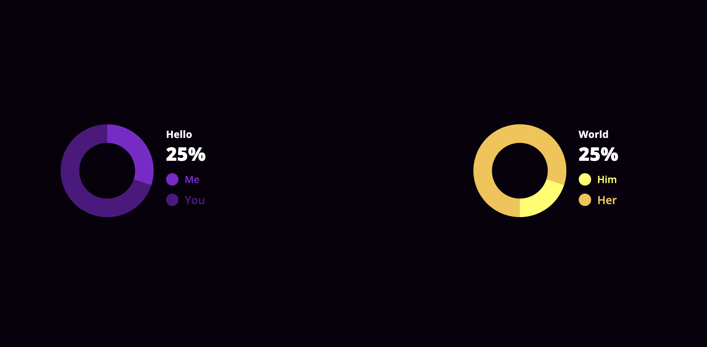
This is a dead simple donut chart component implemented in React.
To use it simply install it via npm:
npm i --save simple-react-donut-chart
demo
You can see this component in action here.
## usage
This is an example how can you use this component in your project(s)
    import DonoutChart from 'simple-react-donut-chart'
    import 'simple-react-donut-chart/src/style.css'
Yes, in this version you have to include the compiled d css also
Using the component:
<DonoutChart
    percentage={30}
    colorOn="#510E80"
    colorOff="#8217CC"
    labelOff="Me"
    labelOn="You"
    circleColor="#ffffff"
    baseClass="customize"
    textStyle={{
        color: '#ff0000',
    }}
    labelStyle={{
        off: {
            fontSize: '16px',
        },
        on: {
            fontSize: '18px',
        },
    }}
/>
props
| name | isRequired | type | default | example | description |
|---------------|------------|----------|-------------|------------------------------------------------------------------------------------|---------------------------------------------------------------------------------|
| percentage | yes | Number | 0 | percentage={10} | the percentage the donut chart should show |
| colorOn | yes | String | null | colorOn="#ff0000" | the color that matches with the percentage on the chart |
| colorOff | yes | String | null | colorOff="#ffff00" | the color that matches the rest of the donut part on the chart |
| labelOn | yes | String | null | labelOn="On" | the text will be shown with the percentage on the chart |
| labelOff | yes | String | null | labelOff="Off" | the text will be shown with the rest of the donut part on the chart |
| circleColor | yes | String | "#ffffff" | circleColor="#444444" | the color the circle should have on the middle of the donut chart |
| labelStyle | no | Object | {} | labelStyle={{ off: {,fontSize: '16px',}, on: {,fontSize: '18px',} }} | styleObject passed to the labels of the donut chart |
| textStyle | no | Object | {} | textStyle={{ color: '#fff', }} | styleObject passed to the explanation text of the donut chart |
| baseClass | no | String | null | baseClass={styles.chartBase} | Providing a baseClass will be applied on every domNode the donut chart has. See more at the styleing section |
Styleing
By providing the baseClass props, you are able to customize the chart as you wish, with CSS.
Here is a quick example how it works:
<DonoutChart
	percentage={30}
    ...
    baseClass="customize"
/>
Given the customize as the value of baseClass the following will happen.
The donutContainer class will be assigned another class, which is the baseClass prop itself.
<div class="donutContainer customize">
    ...
</div>
The rest of the dom will be suffixed with the baseClass prop's value.
| className | extended |
|------------------|----------------------------------------------------------|
| donutContainer | className={`donutContainer ${baseClass}`} |
| details | className={`details details--${baseClass}`} |
| indicator off | className={`indicator off indicator-off-${baseClass}`} |
| indicator on | className={`indicator on, indicator-on-${baseClass}`} |
More might come later if there's a need.
contribution
If you encountered an issue, or a bug, or want to request a feature, please use the issues section.
If you want to modify something yourself, feel free to fork this project, create a new branch for your feature, then send a PR and I will be happy to review and merge it. :wink:
dependencies
This package depends on styled-components
Misc
- this package is licenced under MIT