
sketchbook-ui
v1.0.1
Published
A hand-drawn React component library with a unique sketchy, notebook aesthetic
Maintainers
 sarthakrawat
Readme
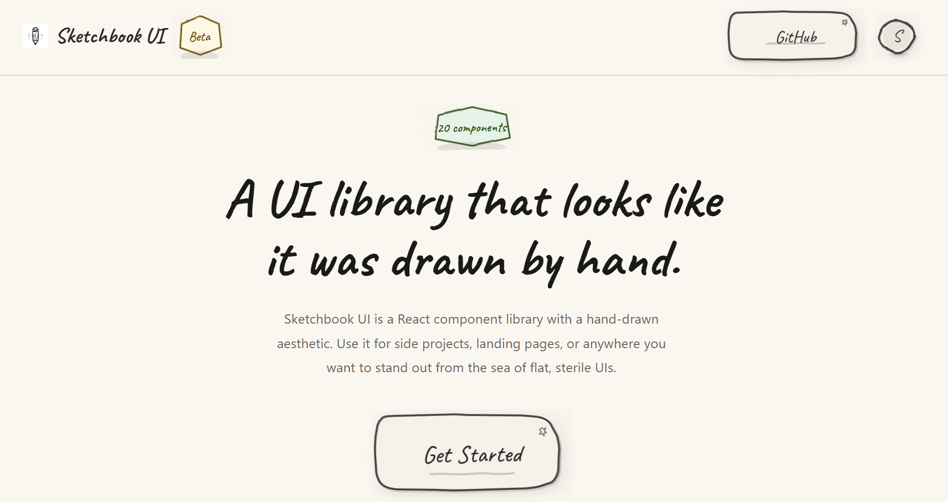
Sketchbook UI
A hand-drawn React component library with a sketchy, notebook aesthetic. 20 fully typed components with wobbly borders, paper textures, and pencil-line details, for side projects, landing pages, or anywhere you want to stand out.
Features
- 20 components (Button, Input, Modal, Accordion, Toast, etc.)
- Hand-drawn SVG borders, paper textures, and subtle animations
- Fully typed with TypeScript
- Themeable via
colorsandtypographyprops on every component - Zero runtime dependencies beyond React
- Tree-shakeable, under 70 kB gzipped
Documentation
Browse all components and their variants in the Storybook docs.
Installation
npm install sketchbook-ui
# or
yarn add sketchbook-ui
# or
pnpm add sketchbook-ui
Peer Dependencies
Make sure you have React installed:
npm install react react-domQuick Start
1. Import the CSS
Import the Sketchbook UI styles in your main entry file (e.g., main.tsx or App.tsx):
import 'sketchbook-ui/style.css';2. Use Components
import { Button, Input, Card, SketchProvider } from 'sketchbook-ui';

function App() {
  return (
    <SketchProvider>
      <Card>
        <h1>Welcome to Sketchbook UI!</h1>
        <Input label="Name" placeholder="Type here..." />
        <Button>Submit</Button>
      </Card>
    </SketchProvider>
  );
}
3. Customize with Themes
Every component accepts colors and typography props for customization:
import { Button } from 'sketchbook-ui';

<Button
  colors={{
    bg: '#ffeb3b',
    stroke: '#000',
    text: '#000'
  }}
  typography={{
    fontSize: '2rem',
    fontFamily: 'Caveat, cursive'
  }}
>
  Custom Button
</Button>
Available Components
- Form Controls: Button, Input, Textarea, Checkbox, Switch, Select, RadioGroup, Slider
- Data Display: Badge, Avatar, Card, Divider, Progress, Skeleton (with SkeletonText, SkeletonCard), Spinner, Tooltip
- Feedback: Toast (with ToastContainer and useToast hook), Modal
- Navigation: Dropdown, Accordion (with AccordionItem)
TypeScript Support
Sketchbook UI is written in TypeScript and includes full type definitions. All components are fully typed with proper prop interfaces.
Tree Shaking
The library is built with tree-shaking support. Only the components you import will be included in your bundle:
// Only Button will be bundled
import { Button } from 'sketchbook-ui';
Contributing
Please read the contributing guide.
License
Licensed under the MIT license.