
smt-select
v1.0.0
Published
A high-performance, lightweight, and customizable **Angular Select Component** with built-in Virtual Scroll and Search capabilities.
Maintainers
 sametacar
Readme
smt-select 👆
A high-performance, lightweight, and customizable Angular Select Component with built-in Virtual Scroll and Search capabilities.
✨ Features
- 🔍 Searchable: Quickly filter through thousands of options.
- ⚡ Virtual Scroll: Built-in support for high-performance rendering of large datasets.
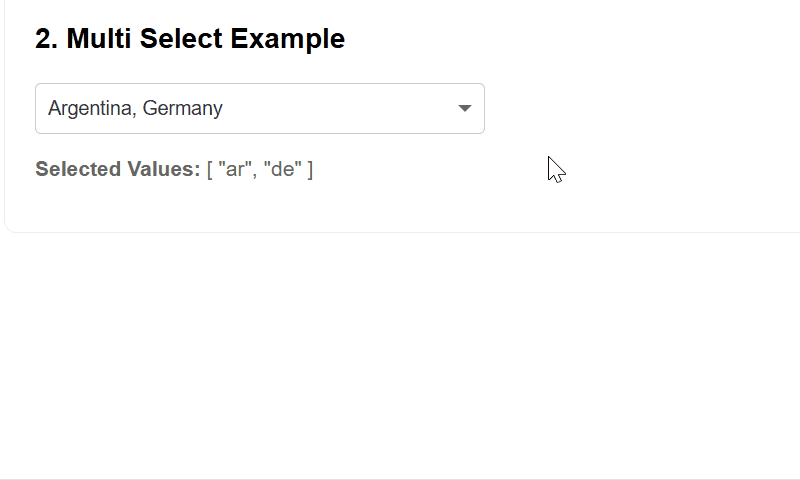
- ✅ Multi-Select: Support for multiple selection out of the box.
- ☑️ Select All: Optional "Select All" toggle for multi-select mode.
- ⌨️ Keyboard Navigation: Full keyboard support (Arrow keys, Enter, Escape).
- 🚫 Disabled Options: Mark options as non-selectable.
- ❌ Clearable: Optional clear button to reset selection.
- 🎨 Custom Styling: Fully customizable via SCSS tokens.
- 📱 Responsive: Works seamlessly across mobile and desktop.
- 🛡️ Type Safe: Developed with strict TypeScript.
📺 Demo
🧩 Angular Compatibility
| Angular Version | Support | |-----------------|---------| | 21.x | ✅ Yes | | 20.x | ✅ Yes | | 19.x | ✅ Yes | | 18.x | ✅ Yes |
🚀 Installation
npm install smt-selectNote: Angular CDK is a peer dependency and will be automatically installed by npm 7+. Make sure it matches your Angular version.
If you're using npm 6 or need a specific CDK version:
# Install CDK first (version should match your Angular version)
npm install @angular/cdk@^21.0.0

# Then install smt-select
npm install smt-select
📦 Usage
1. Component Logic (app.component.ts)
import { SmtSelectComponent, SmtSelectOption, SmtSelectConfig } from 'smt-select';

@Component({
  standalone: true,
  imports: [SmtSelectComponent],
  selector: 'app-root',
  templateUrl: './app.component.html'
})
export class AppComponent {
  myOptions: SmtSelectOption[] = [
    { value: 1, label: 'Option 1' },
    { value: 2, label: 'Option 2', disabled: true }, // Disabled option
    { value: 3, label: 'Option 3' }
  ];

  selectConfig: SmtSelectConfig = {
    placeholder: 'Choose an item...',
    virtualScroll: true,
    isMultiSelect: false,
    clearable: true, // Enable clear button
    noResultsMessage: 'No items found' // Custom no results message
  };

  // Multi-select configuration with Select All
  multiSelectConfig: SmtSelectConfig = {
    placeholder: 'Choose multiple items...',
    virtualScroll: true,
    isMultiSelect: true,
    showSelectAll: true, // Enable Select All option
    clearable: true
  };

  selectedValue: any = null;

  onSelection(value: any) {
    console.log('Selected value:', value);
  }
}
2. Template (app.component.html)
<smt-select
  [options]="myOptions"
  [config]="selectConfig"
  [(selectedValue)]="selectedValue"
  (selectionChange)="onSelection($event)">
</smt-select>
🎨 Customization
You can customize the component's appearance by providing custom colors:
selectConfig: SmtSelectConfig = {
  placeholder: 'Choose an item...',
  virtualScroll: true,
  isMultiSelect: false,
  // Custom theme colors
  optionActiveBackgroundColor: '#ff6b6b',
  optionActiveTextColor: '#ffffff',
  hoverBackgroundColor: '#ffe0e0',
  optionTextColor: '#333333',
  optionBackgroundColor: 'transparent',
  inputTextColor: '#000000', // Placeholder automatically uses 60% opacity
  borderColor: '#cccccc',
  errorBorderColor: '#d9534f',
  borderRadius: 8 // Can be number (px) or string ('8px', '0.5rem')
};
⚙️ API Reference
Inputs
| Property | Type | Default | Description |
|----------|------|---------|-------------|
| options | SmtSelectOption[] | [] | Array of options to display. |
| config | SmtSelectConfig | {} | Configuration object for the component. |
| selectedValue | any \| any[] | null | The currently selected value(s). Supports two-way binding. |
| errorMessage | string \| null | undefined | Error message to display below the component. |
| isInvalid | boolean | false | Manually trigger error state if errorMessage is not provided. |
| visibility | SmtVisibilityType | ENABLED | Controls accessibility (ENABLED, READONLY, HIDDEN). |
Outputs
| Event | Payload | Description |
|-------|---------|-------------|
| selectionChange | any \| any[] | Fired when the selected value changes. |
| selectedValueChange | any \| any[] | Fired when the selected value changes (for two-way binding support). |
| pocketOpen | boolean | Fired when the dropdown is opened or closed. |
Option Structure (SmtSelectOption)
| Property | Type | Required | Description |
|----------|------|----------|-------------|
| value | any | Yes | The value of the option. |
| label | string | Yes | Display text for the option. |
| disabled | boolean | No | Mark option as non-selectable (default: false). |
Configuration (SmtSelectConfig)
| Property | Type | Description |
|----------|------|-------------|
| fieldID | string \| number | Unique ID for the wrapper element. |
| placeholder | string | Text to show when no value is selected. |
| virtualScroll | boolean | Enable/Disable CDK Virtual Scroll for large datasets. |
| isMultiSelect | boolean | Enable multiple item selection. |
| clearable | boolean | Show clear button to reset selection (default: false). |
| showSelectAll | boolean | Show "Select All" option in multi-select mode (default: false). Only visible when isMultiSelect is true. |
| noResultsMessage | string | Custom message when no results found (default: 'No results found'). |
| Theme Colors | | |
| optionActiveBackgroundColor | string | Background color for selected options (default: #005f87). |
| optionActiveTextColor | string | Text color for selected options (default: #fff). |
| hoverBackgroundColor | string | Background color for hovered items (default: #f0faff). |
| optionTextColor | string | Text color for normal options (default: #333). |
| optionBackgroundColor | string | Background color for normal options (default: transparent). |
| inputTextColor | string | Text color for search input, selected value, and placeholder (with 60% opacity) (default: #333). |
| borderColor | string | Border color for the component and dropdown (default: #ccc). |
| errorBorderColor | string | Border color when in error state (default: #d9534f). |
| borderRadius | string \| number | Border radius for the component and dropdown. Number will be converted to px (default: 4px). |
⌨️ Keyboard Shortcuts
When the dropdown is open:
- Arrow Down / Arrow Up: Navigate through options
- Enter: Select highlighted option
- Escape: Close dropdown
- Type to search: Filter options in real-time
📋 Changelog
See CHANGELOG.md for detailed release notes and version history.
📄 License
MIT © Samet Acar