
space-react-components
v1.1.3
Published
Library of components made with tailwind and typescript

Readme
Space React Components
SRC is a library created by Zeety especially for Space Academic. The library integrates Typescript and React, for building custom components focused on the needs of the project. However, we expect SRC to be a 100% usable library for external audiences.
Features
- Components built with typescript and tailwind
- Works with any React framework
- NextJS support
- Responsive design
Installation
Install Space React Components with npm
npm install space-react-componentsComponents
Below you will find the list of components that currently have the library
Avatar
The Avatar component allows the user to add information from the current system session.
| Parameter | Type | Description |
| :-------- | :------- | :------------------------- |
| username | string | Required. Name of current user |
| image | string | Optional. URL of the profile image |
By default the system will take the initial of the username in case of not having an image
Usage/Examples
import { Avatar } from 'space-react-components'

function App() {
  return (
    <>
      ...Your component code
      <Avatar image="https://userimage.png" username="Sara López" />
    </>
  )
}
Header
The Header component allows the user to group the basic information of the system (Logo) and additionally the Avatar component is already integrated.
It also has a button that allows the display of the side menu in its mobile version, all this thanks to the useMenu hook itself.

| Parameter | Type | Description |
| :-------- | :------- | :------------------------- |
| logo | string | Required. Main logo showing the component |
| logoAlt | string | Required. Alternate text for the main logo |
| otherLogo | string | Optional. Secondary logo URL |
| otherLogoAlt | string | Optional. Alternate text for the secondary logo |
| otherLogoMobile | string | Optional. URL of the mobile version of the secondary logo |
| imageAvatar | string | Optional. URL of the profile image |
| usernameAvatar | string | Required. Name of current user |
| toggleMenu | MouseEventHandler | Required. useMenu function enabling menu activation in the mobile version |
| className | string | Optional. List of classes for component customization |
| style | CSSProperties | Optional. Styles for component customization |
Usage/Examples
Basic usage
import { Header } from 'space-react-components'

function App() {
  return (
    <>
      ...Your component code
      <Header
        logo="https://logo_space.png"
        logoAlt="Space Academic"
        toggleMenu={onToggleMenu}
        className="header-area"
        usernameAvatar="Sara López" />
    </>
  )
}
Main Navigation
The MainNav component allows the user to have a main navigation bar, which can complement the Header component.

| Parameter | Type | Description |
| :-------- | :------- | :------------------------- |
| className | string | Optional. List of classes for component customization |
| style | CSSProperties | Optional. Styles for component customization |
| menu | MainNavItemTypes[] | Required. List of menu items |
MainNavItemTypes
| Parameter | Type | Description |
| :-------- | :------- | :------------------------- |
| label | string | Required. Item title |
| url | string | Required. Item destination URL |
| icon | JSX.Element | Required. JSX element for sample icon |
Usage/Examples
Basic usage
import { Header, MainNav } from 'space-react-components'
import { ChartPieIcon, ClipboardDocumentListIcon } from '@heroicons/react/24/outline'
-----
import { MainNavItemTypes } from "space-react-components/dist/components/MainNavItems";
-----

function App() {
  const menus: MainNavItemTypes[] = [
    {
      label: 'Dashboard',
      icon: <ChartPieIcon width={26} />,
      url: '/'
    }, {
      label: 'Processes',
      icon: <ClipboardDocumentListIcon width={26} />,
      url: '/processes',
    }
  ]

  return (
    <>
      ...Your component code
      <Header
        logo="https://logo_space.png"
        logoAlt="Space Academic"
        toggleMenu={onToggleMenu}
        className="header-area"
        usernameAvatar="Sara López" />
      <MainNav menu={menus} />
    </>
  )
}
Example of how the use of the Header and MainNav component might look like

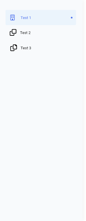
Side Navigation
The SideNav component allows the user to generate a side navigation menu.
It is integrated with the Header component, to facilitate its work in mobile versions.
| Parameter | Type | Description |
| :-------- | :------- | :------------------------- |
| className | string | Optional. List of classes for component customization |
| style | CSSProperties | Optional. Styles for component customization |
| menu | SideNavItemTypes[] | Required. List of menu items |
| closeButtonLabel | string | Required. Label that will have the menu close button in its mobile version |
| toggleMenu | MouseEventHandler | Required. useMenu function enabling menu activation in the mobile version |
| stateMenu | string | Required. Status (active/inactive) of the menu. It is recommended to use the status presented by the useMenu hook. |
SideNavItemTypes
| Parameter | Type | Description |
| :-------- | :------- | :------------------------- |
| label | string | Required. Item title |
| url | string | Required. Item destination URL |
| icon | JSX.Element | Required. JSX element for sample icon |
Usage/Examples
import { Header, SideNav, useMenu } from 'space-react-components'
import { ChartPieIcon, ClipboardDocumentListIcon } from '@heroicons/react/24/outline'
-----
import { SideNavItemTypes } from "space-react-components/dist/components/SideNavItem";
-----

function App() {
  const { activeMenu, onToggleMenu } = useMenu();
  const menus: SideNavItemTypes[] = [
    {
      label: 'Dashboard',
      icon: <ChartPieIcon width={26} />,
      url: '/'
    }, {
      label: 'Processes',
      icon: <ClipboardDocumentListIcon width={26} />,
      url: '/processes',
    }
  ]

  return (
    <>
      ...Your component code
      <Header
        logo="https://logo_space.png"
        logoAlt="Space Academic"
        toggleMenu={onToggleMenu}
        className="header-area"
        usernameAvatar="Sara López" />
      <SideNav
        menu={listado}
        closeButtonLabel={t('logout')}
        stateMenu={activeMenu}
        toggleMenu={onToggleMenu}
        className="menu-area" />
    </>
  )
}
Hooks
For the development of SRC, hooks have been built to facilitate the integration of the modules with each other.
useMenu()
The useMenu() allows the integration between the Header and SideNav components, this hook allows us to control the status of the menu (active/inactive) in its mobile version.
| Parameter | Type | Description |
| :-------- | :------- | :------------------------- |
| activeMenu | string | Required. Allows the user to know the current status of the element |
| onToggleMenu | string | Required. Function that allows the user to modify the current status of the element |
Usage/Examples
import { Header, SideNav, useMenu } from 'space-react-components'

function App() {
  const { activeMenu, onToggleMenu } = useMenu();

  return (
    <>
      ...Your component code
      <Header
        toggleMenu={onToggleMenu} />
      <SideNav
        stateMenu={activeMenu}
        toggleMenu={onToggleMenu}  />
    </>
  )
}