
spin-wheel-react-native
v0.2.2
Published
React Native spin wheel component for iOS and Android.
Maintainers
 harshrajk
Readme
spin-wheel-react-native
A customizable React Native spin wheel component for iOS and Android with weighted winner selection, gesture spin (bidirectional), built-in themes, pointer bounce animation, and full-screen confetti.
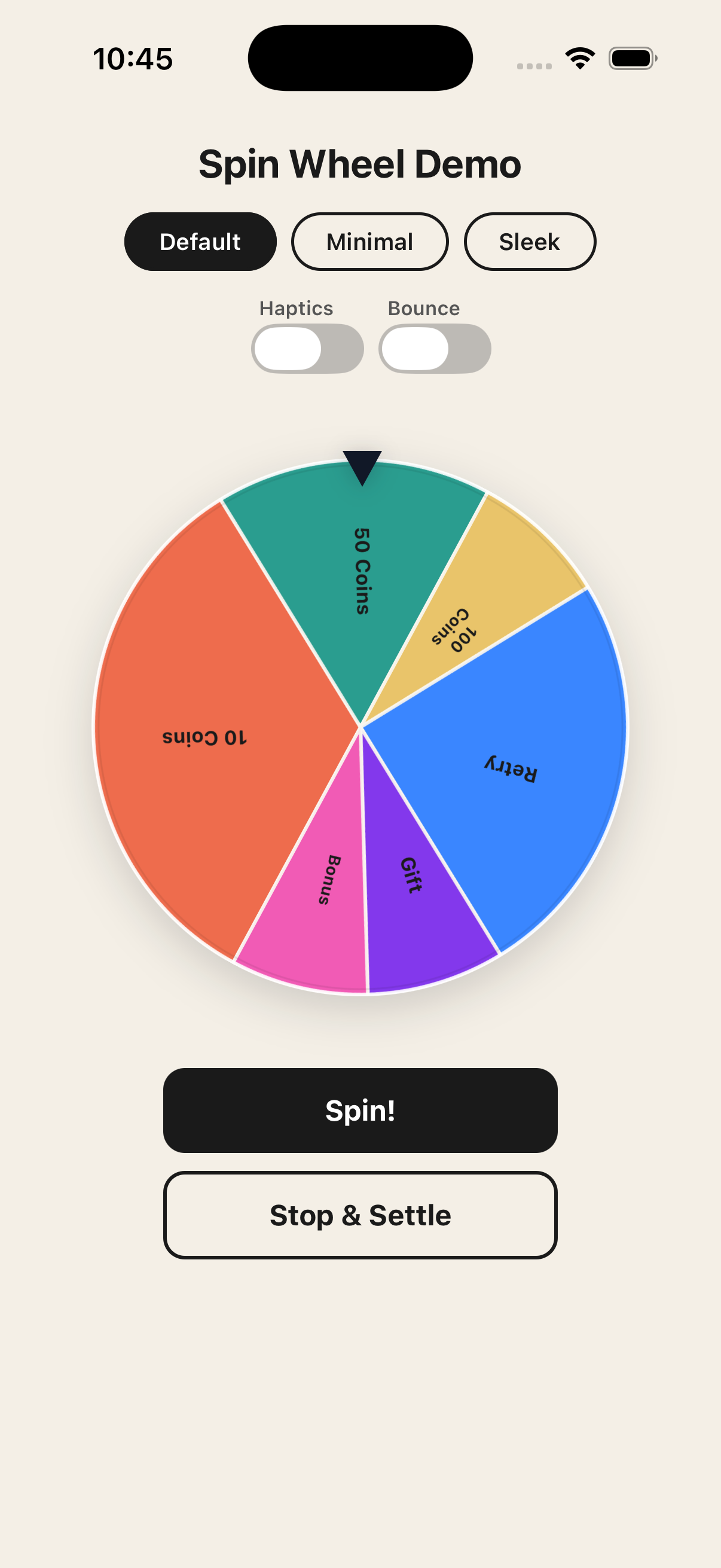
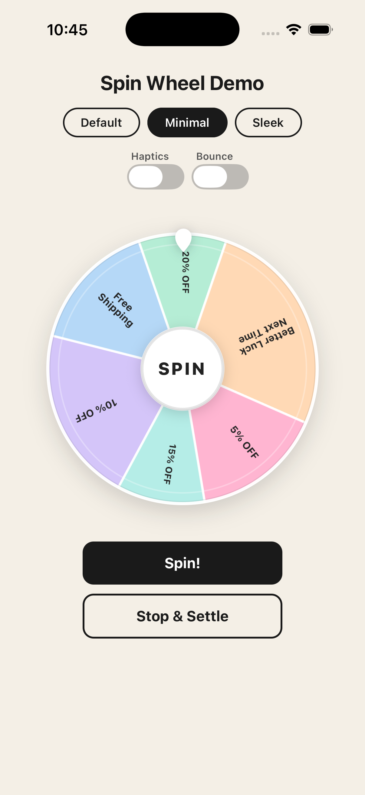
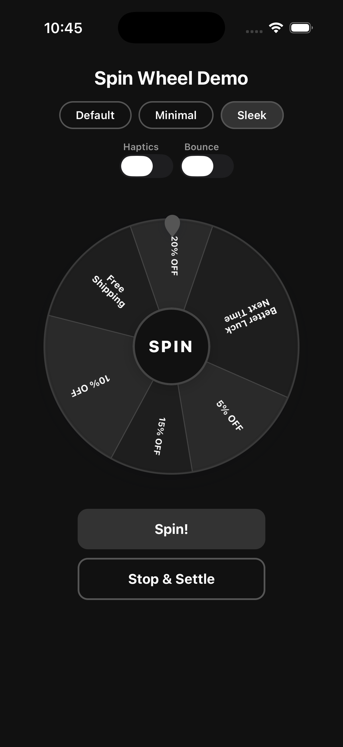
Screenshots
| Default | Minimal | Sleek |
| :---: | :---: | :---: |
|  |
|  |
|  |
| No theme – custom colors |
|
| No theme – custom colors | theme="minimal" | theme="sleek" |
Installation
npm install spin-wheel-react-native react-native-reanimated react-native-gesture-handler react-native-svgExpo users: Dependencies are auto-configured. No extra setup needed.
Bare React Native: Add
react-native-reanimated/pluginas the last entry inbabel.config.jsplugins.
Setup
Wrap your app root with GestureHandlerRootView. In bare RN, also add the gesture handler import to the top of your entry file.
// index.js (bare RN only)
import "react-native-gesture-handler";
import { GestureHandlerRootView } from "react-native-gesture-handler";
export default function App() {
return (
<GestureHandlerRootView style={{ flex: 1 }}>
{/* your app */}
</GestureHandlerRootView>
);
}Usage
import React, { useRef } from "react";
import { Pressable, Text } from "react-native";
import { SpinWheel, type SpinWheelRef } from "spin-wheel-react-native";

const segments = [
  { id: "coins-10", label: "10 Coins", weight: 4 },
  { id: "coins-50", label: "50 Coins", weight: 2 },
  { id: "coins-100", label: "100 Coins", weight: 1 },
  { id: "retry",    label: "Retry",     weight: 3, disableConfetti: true },
  { id: "gift",     label: "Gift",      weight: 1 },
  { id: "bonus",    label: "Bonus",     weight: 1 },
];

export default function GameScreen() {
  const wheelRef = useRef<SpinWheelRef>(null);

  return (
    <>
      <SpinWheel
        ref={wheelRef}
        size={320}
        segments={segments}
        theme="minimal"
        allowGestureSpin
        confettiOnWin
        onSpinEnd={(event) => console.log("Winner:", event.winner.label)}
      />

      <Pressable onPress={() => wheelRef.current?.spin()}>
        <Text>Spin</Text>
      </Pressable>
    </>
  );
}
Themes
Use the theme prop for a zero-config styled wheel. Both themes include a built-in teardrop pointer and a center hub with a SPIN label.
<SpinWheel segments={segments} theme="minimal" />
<SpinWheel segments={segments} theme="sleek" />
| Theme | Description |
| --- | --- |
| "minimal" | Soft pastel palette, light borders, warm hub |
| "sleek" | Dark monochrome palette, sharp contrasts |
Omit theme for full manual control over colors.
Props
Core
| Prop | Type | Default | Description |
| --- | --- | --- | --- |
| segments | WheelSegment[] | required | Wheel segments. |
| size | number | 320 | Wheel diameter in pixels. |
| innerRadiusRatio | number | 0 | Center hole as a ratio of radius (0–1). 0 = solid disc. |
| theme | "minimal" \| "sleek" | — | Built-in visual theme. |
| pointerPosition | "top" \| "right" \| "bottom" \| "left" | "top" | Where the pointer is anchored. |
| initialRotationDeg | number | 0 | Starting rotation angle in degrees. |
| disabled | boolean | false | Disables all spin interactions. |
| allowGestureSpin | boolean | true | Enables pan/flick gesture to spin the wheel. |
| flickEnabled | boolean | — | Enables velocity-based flick to spin (subset of gesture spin). |
| lockWhileSpinning | boolean | true | Prevents re-spin while an animation is in progress. |
Visual
| Prop | Type | Default | Description |
| --- | --- | --- | --- |
| spinDirection | "clockwise" \| "counterclockwise" | "clockwise" | Default spin direction for programmatic spins. Gesture spins always follow the actual flick direction. |
| segmentStrokeColor | string | — | Color of divider lines between segments. |
| segmentStrokeWidth | number | — | Width of divider lines. |
| outerBorderColor | string | — | Outer ring border color. |
| outerBorderWidth | number | — | Outer ring border width. |
| labelFontSize | number | 12 | Base font size for segment labels. Scales down automatically to fit. |
| labelFontWeight | string | "700" | Font weight for segment labels. |
| labelRotation | "slice" \| "static" | — | Controls whether labels rotate with their slice ("slice") or stay upright ("static"). |
| disabledSegmentOpacity | number | 0.4 | Opacity for segments marked disabled: true. |
Behavior
| Prop | Type | Default | Description |
| --- | --- | --- | --- |
| idleRotationSpeed | number | — | Constant idle spin speed in deg/s when no spin is active. |
| hapticFeedback | boolean | — | Triggers a short vibration each time the pointer crosses a segment boundary. |
| customEasing | (t: number) => number | — | Custom easing function. Pass easing: "custom" in SpinRequest to activate it. |
| pointerBounceEnabled | boolean | true | Enables the bounce/wobble animation on the pointer as the wheel spins. |
Confetti
| Prop | Type | Default | Description |
| --- | --- | --- | --- |
| confettiOnWin | boolean \| WinnerConfettiOptions | false | Plays full-screen confetti when the spin completes. Set disableConfetti: true on individual segments to suppress it for specific outcomes. |
confettiOnWin={{
  durationMs: 1800,   // animation duration in ms
  pieceCount: 44,     // number of confetti pieces
  size: 8,            // base piece size in px
  colors: ["#FFD166", "#EF476F", "#06D6A0"],
}}
Custom Render
| Prop | Type | Description |
| --- | --- | --- |
| renderSegmentLabel | (ctx: SegmentLabelContext) => ReactNode | Override the default label renderer for each segment. |
| renderCenterContent | () => ReactNode | Render custom content inside the center hub. |
| renderPointer | () => ReactNode | Replace the built-in pointer with a custom component. |
Callbacks
| Prop | Type | Description |
| --- | --- | --- |
| onSpinStart | (event: SpinStartEvent) => void | Fired when a spin begins. |
| onSpinEnd | (event: SpinEndEvent) => void | Fired when the spin animation completes with the winner. |
| onSegmentChange | (segment: WheelSegment) => void | Fired each time the pointer crosses into a new segment during a spin. |
| onError | (error: WheelError) => void | Fired on validation or runtime errors. |
Ref Methods
// Start a spin. Returns a Promise that resolves to SpinResult when complete.
wheelRef.current.spin(request?)

// Reset the wheel to initialRotationDeg.
// Pass { animated: true } for a smooth transition.
wheelRef.current.reset({ animated?: boolean })

// Stop the current animation immediately.
// Pass { settle: true } to decelerate smoothly and land on a valid segment.
wheelRef.current.stop({ settle?: boolean })

// Returns true if a spin animation is currently running.
wheelRef.current.isSpinning()
Controlling the Winner
// Random weighted pick (default)
wheelRef.current?.spin();

// Seeded deterministic — same seed always picks the same winner
wheelRef.current?.spin({ random: { strategy: "weighted", seed: "session-abc" } });

// Force a specific winner by segment id
wheelRef.current?.spin({ winnerId: "gift" });

// Force a specific winner by index
wheelRef.current?.spin({ winnerIndex: 2 });

// Custom duration and easing
wheelRef.current?.spin({ durationMs: 4000, easing: "outExpo" });

// Override direction for a single spin
wheelRef.current?.spin({ direction: "counterclockwise" });
SpinRequest
type SpinRequest = {
  winnerId?: string;
  winnerIndex?: number;
  random?: {
    seed?: number | string;
    strategy?: "uniform" | "weighted";
  };
  durationMs?: number;
  minRounds?: number;
  maxRounds?: number;
  easing?: "outCubic" | "outQuart" | "outExpo" | "custom";
  /** Overrides the spinDirection prop for this single spin. */
  direction?: "clockwise" | "counterclockwise";
};
Segments
type WheelSegment<TMeta = unknown> = {
  id: string;               // unique identifier
  label: string;            // display text; use "\n" for explicit line breaks
  weight?: number;          // relative probability (default 1); higher = more likely
  color?: string;           // segment fill color
  textColor?: string;       // label color
  metadata?: TMeta;         // your custom data, returned in SpinResult
  disabled?: boolean;       // excluded from winner selection; rendered at reduced opacity
  disableConfetti?: boolean; // suppress confetti when this segment wins (e.g. "Try Again")
};
Gesture Spin
When allowGestureSpin is true (the default), users can flick the wheel to spin it. The spin direction is automatically detected from the gesture: a clockwise flick produces a clockwise spin and a counterclockwise flick produces a counterclockwise spin, regardless of the spinDirection prop.
To disable gesture spin entirely and rely on programmatic control only:
<SpinWheel segments={segments} allowGestureSpin={false} />Spin Direction
spinDirection controls the default direction for wheelRef.current.spin() calls:
// Always spin counterclockwise programmatically
<SpinWheel segments={segments} spinDirection="counterclockwise" />
A direction field in SpinRequest overrides the prop for that individual call:
wheelRef.current.spin({ direction: "clockwise" }); // one-off overrideGesture spins always match the physical flick direction.
Label Text
Labels are positioned at ~52% of the wheel radius (mid-slice). Font size scales down automatically so longer labels always fit within their slice boundary, with a 62% chord safe-zone that prevents text from touching segment dividers.
- Automatic wrapping — labels are wrapped to at most 2 lines when necessary. Single-line text is preferred and will use a smaller font before breaking to a second line.
- Explicit line breaks — use
"\n"in thelabelstring to force a break:"Better Luck\nNext Time". - Font scaling — if a label still overflows after wrapping, the font size shrinks down to a minimum of 7pt.
- Ellipsis truncation — overflow beyond 2 lines is truncated with
…. - Label rotation — use the
labelRotationprop ("slice"|"static") to control whether labels rotate with their slice or stay upright.
TypeScript
All props, events, and ref methods are fully typed. Pass a generic TMeta to type the metadata field on segments and access it in SpinResult:
type Reward = { coins: number };

const segments: WheelSegment<Reward>[] = [
  { id: "big", label: "Jackpot", metadata: { coins: 1000 } },
];

<SpinWheel<Reward>
  segments={segments}
  onSpinEnd={(e) => console.log(e.winner.metadata?.coins)}
/>
License
MIT