
spinner-games
v0.0.4
Published
Tiny playable web-component games to use as loaders/spinners instead of the classic one.

Maintainers
 fabiobiondi
Readme
spinner-games



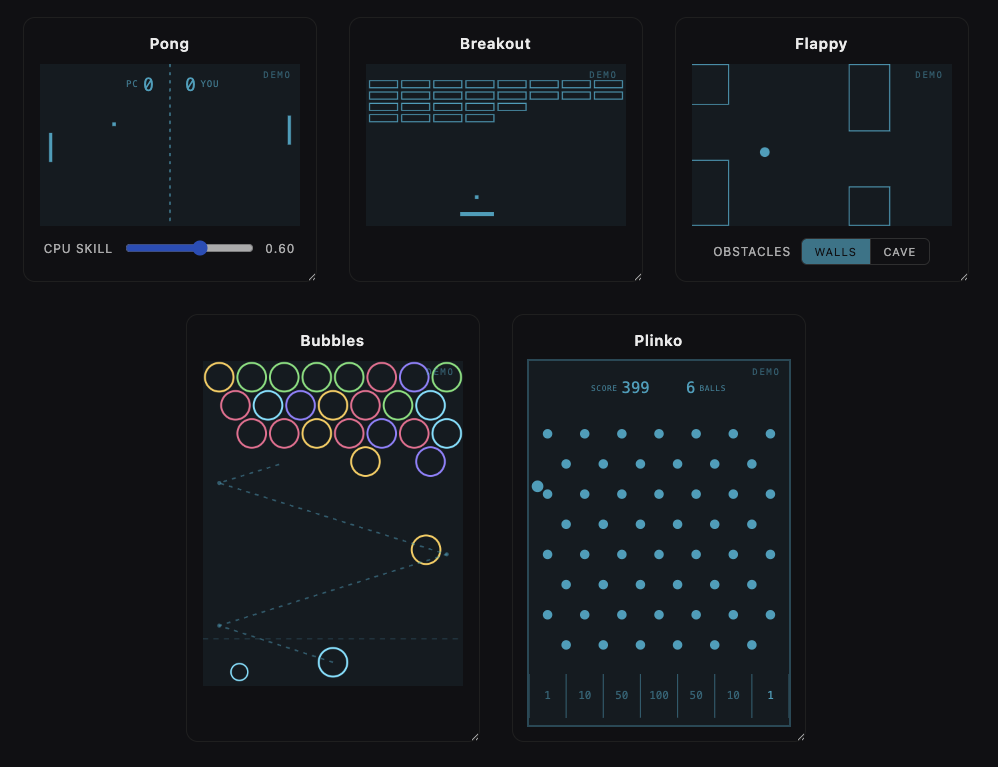
Tiny, playable web-component games you can drop in as loaders/spinners instead of the classic spinning circle. Built with Lit + TypeScript + Vite, shippable as a standalone library.
Status
Playable mini-games (<spinner-pong>, <spinner-breakout>,
<spinner-bubbles>, <spinner-flappy>, <spinner-plinko>) are in place, usable
as interactive loaders or self-running demos.
|
USAGE
Install the package:
npm install spinner-gamesThe games are framework-agnostic custom elements. Import the package once to register the tags, then for Angular, React, Vue and Web Components:
import 'spinner-games'<spinner-pong></spinner-pong>Documentation
Per-environment install & usage guides live in docs/:
- Web components (no framework) — plain HTML, bundlers, CDN
- React —
spinner-games/react - Vue —
spinner-games/vue - Angular —
spinner-games/angular
Framework wrappers
The same components ship with thin, typed wrappers for React, Vue, and Angular
via subpath exports — no customElements boilerplate, full prop type-checking.
Each subpath registers the underlying custom elements for you. Install the
package alongside your framework (declared as optional peer dependencies):
npm install spinner-gamesReact (spinner-games/react)
Built on @lit/react, so props map
to the element's reactive properties (not stringified attributes) and ref
points at the element instance.
import { Pong, Flappy } from 'spinner-games/react'

export function Loader() {
  return (
    <>
      <Pong autoplay difficulty={0.6} />
      <Flappy obstacles="cave" />
    </>
  )
}
Vue (spinner-games/vue)
Typed defineComponent wrappers — use them straight from a SFC:
<script setup lang="ts">
import { Bubbles } from 'spinner-games/vue'
</script>

<template>
  <Bubbles autoplay :show-new-line="30" />
</template>
Prefer the raw tags instead? Tell Vue they're custom elements and the bundled
GlobalComponents types will type them in templates:
// vite.config.ts
vue({ template: { compilerOptions: { isCustomElement: (t) => t.startsWith('spinner-') } } })
Angular (spinner-games/angular)
Standalone directives matching each tag — import the one(s) you need (or the
SPINNER_GAMES_DIRECTIVES bundle). The directive makes the tag a known element
(no CUSTOM_ELEMENTS_SCHEMA needed) and gives its inputs full type-checking,
while rendering the real custom element with no extra DOM node:
import { Component } from '@angular/core'
import { SpinnerPong } from 'spinner-games/angular'

@Component({
  standalone: true,
  imports: [SpinnerPong],
  template: `<spinner-pong autoplay [difficulty]="0.6"></spinner-pong>`,
})
export class LoaderComponent {}
Shared conventions
Every game is responsive (fills its parent, height from a
--spinner-*-aspect ratio) and shares the --spinner-color token. These
opt-in attributes are common to the playable games (<spinner-pong>,
<spinner-breakout>, <spinner-bubbles>, <spinner-flappy>,
<spinner-plinko>):
| Attribute | Default | What it does |
| ---------------------- | ------- | ---------------------------------------------------------------------------- |
| autoplay | off | Demo mode: the game plays itself forever and user input is disabled. |
| show-background | on | Paint the panel background behind the game (a faint --spinner-color tint, overridable via --spinner-bg). Set it off to drop the background so the game floats transparently over whatever is behind it. |
| track-outside | off | Keep following the mouse even after the pointer leaves the canvas (pointer-steered games only — <spinner-flappy> flaps and ignores it). |
| allowOutsideControls | off | Extend the game's pointer controls past the canvas edge — a superset of track-outside. The mouse keeps steering off the element and a click outside still acts: it fires a shot in <spinner-bubbles> and flaps in <spinner-flappy> (the only game where it adds a control without track-outside). <spinner-pong>/<spinner-breakout> have no in-game click, so for them it just extends steering. |
<!-- a real game you play -->
<spinner-breakout></spinner-breakout>

<!-- a self-running demo/loader (not interactive) -->
<spinner-breakout autoplay></spinner-breakout>
<spinner-pong autoplay></spinner-pong>
Color
Color isn't an attribute or prop — every game reads the --spinner-color CSS
custom property. Set it inline, in a stylesheet, or on any ancestor
(it cascades), and it works identically in HTML, React, Vue and Angular:
<!-- inline, on a single instance -->
<spinner-pong autoplay style="--spinner-color: #4ade80"></spinner-pong>
/* in a stylesheet — recolors every game on the page */
spinner-pong {
--spinner-color: #4ade80; /* green */
}
/* …or set it once on a parent and it cascades into every game inside */
.loaders {
--spinner-color: #e879f9;
}The panel background is a faint tint of this color; override it on its own with
--spinner-bg. See each framework's guide in docs/ for idiomatic
snippets (e.g. React needs a React.CSSProperties cast for the inline form).
<spinner-bubbles> also takes showNewLine="<seconds>" — every that-many
seconds a new row of bubbles drops in from the top and the stack slides down,
ramping up the difficulty (0, the default, disables it):
<spinner-bubbles showNewLine="30"></spinner-bubbles><spinner-flappy> takes obstacles to choose what the ball threads through —
walls (the default: classic paired pipes with a gap) or cave (an irregular
rocky ceiling and floor with a winding passage between them). It works in both
the playable and autoplay modes:
<spinner-flappy obstacles="cave"></spinner-flappy>
<spinner-flappy autoplay obstacles="cave"></spinner-flappy>
<spinner-plinko> is a Plinko / Galton board: a ball drops from the top, bounces
through a staggered grid of pegs and lands in a scoring slot. The default 7-slot
board subtracts 1 · 10 · 50 · 100 · 50 · 10 · 1 (biggest in the center). You
start at startScore (default 500) and burn it down: aim with the mouse and
click (or press Space) to drop each ball, and reach 0 within your balls
(default 10) to win — a hit fires a confetti burst; run out of balls first and
the run is over. Tune it with rows (peg rows), slots (scoring bins), balls
(drops you get) and startScore (where the countdown begins):
<spinner-plinko rows="10" slots="9" balls="12" start-score="800"></spinner-plinko>
<spinner-plinko autoplay></spinner-plinko>
Contributions
npm install
npm run dev        # open the playground (Vite dev server)
Scripts
| Script | What it does |
| --------------------- | ---------------------------------------------------------- |
| npm run dev | Dev server + playground (index.html) |
| npm run build | Build everything: core + React/Vue + Angular into dist/ |
| npm run build:lib | Build core web components + React/Vue wrappers (Vite + tsc) |
| npm run build:angular | Build the Angular wrappers (ng-packagr, partial-Ivy) |
| npm run preview | Preview the production build |
| npm run typecheck | Type-check only, no emit
Adding a game
Each game is a self-registering custom element:
- Create
src/components/spinner-<name>.tsextendingLitElement. - Register it with
@customElement('spinner-<name>'). - Re-export it from
src/index.ts.
Project structure
index.html                    # dev playground
src/                          # the core web components (the published `spinner-games`)
  index.ts                    # library entry — re-exports all components
  components/
    spinner-pong.ts           # self-playing Pong loader
    spinner-breakout.ts       # self-playing Arkanoid/Breakout loader
    spinner-bubbles.ts        # self-playing Puzzle Bobble / bubble-shooter loader
    spinner-flappy.ts         # self-playing Flappy Bird loader (a ball for a bird)
    spinner-plinko.ts         # self-playing Plinko / Galton board loader
wrappers/                     # framework wrappers — each imports the core as `spinner-games`
  react/index.ts              #   React wrappers (subpath: spinner-games/react)
  vue/index.ts                #   Vue wrappers (subpath: spinner-games/vue)
  angular/                    #   Angular wrappers — separate ng-packagr build
    src/                      #     standalone directives + public-api
    ng-package.json           #     (subpath: spinner-games/angular)
    tsconfig.lib.json
vite.config.ts                # core build (src → dist/index.*)
vite.config.wrappers.ts       # React/Vue build (wrappers → dist/react, dist/vue)