
split-flap-elements
v0.2.0
Published
Configurable, accessible split-flap Web Components.

Maintainers
 gabeosx
Readme
split-flap-elements
Dependency-free, accessible split-flap displays built with Web Components. Use individual letters, numbers, words, symbols, or emoji; coordinate how cells settle; and restyle every surface with CSS custom properties and parts.


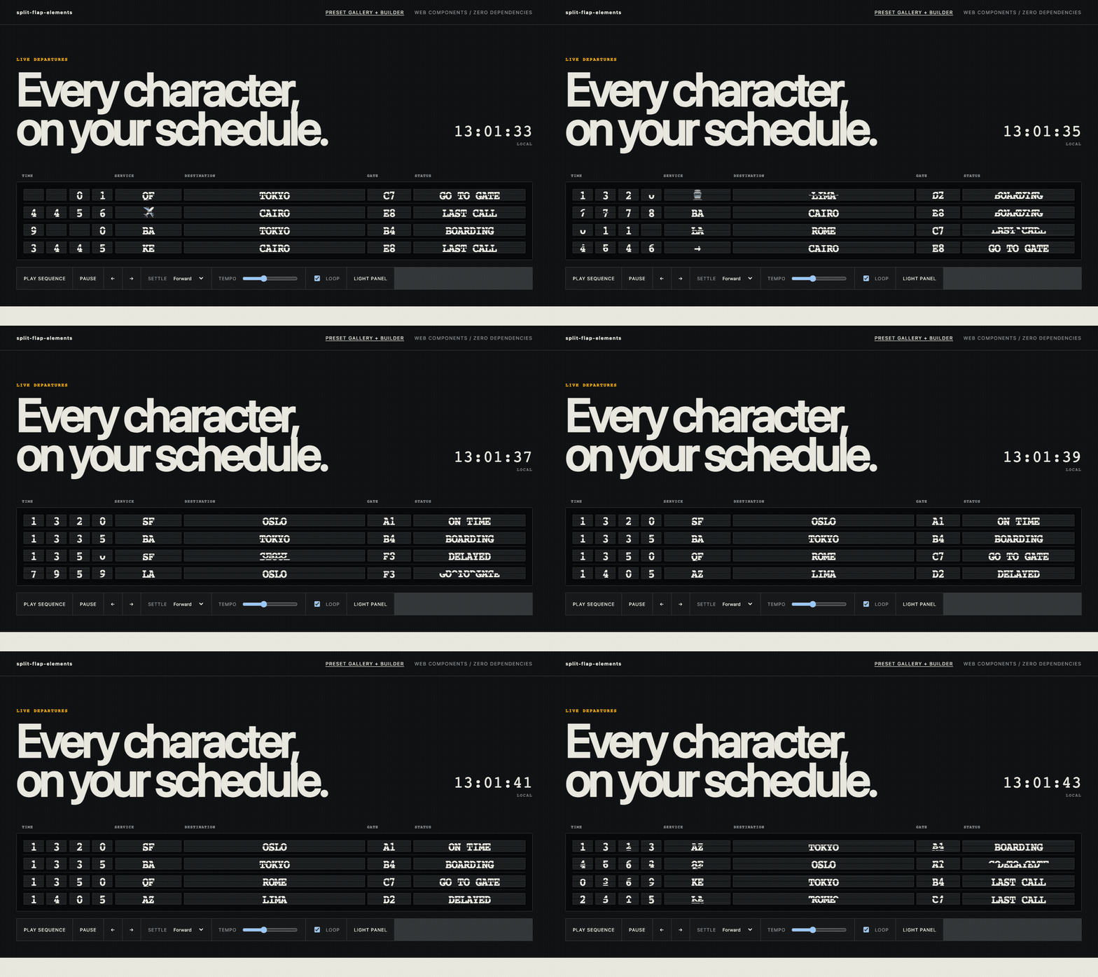
Open the live demo · Try every preset and build a board
The primary import registers <sfe-board> and <sfe-cell>. The package has zero runtime dependencies and uses a system font stack.
Editor and catalog tooling can discover both elements through the packaged Custom Elements Manifest.
Install
The npm release is forthcoming. After publication:
npm install split-flap-elementsTo run the current source locally, use a web server—the demo will not work by opening its HTML with file://:
git clone https://github.com/gabeosx/split-flap-elements.git
cd split-flap-elements
npm ci
npm run dev
Quick start
With a bundler:
<sfe-board id="board" loop announce>
  <sfe-cell name="letter-0" preset="alpha"></sfe-cell>
  <sfe-cell name="letter-1" preset="alpha"></sfe-cell>
  <sfe-cell name="letter-2" preset="alpha"></sfe-cell>
</sfe-board>

<script type="module">
  import "split-flap-elements";

  const board = document.querySelector("#board");
  board.sequence = [
    { values: { "letter-0": "N", "letter-1": "Y", "letter-2": "C" } },
    { values: { "letter-0": "L", "letter-1": "A", "letter-2": "X" } },
  ];
  board.play();
</script>
Each uninitialized cell chooses a random position from its reel. Set value before connection when you need a deterministic start, including the alpha preset's blank value:
<sfe-cell name="letter" preset="alpha" value=" "></sfe-cell>After npm publication, a no-build browser import can use an ESM CDN:
<script type="module">
  import "https://esm.sh/split-flap-elements";
</script>
Pin an exact package version in production. The primary entry point is browser-only because registration requires HTMLElement and customElements; client-only or deferred import is required in SSR applications. split-flap-elements/presets is DOM-free.
The live builder's Import style control generates either the bare npm specifier for bundlers or a version-pinned ESM CDN URL for direct browser use.
Reels and cells
Built-in presets all include a blank space:
| Preset | Reel |
| -------------- | -------------------------- |
| alpha | space, A–Z |
| numeric | space, 0–9 |
| alphanumeric | space, A–Z, 0–9 |
| symbols | space, punctuation, arrows |
Use the reel property for arbitrary plain-text tokens:
const cell = document.querySelector("sfe-cell");
cell.reel = ["ON TIME", "BOARDING", "LAST CALL", "✓"];
await cell.spinTo("BOARDING");
HTML-authored reels use a non-empty JSON array of strings:
<sfe-cell reel='["SUNNY","RAIN","☂"]' value="SUNNY" span="4"></sfe-cell>Targets absent from a cell's reel are rejected with sfe-config-error and do not corrupt playback state.
Cell API
| HTML attribute | Property | Default | Purpose |
| -------------------- | ------------------- | ---------------- | ------------------------------------- |
| name | name | "" | Key used in frame values |
| preset | preset | alpha | Built-in reel |
| reel | reel | alpha reel | JSON attribute or string[] property |
| value | value | random reel item | Current/initial value |
| span | span | 1 | Relative cell width/grid-column span |
| flip-duration | flipDuration | 140 ms | Preferred per-flap cadence |
| spin-duration | spinDuration | 1400 ms | Minimum spin window |
| intermediate-order | intermediateOrder | forward | forward, reverse, or random |
spinTo(target, options?) returns Promise<boolean>. It resolves false when cancelled, aborted, or invalid. cancel(), pause(), and resume() control an active cell spin; boards call them automatically.
The default motion advances through adjacent reel values at a readable mechanical cadence. To preserve reel order and coordinated settling, the board may tune the preferred cadence within a restrained range or add a complete revolution. Cells spin concurrently, and longer paths naturally show more flaps. Set spinDuration: 0 for an immediate settle.
Sequences and boards
Assign frames through the JavaScript-only sequence property. Each frame needs a values record keyed by cell name; partial frames are allowed.
board.sequence = [
  {
    values: { gate: "A", status: "BOARDING" },
    hold: 2400,
    settleOrder: "forward",
    stagger: 120,
    timing: { spinDuration: 1400, flipDuration: 140 },
  },
  {
    values: { gate: "C", status: "LAST CALL" },
    timing: {
      status: { spinDuration: 2100, intermediateOrder: "reverse" },
    },
  },
];
Frame defaults are a 2400 ms hold, forward settle order, and 120 ms minimum gap between settle groups. timing may be one CellTiming object or a record keyed by cell name.
Settle orders are forward, reverse, simultaneous, center-out, edges-in, or a custom array of cell indexes. Center-out and edges-in settle symmetric pairs together. Nested indexes form custom groups; omitted cells are appended in document order:
{
  settleOrder: [[0, 1], [2, 3], 4];
}
All targeted cells begin before the first ordered settle. The board lengthens later groups as needed; it does not run cells serially.
Board API
Boolean attributes/properties are autoplay, loop, and announce. autoplay also works when sequence is assigned after the board connects. announce enables polite announcements only after a complete frame settles.
Read-only properties are cells, currentFrame, and playbackState. Playback methods are:
await board.play();
board.pause();
board.resume();
board.stop();
await board.replay();
await board.next();
await board.previous();
await board.seek(2);
Pausing freezes active flaps and hold timers. stop() cancels active work and leaves the displayed values where they stopped.
Events
Every event bubbles and is composed, so applications can listen on the board or document without reaching into Shadow DOM.
| Event | Detail boundary |
| -------------------- | --------------------------------------------------------------- |
| sfe-flip-start | Cell starts moving; includes cell, name, target, previous value |
| sfe-flip | One intermediate flap; includes current transition values |
| sfe-settle | Cell reaches its target |
| sfe-frame-start | A validated frame starts |
| sfe-frame-settle | All targeted cells settle |
| sfe-sequence-start | Playback starts |
| sfe-sequence-end | Non-looping playback ends |
| sfe-playback-state | State becomes idle, playing, paused, or stopped |
| sfe-config-error | Invalid reel, target, frame, sequence, or seek boundary |
Sound is intentionally external:
board.addEventListener("sfe-flip", () => {
  void flapAudio.play().catch(() => {});
});
Styling
Both elements use open Shadow DOM. Custom properties inherit from the board into its cells.
| Custom property | Default |
| ------------------------ | --------------------------- |
| --sfe-board-background | #0c0d0e |
| --sfe-board-padding | 0.7rem |
| --sfe-board-gap | 0.12rem |
| --sfe-board-radius | 0.22rem |
| --sfe-board-border | subtle 1 px border |
| --sfe-font-family | system monospace stack |
| --sfe-font-size | 1rem |
| --sfe-font-weight | 700 |
| --sfe-letter-spacing | -0.04em |
| --sfe-value-size | 1.35em |
| --sfe-cell-width | 1.9em |
| --sfe-cell-height | 2.5em |
| --sfe-cell-background | #17191b |
| --sfe-cell-color | #f3f1e8 |
| --sfe-cell-border | subtle 1 px border |
| --sfe-cell-radius | 0.08em |
| --sfe-cell-shadow | dark drop shadow |
| --sfe-split-line | dark split line |
| --sfe-step-duration | managed from flipDuration |
sfe-board {
  --sfe-board-background: #0b0c0d;
  --sfe-cell-background: #1b1d1f;
  --sfe-cell-color: #f5f1e8;
  --sfe-cell-width: 2em;
  --sfe-cell-height: 2.7em;
}

sfe-cell::part(split-line) {
  opacity: 0.65;
}
Parts are board, grid, cell, top, bottom, moving-top, moving-bottom, and split-line.
Accessibility and browser support
prefers-reduced-motion: reduceremoves intermediate flips and settles directly.- Each cell exposes one accessible value; duplicated mechanical layers are hidden from assistive technology.
- Intermediate reel values are not announced.
announceopts a board into an atomic polite live region after each settled frame; adjacent single-character cells are announced as normal words.- Demo and builder controls use native keyboard controls and visible focus styles.
- Current Chromium, Firefox, and WebKit are tested. The package requires Custom Elements, Shadow DOM, CSS custom properties, private class fields, and ES modules.
Development and releases
npm ci
npm run validate
See CONTRIBUTING.md, SECURITY.md, and the maintainer release runbook. Releases use Conventional Commits and Release Please; npm publication remains disabled until trusted publishing is configured.
License
MIT © Gabe Albert