
stitch2
v0.15.3
Published
A design canvas, layout and type checks, component consistency and screen versioning for agent-built UI, on Google's DESIGN.md format.

Maintainers
 ifokeev
Readme
stitch2
A design lab for agent-built UI. Agents draft screens as plain HTML on your design system; stitch2 renders them, checks them, keeps every version, and gives you a canvas to compare, approve and comment on them, and gives agents skills that tell them how.
stitch2 is inspired by Google Stitch and works with it, but it is an independent project, not affiliated with or endorsed by Google.
▶ Watch the 80-second demo on YouTube
Quick start with an AI agent
Paste this to your coding agent (Codex, Claude Code, Cursor or any agent that runs commands) in your project:
Set up stitch2 (https://github.com/ifokeev/stitch2) in this project:
1. Install it as a dev dependency (pnpm add -D stitch2, or npm install -D stitch2) and
   Chromium for Playwright (npx playwright install chromium).
2. Ask me for the product name, the brand colour and whether it needs dark, light or both modes, then run
   npx stitch2 setup --name "<name>" --primary "<#hex>" --modes <modes>
   (add --skills-dir .claude/skills if you read skills from there).
3. Read the stitch2 skill it linked and follow it from now on: refine DESIGN.md's prose with me, draft the
   screens I describe from the template, run npx stitch2 check --strict until it passes, and tell me to open the
   canvas (npx stitch2 canvas) to review.
stitch2 setup does the mechanical part in one step: it links the skills, writes stitch2.config.json,
DESIGN.md and its tokens, a screen template and a component catalog with a few starter components, and keeps any
file that already exists. From there the agent spends its effort on the design.
What it does
Canvas (
stitch2 canvas): every screen and its versions on a pan-and-zoom board, a sidebar with search and status filters, your DESIGN.md drawn as tokens and rules, the component catalog, and an inspector to approve, archive or leave a note on a version. Live reload; copyable references to paste to an agent. With a light and a dark theme (DESIGN.md'slight-*colours), a switch (T) shows every screen in either one. A width switch (W) shows every screen at the narrowest or widest window its layout covers. With languages configured, a Language switch (L) shows every screen in one of them, and the Languages page shows a screen side by side in each. Pick mode (P) highlights any element of a screen and copies a reference with its source line, such ashome mobile v1 (design/screens/home/mobile-v1.html:36) <gg-button> “Start Push”; Shift-click collects several to copy at once or add to the version's note.Checks (
stitch2 check): content past the frame edge or out of its card, navigation whose links scroll or are cut (in any language), labels that wrap, text running into other text, labels cut short with an ellipsis, content under fixed bars, fixed bars that overlap each other, tap targets (WCAG 2.2), all of it again at both ends of the window widths each layout covers (360 and 599 px for a phone, 1024 and 1920 for desktop, or your own ranges), text contrast in every theme, text that is not one of DESIGN.md's type levels, capitals without tracking, large numbers in monospace, components built by hand, components that differ between screens, and colours written as values instead of DESIGN.md tokens. Google's guidelines (Material 3, Android's app quality guidelines, web.dev, Lighthouse) add warnings for text under 11 px, text closer than 16 px (24 px from 600 px) to the edge, lines over 75 characters, targets under 48 px without room around them, placeholder-only labels, icon-only controls without a name, more than five bottom-navigation destinations and controls without visible focus. Each screen is also run in long and right-to-left pseudo-languages and your locales (see below).Consistency report (
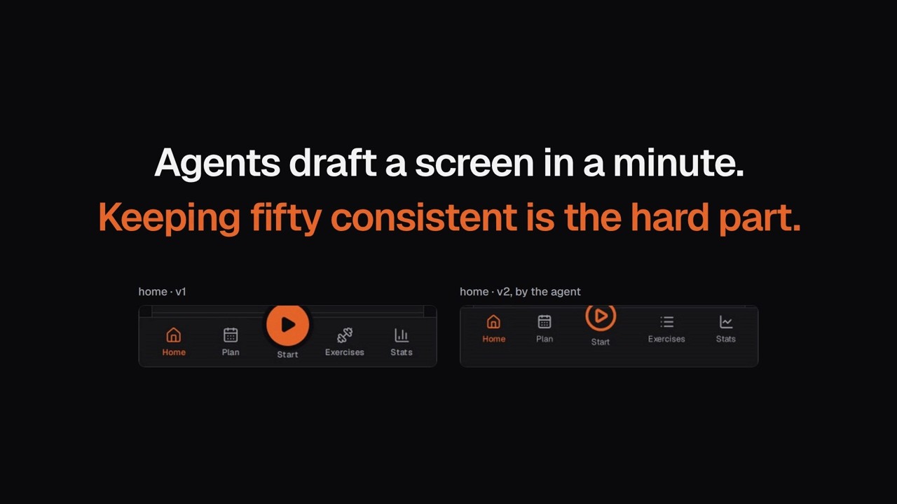
stitch2 consistency): every shared component (tab bar, header, buttons, chips, …) cropped from every screen, next to the catalog's version, with what differs (sizes, fonts, icon set, icons).Type audit (
stitch2 type): every text style a screen uses, and the level it matches.Tokens (
stitch2 tokens): CSS variables, one.type-<level>class per type level (with per-language rules for scripts without capitals) and a Tailwind config, from DESIGN.md's front matter, plus Material 3 colour roles from a seed colour. Exports write the same tokens for your app, so DESIGN.md drives the product as well as the screens: plain CSS variables, a Tailwind v4 theme (@themeplus@utility type-*), or W3C Design Tokens JSON for Style Dictionary and native platforms. Aliases keep your app's own variable names:"exports": [ { "format": "tailwind4", "path": "src/styles/design-tokens.css", "aliases": { "background": "surface", "primary": "primary", "border": "border" } }, { "format": "dtcg", "path": "design/tokens.json" } ]Versions, variants and approval: a screen has versions (v1, v2, …), and each version has variants, its layouts for mobile and desktop (
mobile-v3.html,desktop-v3.html). The canvas groups them; you approve a version as a whole or one variant at a time, leave notes, and approving archives the previous approved layout.DESIGN.md builder:
stitch2 initwrites a complete DESIGN.md from a few choices (brand colour, modes, fonts, roundness, density), with colours checked for contrast;stitch2 extractmeasures one from an existing site or screens.Fresh-eyes alternatives (
stitch2 sandbox): a folder with your design system, components and skills but no screens, where a fresh agent designs from a brief without being anchored to the existing versions;stitch2 sandbox importbrings the result back as the next version for review. Also the way to test a change to the skills on output only the rules produced.Skills for agents (
skills/):stitch2(the design workflow, principles, typography, components, versions),stitch2-design-md(building the design system),stitch2-alternatives(fresh-eyes versions and testing skill changes),stitch2-consistency(verifying and fixing consistency),stitch2-i18n(screens in every language),stitch2-copy(writing the text: a brief, plain words, the reader's outcome),stitch2-translate(translating by meaning, with a glossary from the product, a review by error type and a check in context),stitch2-app-sync(keeping the app and the designs in step: design first, then the app) and, optional,stitch2-import-from-google-stitch(drafting screens in Google Stitch through its MCP server).
Setup
Install it as a dev dependency (Node 24 or newer), then Chromium for Playwright, which renders the screens:
pnpm add -D stitch2          # or: npm install -D stitch2
npx playwright install chromium
Set the project up:
npx stitch2 setup --name "My app" --primary "#2F6FEB" [--modes dark,light] [--prefix ma] [--skills-dir .agents/skills]It links the skills from
skills/into your agent's skills folder, and writes:stitch2.config.json(schema: config.schema.json).prefixnames your meta tags (ma-status), your components and their marker (<ma-button>,data-ma) and your CSS variables (--ma-*); by default it comes from the product name.design/DESIGN.mdin Google's DESIGN.md format (tokens in the YAML front matter, rules in the prose) and its tokens. Without--primaryit leaves DESIGN.md to you:stitch2 initfrom a few choices, orstitch2 extract https://my.appfrom an existing product.design/screens/_template.html,design/screens/components/catalog.htmlanddesign/components/<prefix>.js: a screen template, the component catalog and starter components (header, section, card, row, button, chip) as light-DOM custom elements on the tokens. Grow them, or swap in your app's own components (next section).
Refine DESIGN.md's prose (brand, voice, component rules);
stitch2 lintvalidates it andstitch2 tokensregenerates the tokens. Add a short project skill with your brand, component list, screen names and demo data.stitch2 canvasand start drafting screens from the template.
Your app's components on the canvas
Screens can use the app's own components, so a screen shows exactly what the app renders and the two cannot
drift. stitch2/elements turns components of any framework into the <prefix>-<name> elements screens use:
// design/elements.tsx
import { createElement } from 'react'
import { renderToStaticMarkup } from 'react-dom/server'
import { defineElements } from 'stitch2/elements'
import { Button, Card, Row } from '../src/ui'

defineElements({ button: Button, card: Card, row: Row }, {
  prefix: 'ex',
  render: (C, props) => renderToStaticMarkup(createElement(C, props)),
})
stitch2 elements design/elements.tsx bundles it into design/components/<prefix>.elements.js. A screen loads
that bundle, the Tailwind v4 browser build and the theme from a tailwind4 export, and writes
<ex-row name="Morning run" chevron></ex-row>:
<script src="https://cdn.jsdelivr.net/npm/@tailwindcss/browser@4"></script>
<link rel="stylesheet" type="text/tailwindcss" href="/tokens.tailwind.css" />
<script src="/components/ex.elements.js" defer></script>
Attributes become props (kebab-case to camelCase, an empty attribute is true), the element's content becomes
children, and each element marks its root data-<prefix> so the checks and the consistency report find it.
The stitch2 server inlines text/tailwindcss links, which the browser build cannot load itself. Tested with
React; any framework with a string renderer fits render (Preact, Solid, and Vue's asynchronous one).
Is the app still the design?
stitch2 compare opens every approved version next to its live page in the app, at the same width, and reports
what differs in structure: shared components the design has and the app lacks (or the other way round), their
order, and how the measured ones look. Mock-ups and the app hold different data, so the screenshots are shown side
by side in design/compare/index.html (the canvas links it) rather than diffed. It also runs check's layout
rules on the app (content past the edge, fixed bars or controls overlapping), which catches a control the app
squeezed in although no screen drew it. Each version is then compared again at both edges of its variant’s width
range (widths in the config), so a layout that holds at 390 px but breaks at 1023 px shows up as "at 1023px: …".
Compare and the consistency report run only when you call them; the canvas sidebar shows when each last ran and,
once screens it covers have changed since, how many (hover for the list). The stitch2-app-sync skill describes the workflow around it: a visible
change goes component, canvas, approval, then app. Configure it in the config:
"app": {
  "url": "http://localhost:3000",
  "signIn": "design/app/sign-in.mjs",
  "routes": { "home": "/", "exercise-detail": { "path": "/exercises", "prepare": "design/app/open-first.mjs" } }
}
A route with "signedOut": true (a sign-in page, which would redirect a signed-in visitor) is opened in a
separate browser context that never signed in.
signIn and prepare are modules whose default export gets { page, url } (a Playwright page): sign in once, or
put a page into the state the design shows (open a sheet, start a workout). The app's components must carry the
data-<prefix> markers, which they do when the screens use them too (see above). A prepare that throws becomes
an error on that version and the run goes on. When it opens a modal, wait for something inside it (a marked
component): dialog roots are often zero-sized wrappers, which Playwright reports as hidden.
In your own tests: every language, every width
The layout rules are a plain function you can run on any page, so an app's own Playwright tests can check what mock-ups never show: long translations, right-to-left layouts, narrow phones.
import { audit } from 'stitch2/audit'

for (const locale of ['de', 'ru', 'ar']) {
  // …open the page in that language…
  const issues = await page.evaluate(audit, { comfortable: 32 })
  const errors = issues.filter((i) => i.severity === 'error') // overflow, text-overlap, label-wraps, …
}
Warnings worth reading for translations: truncated (a label cut short with an ellipsis), text-crowded (two
controls' labels nearly touching) and clipped.
Screens in every language
A screen is written once, in the source language, with each product string marked by its message key from your app's own translation files. stitch2 swaps the text in when the screen is opened in another language, so one file shows every locale and the screens use the same strings as the product:
<span data-t="nav.home">Home</span>
<ex-header title="Settings" data-t-title="settings.title"></ex-header>
<p data-t="workout.sets" data-t-args="count=16">16 sets</p>   <!-- plural form picked by count -->
<p translate="no">Dumbbell Bench Press</p>                   <!-- sample content stays as written -->
<ex-row meta="5 exercises · Linear" data-t-meta="{plan.exercises|count=5} · {plan.linear}"></ex-row>  <!-- a template -->
<ex-row meta="Sun, 4 Oct · 7,920 kg"
  data-t-meta="{@date|value=2026-10-04;weekday=short;day=numeric;month=short} · {@number|value=7920} {unit.kg}"></ex-row>
"i18n": {
"source": "en",
"locales": ["en", "de", "ru", "ar"],
"messages": { "en": "src/i18n/en.ts", "*": "src/i18n/locales/{locale}.ts" },
"check": ["de", "ar"]
}Messages are JSON or a JS/TS module (its default export, else its first exported object); nested objects become
dotted keys, and plurals are objects keyed by CLDR category (one, few, other…). A value with braces is a
template: each {key|name=value;…} becomes its message and the rest is kept, and {@date|…} and {@number|…}
format with Intl in the screen's language. Styled parts inside a sentence (a name in bold) are slots:
<p data-t="library.showing">At <b data-t-slot="profile">Home gym</b></p> keeps the <b> where the translation puts
{profile}. Two pseudo-languages need
no translations: pseudo makes every text about 40% longer, accented and bracketed, so cut text shows, and
pseudo-rtl lays the page out right to left.
- The canvas's Language switch (
L) shows every screen in one language; the Languages page shows each screen side by side in the check languages, or in all of them, with the number of missing translations. stitch2 checkruns every screen in pseudo, pseudo-rtl and the locales incheck; an issue that only shows in one language carries it ("pseudo: Text overflows…"). A key missing from the source messages is an error.stitch2 i18nlists, per screen, keys the source or a locale lacks, translations whose{placeholders}differ, and text with no key;--suggestnames existing messages with the same text.- Components that draw their own labels read them with
translate(key, fallback)fromstitch2/elements.
The stitch2-i18n skill teaches agents to write keyed screens and to fix text that does not fit: room in the
layout first, then a shorter natural word, never a smaller type size.
Commands
| Command | What it does |
|---|---|
| stitch2 setup [--name N --primary #hex] [options] | Sets a project up: skills, config, DESIGN.md and tokens, template, catalog, starter components |
| stitch2 init --name N --primary #hex [options] | Writes a complete DESIGN.md from a few choices |
| stitch2 extract <url or file…> | Writes a DESIGN.md measured from an existing site or screens |
| stitch2 canvas | The canvas at http://localhost:4400 (PORT and HOST to change) |
| stitch2 check [filter] [--shots] [--strict] [--locales l,…] | All checks, in every theme and check language; --shots saves renders to <design>/renders/ (--light.png, --pseudo.png…) |
| stitch2 i18n [filter] [--locale l] [--suggest] [--json] | Message keys the source or a locale lacks, and screen text with no key |
| stitch2 consistency [kind…] | The consistency report, <design>/consistency/index.html |
| stitch2 type [filter] [--json] | The type audit |
| stitch2 screens [name] [--status s] [--json] | Versions, statuses and notes |
| stitch2 tokens | Tokens from DESIGN.md |
| stitch2 compare [screen…] | The live app against the approved screens (app in the config) |
| stitch2 elements <entry> | Bundle your components (stitch2/elements) for the screens |
| stitch2 lint | Google's DESIGN.md linter |
| stitch2 localize [filter] | Copies a screen's remote images into its assets/ folder |
| stitch2 sandbox create <dir> <brief.md>… [--context <screen>…] | A fresh-eyes folder for an agent that sees no other versions |
| stitch2 sandbox import <dir> [--label …] | Brings its screens back as new versions, status review |
Development
Agents working on stitch2 itself: see AGENTS.md.
git clone https://github.com/ifokeev/stitch2 && cd stitch2
pnpm install
node src/cli.ts <command>    # runs the TypeScript sources directly (Node 24 strips the types)
pnpm typecheck
pnpm test                    # smoke test in a fresh project; needs Chromium (npx playwright install chromium)
pnpm build                   # compiles to dist/, which the installed package runs
Releases: bump version in package.json, commit and push to main, then pnpm release. It tags that commit
v<version> and pushes the tag, which runs .github/workflows/publish.yml: it builds and tests the tagged commit and
publishes it to npm through trusted publishing. dist/ is ignored; npm gets it from the build.
Point it at a project with STITCH2_CONFIG=/path/to/stitch2.config.json, or run it from inside the project.
Licence
Contributions are welcome: see CONTRIBUTING.md, and SECURITY.md for reporting a vulnerability.
MIT, see LICENSE. It builds on Apache-2.0 projects: Playwright, Google's material-color-utilities and
@google/design.md.