
story-show-gallery
v3.3.13
Published
Vertical photo gallery lightbox optimized for smartphones. Optimally placed captions, fullscreen mode, EXIF, no ugly arrows. SSG supports your brand and marketing
Maintainers
 roman-flossler
Readme
Story Show Gallery - JS & React - minimalist, vertical photo gallery, mobile friendly
Story Show Gallery is a vertical photo gallery lightbox optimised for smartphones (including notch area). It combines photos and captions nicely, it has full screen mode, EXIF support, no ugly arrows. SSG supports your brand and marketing.
SSG has very easy setup, it binds onto image hyperlinks on the page automatically. You can control this proccess by CSS classes.
View demo gallery and documentation at Story Show Gallery homepage SSG is also in the form of a Wordpress plugin
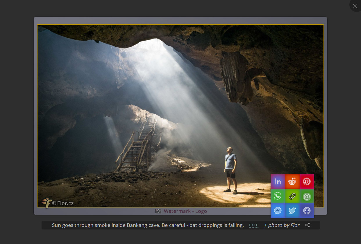
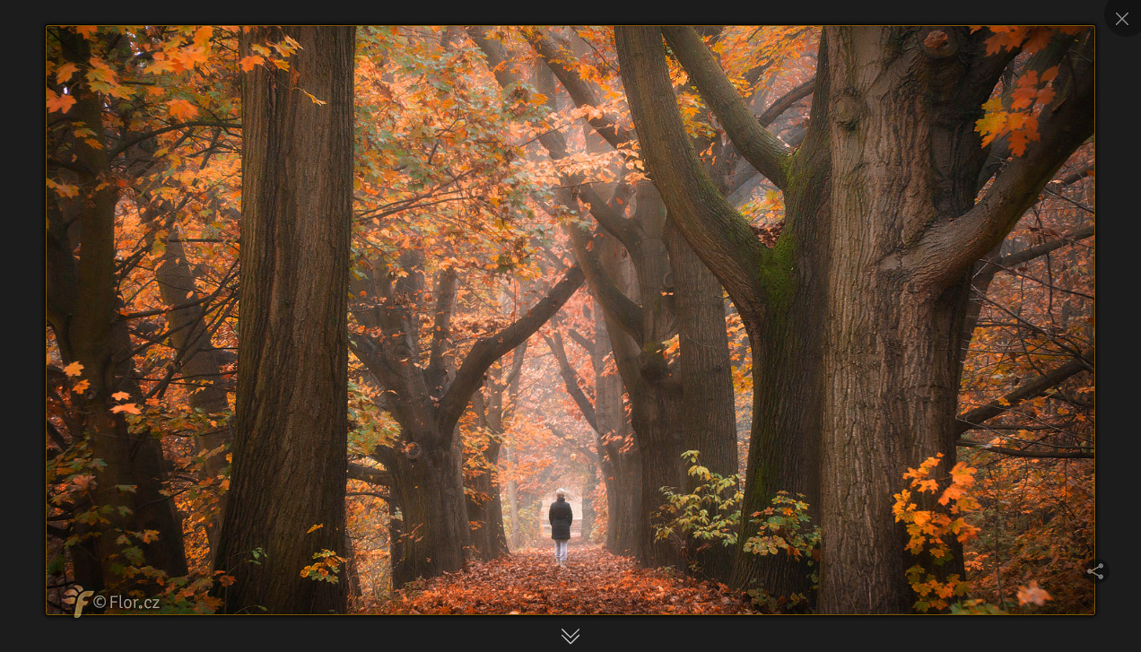
The gallery can be set color theme, borders, rounding, watermark (image or text). SSG also offers social sharing and EXIF display.
.
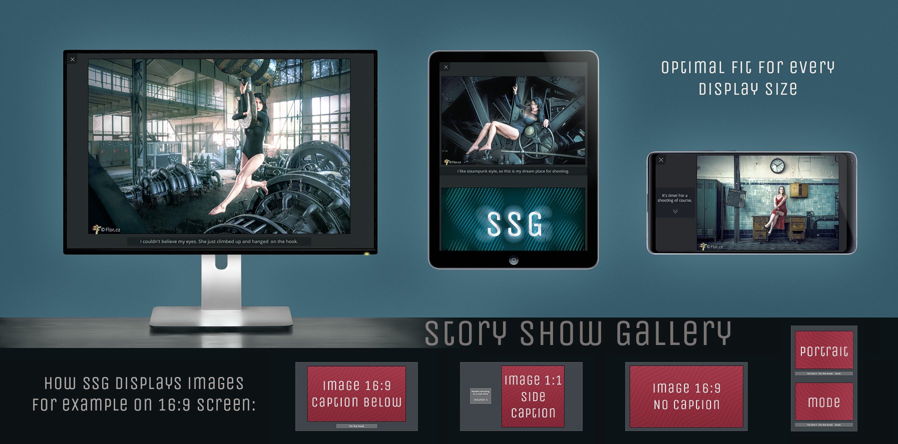
Story Show Gallery is vertical - optimized for use on smartphones. It has 4 visual themes:
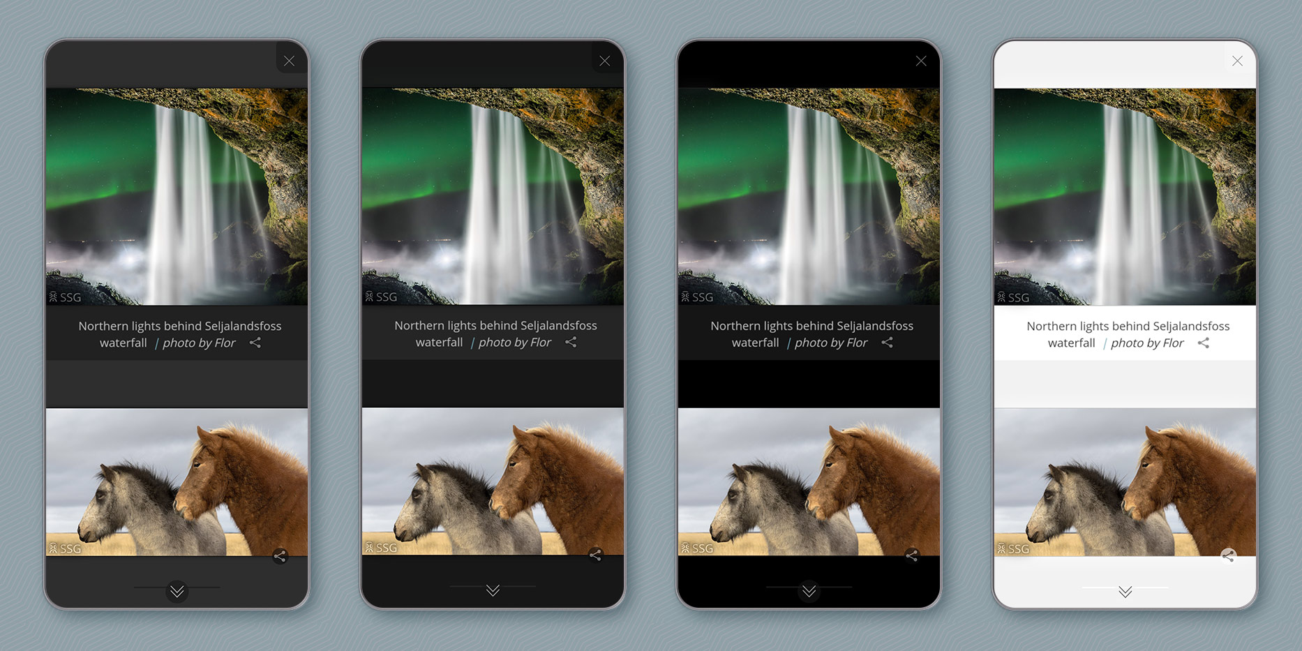
Story Show Gallery versus usual gallery lightbox. Do you want more icons or more from a photo?
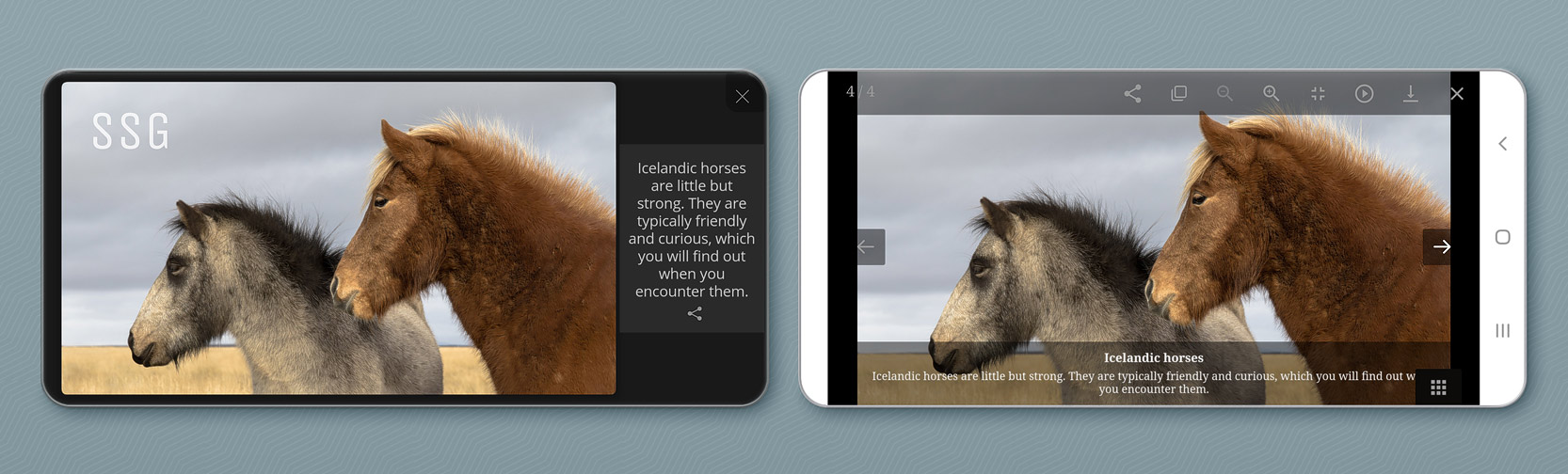
↑ SSG use whole smartphone display - even notch area and even on iPhone.
.
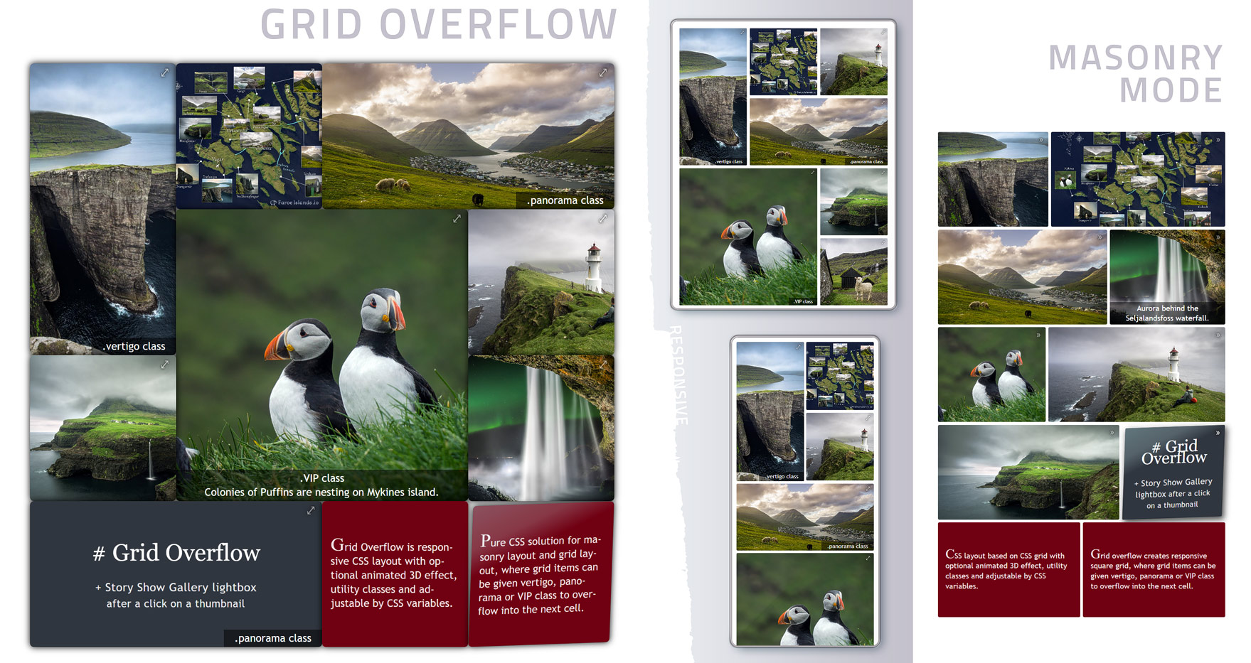
Part of Story Show Gallery is Grid overflow - a pure CSS solution for masonry layout and grid layout, where grid items can be given vertigo, panorama or VIP class to overflow into the next cell.
.
Story Show Gallery has very easy setup, it binds onto image hyperlinks on the page automatically. You can control this proccess by CSS classes. Define separate galleries, activate full screen mode, selectively deactivate SSG, etc. Story Show Gallery can also work as a React Component.
Not another photo gallery
- On smartphones, full screen mode can work like on YouTube - after rotating a phone into landscape mode.
- Also is possible to start the gallery in full screen portrait or forced landscape mode.
- Brand building (image or text), hardly overlooked social sharing icon
- Easy browsing without clicking and thinking
- Image frame effects and settings
- EXIF info inside captions
- Deeplinking
- Four visual themes
- Google Analytics support
- HTML signpost to other galleries
- No e×it mode for galleries based on bare HTML
- SSG is probably the only gallery which can place each caption individually according to image size vs. screen size:
Implementation
Add ssg.min.css and jQuery in the <head> of the document. Add ssg.min.js before end of </body>. You can link files directly from CDN:
<head>
<link rel="stylesheet" href="https://cdn.jsdelivr.net/npm/story-show-gallery@3/dist/ssg.min.css">
<script src="https://code.jquery.com/jquery-3.5.1.min.js"> </script>
</head>
...
<script src="https://cdn.jsdelivr.net/npm/story-show-gallery@3/dist/ssg.min.js"></script>
<!-- add also Exifr library if you want to display EXIF info -->
<script src="https://cdn.jsdelivr.net/npm/exifr@7/dist/lite.umd.js"> </script>
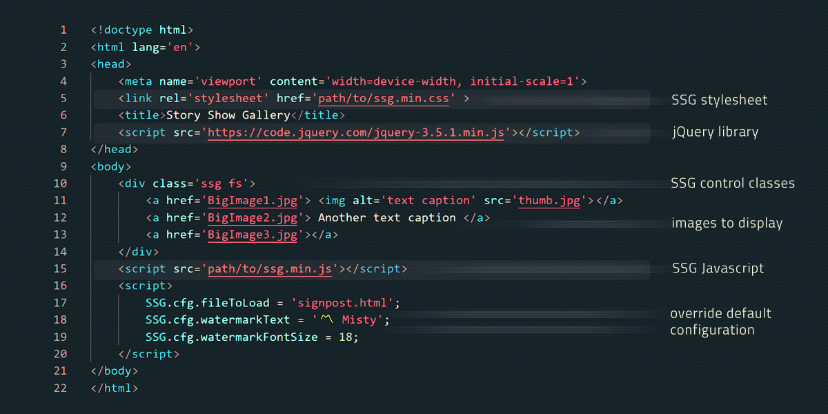
</body>SSG binds onto image hyperlinks on the page automatically, BigImage1-4 will be in the gallery. You can control this proccess by CSS classes.
<div class='ssg fs'>
    <a href='BigImage1.jpg'> <img alt='This text will appear under picture as a caption' src='thumbnail.jpg'> </a>
    <a href='BigImage2.jpg' data-author='photo by Misty'> Also image caption </a>
    <a href='BigImage3.jpg data-caption='this caption has priority over link text or alt'> some text </a>
    <a href='BigImage4.jpg'></a> <!-- an empty link, no caption -->


    <a href='BigImage5.jpg' class='nossg'> don't include me into SSG </a>
</div>
The ssg class creates a separate gallery, the fs class will activate full screen mode. The BigImage5.jpg will open normally within a browser because of the nossg class. There are more control classes.
You can also run the gallery by calling SSG.run method and passing an JS array of images into SSG.
Grid Overflow - CSS layout for thumbnails
To use it just link GridOverflow3D.min.css from CDN:
<link rel="stylesheet" href="https://cdn.jsdelivr.net/npm/story-show-gallery@3/dist/GridOverflow3D.min.css" />Short implementation tutorial is available at https://github.com/Roman-Flossler/Grid-Overflow
React Component (Next.js)
Story Show Gallery for React works the same way as it is described above. Just put in your React app StoryShowGallery component and every image hyperlink on the entire page will be asigned an onclick function, which opens image into the gallery. Image hyperlinks can be controled by CSS classes, as it is described above.
Or you can use SSG.run method with array of images.
How to install and use StoryShowGallery React component:
// install npm package:
npm i story-show-gallery

// import into React app:
import StoryShowGallery, { SSG } from "story-show-gallery/src/modules/react";

// if you want EXIF support use:
import StoryShowGallery, { SSG } from "story-show-gallery/src/modules/react-exifr";

// and also import CSS file:
import "story-show-gallery/src/ssg.css";
// if you use Next.js, you have to import it into _app.tsx as global CSS

// use StoryShowGallery component and configure the gallery:
<StoryShowGallery config={{ theme: 'light', watermarkText: 'xxx' }} />
You can import story-show-gallery into root component (app.js or _app.js in case of Next.js) so the all aplication can use it. Or import it just into some component/page with a gallery. There is sample implementation (SsgReactExample.jsx) in the example directory.
Configuration
Default SSG configuration and language localization are at the begining of ssg.js file. You can edit source ssg.js file and then minify it. Or copy selected settings into your document to override default configuration. See all possible settings. Place the selected settings after ssg.min.js:
<script type="text/javascript" src="ssg.min.js"></script>
<script>
  SSG.cfg.theme: 'light';  // visual theme
  SSG.cfg.fileToLoad = 'signpost.html'; // HTML file to load behind the gallery
  SSG.cfg.watermarkText = '〽️ Misty';  // watermark text overlaying a photo
  SSG.cfg.watermarkFontSize = 18;
  SSG.cfg.captionExif = 'trim'; // show EXIF with reduced lens info
</script>
Part of the configuration are also SSG events, you can use them to run your functions on the gallery start, on an image change, etc.
Minifying
If you modify source files (src folder), you will probably want to minify the result. Use existing npm script:
npm install   // it will install uglify-JS and uglify-CSS which are needed for minifying
npm run-script dist  // it will minify the source files and put them into the dist directory.
License
You can use Story Show Gallery freely within open source GNU GPL-3.0 license.
There is one exception from the license: Distributing Story Show Gallery within a Wordpress plugin or theme is only allowed for the author of Story Show Gallery.