
storybook-addon-inspector
v0.0.7
Published
Inspects the computed css properties applied to an element in storybook
Maintainers
 mbao01
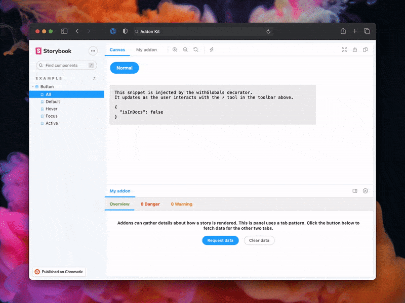
Readme
Storybook Addon Inspector
A powerful Storybook addon that allows you to inspect and analyze computed CSS properties applied to elements in your stories. This addon provides a comprehensive view of styles, making it easier to debug and understand how CSS is being applied to your components.
Features
- 🔍 Inspect computed CSS properties of any element in your stories
- 📊 View CSS variables and their computed values
- 🎯 Real-time style inspection
- 🛠️ Easy-to-use interface integrated into Storybook's toolbar
- 🔄 Live updates as you interact with your components
Installation
pnpm add -D storybook-addon-inspectorConfiguration
Add the addon to your Storybook configuration (.storybook/main.js):
// .storybook/main.js
export default {
  addons: [
    // ... other addons
    'storybook-addon-inspector'
  ],
};
Usage
- Start your Storybook instance
- Click the Inspector icon in the Storybook toolbar
- Click on any element in your story to inspect its computed CSS properties
- View information about:
- Computed styles
- CSS variables
- Typography
- Layout properties
Documentation
Keyboard Shortcuts
- Press p to toggle the inspector mode
- Press Esc to exit inspector mode
Features in Detail
Computed Styles
View all computed CSS properties applied to the selected element, including:
CSS Variables
- See all CSS custom properties (variables) applied to the element
- View the computed values of CSS variables
- Track variable inheritance and overrides
Real-time Updates
- Styles update in real-time as you interact with your components
- Changes in CSS variables are reflected immediately
- Hover states and transitions are captured
Framework Support
This addon works with all major frameworks supported by Storybook:
- React
- Vue
- Angular
- Web Components
- Ember
- HTML
- Svelte
- Preact
- React Native
Tips & Tricks
Inspecting Nested Elements
- Hover over elements to see their computed styles
- Click to select an element for detailed inspection
- Use the element picker to select deeply nested elements
Debugging CSS Variables
- Look for the CSS Variables section to see all custom properties
- Track variable inheritance through the component tree
- Identify overridden variables
Performance Optimization
- The inspector updates in real-time, so it's perfect for debugging responsive designs
- Use it to verify media query implementations
- Check computed values across different viewport sizes
Known Limitations
- Some framework-specific styling solutions might not be fully visible
- Dynamic styles applied through JavaScript might not be immediately reflected
- Very large style sheets might impact performance
Development
Prerequisites
- Node.js (Latest LTS version recommended)
- pnpm (Package manager)
Available Scripts
pnpm start- Runs the build in watch mode and starts Storybookpnpm build- Builds and packages your addon codepnpm test- Runs the test suitepnpm test:watch- Runs tests in watch modepnpm test:coverage- Runs tests with coverage reportingpnpm storybook- Starts Storybook in development modepnpm storybook:build- Builds the Storybook static site
Project Structure
The addon code lives in src and demonstrates core addon concepts:
src/Tool.tsx- Toolbar integrationsrc/Panel.tsx- Panel view implementationsrc/Tab.tsx- Tab view implementation
Supported Frameworks
This addon supports the following frameworks:
- React
- Vue
- Angular
- Web Components
- Ember
- HTML
- Svelte
- Preact
- React Native
Contributing
Contributions are welcome! Please feel free to submit a Pull Request.
License
MIT © Ayomide Bakare
Release Management
Setup
This project is configured to use auto for release management. It generates a changelog and pushes it to both GitHub and npm. Therefore, you need to configure access to both:
NPM_TOKENCreate a token with both Read and Publish permissions.GH_TOKENCreate a token with thereposcope.
Then open your package.json and edit the following fields:
nameauthorrepository
Local
To use auto locally create a .env file at the root of your project and add your tokens to it:
GH_TOKEN=<value you just got from GitHub>
NPM_TOKEN=<value you just got from npm>
Lastly, create labels on GitHub. You'll use these labels in the future when making changes to the package.
pnpm dlx auto create-labelsIf you check on GitHub, you'll now see a set of labels that auto would like you to use. Use these to tag future pull requests.
GitHub Actions
This template comes with GitHub actions already set up to publish your addon anytime someone pushes to your repository.
Go to Settings > Secrets, click New repository secret, and add your NPM_TOKEN.
Creating a release
To create a release locally you can run the following command, otherwise the GitHub action will make the release for you.
pnpm releaseThat will:
- Build and package the addon code
- Bump the version
- Push a release to GitHub and npm
- Push a changelog to GitHub