
storybook-addon-visual-delta
v0.1.5
Published
Data-driven visual infrastructure for Storybook. Features Overlay, Side-by-Side, and Pixel-perfect Heatmap Diff modes powered by Chrome native rendering.

Readme
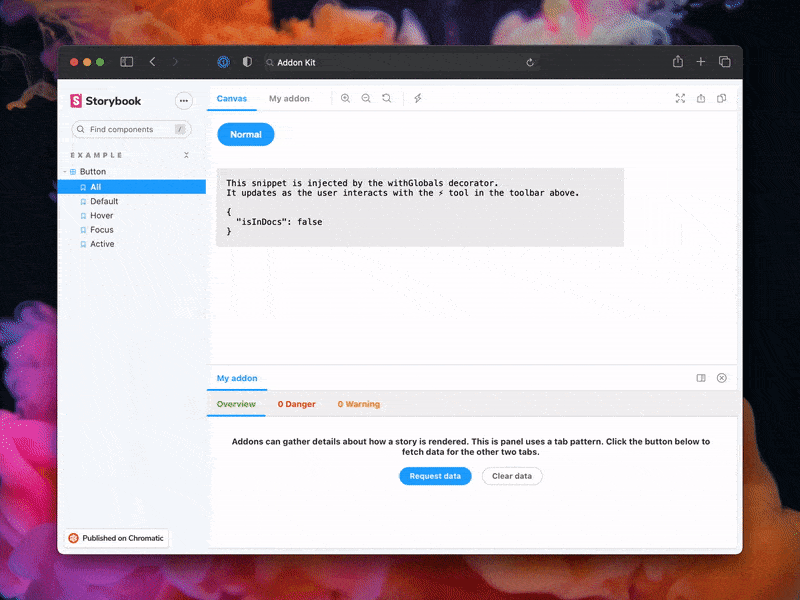
Storybook Addon Visual Delta
Data-driven visual infrastructure for Storybook. Features Overlay, Side-by-Side, and Pixel-perfect Heatmap Diff modes powered by Chrome native rendering.
Development scripts
npm run startruns babel in watch mode and starts Storybooknpm run buildbuild and package your addon code
Switch from TypeScript to JavaScript
Don't want to use TypeScript? We offer a handy eject command: npm run eject-ts
This will convert all code to JS. It is a destructive process, so we recommended running this before you start writing any code.
What's included?
The addon code lives in src. It demonstrates all core addon related concepts. The three UI paradigms
src/Tool.tsxsrc/Panel.tsxsrc/Tab.tsx
Which, along with the addon itself, are registered in src/manager.ts.
Managing State and interacting with a story:
src/withGlobals.ts&src/Tool.tsxdemonstrates how to useuseGlobalsto manage global state and modify the contents of a Story.src/withRoundTrip.ts&src/Panel.tsxdemonstrates two-way communication using channels.src/Tab.tsxdemonstrates how to useuseParameterto access the current story's parameters.
Your addon might use one or more of these patterns. Feel free to delete unused code. Update src/manager.ts and src/preview.ts accordingly.
Lastly, configure you addon name in src/constants.ts.
Bundling
Addons can interact with a Storybook project in multiple ways. It is recommended to familiarize yourself with the basics before getting started.
- Manager entries are used to add UI or behavior to the Storybook manager UI.
- Preview entries are used to add UI or behavior to the preview iframe where stories are rendered.
- Presets are used to modify the Storybook configuration, similar to how users can configure their
main.tsconfigurations.
Since each of these places represents a different environment with different features and modules, it is also recommended to split and build your modules accordingly. This addon-kit comes with a preconfigured bundling configuration that supports this split, and you are free to modify and extend it as needed.
You can define which modules match which environments in the package.json#bundler property:
exportEntriesis a list of module entries that users can manually import from anywhere they need to. For example, you could have decorators that users need to import into theirpreview.tsfile or utility functions that can be used in theirmain.tsfiles.managerEntriesis a list of module entries meant only for the manager UI. These modules will be bundled to ESM and won't include types since they are mostly loaded by Storybook directly.previewEntriesis a list of module entries meant only for the preview UI. These modules will be bundled to ESM and won't include types since they are mostly loaded by Storybook directly.
Manager and preview entries are only used in the browser so they only output ESM modules. Export entries could be used both in the browser and in Node depending on their use case, so they both output ESM and CJS modules.
Globalized packages
Storybook provides a predefined set of packages that are available in the manager UI and the preview UI. In the final bundle of your addon, these packages should not be included. Instead, the imports should stay in place, allowing Storybook to replace those imports with the actual packages during the Storybook build process.
The list of packages differs between the manager and the preview, which is why there is a slight difference between managerEntries and previewEntries. Most notably, react and react-dom are prebundled in the manager but not in the preview. This means that your manager entries can use React to build UI without bundling it or having a direct reference to it. Therefore, it is safe to have React as a devDependency even though you are using it in production. Requiring React as a peer dependency would unnecessarily force your users to install React.
An exception to this rule is if you are using React to inject UI into the preview, which does not come prebundled with React. In such cases, you need to move react and react-dom to a peer dependency. However, we generally advise against this pattern since it would limit the usage of your addon to React-based Storybooks.
Documentation
下面是 Visual Delta 插件的真实使用说明(请按此配置)。
1) 安装
pnpm add -D storybook-addon-visual-delta
# 或
npm i -D storybook-addon-visual-delta
2) 集成到 Storybook
在你的 .storybook/main.ts 里注册 addon:
// .storybook/main.ts
import type { StorybookConfig } from '@storybook/react-vite';

const config: StorybookConfig = {
  addons: ['storybook-addon-visual-delta'],
  // ...rest
};

export default config;
3) 配置基准图片(核心:parameters.visualDelta)
插件从每个 story 的 parameters.visualDelta 读取图片配置。
没有配置 visualDelta.images 时,面板会显示空状态。
visualDelta: {
  images: [
    // 字符串简写:使用全局 anchor/offset
    'path/to/baseline.png',
    // 对象写法:单图可覆盖 anchor/offset
    { src: 'path/to/baseline.png', anchor: '.target', offsetX: 0, offsetY: 0 },
  ],

  // 可选:全局定位(未在图片对象中指定时使用)
  anchor: '.target',
  offsetX: 0,
  offsetY: 0,

  // 可选:覆盖层样式
  opacity: 0.5,          // 0-1,默认 0.5
  colorInversion: true, // 默认 true(mix-blend-mode: difference)
}示例可参考:src/stories/Button.stories.ts。
4) 使用流程(在面板里操作)
- 打开一个配置了
parameters.visualDelta.images的 story - 打开
Visual Delta面板 - 选择一张基准图(可点击已选图片取消选择)
- 调整
透明度/颜色反转 - 点击
执行 Diff,面板会展示基准图、Diff 图、实际截图与差异统计
5) 截图能力依赖(非常重要)
当前截图由 src/components/Panel/utils.ts 的 captureScreen() 完成。
它通过 window.postMessage 请求区域截图,并等待返回:
- 请求消息类型:
HIYA_EXTENSION_REQUEST_SCREENSHOT - 返回消息类型:
HIYA_EXTENSION_SCREENSHOT_RESULT
因此需要你在浏览器环境中提供“监听并返回区域截图 dataUrl”的能力(通常是对应的 Chrome 扩展/注入脚本)。
Sample documentation template(旧模板,可忽略)
# My Addon

## Installation

First, install the package.

```sh
npm install --save-dev my-addon
```

Then, register it as an addon in `.storybook/main.js`.

```ts
// .storybook/main.ts

// Replace your-framework with the framework you are using (e.g., react-webpack5, vue3-vite)
import type { StorybookConfig } from '@storybook/your-framework';

const config: StorybookConfig = {
  // ...rest of config
  addons: [
    '@storybook/addon-docs'
    'my-addon', // 👈 register the addon here
  ],
};

export default config;
```

## Usage

The primary way to use this addon is to define the `exampleParameter` parameter. You can do this the
component level, as below, to affect all stories in the file, or you can do it for a single story.

```ts
// Button.stories.ts

// Replace your-framework with the name of your framework
import type { Meta } from '@storybook/your-framework';

import { Button } from './Button';

const meta: Meta<typeof Button> = {
  component: Button,
  parameters: {
    myAddon: {
      exampleParameter: true,
      // See API section below for available parameters
    },
  },
};

export default meta;
```

Another way to use the addon is...

## API

### Parameters

This addon contributes the following parameters to Storybook, under the `myAddon` namespace:

#### `disable`

Type: `boolean`

Disable this addon's behavior. This parameter is most useful to allow overriding at more specific
levels. For example, if this parameter is set to true at the project level, it could then be
re-enabled by setting it to false at the meta (component) or story level.

### Options

When registering this addon, you can configure it with the following options, which are passed when
registering the addon, like so:

```ts
// .storybook/main.ts

// Replace your-framework with the framework you are using (e.g., react-webpack5, vue3-vite)
import type { StorybookConfig } from '@storybook/your-framework';

const config: StorybookConfig = {
  // ...rest of config
  addons: [
    '@storybook/addon-docs',
    {
      name: 'my-addon',
      options: {
        // 👈 options for my-addon go here
      },
    },
  ],
};

export default config;
```

#### `useExperimentalBehavior`

Type: `boolean`

Enable experimental behavior to...
Release Management
Setup
This project is configured to use auto for release management. It generates a changelog and pushes it to both GitHub and npm. Therefore, you need to configure access to both:
NPM_TOKENCreate a token with both Read and Publish permissions.GH_TOKENCreate a token with thereposcope.
Then open your package.json and edit the following fields:
nameauthorrepository
Local
To use auto locally create a .env file at the root of your project and add your tokens to it:
GH_TOKEN=<value you just got from GitHub>
NPM_TOKEN=<value you just got from npm>
Lastly, create labels on GitHub. You’ll use these labels in the future when making changes to the package.
npx auto create-labelsIf you check on GitHub, you’ll now see a set of labels that auto would like you to use. Use these to tag future pull requests.
GitHub Actions
This template comes with GitHub actions already set up to publish your addon anytime someone pushes to your repository.
Go to Settings > Secrets, click New repository secret, and add your NPM_TOKEN.
Creating a release
To create a release locally you can run the following command, otherwise the GitHub action will make the release for you.
npm run releaseThat will:
- Build and package the addon code
- Bump the version
- Push a release to GitHub and npm
- Push a changelog to GitHub