
sty-loader
v1.0.4
Published
Lightweight animated React loaders built with Tailwind CSS
Maintainers
 sty-loader
Readme
sty-loader 🚀
Lightweight, animated React loader components built with Tailwind CSS.
Simple, fast, customizable, and production-ready.


✨ Features
- ⚡ Lightweight & fast (tiny bundle size)
- 🎨 Customizable size and color
- 💨 Smooth CSS-based animations
- 🌈 Tailwind CSS friendly
- 📦 Zero runtime dependencies
- 🧩 Fully typed with TypeScript
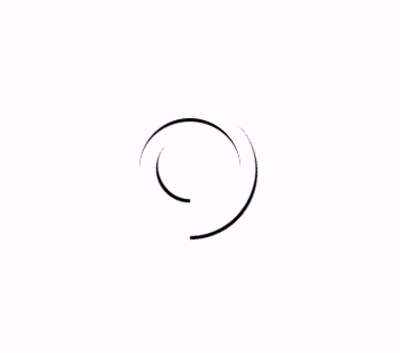
📸 Preview
📦 Installation
npm install sty-loader
or
yarn add sty-loader
🚀 Usage
import { Spinner } from "sty-loader";

export default function Example() {
  return (
    <div className="flex items-center justify-center h-screen">
      <Spinner size={24} color="#22c55e" />
    </div>
  );
}
🎛️ Props
| Prop | Type | Default | Description |
| ----------- | ------ | --------- | ---------------------------- |
| size | number | 16 | Size of the loader in pixels |
| color | string | "white" | Color of the spinner |
| className | string | "" | Additional Tailwind classes |
⚠️ Requirements
React >= 17
Tailwind CSS must be installed and configured
Tailwind animation utilities (animate-spin) should be enabled (default)
🎨 Example with Button Loader
<button className="flex items-center gap-2 px-4 py-2 bg-blue-600 text-white rounded">
  <Spinner size={14} color="white" />
  Loading
</button>
📁 Included Loaders
✅ Spinner – Nested circular spinner
More loaders coming soon 🚧
📄 License MIT © Raman Patil
⭐ Support & Contribution If you find this useful:
⭐ Star the project
🐛 Report issues
💡 Suggest new loaders