
svelte-color
v1.0.2
Published
Color pickers for svelte

Readme
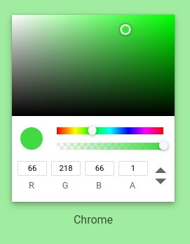
Svelte Color
Color pickers for svelte
Install
npm install svelte-colorUse
  <!-- my-component.svelte -->
<script>
  import ChromePicker from 'svelte-color/Chrome.svelte';

  let chrome;
  let color; // same as event.detail

  const handleInput = (event) => {
    {r, g, b, h, s, l, v, a, hex} = event.detail;
    /*
      r: red          Number 0-255,
      g: green        Number 0-255,
      b: blue         Number 0-255,
      h: hue          Number 0-359,
      s: saturation   Number 0-1
      l: lightness    Number 0-1
      v: value        Number 0-1
      a: alpha        Number 0-1
      hex: hex        String (starting with #)
    */
  }

  function setColor(){
    // setColor accepts any value
    // that tinycolor2 accepts
    // use this method, do not do chrome.color = "red"
    // startColor accepts the same arguments
    chrome.setColor("red");
    chrome.setColor("#fff")
    chrome.setColor("#ffffff")
    chrome.setColor("rgb(255, 255, 255, 1)")
    chrome.setColor("rgba(255, 255, 255 ,1)")
    chrome.setColor("hsv(359, 100%, 100%, 1)")
    chrome.setColor("hsva(359, 100%, 100%, 1)")
    chrome.setColor({r: 255, g: 255, b: 255, a?: 1});
    chrome.setColor({h: 359, s: 1, l: 1, a?: 1});
    chrome.setColor({h: 359, s: 1, v: 1, a?: 1});
  }

</script>

<ChromePicker
  class="classes to add to the root element"
  bind:color
  bind:this={chrome}
  startColor="red"
  disableAlpha={false} // default
  on:input={handleInput}
/>
<!--
  you can also bind
  specific props
  like bind:r={red} bind:h={hue}
-->
API
| Prop / Method | Type | Default / Args | Description | |-----------------|-----------------|-------------------------|--------------------------------------------------------------| | class | string | "" | class(es) to add to the root element | | startColor | string | object | red | any color that tinicolor2 accepts | | disableAlpha | boolean | false | show or not alpha picker and alpha inputs | | bind:color | object | | see in the usage seccion | | bind:r,g,b | number 0-255 | | red, green, blue | | bind:h | number 0-359 | | hue | | bind:s,l,v,a | number 0-1 | | saturation, lightness, value, alpha | | setColor(color) | method | color: string or object | color: any color tinycolor2 accepts | | on:input | event | event.detail = color | Any time user changes value, see detail in the usage seccion |
License
MIT
Contribute
git clone https://github.com/ramiroaisen/svelte-color.git
npm install -D
npm run dev
Opens a dev server with the docs github page showing the components
Enjoy!