
svelte-time-picker
v2.1.1
Published
Svelte Time Picker

Readme
 svelte-time-picker
Inspired by the MaterialUI React Time Picker, many thanks to Hunter Perrin.
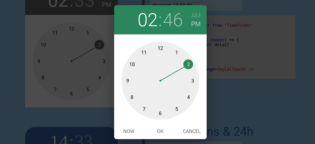
Time pickers use a dialog to select a single time (in the hours:minutes format). The filled circle at the end of the clock hand indicates the selected time.
Demo and examples
Important changes since v2
The import statement is different:
v1.x: import TimePicker from 'svelte-time-picker';
v2.x: import {TimePicker} from 'svelte-time-picker';
Installation
npm install --save-dev svelte-time-pickerBasic Usage
<script>
  import {TimePicker} from 'svelte-time-picker'
  // v1: import TimePicker from 'svelte-time-picker'

  /* Callback */
  let myCallback = (event) => {
    let date = event.detail
    // ...
  }
</script>

<TimePicker on:change={myCallback} />
API
The TimePicker component supports 2 optional attributes:
- date: a javascript Date instance. If set, the TimePicker will be initialized with the time of this date.
- options: an object. Each key/value pair is optional and has default values.
date
A javascript Date instance, like new Date().
If this attribute is set, the TimePicker is initialized with the time of this date. Otherwise, it uses the current date.
Example:
<script>
  import {TimePicker} from 'svelte-time-picker'
  // v1: import TimePicker from 'svelte-time-picker'
  let myDate = new Date(2020, 4, 15, 10, 13) // 10:13 AM
</script>
<TimePicker date={myDate} />
options
An object.
The TimePicker component is easily configurable. The available options, in alphabetic order, are:
| Name | Type | Default | Short description | | ---------------------- | ------- | ------- | ------------------------------------------------------------ | | bgColor | String | #666 | The background color for the Time toolbar and the clock hand. | | buttonBarClassName | String | (none) | The name of the overriding class for the Button bar style. | | buttonCancel | String | CANCEL | The label of the Cancel button in the Button bar. | | buttonClassName | String | (none) | The name of the overriding class for each button style. | | buttonNow | String | NOW | The label of the Now button in the Button bar. | | buttonOk | String | OK | The label of the Ok button in the Button bar. | | clockClassName | String | (none) | The name of the overriding class for the Clock container style. | | color | String | #FFF | The text color of the selected values in the Time toolbar. | | hasButtons | Boolean | false | true = the Button bar is displayed. Otherwise it is hidden. | | hasToolbar | Boolean | true | true = the Time toolbar is displayed. Otherwise it is hidden. | | is24h | Boolean | false | true = the 24h time format is used. Otherwise the AM/PM format is used. | | minutesIncrement | Integer | 1 | The minutes increment. For example, 5 = 5 minutes by 5 minutes. | | openTo | String | hours | if "hours", the hours pane is displayed first. Otherwise the minutes pane is displayed first. | | timeClassName | String | (none) | The name of the overriding class for the Time toolbar style. | | zIndex | Integer | 10 | The z-index rule value for the TimePicker. Useful with a modal component. |
They are described below.
Example:
<script>
  import {TimePicker} from 'svelte-time-picker'
  // v1: import TimePicker from 'svelte-time-picker'
  /* Background color as dark red. Buttons are displayed */
  let myOptions = {
    bgColor: '#9b2c2c',
    hasButtons: true
  }
</script>
<TimePicker options={myOptions} />
Color options
bgColor
Default: #666
A string equivalent to a CSS color. For example: #9b22ac, rgb(128, 0, 54), hsl(301, 20%, 75%)
This color is used as the background color for the Time toolbar, and the clock hand.
color
Default: #fff
A string equivalent to a CSS color. For example: #9b22ac, rgb(128, 0, 54), hsl(301, 20%, 75%)
In the Time toolbar, this color is used as the text color for the selected AM/PM value, and for the selected Hour/Minute value.
Component class options
You can override each TimePicker component style by specifying a class name. The components concerned are :
- the Buttons
- the Button bar
- the Clock container
- the Time toolbar
By this way, the look of the TimePicker can be fully changed. The only component that you cannot change is the clock itself: by design it must have a fixed width, fixed font, and fixed colors.
Some of your CSS rules may require the !important flag to run.
buttonClassName
Default: none
A string. The name of the overriding class that you set in your application CSS file.
You can define the rules you want. Each button in the Button bar will be affected. Beware of size changes that could overload the fixed clock component.
This option has no effect if the hasButtons option is set to false.
buttonBarClassName
Default: none
A string. The name of the overriding class that you set in your application CSS file.
You can define the rules you want. This is useful to change the font, the background color and so one. Beware of size changes that could overload the fixed clock component.
This option has no effect if the hasButtons option is set to false.
clockClassName
Default: none
A string. The name of the overriding class that you set in your application CSS file.
You can define the rules you want. They will affect the clock container, not the clock itself. The clock is the only component that you cannot change: by design it must have a fixed width, fixed font, and fixed colors. Beware of size changes that could overload the fixed clock component.
timeClassName
Default: none
A string. The name of the overriding class that you set in your application CSS file.
You can define the rules you want. Beware of size changes that could overload the fixed clock component.
Button label option
If the hasButtons option is set to true, the button bar is displayed with 3 buttons:
- the Now button: once clicked, the TimePicker is reset with the current date.
- the OK button: once clicked, the
okevent is fired with the date as detail argument. - the Cancel button: once clicked, the
cancelevent is fired with the date detail as argument.
buttonNow
Default: NOW
A string. The label for this button. As it is declared as @html attribute, you can place HTML code in the label.
buttonOk
Default: OK
A string. The label for this button. As it is declared as @html attribute, you can place HTML code in the label.
buttonCancel
Default: CANCEL
A string. The label for this button. As it is declared as @html attribute, you can place HTML code in the label.
Feature options
hasButtons
Default: false
If true, the button bar is displayed with the 3 buttons: Now, OK and Cancel.
Otherwise, the button bar is hidden.
hasToolbar
Default: true
If true, the Time toolbar is displayed. Otherwise, the Time toolbar bar is hidden.
is24h
Default: false
If true, the 24h time format is used. The clock pane has 2 circles: one for AM hours, another for PM hours. There is no AM/PM choice in the Time toolbar.
Otherwise, the AM/PM format is used. The clock pane has a single circle. The Time toolbar displays the AM/PM choice.
minutesIncrement
Default: 1
An integer. For example, 5 = 5 minutes by 5 minutes.
openTo
Default: hours
The possible values are: hours, minutes.
This option defines the first pane to display.
zIndex
Default: 10
An integer. The z-index rule value for the full TimePicker element.
The clock canvas captures the mouve events. To be effective, this component must be placed at the top in DOM structure. With the z-index rule, it can be done easily. This option is very useful when the TimePicker is part of a modal.
Events and callbacks
Depending on the user actions, the TimePicker can fire 3 different events:
- cancel: when the Cancel button is clicked on the Button bar.
- change: when the date changes. It fires when: -- the TimePicker is mounted at the first time -- the clock hand is moved -- the AM or PM mode is clicked, and the date is changed -- the Now button is clicked
- ok: when the OK button is clicked.
For each event, the returned date is the event.detail value, as a javascript Date instance.
You can set your callbacks directly on the TimePicker component. Example:
<script>
  import {TimePicker} from 'svelte-time-picker'
  // v1: import TimePicker from 'svelte-time-picker'

  /* Callbacks */
  let cancelCallback = (event) => {
    let date = event.detail
    // ...
  }
  let changeCallback = (event) => {
    let date = event.detail
    // ...
  }
  let okCallback = (event) => {
    let date = event.detail
    // ...
  }
</script>

<TimePicker
  on:cancel={cancelCallback}
  on:change={changeCallback}
  on:ok={okCallback}
/>
Modal
This svelte-time-picker package includes a ready-to-use modal version. For more information on the Svelte modal feature, see the Svelte Modal Example in the Svelte documentation.
Basic use
In your App
<script>
  import MyModal from "../some/path/MyModal" // your component including the TimePickerModal
  let showModal = false // toggles the hide/show modal mode
</script>
... some code...
{#if showModal}
<MyModal bind:showModal />
{/if}
MyModal.svelte
<script>
  import { TimePickerModal } from 'svelte-time-picker' // the modal including the TimePicker component
  import { fade } from 'svelte/transition'

  export let showModal // bound by the App

  /* Callbacks */
  let cancelCallback = (event) => {
    let date = event.detail
    // ...
  }
  let changeCallback = (event) => {
    let date = event.detail
    // ...
  }
  let okCallback = (event) => {
    let date = event.detail
    // ...
  }

  /* Closes this modal */
  function close () {
    showModal = false // will be closed by the App
  }

  /* The TimePicker options */
  let options = {
    ... your options ...,
    zIndex: 200 // this option is important to avoid mouse event capture conflicts
  }
</script>

<div transition:fade={ {duration: 300} }>
  <TimePickerModal {options}
    on:cancel={cancelCallback}
    on:change={changeCallback}
    on:ok={okCallback}
    on:close={close}
  />
</div>
License
Copyright (c) 2020-2024 Jacques Desodt and contributors.