
svelte-vertical-timeline
v2.0.0
Published
Maintainers
 sato0130
Readme
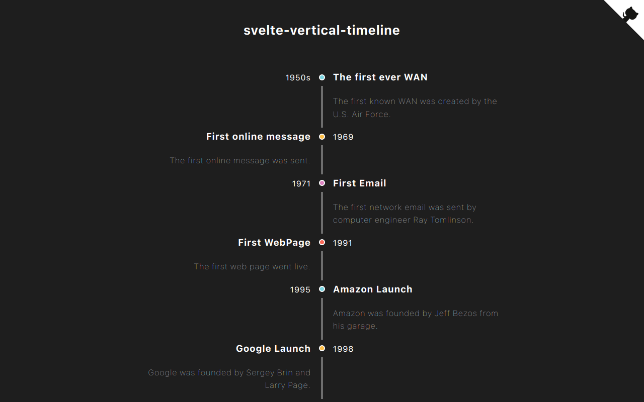
svelte-vertical-timeline

Svelte components for creating a vertical timeline.
Check out the demo.
Demo
Installation
Svelte5
yarn add svelte-vertical-timelineor
npm install svelte-vertical-timelineSvete4 or lower
yarn add [email protected]or
npm install [email protected]Usage
A timeline consists of components below.
<Timeline/><TimelineItem/><TimelineSeparator/><TimelineDot/><TimelineConnector/><TimelineContent/><TimelineOppositeContent/>
I listed some examples of timelines you can create with this library below.
Basic Timeline
A basic timeline showing list of events.

<script>
	import {
		Timeline,
		TimelineItem,
		TimelineSeparator,
		TimelineDot,
		TimelineConnector,
		TimelineContent
	} from 'svelte-vertical-timeline';

	const options = [{ title: 'Eat' }, { title: 'Sleep' }, { title: 'Code' }];
</script>

<Timeline>
	{#each options as option}
		<TimelineItem>
			<TimelineSeparator>
				<TimelineDot />
				<TimelineConnector />
			</TimelineSeparator>
			<TimelineContent>
				<h3>{option.title}</h3>
			</TimelineContent>
		</TimelineItem>
	{/each}
</Timeline>
Left positioned timeline
The main content of the timeline can be positioned on the left side.

<script>
	import {
		Timeline,
		TimelineItem,
		TimelineSeparator,
		TimelineDot,
		TimelineConnector,
		TimelineContent
	} from 'svelte-vertical-timeline';

	const options = [{ title: 'Eat' }, { title: 'Sleep' }, { title: 'Code' }];
</script>

<Timeline position="left">
	{#each options as option}
		<TimelineItem>
			<TimelineSeparator>
				<TimelineDot />
				<TimelineConnector />
			</TimelineSeparator>
			<TimelineContent>
				<h3>{option.title}</h3>
			</TimelineContent>
		</TimelineItem>
	{/each}
</Timeline>
Alternating timeline
The timeline can display the events on alternating sides.

<script>
	import {
		Timeline,
		TimelineItem,
		TimelineSeparator,
		TimelineDot,
		TimelineConnector,
		TimelineContent
	} from 'svelte-vertical-timeline';

	const options = [{ title: 'Eat' }, { title: 'Sleep' }, { title: 'Code' }];
</script>

<Timeline position="alternate">
	{#each options as option}
		<TimelineItem>
			<TimelineSeparator>
				<TimelineDot />
				<TimelineConnector />
			</TimelineSeparator>
			<TimelineContent>
				<h3>{option.title}</h3>
			</TimelineContent>
		</TimelineItem>
	{/each}
</Timeline>
Opposite content
The timeline can display content on opposite sides.
Please make sure to add slot="opposite-content" to the <TimelineOppositeContent/> component.

<script>
	import {
		Timeline,
		TimelineItem,
		TimelineSeparator,
		TimelineDot,
		TimelineConnector,
		TimelineContent,
		TimelineOppositeContent
	} from 'svelte-vertical-timeline';

	const options = [
		{ title: 'Eat', time: '09:30 am' },
		{ title: 'Sleep', time: '10:00 am' },
		{ title: 'Code', time: '11:00 am' },
		{ title: 'Eat', time: '01:00 pm' }
	];
</script>

<Timeline position="alternate">
	{#each options as option}
		<TimelineItem>
			<TimelineOppositeContent slot="opposite-content">
				<p>{option.time}</p>
			</TimelineOppositeContent>
			<TimelineSeparator>
				<TimelineDot />
				<TimelineConnector />
			</TimelineSeparator>
			<TimelineContent>
				<h3>{option.title}</h3>
			</TimelineContent>
		</TimelineItem>
	{/each}
</Timeline>
Customization
You can customize the timeline anyway you want. Check here for furthur information.

<script>
	import {
		Timeline,
		TimelineItem,
		TimelineSeparator,
		TimelineDot,
		TimelineConnector,
		TimelineContent,
		TimelineOppositeContent
	} from 'svelte-vertical-timeline';
</script>

<!-- Icons from: https://icons8.com/pricing -->
<Timeline position="alternate">
	<TimelineItem>
		<TimelineOppositeContent slot="opposite-content">
			<p>09:30 am</p>
		</TimelineOppositeContent>
		<TimelineSeparator>
			<TimelineDot
				style={'width: 45px; height: 45px; background-color: #fff; display: flex; justify-content: center; border-color: transparent; '}
			>
				<img src="https://img.icons8.com/nolan/64/taco.png" />
			</TimelineDot>
			<TimelineConnector />
		</TimelineSeparator>
		<TimelineContent style={'height: 150px;'}>
			<h3>Eat</h3>
			<p>You need to eat.</p>
		</TimelineContent>
	</TimelineItem>

	<TimelineItem>
		<TimelineOppositeContent slot="opposite-content">
			<p style={'margin-top: -1px;'}>10:30 am</p>
		</TimelineOppositeContent>
		<TimelineSeparator>
			<TimelineDot style={'background-color: #FEC048;'} />
			<TimelineConnector />
		</TimelineSeparator>
		<TimelineContent>
			<h3 style={'margin-top: -2px;'}>Sleep</h3>
			<p style={'margin-top: -2px;'}>You need to take a nap.</p>
		</TimelineContent>
	</TimelineItem>

	<TimelineItem>
		<TimelineOppositeContent slot="opposite-content">
			<p>11:00 am</p>
		</TimelineOppositeContent>
		<TimelineSeparator>
			<TimelineDot
				style={'width: 45px; height: 45px; background-color: #fff; display: flex; justify-content: center; border-color: transparent; '}
			>
				<img src="https://img.icons8.com/doodle/48/000000/svetle.png" />
			</TimelineDot>
			<TimelineConnector />
		</TimelineSeparator>
		<TimelineContent style={'height: 200px;'}>
			<h3>Code</h3>
			<p>Svelte is Awesome.</p>
		</TimelineContent>
	</TimelineItem>

	<TimelineItem>
		<TimelineOppositeContent slot="opposite-content">
			<p>01:00 am</p>
		</TimelineOppositeContent>
		<TimelineSeparator>
			<TimelineDot
				style={'width: 45px; height: 65px; background-color: #fff; display: flex; justify-content: center; border-color: transparent; '}
			>
				<img src="https://img.icons8.com/nolan/64/birthday-cake.png" />
			</TimelineDot>
		</TimelineSeparator>
		<TimelineContent style={'height: 200px;'}>
			<h3>Snack</h3>
			<p>You need to treat yourself.</p>
		</TimelineContent>
	</TimelineItem>
</Timeline>

<style>
	p {
		margin: px 0;
		color: grey;
	}
</style>
API
<Timeline/>
Props
| Name | type | isRequired | Description |
| -------- | ------------------------------ | ---------- | ---------------------------------------------------- |
| position | right, left or alternate | x | The position where the TimelineContent should appear |
| style | string | x | Custom style for this component |
<TimelineItem/>
Props
| Name | type | isRequired | Description |
| -------- | ----------------- | ---------- | ---------------------------------------------------- |
| position | right or left | x | The position where the timeline's item should appear |
| style | string | x | Custom style for this component |
<TimelineSeparator/>
Props
| Name | type | isRequired | Description | | ----- | ------ | ---------- | ------------------------------- | | style | string | x | Custom style for this component |
<TimelineDot/>
Props
| Name | type | isRequired | Description | | ----- | ------ | ---------- | ------------------------------- | | style | string | x | Custom style for this component |
<TimelineConnector/>
Props
| Name | type | isRequired | Description | | ----- | ------ | ---------- | ------------------------------- | | style | string | x | Custom style for this component |
<TimelineContent/>
Props
| Name | type | isRequired | Description | | ----- | ------ | ---------- | ------------------------------- | | style | string | x | Custom style for this component |
<TimelineOppositeContent/>
Props
| Name | type | isRequired | Description | | ----- | ------ | ---------- | ------------------------------- | | style | string | x | Custom style for this component |