svl-ui-lib
v1.2.0
Published
This UI library provides a set of React components that are inspired by Material-UI. It includes customizable `Button` and `TextField` components currently (will be extended).
Downloads
16

Readme
Simple UI Library
This UI library provides a set of React components that are inspired by Material-UI.
It includes customizable Button and TextField components currently (will be extended).
Installation
To install the components library, run:
npm i svl-ui-libUsage
import { Button, TextField, Checkbox, Switch } from 'svl-ui-lib';Button:
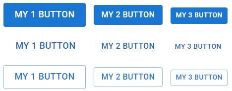
The Button component can be used with three different variants: text, contained, and outlined. The default variant is contained. It also supports disabled state, onClick event, and three sizes: small, medium, and large.
Props
variant: The visual style of the button ("text" | "contained" | "outlined"). Default is "contained".
disabled: If true, the button will be disabled.
onClick: Function to execute on button click.
size: The size of the button ("small" | "medium" | "large").
TextField:
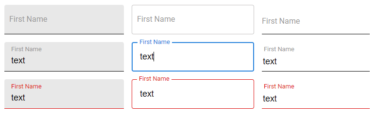
The TextField component is an input field which is styled according to the Material-UI design. It includes several states such as error and disabled.
Props
variant: The visual style of the text field ("standard" | "filled" | "outlined"). Default is "standard".
disabled: If true, the text field will be disabled.
error: If true, the text field will show an error state.
label: The label content.
Checkbox
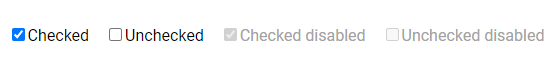
TO the checkbox you can pass the following props:
checked If it is true the checkbox will be checked by default
obChange Function to execute on checkbox change
disabled If true, the checkbox will be disabled.
label The label content.
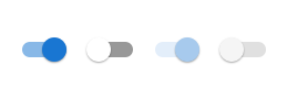
Switch
TO the checkbox you can pass the following props:
checked If it is true the switch will be on by default
obChange Function to execute on switch change
disabled If true, the switch will be disabled.