
sweetpagination
v2.0.1
Published
SweetPagination is a lightweight, responsive, and customizable React pagination component library. Works seamlessly with React, Next.js, and JavaScript projects. Ideal for tables, lists, data grids, and UI components. Supports hooks, modern design, and fu
Maintainers
 jahidulislamzim
Keywords
Readme
SweetPagination 🚀


SweetPagination is a lightweight, responsive, and customizable React pagination component. It works seamlessly with React, Next.js, and JavaScript projects. Ideal for tables, lists, data grids, and UI components. Fully responsive, accessible, and easy to integrate.
Features ✨
- Responsive and modern design
- Supports React, Next.js, and plain JavaScript
- Hooks-based component
- Customizable styles or pre-built styles (
style-1,style-2) - Navigation buttons (Previous / Next)
- Supports any number of items and dynamic page counts
- Easy integration with tables, lists, grids, and UI components
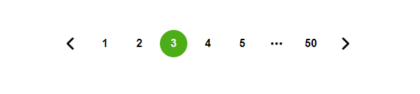
Available Pre-Loaded Styles


Installation 📦
Install via npm:
npm i sweetpagination --saveBasic Usage 🔹
import React, { useState } from "react";
import SweetPagination from "sweetpagination";

function Items() {
  const [currentPageData, setCurrentPageData] = useState([]);
  const items = [1, 2, 3, 4, 5, 6, 7, 8, 9, 10, 11, 12, 13, 14];

  return (
    <div>
      {currentPageData.map((item) => (
        <div key={item}>
          <h3>Item #{item}</h3>
        </div>
      ))}

      <SweetPagination
        currentPageData={setCurrentPageData}
        getData={items}
      />
    </div>
  );
}
Props & Customization 🎨
| Prop | Type | Default | Description |
| ----------------- | -------- | --------- | --------------------------------------------------------- |
| dataPerPage | Number | 10 | Number of items per page |
| getData | Array | [] | Array of data to paginate |
| currentPageData | Function | - | Callback function to get current page data |
| navigation | Boolean | true | Show Previous/Next navigation buttons |
| getStyle | String | 'style-1' | Preloaded styles: style-1, style-2, or style-custom |
Change Items Per Page 🔹
<SweetPagination
  currentPageData={setCurrentPageData}
  getData={items}
  dataPerPage={10}
/>
Add Navigation Buttons 🔹
<SweetPagination
  currentPageData={setCurrentPageData}
  getData={items}
  dataPerPage={10}
  navigation={true}
/>
Preloaded Styles 🔹
Available Styles:
style-1– Modern round buttons with hover effectsstyle-2– Minimal flat design
<SweetPagination
  currentPageData={setCurrentPageData}
  getData={items}
  dataPerPage={10}
  navigation={true}
  getStyle={'style-1'}
/>
Custom Style 🔹
You can also create your own custom style:
<SweetPagination
  currentPageData={setCurrentPageData}
  getData={items}
  dataPerPage={10}
  navigation={true}
  getStyle={'style-custom'}
/>
Add your custom CSS:
.style-custom {
  background-color: #4caf50;
  color: white;
  border-radius: 12px;
  transition: all 0.3s ease;
}

.style-custom:hover {
  background-color: #45a049;
  transform: scale(1.05);
}
Responsive Design 📱
SweetPagination automatically adjusts for mobile devices. Works on all screen sizes, from desktop to mobile.
Examples 💡
- Table Pagination: Perfect for large data tables
- List Pagination: Paginate any list of items
- Grid Pagination: Works seamlessly with UI grids
- Infinite Scroll Integration: Can be combined with infinite scroll logic
SEO & Accessibility 🔹
- Fully keyboard navigable
- Compatible with screen readers
- Lightweight & optimized for performance
- Works with React, Next.js, JavaScript, TypeScript
License
MIT © Jahidul Islam Zim All rights reserved.
✅ Why SweetPagination?
- Easy to integrate
- Modern and eye-catching design
- Fully responsive & accessible
- Works with any data source or UI component