tailwindcss-github-markdown
v0.1.2
Published
A Tailwind CSS plugin that brings GitHub's beautiful Markdown styling to your projects, with support for both light and dark themes.
Downloads
181
Readme
tailwindcss-github-markdown
A Tailwind CSS plugin that brings GitHub's beautiful Markdown styling to your projects, with support for both light and dark themes.
Why This Project?
While Tailwind Typography (@tailwindcss/typography) is a popular choice for Markdown styling, it doesn't quite match GitHub's polished and widely-admired Markdown rendering. This plugin aims to bridge that gap by:
- Providing GitHub's exact Markdown styling
- Supporting both light and dark themes
- Working with both class-based and system preference-based theme switching
- Maintaining GitHub's excellent typography and spacing
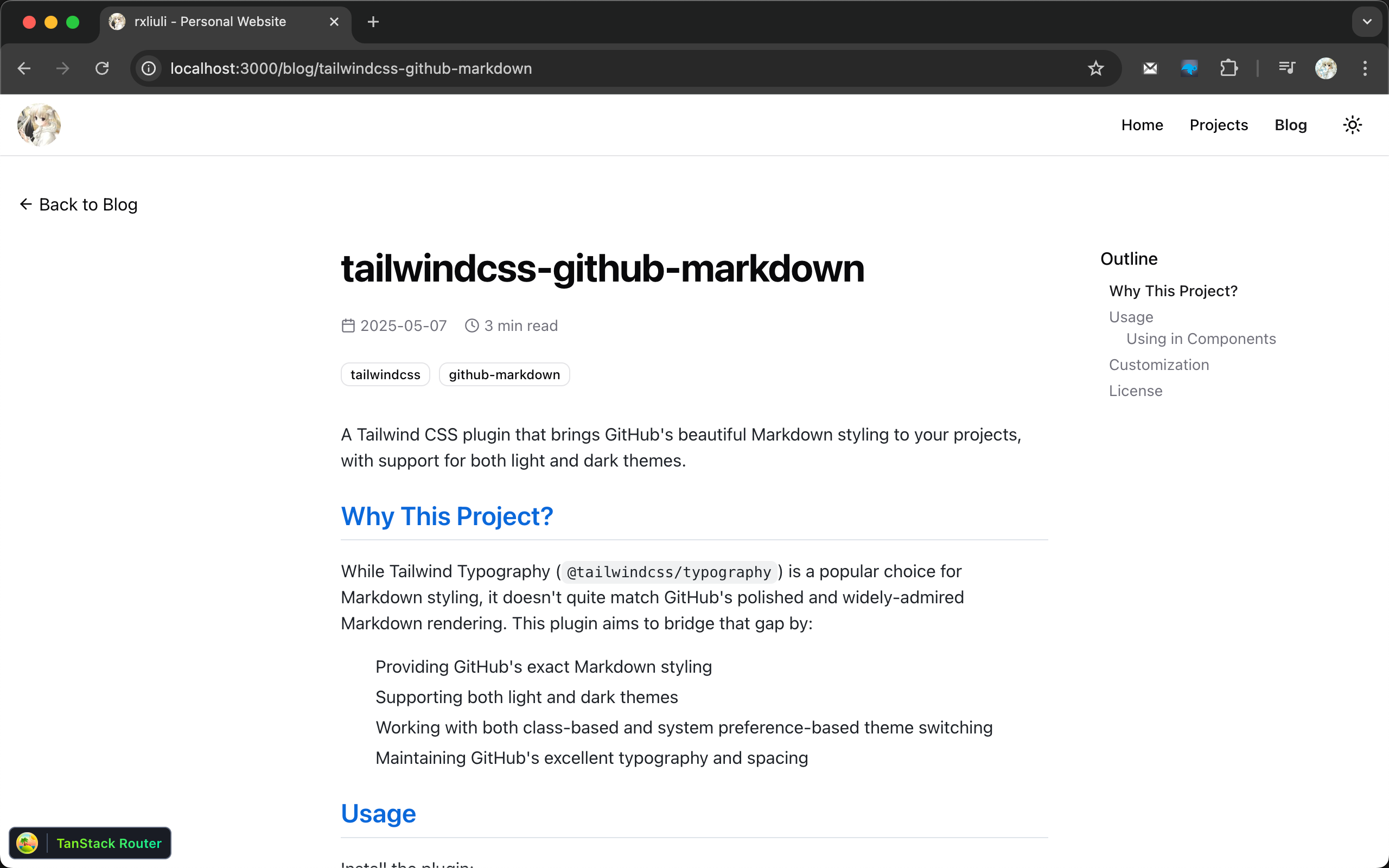
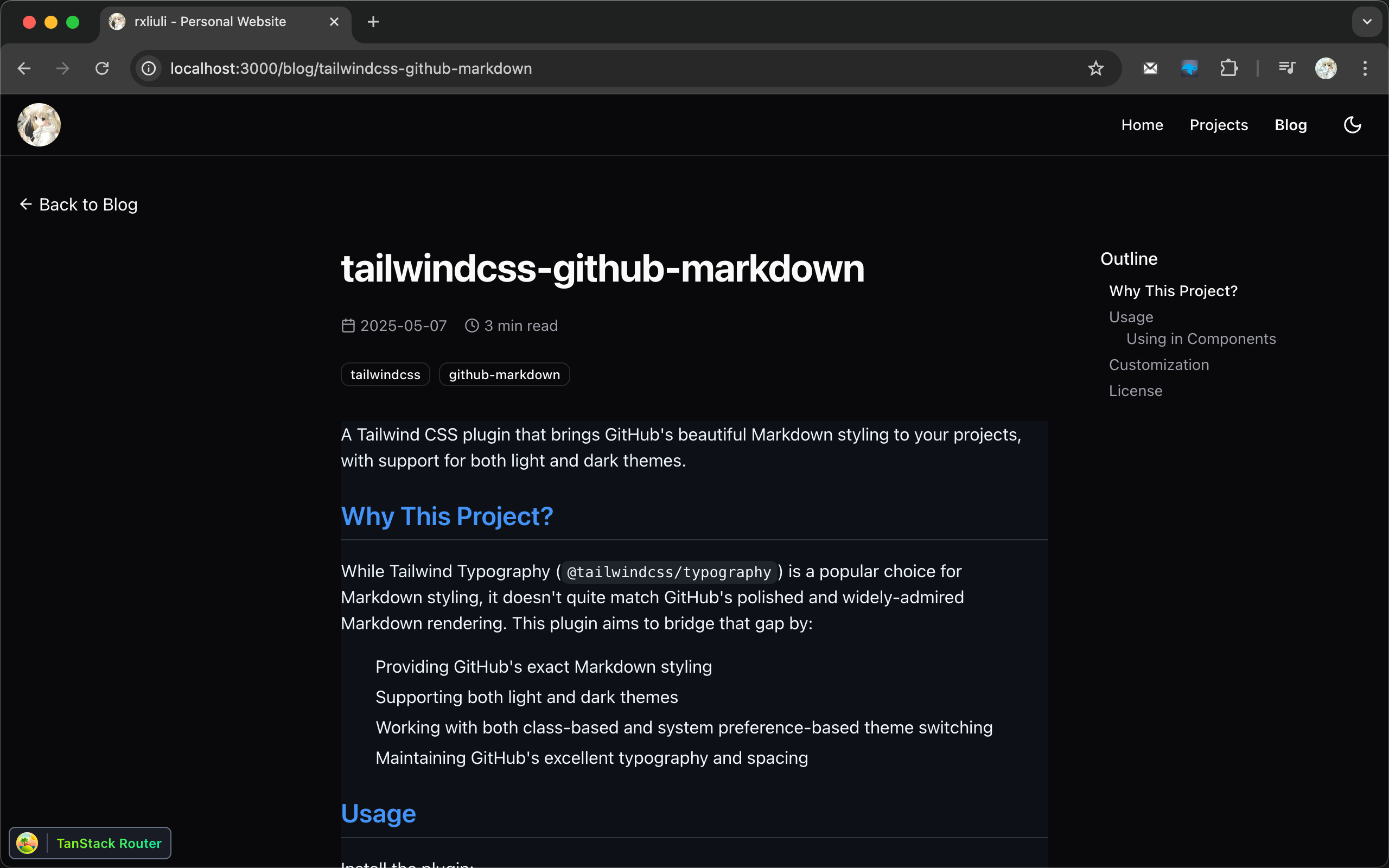
Screenshots
Light Theme

Dark Theme

Usage
Install the plugin:
pnpm add -D tailwindcss-github-markdownAdd the plugin to your CSS:
/* styles.css */
@import 'tailwindcss';

@plugin 'tailwindcss-github-markdown';
Using in Components
Add the prose class to your container element. For dark mode support, add dark:prose-invert:
<!-- HTML -->
<div class="prose dark:prose-invert">
  <!-- Your markdown content here -->
</div>
// React/Next.js
<div className="prose dark:prose-invert">{/* Your markdown content here */}</div><!-- Vue -->
<template>
<div class="prose dark:prose-invert">
<!-- Your markdown content here -->
</div>
</template>The dark:prose-invert class will automatically switch to dark mode when:
- The parent element has the
darkclass - The user's system preference is set to dark mode (if you're using Tailwind's dark mode: 'media' setting)
Customization
You can customize the default styles by overriding them in your CSS. Here are some examples:
.prose a {
  @apply text-primary underline;
}

.prose a:hover {
  @apply text-primary/90;
}
All GitHub Markdown styles are applied using the .prose class, so you can override any style by targeting the appropriate selector within .prose.
License
MIT
