
taily-ui
v1.2.32
Published
🚀 Beautiful, fast, and modern UI Library 100% built and animated with pure Tailwind CSS.
Maintainers
 nikdelvin
Readme
Introducing Taily UI - 🚀 Beautiful, fast, and modern UI Library 100% built and animated with pure Tailwind CSS.


Table of Contents
- Taily UI
✨ Features
- 🎨 Pure Tailwind CSS - No extra CSS files or dependencies to load
- ⚡ Lightweight & Fast - Minimal bundle size with zero overhead
- 🔧 Fully Customizable - Use Tailwind utilities to style components
- 📱 Responsive by Default - Mobile-first design patterns
- ♿ Accessible - Built with accessibility best practices
- 🎯 Simple Data Attributes - Easy-to-use HTML interface
🚀 Quick Start
The fastest way to get started with Taily UI is to use the data attributes interface:
<!DOCTYPE html>
<html>
<head>
    <script src="https://cdn.tailwindcss.com"></script>
</head>
<body>
    <button data-color="primary" data-type="solid" data-size="medium" class="button">
        Start using Taily UI
    </button>
</body>
</html>
For a complete setup guide, check the Installation section below.
📋 Prerequisites
Before you begin, make sure you have:
- Node.js 14.0 or higher (Download)
- Tailwind CSS 3.0 or higher (Install Guide)
💻 Installation
Taily UI can be included as a plugin into an existing Tailwind CSS project to help you build websites faster with a set of beautiful, production-ready web components built with Tailwind CSS utilities.
NPM Installation
Make sure that you have Node.js and Tailwind CSS installed first.
Install Taily UI as a dependency:
npm install taily-uiAdd Taily UI as a plugin in your
tailwind.config.js:const { tailyUI } = require('taily-ui') module.exports = { plugins: [tailyUI] }Or if you use TypeScript, add it to your
tailwind.config.ts:import type { Config } from 'tailwindcss' import { tailyUI } from 'taily-ui' const config: Config = { plugins: [tailyUI] } export default config
📖 Usage
Data Attributes
The preferred way to use Taily UI components is via the data attributes interface. This allows you to configure components directly in your HTML using simple attributes:
<button data-color="primary" data-type="solid" data-size="medium" class="button">
    Start using Taily UI
</button>
Available attributes include:
data-color- Set the button color (primary, secondary, default, etc.)data-type- Choose the button type (solid, outline, ghost, etc.)data-size- Define the button size (small, medium, large, etc.)
🪄 Components
Taily UI is an open source collection of 50+ UI components built with the utility classes from Tailwind CSS that you can use as a starting point when coding user interfaces and websites. Each component is production-ready, fully customizable, and accessible.
Featured Components
| Button | Button Group | Card |
| --- | --- | --- |
| 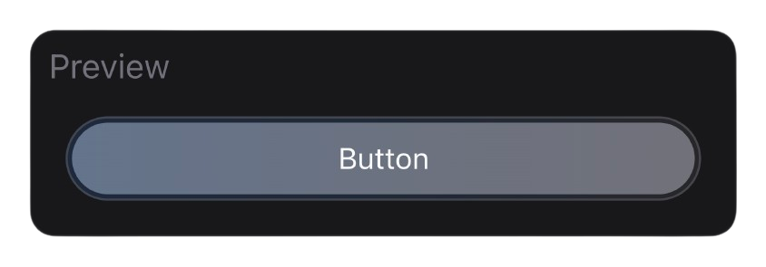 |
| 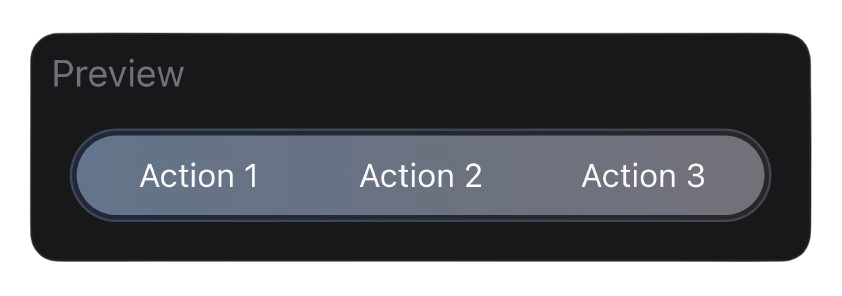 |
| 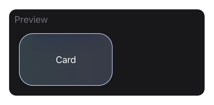 |
|
❓ Troubleshooting
Styles not showing up?
Make sure Taily UI is correctly installed as a plugin in your tailwind.config.js or tailwind.config.ts file. The plugin needs to be included in the plugins array for styles to be generated.
Components not working?
Ensure that:
- Tailwind CSS version 3.0 or higher is installed
- You've included the Taily UI plugin in your Tailwind config
- You're using the correct data attributes
For more help, check the documentation or open an issue on GitHub.
🤝 Contributing
Contributions, issues, and feature requests are welcome! Feel free to check the issues page.
Getting Started
Fork the Project
Create your Feature Branch
git checkout -b feature/AmazingFeatureCommit your Changes
git commit -m 'Add some AmazingFeature'Push to the Branch
git push origin feature/AmazingFeatureOpen a Pull Request
📜 License
This project is licensed under the MIT License - see the LICENSE file for details.