
text-line-clamp
v1.0.3
Published
An Angular library that renders a Show More button on text.
Downloads
25
Maintainers
 hongdaesik
Readme
TextLineClamp


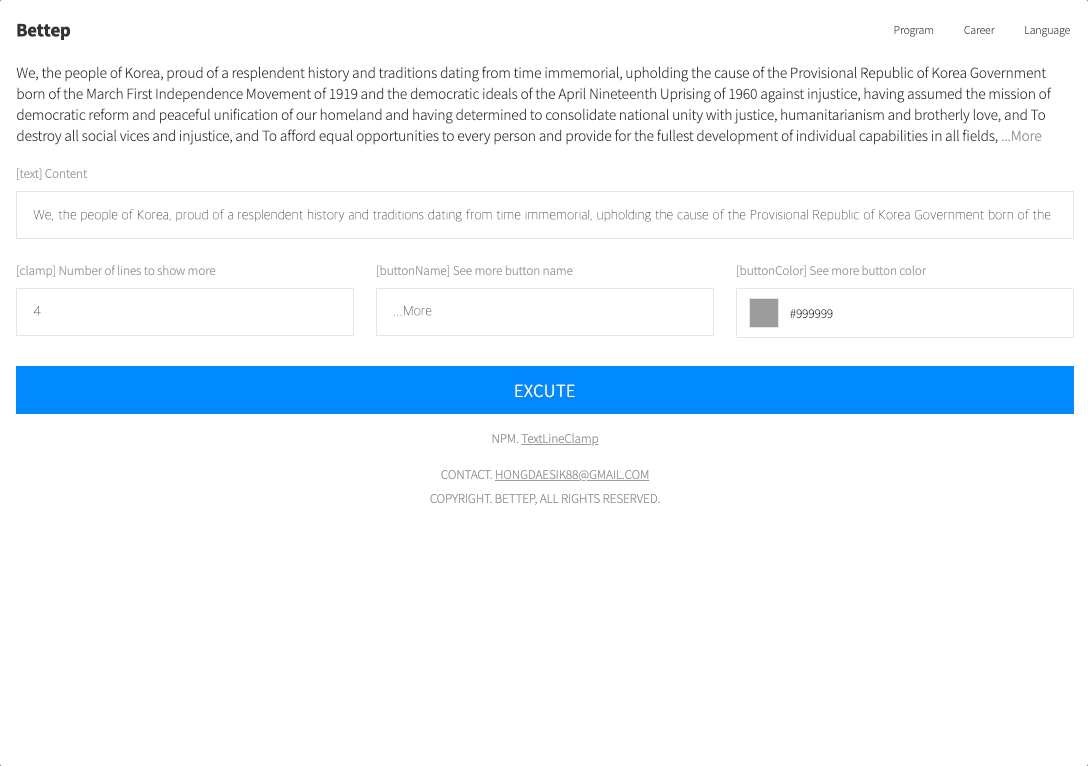
A lightweight Angular library that truncates text to a specified number of lines and renders a "Show More" toggle button. Uses Canvas 2D text measurement for pixel-accurate line breaking.
Installation
npm install text-line-clampQuick Start
import { Component } from '@angular/core'
import { TextLineClampComponent } from 'text-line-clamp'

@Component({
  selector: 'app-example',
  imports: [TextLineClampComponent],
  template: `
    <text-line-clamp
      [text]="content"
      [clamp]="3"
    />
  `
})
export class ExampleComponent {
  content = 'Lorem ipsum dolor sit amet, consectetur adipiscing elit. Sed do eiusmod tempor incididunt ut labore et dolore magna aliqua. Ut enim ad minim veniam, quis nostrud exercitation ullamco laboris.'
}
API
Inputs
| Property | Type | Default | Description |
|----------|------|---------|-------------|
| [text] | string | undefined | The text content to display. |
| [clamp] | number | 2 | Maximum number of visible lines before truncation. |
| [buttonName] | string | '...More' | Label for the expand/collapse toggle button. |
| [buttonColor] | string | '#999999' | Color of the toggle button text. |
Advanced Usage
@Component({
  selector: 'app-custom',
  imports: [TextLineClampComponent],
  template: `
    <text-line-clamp
      [text]="article"
      [clamp]="4"
      [buttonName]="'Read more'"
      [buttonColor]="'#6366f1'"
    />
  `,
  styles: [`
    text-line-clamp {
      font-size: 1rem;
      line-height: 1.6;
      color: #374151;
    }
  `]
})
export class CustomComponent {
  article = `Long article text goes here...`
}
The component inherits
font-size,font-weight,font-family, andletter-spacingfrom its parent element for accurate text measurement.
Changelog
| Version | Description |
|---------|-------------|
| 1.0.3 | Angular 21 upgrade. Signal inputs, inject(), effect() migration. |
| 1.0.2 | Standalone / SSR compatible. |
| 1.0.1 | Changed from word wrapping to character wrapping. |
| 1.0.0 | Initial release. |