
theme-class-provider
v1.0.1
Published
React library providing a ThemeProvider based on a list of class provided.
Maintainers
 sreed17
Readme
theme-class-provider
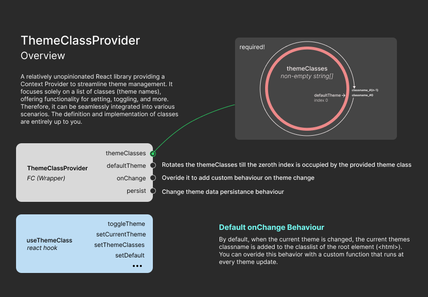
A react library that simplifies theming in your applications. It offers a ThemeClassProvider component and a convenient hook (useThemeClass) to access and manage the theme throughout your app.
Installation
You can install theme-class-provider using npm or yarn:
npm install theme-class-provider
# or
yarn add theme-class-provider
Usage
To integrate theme-class-provider into your React application, follow these steps:
1. Installation
First, install the theme-class-provider package via npm or yarn:
npm install theme-class-provideror
yarn add theme-class-provider2. Usage
Wrap your root component with the ThemeClassProvider component provided by the library. This component manages the theme context for your application:
import React from "react";
import ReactDOM from "react-dom";
import { ThemeClassProvider } from "theme-class-provider";
import App from "./App";

const themeClasses = ["red", "green", "blue"];

ReactDOM.render(
    <ThemeClassProvider themeClasses={themeClasses}>
        <App />
    </ThemeClassProvider>,
    document.getElementById("root")
);
In the above example, themeClasses is an array of class names representing different themes. You can customize this array based on your application's requirements.
3. Accessing Theme Context
To access the theme context within your components, utilize the useThemeClass hook provided by the library:
import React from "react";
import { useThemeClass } from "theme-class-provider";

const MyComponent = () => {
    const { getCurrentTheme, toggleTheme } = useThemeClass();

    const currentTheme = getCurrentTheme();

    return (
        <div className={currentTheme}>
            <button onClick={toggleTheme}>Toggle Theme</button>
            <p>Current Theme: {currentTheme}</p>
        </div>
    );
};

export default MyComponent;
4. Setting Up Light and Dark Themes
To define your light and dark theme styles, create corresponding CSS classes:
/* index.css */

.light {
    color-scheme: light;
    /* Light theme styles */
}

.dark {
    color-scheme: dark;
    /* Dark theme styles */
}

/* Additional body styles */
5. Wrapping Your App Component
Finally, wrap your App component with ThemeClassProvider:
import { ThemeClassProvider } from "theme-class-provider";

// Function to set the default theme based on user preferences
const setDefaultTheme = () => {
    return window.matchMedia("(prefers-color-scheme: dark)").matches
        ? "dark"
        : "light";
};

ReactDOM.render(
    <React.StrictMode>
        {/** configure the persistance behaviour as the application demands */}
        <ThemeClassProvider
            defaultTheme={setDefaultTheme()}
            themeClasses={["light", "dark"]}
            persist={{ clearOnUnload: true }}
        >
            <App />
        </ThemeClassProvider>
    </React.StrictMode>,
    document.getElementById("root")
);
Persistence Configuration and Theme Class Context Functions
Persistence Configuration
The ThemeClassProvider component allows you to configure persistence options for managing theme data. Here are the available configuration options:
- key: The key used for storing theme data.
- disabled: Indicates whether persistence is disabled.
- clearOnUnload: Clear the persisted data when the component unmounts.
By default, the library uses localstorage to persist the data.
Theme Class Context Functions
The useThemeClass hook provides access to various functions for managing the theme class context. Here's an overview of these functions:
- toggleTheme(): void: Toggles the theme class.
- setCurrentTheme(theme_class: string): void: Sets the current theme class.
- getCurrentTheme(): string: Retrieves the name of the current theme class.
- setThemeClasses(classes: string[]): void: Sets the theme classes to the provided array.
- getThemeClasses(): string[]: Retrieves the list of theme classes.
- clearPersistedThemeData(): void: Clears the persisted theme data.
- setDefault(theme_class: string): void: Sets the default theme class.
Release
For detailed release notes, please see CHANGELOG.md.
Contributing
Contributions are welcome! If you have any ideas, suggestions, or bug fixes, please open an issue or submit a pull request on GitHub.
License
This project is licensed under the MIT License - see the LICENSE file for details.