
toastonstaroid
v2.0.6
Published
A simple and beautiful toast notification library for React
Maintainers
 sayansenapati
Readme
🎉 Toastonstaroid
A modern, beautiful toast notification library for React with smooth GSAP animations and elegant design.


✨ Features
- 🚀 Simple API: Easy to integrate and use
- 🎨 Beautiful Animations: Powered by GSAP for buttery-smooth transitions
- 🎯 Multiple Positions: Display toasts at any corner of the screen
- 🔥 Interactive: Hover effects and click handling
- 📱 Fully Responsive: Works on all device sizes
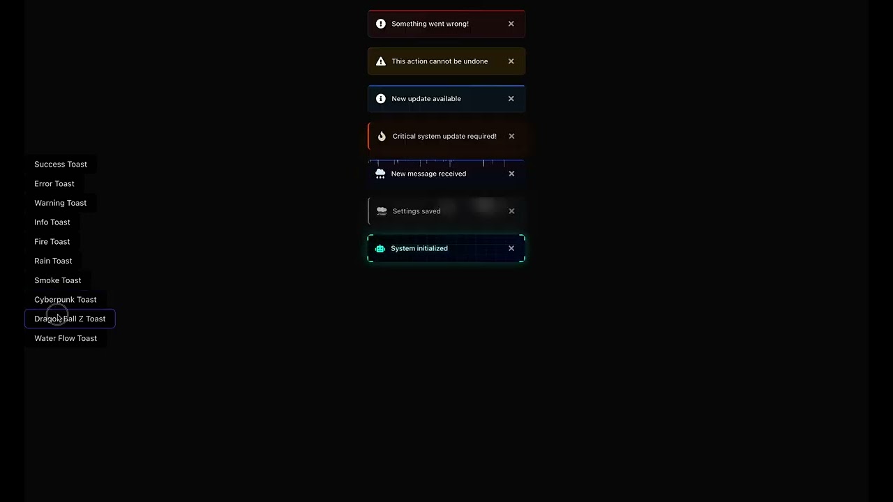
- 🎭 Variants: Success, Error, Warning, Info, Fire, Rain, Smoke, Cyberpunk, Dragon Ball, and Water Flow styles
- ⚡ Lightweight: Minimal bundle size impact
- 🎨 Customizable: Full control over appearance and behavior
- 🔄 Queue System: Handles multiple toasts gracefully
- ⏱ Auto-dismiss: Configurable duration for each toast
🛠 Tech Stack
- ⚛️ React 16.8+ (Hooks)
- 💫 GSAP for animations
- 🏪 Zustand for state management
- 🎨 React Icons for beautiful icons
- 📦 TypeScript for type safety
📦 Installation
For React 16.8+
npm install toastonstaroid
# or
yarn add toastonstaroid
Peer Dependencies
Make sure you have these peer dependencies installed:
react(>=16.8.0)react-dom(>=16.8.0)react-icons(>=4.0.0)gsap(>=3.0.0)zustand(>=4.0.0)
🚀 Quick Start
- First, wrap your app with the
ToastContainercomponent:
import React from "react";
import { ToastContainer } from "toastonstaroid";

function App() {
  return (
    <div className="app">
      <YourApp />
      <ToastContainer position="top-right" />
    </div>
  );
}

export default App;- Use the
toastfunction to show notifications:
import React from "react";
import { toast } from "toastonstaroid";

function MyComponent() {
  const showToast = () => {
    // Success toast
    toast.success("Operation completed successfully!");

    // Error toast
    toast.error("Something went wrong!");

    // Warning toast
    toast.warning("This action cannot be undone");

    // Info toast
    toast.info("New update available");

    // With custom duration (5 seconds)
    toast.success("Changes saved!", 5000);
  };

  return (
    <button onClick={showToast} className="px-4 py-2 text-white rounded">
      Show Toast Notifications
    </button>
  );
}

export default MyComponent;
Available Toast Types
// Success toast
toast.success("Operation completed successfully!");

// Error toast
toast.error("Something went wrong!");

// Warning toast
toast.warning("This action cannot be undone");

// Info toast
toast.info("New update available");

// Fire toast (for important alerts)
toast.fire("Critical system update required!");

// Rain toast (for notifications)
toast.rain("New message received");

// Smoke toast (for subtle notifications)
toast.smoke("Settings saved");

// Cyberpunk toast (for futuristic UI)
toast.cyberpunk("System initialized");

// Dragon Ball Z style
toast.dragonball("Power level over 9000!");

// Water Flow style
toast.waterflow("Your changes have been saved");

// Basic toast
toast.basic("This is a simple notification");
toast.basic("With custom styling", {
  iconColor: "#3b82f6",
  textColor: "#1f2937",
  duration: 5000
});
Customizing Duration
// Show for 5 seconds (default is 3000ms)
toast.success("Profile updated!", 5000);

// Show until manually closed
toast.info("Processing...", 0);
🎭 Variants
Toastonstaroid comes with a variety of beautiful toast variants, each with unique animations and styles:
| Variant | Description | Example |
| ------------ | --------------------------------------------- | ----------------------------------------------- |
| success | Indicates a successful operation | toast.success('Operation completed!') |
| error | Indicates an error that needs attention | toast.error('Something went wrong!') |
| warning | For warning messages | toast.warning('This action cannot be undone') |
| info | General information | toast.info('New message received') |
| fire | Fiery animation for important alerts | toast.fire('Hot! New message') |
| rain | Rain effect for notifications | toast.rain('Don\'t forget your umbrella!') |
| smoke | Smoke effect for subtle notifications | toast.smoke('Poof! It\'s gone') |
| cyberpunk | Futuristic cyberpunk style | toast.cyberpunk('Access granted') |
| dragonball | Anime-inspired with energy aura and particles | toast.dragonball('Power level over 9000!') |
| waterflow | Smooth flowing water animation with bubbles | toast.waterflow('Changes saved successfully') |
| basic | Clean, simple notifications with solid white background and black text | toast.basic('This is a simple notification') |
Basic Variants
Success Toast
Indicates a successful operation.
toast.success("Operation completed successfully!");Error Toast
Indicates an error that needs attention.
toast.error("Failed to save changes");Warning Toast
For warning messages.
toast.warning("This action cannot be undone");Info Toast
For general information.
toast.info("New message received");Basic Toast
Clean, simple notifications with solid white background and black text.
toast.basic("This is a simple notification");
toast.basic("With custom styling", {
  iconColor: "#3b82f6",
  textColor: "#1f2937",
  duration: 5000
});
Animated Variants
Fire Toast
Fiery animation for important alerts.
toast.fire("Hot! New message");Rain Toast
Rain effect for notifications.
toast.rain("Don't forget your umbrella!");Smoke Toast
Smoke effect for subtle notifications.
toast.smoke("Poof! It's gone");Cyberpunk Toast
Futuristic cyberpunk style.
toast.cyberpunk("Access granted");Dragon Ball Z Style
Anime-inspired with energy aura and particles.
toast.dragonball("Power level over 9000!");Water Flow
Smooth flowing water animation with bubbles.
toast.waterflow("Changes saved successfully");Custom Duration
// Show for 5 seconds
toast.success("Profile updated!", 5000);

// Show until manually closed
toast.info("Processing...", 0);
🎛️ Configuration
ToastContainer Props
| Prop | Type | Default | Description |
| -------------- | --------------------- | ------------- | ------------------------------------------------------------------------------------------------------------------------------------------- |
| position | string | 'top-right' | Position of the toast container. Options: 'top-left', 'top-center', 'top-right', 'bottom-left', 'bottom-center', 'bottom-right' |
| autoClose | number | 3000 | Auto close timeout in milliseconds (0 to disable) |
| closeOnClick | boolean | true | Close toast when clicked |
| pauseOnHover | boolean | true | Pause toast timer on hover |
| className | string | '' | Additional CSS class for the container |
| style | React.CSSProperties | {} | Inline styles for the container |
Toast Methods
// Show a toast
toast.success(message: string, options?: ToastOptions): string;
toast.error(message: string, options?: ToastOptions): string;
toast.warning(message: string, options?: ToastOptions): string;
toast.info(message: string, options?: ToastOptions): string;
toast.fire(message: string, options?: ToastOptions): string;
toast.rain(message: string, options?: ToastOptions): string;
toast.smoke(message: string, options?: ToastOptions): string;
toast.cyberpunk(message: string, options?: ToastOptions): string;
toast.basic(message: string, options?: ToastOptions): string;

// Remove a toast
toast.dismiss(toastId: string): void;

// Remove all toasts
toast.dismissAll(): void;

// Update a toast
toast.update(toastId: string, options: ToastOptions): void;
Toast Options
| Option | Type | Default | Description |
| ------------ | --------------------- | --------- | ------------------------------------------- |
| toastId | string | Random ID | Custom ID for the toast |
| duration | number | 3000 | Display duration in ms |
| onClose | () => void | - | Callback when toast closes |
| onOpen | () => void | - | Callback when toast opens |
| className | string | - | Additional CSS class |
| style | React.CSSProperties | - | Inline styles |
| textColor | string | - | Custom text color (e.g., '#FF0000', 'blue') |
| iconColor | string | - | Custom icon color (e.g., '#00FF00', 'red') |
| backgroundStyle | 'blur' | 'solid' | 'blur' | Background style (blur or solid) |
📚 API
Toast Methods
All toast methods accept the following parameters:
message: string- The message to displayduration?: number- (Optional) Time in milliseconds the toast should be visible (default: 5000ms)
Basic Variants
import { toast } from "toastonstaroid";

toast.success("Operation completed successfully!");
toast.error("Something went wrong!");
toast.warning("This action cannot be undone!");
toast.info("New update available!");
Themed Variants
// Fire theme
toast.fire("Hot notification!");

// Rain theme
toast.rain("Bring an umbrella! ☔");

// Smoke theme
toast.smoke("Poof!");

// Cyberpunk theme
toast.cyberpunk("System updated!");

// Dragon Ball theme
toast.dragonball("Power level over 9000!");

// Water Flow theme
toast.waterflow("Smooth as water");
ToastContainer Component
The ToastContainer component is required in your app to display the toasts. Place it once in your app layout.
import { ToastContainer } from "toastonstaroid";

function App() {
  return (
    <div>
      <YourApp />
      <ToastContainer position="top-right" />
    </div>
  );
}
Props
| Prop | Type | Default | Description |
| --------- | -------------------------------------------------------------------- | ------------- | ------------------------------- |
| position | 'top-right' | 'top-left' | 'bottom-right' | 'bottom-left' | 'top-right' | Position of the toast container |
| className | string | '' | Additional CSS class name |
| style | React.CSSProperties | {} | Inline styles for the container |
Customization
You can customize the default duration for all toasts by setting the duration parameter:
// Show success toast for 10 seconds
toast.success("Saved successfully!", 10000);
Styling with CSS Variables
Customize the look using these CSS variables:
:root {
  /* Base styles */
  --toast-bg: rgba(30, 41, 59, 0.95);
  --toast-text: #ffffff;
  --toast-border: rgba(255, 255, 255, 0.1);
  --toast-shadow: 0 4px 12px rgba(0, 0, 0, 0.15);

  /* Layout */
  --toast-padding: 12px 16px;
  --toast-spacing: 16px;
  --toast-border-radius: 8px;

  /* Typography */
  --toast-font-size: 14px;
  --toast-line-height: 1.5;

  /* Icons */
  --toast-icon-size: 20px;

  /* Animations */
  --toast-animation-duration: 300ms;
}
Custom Animations
You can customize the enter/exit animations by providing your own CSS classes:
<ToastContainer
  className="custom-toast-container"
  toastClassName="custom-toast"
  bodyClassName="custom-toast-body"
  position="top-right"
  autoClose={5000}
  hideProgressBar
  newestOnTop
  closeOnClick
  rtl={false}
  pauseOnFocusLoss
  draggable
  pauseOnHover
/>
🚀 Advanced Usage
Programmatic Control
import { useToastStore } from "toastonstaroid";

function MyComponent() {
  const { toasts, removeToast } = useToastStore();

  const showTemporaryToast = () => {
    const toastId = toast.info("This will be removed in 2 seconds");

    setTimeout(() => {
      removeToast(toastId);
    }, 2000);
  };

  return (
    <div>
      <button onClick={showTemporaryToast}>Show Temporary Toast</button>

      <div>{toasts.length} active toasts</div>
    </div>
  );
}
Custom Toast Component
import { useToastStore } from "toastonstaroid";

function CustomToast() {
  const { toasts, removeToast } = useToastStore();

  return (
    <div className="fixed bottom-4 right-4 space-y-2 z-50">
      {toasts.map((toast) => (
        <div
          key={toast.id}
          className={`p-4 rounded-lg shadow-lg flex items-center ${
            toast.type === "success"
              ? "bg-green-500"
              : toast.type === "error"
              ? "bg-red-500"
              : toast.type === "warning"
              ? "bg-yellow-500"
              : "bg-blue-500"
          } text-white`}
        >
          <span className="flex-1">{toast.message}</span>
          <button
            onClick={() => removeToast(toast.id)}
            className="ml-4 text-white hover:text-gray-200"
            aria-label="Close"
          >
            ✕
          </button>
        </div>
      ))}
    </div>
  );
}
📱 Responsive Design
Toasts are fully responsive and adapt to different screen sizes:
- Mobile: Full width with 16px margins
- Tablet: 400px width
- Desktop: 320px width
- Large Screens: 360px width
⚠️ Troubleshooting
Common Issues
Toasts not showing up?
- Ensure
<ToastContainer />is rendered in your app - Check for z-index conflicts
- Verify no
overflow: hiddenis hiding toasts
- Ensure
Animations not working?
- Make sure GSAP is installed
- Check browser console for errors
- Verify you're not calling toast functions during SSR
TypeScript errors?
- Ensure you have
@types/reactinstalled - Check your TypeScript version (requires 4.1+)
- Ensure you have
🤝 Contributing
We welcome contributions from the community! Before you start, please take a moment to read our Contribution Guidelines which includes detailed information on:
- 🛠️ Setting up your development environment
- 📝 Code style and conventions
- 🧪 Testing your changes
- 💡 Proposing new features
- 🐛 Reporting bugs
Quick Start
- Fork the repository
- Create a feature branch (
git checkout -b feature/amazing-feature) - Commit your changes (
git commit -m 'Add some amazing feature') - Push to the branch (
git push origin feature/amazing-feature) - Open a Pull Request
For more details, please see our Contribution Guidelines.
📄 License
This project is licensed under the MIT License - see the LICENSE file for details.
🙏 Acknowledgments
- GSAP for smooth animations
- React Icons for beautiful icons
- Zustand for simple state management
- react-hot-toast for inspiration