
toc-rail
v0.1.4
Published
Sticky reading rail with table-of-contents, scroll progress, and active heading state. Vanilla, ESM, zero dependencies.
Maintainers
 hanityx
Readme
toc-rail
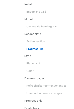
Sticky reading rail for long articles — TOC links, scroll progress, and active heading state. Vanilla TypeScript, ESM-only, zero dependencies.
npm install toc-railimport { mountTocRail } from "toc-rail";
import "toc-rail/style.css";
const rail = mountTocRail({ content: "article" });
rail.refresh(); // call after headings or layout change
rail.unmount(); // call before leaving the pagemountReadingRail is an alias for mountTocRail.
Use it on the client only.
In SSR or hydrated apps, give headings stable id values so hash links do not
change after a re-render.
Options
| Option | Type | Default | Notes |
| --- | --- | --- | --- |
| content | string \| Element | required | Article element or selector. |
| headings | string \| Iterable<Element> \| false | h2[id], h3[id] | Pass false for progress-only mode. |
| container | Element | document.body | Where the rail is appended. |
| title | string \| false | "On this page" | Rail heading; false hides it. |
| ariaLabel | string | title text or "Table of contents" | Accessible label on the nav element. |
| minWidth | number | 1140 | Hide below this viewport width (px). |
| topOffset | number | 52 | Fixed header height for scroll math. |
| activeBoundary | "viewport-start" \| "viewport-end" | "viewport-start" | Boundary used for deciding the active heading. |
| activeOffset | number | 32 | Extra offset for deciding the active heading. With viewport-end, this is distance above the bottom edge. |
| progressMode | "outline" \| "content" | "outline" | outline follows the active TOC item. content fills by article reading progress. |
| edge.hideBefore | boolean | true | Hide before the article enters the viewport. |
| edge.hideAfter | boolean | true | Hide after the article leaves the viewport. |
| edge.afterBoundary | "viewport-start" \| "viewport-end" | "viewport-start" | Boundary used for after-content fade. Use viewport-end to fade when the article end reaches the bottom of the viewport. |
| edge.afterOffset | number | 0 | Extra distance after the after-boundary before fade starts. |
| edge.beforeOffset | number | 120 | Before-content threshold (px). |
| edge.afterFadeDistance | number | 160 | Fade distance (px) near the article end. |
| classes | object | — | Extra class hooks: root, link, activeItem. |
| getHeadingText | (heading) => string | text content | Customize link text extraction. |
| idPrefix | string | toc-rail-section / toc-rail | Prefix for generated IDs: headings use toc-rail-section, title uses toc-rail. |
| scrollingClassDuration | number | 1400 | How long is-scrolling stays after scroll. |
| environment.window | Window | global window | Advanced testing/adapter escape hatch. |
Progress-only mode ignores navigation-only options like link classes and active item classes.
Styling
Override CSS tokens:
.toc-rail {
  --toc-rail-accent: #197ca8;
  --toc-rail-width: 184px;
  --toc-rail-right: 2rem;
  --toc-rail-top: max(96px, 18vh);
}
The root also exposes data-toc-rail-progress and --toc-rail-progress for
debugging or custom UI around the rail.
Runtime tokens such as --toc-rail-progress, --toc-rail-edge-opacity,
--toc-rail-edge-offset, and --toc-rail-visibility-delay are read-only state
hooks, not theme tokens.
The demo lists the supported customization tokens; other implementation variables may change before 1.0.
The package ships a [data-theme='dark'] token block; prefers-color-scheme is intentionally not wired so the site controls when dark tokens apply.
Add scroll-margin-top to headings if you use a fixed header.
License
MIT