
trud-calendar
v1.0.1
Published
A beautiful, fully-featured React calendar component. Google Calendar-level UX, MIT license, shadcn-compatible.
Maintainers
 trud
trudReadme
trud-calendar
A beautiful, fully-featured React calendar component. Google Calendar-level UX, MIT license, shadcn-compatible, zero-config theming.
- 6 views — Month, Week, Day, Agenda, Year, and horizontal Resource Timeline
- Drag & Drop — Move and resize events with pointer events (mouse + touch)
- Resources — Resource columns in week/day, plus a horizontal Gantt-style timeline
- Recurrence — RFC 5545 RRULE support: daily, weekly, monthly, yearly, with exceptions
- Timezones — IANA-anchored events +
displayTimeZoneprop (labels and grid geometry agree) - Touch support — Full touch/stylus support via Pointer Events API
- Keyboard navigation — WAI-ARIA grid pattern with arrow keys, Enter/Space, Escape
- i18n — Full locale support via native
IntlAPI + translatable UI labels - Dark mode — Works out of the box
- Slots API — Replace any sub-component (toolbar, events, day cells, popovers)
- Undo/Redo — Built-in undo stack with Ctrl+Z/Y keyboard shortcuts
- Multi-select — Select multiple events with Ctrl/Shift+click
- Mobile responsive — Adaptive layout (1/3/7 day columns) + swipe navigation
- Virtual scrolling — Viewport-based event filtering for large datasets
- Lightweight — Zero heavy dependencies, no moment/date-fns
- Tailwind v4 — CSS variables with automatic shadcn theme inheritance
- Controlled & uncontrolled — Works both ways for date and view state
Installation
npm install trud-calendar
# or
pnpm add trud-calendar
Peer dependencies: react >=18, react-dom >=18
Tailwind v4 setup
Add the package source to your CSS so Tailwind generates the required utility classes:
@import "tailwindcss";
@source "../node_modules/trud-calendar/dist";
Import the theme variables (optional if you already use shadcn — the variables auto-inherit):
@import "trud-calendar/styles.css";Without Tailwind
Import the pre-built CSS:
@import "trud-calendar/styles.css";Quick start
import { Calendar } from "trud-calendar";

const events = [
  {
    id: "1",
    title: "Team standup",
    start: "2026-03-13T09:00:00",
    end: "2026-03-13T09:30:00",
  },
  {
    id: "2",
    title: "Vacation",
    start: "2026-03-16T00:00:00",
    end: "2026-03-20T23:59:59",
    allDay: true,
    color: "#10b981",
  },
];

function App() {
  return (
    <Calendar
      events={events}
      onEventClick={(event) => console.log("Clicked:", event)}
      onSlotClick={(dateTime) => console.log("Slot:", dateTime)}
    />
  );
}
That's it. The calendar renders with sensible defaults — month view, English locale, Sunday start, full 24h time grid.
Props
<Calendar> accepts all fields from CalendarConfig:
| Prop | Type | Default | Description |
|------|------|---------|-------------|
| events | CalendarEvent[] | required | Events to display |
| defaultView | CalendarView | "month" | Initial view (uncontrolled) |
| defaultDate | DateString | today | Initial date (uncontrolled) |
| view | CalendarView | — | Controlled view |
| date | DateString | — | Controlled date |
| locale | Partial<CalendarLocale> | { locale: "en-US", weekStartsOn: 0 } | Locale settings |
| slots | Partial<CalendarSlots> | — | Custom component overrides |
| enableDnD | boolean | false | Enable drag and drop |
| dayStartHour | number | 0 | Hour the time grid starts (0-23) |
| dayEndHour | number | 24 | Hour the time grid ends (0-24) |
| className | string | — | Additional CSS classes |
| onEventClick | (event) => void | — | Fired when an event is clicked |
| onSlotClick | (dateTime) => void | — | Fired when an empty slot is clicked |
| onEventDrop | (event, newStart, newEnd) => void | — | Fired when an event is dropped after drag |
| onEventResize | (event, newStart, newEnd) => void | — | Fired when an event is resized |
| onSlotSelect | (start, end) => void | — | Fired when a time range is selected by dragging |
| onDateChange | (date) => void | — | Fired when the visible date changes |
| onViewChange | (view) => void | — | Fired when the view changes |
CalendarEvent
interface CalendarEvent {
  id: string;
  title: string;
  start: string;  // ISO 8601: "2026-03-13T09:00:00"
  end: string;    // ISO 8601: "2026-03-13T10:00:00"
  allDay?: boolean;
  color?: string;  // Any CSS color
  recurrence?: RecurrenceRule;  // Recurring event rule
  exDates?: string[];           // Dates to exclude from recurrence
  recurringEventId?: string;    // Set on expanded instances
  originalDate?: string;        // Original date of this instance
  [key: string]: unknown;       // Attach any custom data
}
All dates use ISO 8601 strings — no Date objects. This makes them serializable, easy to memoize, and compatible with any backend.
Keyboard Navigation
The calendar follows the WAI-ARIA grid pattern for full keyboard accessibility:
| Key | Action |
|-----|--------|
| Arrow keys | Navigate between days/time slots |
| Enter / Space | Click event or create event in empty slot |
| Escape | Close popover or blur focus |
| Home / End | Jump to first/last cell in row |
| Tab | Move between regions (toolbar → grid → events) |
Keyboard navigation is always enabled — no prop needed.
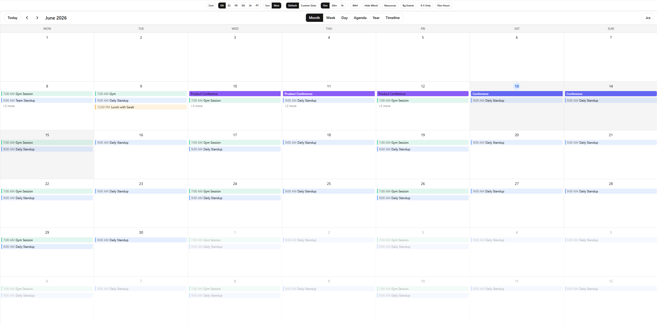
Views
type CalendarView = "month" | "week" | "day" | "agenda";- Month — 6-week grid with event pills, multi-day spanning, "+N more" popover
- Week — 7-column time grid with positioned overlapping events, all-day row, multi-day timed events
- Day — Single-column time grid (same engine as week view)
- Agenda — Chronological event list grouped by date
Multi-day timed events
Timed events that span multiple days (e.g., a conference from Wednesday 10:00 to Friday 16:00) are segmented across each day in the Week/Day view. The first day shows the event from start time to day end, middle days show full-height, and the last day shows from day start to end time.
Drag & Drop, Resize, and Slot Selection
Enable interactions with enableDnD={true}:
<Calendar
  events={events}
  enableDnD
  onEventDrop={(event, newStart, newEnd) => {
    await api.updateEvent(event.id, { start: newStart, end: newEnd });
  }}
  onEventResize={(event, newStart, newEnd) => {
    await api.updateEvent(event.id, { start: newStart, end: newEnd });
  }}
  onSlotSelect={(start, end) => {
    // User dragged across a time range to create an event
    openCreateModal({ start, end });
  }}
/>- Pointer Events — All interactions use the Pointer Events API, working seamlessly on mouse, touch, and stylus
- Event move — Drag events across days (month) or time slots (week/day)
- Event resize — Drag the bottom edge of events in week/day view to change duration
- Drag-to-create — Drag across empty slots to select a time range
- 15-minute snap — Week/day interactions snap to 15-minute increments
- Touch support — Works on mobile and tablet with no extra configuration
Recurrence
Create recurring events using the recurrence property on CalendarEvent:
const events = [
  {
    id: "standup",
    title: "Daily Standup",
    start: "2026-03-13T09:00:00",
    end: "2026-03-13T09:30:00",
    recurrence: { freq: "daily" },
  },
  {
    id: "review",
    title: "Sprint Review",
    start: "2026-03-13T14:00:00",
    end: "2026-03-13T15:00:00",
    recurrence: {
      freq: "weekly",
      byDay: ["FR"],
      count: 12,
    },
  },
];
Expanding recurring events
The calendar does not auto-expand recurring events. Use expandRecurringEvents() from the core:
import { expandRecurringEvents } from "trud-calendar-core";

const expanded = expandRecurringEvents(events, rangeStart, rangeEnd);
// Returns: original non-recurring events + generated instances for recurring ones
Each generated instance has:
recurringEventId— ID of the parent eventoriginalDate— the date this instance was generated for- A synthetic
idin the formatparentId::YYYY-MM-DD
RecurrenceRule
interface RecurrenceRule {
  freq: "daily" | "weekly" | "monthly" | "yearly";
  interval?: number;     // Every N periods (default: 1)
  byDay?: RecurrenceDay[];  // "MO", "TU", "WE", "TH", "FR", "SA", "SU"
  byMonthDay?: number[]; // Day of month: [1, 15]
  bySetPos?: number[];   // Position in set: [1] = first, [-1] = last
  count?: number;        // Stop after N occurrences
  until?: string;        // Stop after this date (YYYY-MM-DD)
}
Editing recurring events
Use exDates to exclude specific dates from a series:
const event = {
  id: "standup",
  title: "Daily Standup",
  start: "2026-03-13T09:00:00",
  end: "2026-03-13T09:30:00",
  recurrence: { freq: "daily" },
  exDates: ["2026-03-17", "2026-03-24"], // Skip these dates
};
To edit a single occurrence: add the date to exDates on the parent, then create a standalone event for the exception. To edit the whole series: update the parent event directly.
Locale & i18n
Date formatting
Pass a BCP 47 locale string. All date/time formatting uses the native Intl API — no extra dependencies.
<Calendar
  events={events}
  locale={{
    locale: "es-ES",
    weekStartsOn: 1, // Monday
  }}
/>
UI labels
All button and label text is customizable via locale.labels:
<Calendar
  events={events}
  locale={{
    locale: "es-ES",
    weekStartsOn: 1,
    labels: {
      today: "Hoy",
      month: "Mes",
      week: "Semana",
      day: "Dia",
      agenda: "Agenda",
      allDay: "todo el dia",
      noEvents: "No hay eventos en este periodo",
      more: (n) => `+${n} mas`,
    },
  }}
/>
You only need to provide the labels you want to override — the rest fall back to English defaults.
interface CalendarLabels {
  today: string;
  month: string;
  week: string;
  day: string;
  agenda: string;
  allDay: string;
  noEvents: string;
  more: (count: number) => string;
}
Controlled mode
Control the date and/or view from outside:
const [date, setDate] = useState("2026-03-13");
const [view, setView] = useState<CalendarView>("week");

<Calendar
  events={events}
  date={date}
  view={view}
  onDateChange={setDate}
  onViewChange={setView}
/>
Or use uncontrolled mode with defaultDate and defaultView (no callbacks needed).
Time grid customization
Limit the visible hours in week/day views:
<Calendar
  events={events}
  dayStartHour={8}   // Start at 8 AM
  dayEndHour={20}    // End at 8 PM
/>
Slots API
Replace any sub-component with your own. Slot components receive typed props — use them to build completely custom UIs while keeping the calendar's state management, layout algorithms, and navigation.
<Calendar
  events={events}
  slots={{
    toolbar: MyCustomToolbar,
    dayCell: MyCustomDayCell,
    timeEvent: MyCustomTimeEvent,
    allDayEvent: MyCustomAllDayEvent,
    popover: MyCustomPopover,
    agendaEvent: MyCustomAgendaEvent,
  }}
/>
Available slots
| Slot | Props | Used in |
|------|-------|---------|
| toolbar | ToolbarSlotProps | All views |
| dayCell | DayCellSlotProps | Month view |
| timeEvent | TimeEventSlotProps | Week/Day view |
| allDayEvent | AllDayEventSlotProps | Week/Day view |
| popover | PopoverSlotProps | All views |
| agendaEvent | AgendaEventSlotProps | Agenda view |
Example: Custom toolbar
import type { ToolbarSlotProps } from "trud-calendar";

function MyToolbar({ formattedDate, view, onPrev, onNext, onToday, onViewChange }: ToolbarSlotProps) {
  return (
    <div className="flex items-center justify-between p-4">
      <div className="flex gap-2">
        <button onClick={onPrev}>Back</button>
        <button onClick={onToday}>Today</button>
        <button onClick={onNext}>Forward</button>
      </div>
      <h2>{formattedDate}</h2>
      <select value={view} onChange={(e) => onViewChange(e.target.value as any)}>
        <option value="month">Month</option>
        <option value="week">Week</option>
        <option value="day">Day</option>
        <option value="agenda">Agenda</option>
      </select>
    </div>
  );
}

<Calendar events={events} slots={{ toolbar: MyToolbar }} />
Example: Custom day cell
import type { DayCellSlotProps } from "trud-calendar";

function MyDayCell({ date, isToday, isCurrentMonth, events }: DayCellSlotProps) {
  return (
    <div className={`p-2 ${isToday ? "bg-blue-100" : ""} ${!isCurrentMonth ? "opacity-30" : ""}`}>
      <span>{new Date(date).getDate()}</span>
      {events.length > 0 && <span className="text-xs">({events.length})</span>}
    </div>
  );
}
Theming
The calendar uses CSS custom properties that automatically inherit from shadcn/ui if present. Override any variable to customize the look:
:root {
  --trc-background: #ffffff;
  --trc-foreground: #0a0a0a;
  --trc-muted: #f5f5f5;
  --trc-muted-foreground: #737373;
  --trc-border: #e5e5e5;
  --trc-primary: #171717;
  --trc-primary-foreground: #fafafa;
  --trc-accent: #f5f5f5;
  --trc-accent-foreground: #171717;
  --trc-card: #ffffff;
  --trc-card-foreground: #0a0a0a;
  --trc-ring: #171717;
  --trc-radius: 0.5rem;

  /* Calendar-specific */
  --trc-today-bg: #dbeafe;
  --trc-today-text: #1d4ed8;
  --trc-event-default: #3b82f6;
  --trc-current-time: #ef4444;
  --trc-hour-height: 3rem;
}
Dark mode
Add the .dark class to a parent element. The built-in dark theme activates automatically:
<div className={darkMode ? "dark" : ""}>
  <Calendar events={events} />
</div>
shadcn compatibility
If your project already uses shadcn/ui, the calendar inherits your theme automatically — the CSS variables fall back to shadcn's var(--background), var(--foreground), etc. No extra configuration needed.
Hooks
Use these hooks inside <CalendarProvider> to build custom calendar UIs from scratch.
useCalendar()
Main orchestrator — combines state, events, and navigation.
const {
  currentDate,    // DateString
  view,           // CalendarView
  events,         // CalendarEvent[] (all)
  visibleEvents,  // CalendarEvent[] (filtered to visible range)
  visibleRange,   // { start, end }
  locale,         // string
  prev, next, today,
  setDate, setView,
} = useCalendar();
useNavigation()
Date navigation and view switching.
const {
  currentDate,
  view,
  formattedDate,  // Locale-aware title (e.g., "March 2026")
  prev, next, today,
  setDate, setView,
} = useNavigation();
useEvents()
Event data for the visible range.
const {
  visibleEvents,
  getForDay,       // (date: DateString) => CalendarEvent[]
  partitioned,     // { allDay: CalendarEvent[], timed: CalendarEvent[] }
  segments,        // EventSegment[] (multi-day segments)
  groupedByDate,   // Map<DateString, CalendarEvent[]>
} = useEvents();
useEventLayout(events)
Column-packing algorithm for overlapping events in the time grid.
const positioned: PositionedEvent[] = useEventLayout(timedEvents);
// Each PositionedEvent has: event, column, totalColumns, top, height
useCurrentTime(intervalMs?)
Live clock for "current time" indicators. Updates every 60s by default.
const { now, today, timeOfDay } = useCurrentTime();
// timeOfDay: fractional hour (14.5 = 2:30 PM)
useEventDrag()
Pointer-based event drag hook. Use it to build custom drag interactions for moving events.
const { dragState, onPointerDown, isDragging, didDrag } = useEventDrag({
  mode: "time", // "time" for week/day, "date" for month
  onEventDrop,
  enableDnD,
});
useGridKeyboard()
Keyboard navigation hook implementing the WAI-ARIA grid pattern with roving tabindex.
const grid = useGridKeyboard({
  cols: 7,
  rows: 24,
  onActivate: (row, col) => handleSlotClick(row, col),
  onEscape: () => blurGrid(),
});
// grid.registerCell(row, col), grid.getTabIndex(row, col), grid.handleKeyDown, grid.handleFocus
useUndoableEvents()
Wraps a CalendarEvent[] with undo/redo support. Auto-snapshots on onEventDrop and onEventResize, with Ctrl+Z / Ctrl+Shift+Z keyboard shortcuts built in.
const {
  events,        // CalendarEvent[] — current state
  setEvents,     // (events) => void — update + snapshot
  onEventDrop,   // auto-snapshots before applying
  onEventResize, // auto-snapshots before applying
  undo, redo,    // () => void
  canUndo, canRedo, // boolean
  snapshot,      // () => void — manual snapshot
} = useUndoableEvents({ initialEvents, maxHistory: 30 });
useEventSelection()
Multi-select event management with Set-based tracking.
const {
  selectedIds,    // Set<string>
  isSelected,     // (id: string) => boolean
  toggle,         // (id: string) => void — Ctrl+click
  rangeSelect,    // (id: string, sortedIds: string[]) => void — Shift+click
  clearSelection, // () => void
  selectAll,      // (ids: string[]) => void
} = useEventSelection();
useResponsiveView()
Adaptive layout hook using ResizeObserver.
const {
  isMobile,       // boolean (< 640px)
  isTablet,       // boolean (640px – 1024px)
  containerWidth, // number
  visibleDays,    // 1 | 3 | 7
} = useResponsiveView(containerRef);
useSwipeNavigation()
Touch swipe detection for prev/next navigation (touch-only, ignores mouse).
const swipe = useSwipeNavigation({
  onSwipeLeft: () => next(),
  onSwipeRight: () => prev(),
  threshold: 50,
});
// Spread swipe.onPointerDown, swipe.onPointerMove, swipe.onPointerUp on the container
useVirtualScroll()
Viewport-based scroll tracking for filtering visible events in large datasets.
const { viewportTop, viewportBottom, isVirtualized } = useVirtualScroll({
  containerRef,
  totalHours: 24,
  enabled: true,
});
useDateFormat()
Locale-aware date formatting functions.
const fmt = useDateFormat();
fmt.toolbarTitle("2026-03-13", "month"); // "March 2026"
fmt.time("2026-03-13T14:30:00");         // "2:30 PM"
fmt.timeRange(start, end);               // "2:30 – 3:00 PM"
fmt.weekdayShort("2026-03-13");          // "Fri"
Headless core
The trud-calendar-core package provides all logic with zero dependencies and zero React dependency. Use it to build calendar UIs in any framework.
npm install trud-calendar-coreWhat's included
- Types —
CalendarEvent,CalendarView,DateString,DateTimeString,PositionedEvent,EventSegment,RecurrenceRule,TimedEventSegment,UndoStack,VirtualRange - Date utils —
addDays,startOfWeek,startOfMonth,isSameDay,eachDayOfRange,getVisibleRange, ... - Formatting —
formatToolbarTitle,formatTime,formatTimeRange,formatAgendaDate(all viaIntl) - Event utils —
sortEvents,filterEventsInRange,segmentMultiDayEvent,segmentTimedMultiDayEvent,groupEventsByDate - Recurrence —
expandRecurringEvents,generateOccurrences(RFC 5545 RRULE expansion) - Layout algorithm —
buildOverlapGroups,assignColumns,computeTimePositions(column-packing) - Undo/Redo —
createUndoStack,pushState,undo,redo,canUndo,canRedo(generic, framework-agnostic) - Virtualization —
filterVisibleEvents,scrollToViewportRange(viewport-based event filtering) - State —
calendarReducer,createInitialState
import {
  getVisibleRange,
  filterEventsInRange,
  computeTimePositions,
  formatTime,
} from "trud-calendar-core";

const range = getVisibleRange("2026-03-13", "week", 1);
const visible = filterEventsInRange(events, range.start, range.end);
const positioned = computeTimePositions(timedEvents, 0, 24);
License
MIT