
uikitly-react
v1.0.2
Published
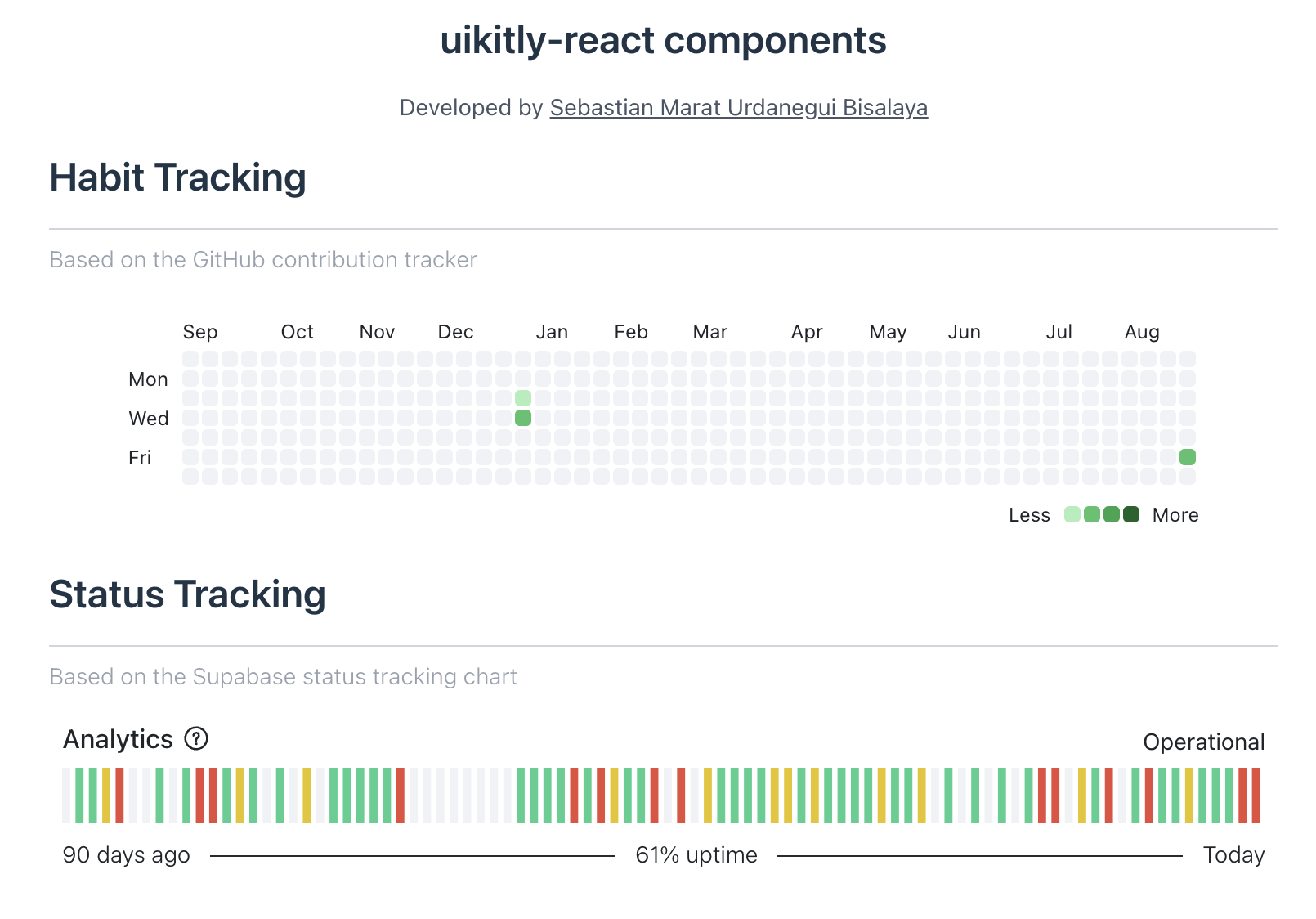
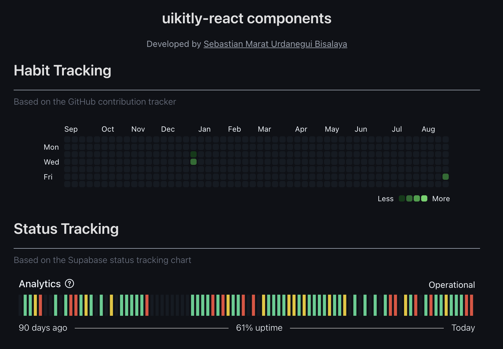
uikitly-react is a TypeScript library that provides two customizable react components inspired by GitHub's contribution tracker and status tracking chart.
Maintainers
 sebastianurdanegui
Readme
uikitly-react Components
uikitly-react is a TypeScript library that provides two customizable react components inspired by GitHub's contribution tracker and status tracking chart.
Both components support light and dark themes out of the box, allowing you to easily adapt them to your design preferences.
The goal of this library is to help developers save working hours by reusing ready-to-use, flexible table-based components.
Developed by Sebastian Marat Urdanegui Bisalaya
Installing
Using npm:
npm install uikitly-reactUsing pnpm:
pnpm add uikitly-reactComponents
Usage - Habit Tracking
Component properties
| Prop | Required | Type | Description |
| -------------- | :------: | :--------------: | ----------- |
| bgColor | ❌ | string | Background color of cells that have no activity. Default: bg-[#EFF2F5] dark:bg-[#151B23]. |
| className | ❌ | string | Additional CSS classes |
| colors | ❌ | ColorRank[] | Array of objects used to fill the background of each cell based on its activity. By default, this array uses colors from the GitHub contribution tracker. |
| data | ✅ | StatsList[] | Array of objects that contains the user data based on activity (value) of each day (date). |
| legendLabelMax | ❌ | string | Legend name of minimum value. Default: 'Less'. |
| legendLabelMin | ❌ | string | Legend name of maximum value. Default: 'More'. |
| months | ❌ | string[] | Array of strings with the months. Length: exactly 12. |
| onCellClick | ❌ | (data: { date: string; value: number; }) => void | Callback function when a cell is clicked |
| textColor | ❌ | string | Default: text-[#1f2328] dark:text-[#f0f6fc] |
| tooltipLabel | ❌ | string | Detail tasks of each day. Default: 'tasks on'. |
| weekDays | ❌ | string[] | Array of strings with the days of the week. Length: exactly 7. |
Types: | Type | Description | | --- | --- | | ColorRank | { min: number; max: number; color: string; } | | StatsList | { date: string; value: number; } |
Example
Using React with TypeScript:
import { HabitTracking, type HabitTrackingProps } from 'uikitly-react';

type HabitTrackingData = HabitTrackingProps["data"];

function App() {
  const [habitTracking, setHabitTracking] = useState<HabitTrackingData[]>([{"date":"2025-01-01","value":5},{"date":"2025-01-02","value":10},{"date":"2025-08-30","value":8}]);

  return (
    <div className="w-full max-w-3xl mx-auto flex flex-col items-center gap-4 p-2">
      <div className='flex flex-col justify-center items-center p-2'>
        <HabitTracking
          data={habitTracking}
        />
      </div>
    </div>
  );
}
Usage - Status Tracking
Component properties
| Prop | Required | Type | Description |
| ---------------- | :------: | :--------------------: | ----------- |
| bgRankEmpty | ❌ | string | Background color of rectangle without data in light theme. Default: #EFF2F5. |
| bgRankEmptyDark | ❌ | string | Background color of rectangle without data in dark theme. Default: #151B23. |
| bgSpacer | ❌ | string | Background color of spacer. Default: bg-[#2a2a2a] dark:bg-[#aaaaaa]. |
| className | ❌ | string | Additional CSS classes |
| data | ✅ | TooltipStatus[] | Array of objects that contains the activity of your product or service. |
| fill | ❌ | Record<string, string> | Object used to fill the background of each rectangle based on its level. The level types are 'zero', 'low', 'high', null. By default, if the level type is null, the color is bgRankEmpty in light theme and bgRankEmptyDark in dark mode. |
| fromDateLabel | ❌ | string | Indicates the legend based on length of the period of time that the user is analyzing. Default: 'days ago'. |
| status | ✅ | string | Indicator of the latest status of the analytic chart. |
| textColor | ❌ | string | Default: text-[#1f2328] dark:text-[#f0f6fc] |
| titleComponent | ✅ | string | Main title of the analytic chart. |
| toDateLabel | ❌ | string | Default: 'Today'. |
| tooltipContentMark | ✅ | string | Description of the main metric of that chart. |
| uptimeLabel | ❌ | string | Default: 'uptime'. |
Types: | Type | Description | | --- | --- | | TooltipStatus | { date: string; mainTitle: string | null; content: string; level: 'zero' | 'low' | 'high' | null; } |
Example
Using React with TypeScript:
import { StatusTracking, type StatusTrackingProps } from 'uikitly-react';

type StatusTrackingData = StatusTrackingProps["data"];

function App() {
  const [statusTracking, setStatusTracking] = useState<StatusTrackingData[]>([{date: "2025-09-01", mainTitle: "Métrica", content: "Sin inconveniente.", level: null }, { date: "2025-08-31", mainTitle: "Métrica", content: "Sin inconveniente.", level: "zero" }, { date: "2025-08-30", mainTitle: "Métrica", content: "Sin inconveniente.", level: "zero" }, ... ]);

  return (
    <div className="w-full max-w-3xl mx-auto flex flex-col items-center gap-4 p-2">
      <div className='flex flex-col justify-center items-center p-2'>
        <StatusTracking
          data={statusTracking}
          titleComponent="Analytics"
          status="Operational"
          tooltipContentMark="Company analytics powers logs, metrics, and reports for all users."
        />
      </div>
    </div>
  );
}
Contributing
We welcome contributions from the community! 🎉
If you’d like to improve this project, follow these steps:
- Fork this repository and clone your fork:
git clone https://github.com/your-username/uikitly-react.git
cd uikitly-react
pnpm install- Create a new branch for your feature or fix:
git switch -c my-new-feature- Make your changes and commit them with a clear, descriptive message:
git add .
git commit -m "feat: add new feature to improve X"- Push your branch to your fork:
git push origin my-new-feature- Open a Pull Request to the main branch of this repository.
Please include a description of your changes and why they are useful.
License
MIT