
uni-checkbox-field
v1.0.2
Published
<uni-checkbox-field /> is an encapsulated Web Component built upon the foundation of the uniopen design language. Implementation is straightforward: simply slot a standard input element inside <uni-checkbox-field />. The component instantly applies a user


Readme
uni-checkbox-field


<uni-checkbox-field /> is an encapsulated Web Component built upon the foundation of the uniopen design language.
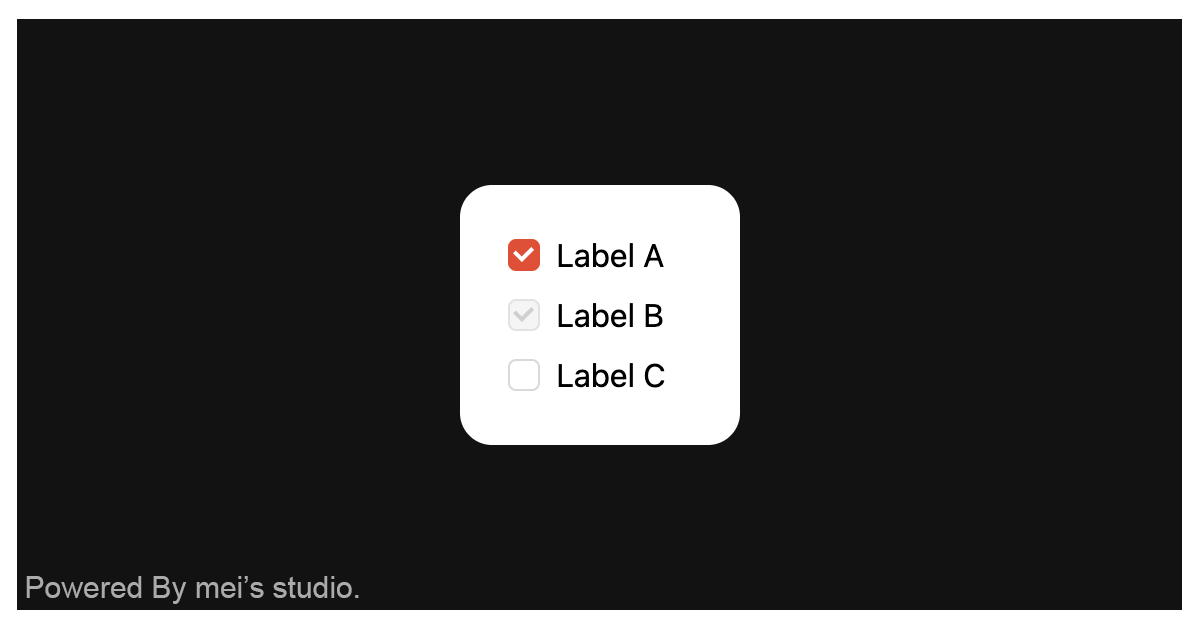
Implementation is straightforward: simply slot a standard input element inside <uni-checkbox-field />. The component instantly applies a user interface that aligns seamlessly with the uniopen design language guidelines. Furthermore, its visual styles can be dynamically adapted via native HTML attributes or JavaScript properties.
Basic Usage
<uni-checkbox-field /> is a web component. All we need to do is put the required script into your HTML document. Then follow <uni-checkbox-field />'s html structure and everything will be all set.
Required Script
<script
  type="module"
  src="https://unpkg.com/uni-checkbox-field/mjs/wc-uni-checkbox-field.js">
</script>
Structure
Put <uni-checkbox-field /> into HTML document. It will have different functions and looks with attribute mutation.
<uni-checkbox-field>
  <input
    slot="checkbox"
    type="checkbox"
    value="my-value"
  />
</uni-checkbox-field>
<uni-checkbox-field /> dynamically adjusts its user interface and core functionality by strictly adhering to the attributes of the encapsulated input element. Developers can leverage these capabilities and observe the corresponding behavioral shifts by modifying standard attributes—such as disabled—directly on the input element.
  <uni-checkbox-field>
    <input
      slot="checkbox"
      type="checkbox"
      value="my-value"
      disabled
    />
  </uni-checkbox-field>
JavaScript Instantiation
<uni-checkbox-field /> could also use JavaScript to create DOM element. Here comes some examples.
<script type="module">
import { UniCheckboxField } from 'https://unpkg.com/uni-checkbox-field/mjs/wc-uni-checkbox-field.js';

const checkboxTemplate = document.querySelector('.my-checkbox-template');

// use DOM api
const nodeA = document.createElement('uni-checkbox-field');
nodeA.appendChild(checkboxTemplate.content.cloneNode(true));
document.body.appendChild(nodeA);

// new instance with Class
const nodeB = new UniCheckboxField();
nodeB.appendChild(checkboxTemplate.content.cloneNode(true));
document.body.appendChild(nodeB);
</script>
Style Customization
Developers could apply styles to decorate <uni-checkbox-field />'s looking.
<style>
uni-checkbox-field {
  --uni-checkbox-field-border-color-normal: var(--ct_checkbox_main_focus-outline_default);
  --uni-checkbox-field-border-color-hover: var(--ct_checkbox_main_focus-outline_hover);
  --uni-checkbox-field-border-color-checked: var(--ct_checkbox_main_container_selected);
  --uni-checkbox-field-border-color-checked: var(--ct_checkbox_main_focus-outline_disabled);

  --uni-checkbox-field-background-color-normal: var(--ct_checkbox_main_container_default);
  --uni-checkbox-field-background-color-hover: var(--ct_checkbox_main_container_hover);
  --uni-checkbox-field-background-color-checked: var(--ct_checkbox_main_container_selected);
  --uni-checkbox-field-background-color-disabled: var(--ct_checkbox_main_container_disabled);

  --uni-checkbox-field-checkmark-color-normal: var(--ct_checkbox_main_unit_selected);
  --uni-checkbox-field-checkmark-color-disabled: var(--ct_checkbox_moderate_unit_disabled);
}
</style>
Attribute
<uni-checkbox-field /> component exposes a curated set of attributes, enabling developers to dynamically adjust the user interface. This provides the flexibility to tailor the component’s appearance to seamlessly adapt to any given context.
round
By applying the
roundattribute, the appearance of the <uni-checkbox-field /> UI can be modified, transforming its border from a square to acircleto accommodate different design contexts. By default, without the attribute, the checkbox renders as a square.<uni-checkbox-field> <input slot="checkbox" type="checkbox" value="my-value" round /> </uni-checkbox-field>
Property
| Property Name | Type | Description |
| ----------- | ----------- | ----------- |
| round | Boolean | Getter / Setter round. round configures the appearance of the <uni-checkbox-field /> UI, transforming its border from a square to a circle to accommodate different design contexts. Default is false. |
Method
| Mathod Signature | Description | | ----------- | ----------- | | refresh() | Force a UI refresh on <uni-checkbox-field />. |