
uni-lb-action-sheet
v1.0.2
Published
uniapp自定义可左右互动Action操作列表
Downloads
21

Readme
工做项目需要,开发了一个可自定义的 Action 操作列表,支持左右滑动,可配置性强,可自定义性高。
Github:uni-lb-action-sheet
兼容性
App + H5 + 各平台小程序(快应用、360、nvue 未测试)
引入插件
单独引入,在需要使用的页面上 import 引入即可
<template>
  <view>
    <lb-action-sheet></lb-action-sheet>
  </view>
</template>

<script>
  import LbActionSheet from '@/components/lb-action-sheet'
  export default {
    components: {
      LbActionSheet
    }
  }
</script>全局引入,main.js中 import 引入并注册即可全局使用
import LbActionSheet from '@/components/lb-action-sheet'
Vue.component("lb-action-sheet", LbActionSheet)
easycom 引入
pages.json加上如下配置:
"easycom": {
  "autoscan": true,
  "custom": {
    "lb-action-sheet": "@/components/lb-action-sheet/index.vue"
  }
}
npm 安装引入:
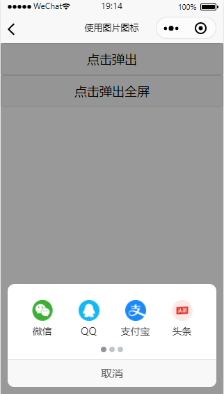
npm install uni-lb-action-sheetimport LbActionSheet from 'uni-lb-action-sheet'操作列表数据基本格式,更多字段详情见下Actions字段详解
[
  {
    "name": "wx",
    "label": "微信",
    "image": "/static/wx.png"
  },
  {
    "name": "qq",
    "label": "QQ",
    "image": "/static/qq.png"
  },
  {
    "name": "zfb",
    "label": "支付宝",
    "image": "/static/zfb.png"
  },
  {
    "name": "tt",
    "label": "头条",
    "image": "/static/tt.png"
  }
]
调用显示
通过ref形式手动调用show方法显示,隐藏同理调用hide
<lb-action-sheet ref="actionSheet"></lb-action-sheet>

this.$refs.actionSheet.show() // 显示
this.$refs.actionSheet.hide() // 隐藏
小程序开放能力支持,同 Button
actions: [
  {
    "name": "wx",
    "label": "微信",
    "image": "/static/wx.png",
    "openType": "getUserInfo" // 开放能力的获取用户信息
  }
]
<lb-action-sheet ref="actionSheet" @getuserinfo="getuserinfo"></lb-action-sheet>
getuserinfo (e) {
console.log(res) // 获取的用户信息
}插槽使用
选择器支持一些可自定义化的插槽,如自定义底部取消按钮,可使用插槽,使用方法如下:
<lb-action-sheet>
  <view slot="footer">我是自定义取消</view>
</lb-action-sheet>
其他插槽见下。
参数及事件
Props
| 参数 | 说明 | 类型 | 可选值 | 默认值 |
| :--------------------- | :----------------------------------- | :------ | :--------- | :----------------- |
| actions | 操作列表数据,详细说明见下Actions | Array | - | - |
| full | 是否整屏宽度显示 | Boolean | true/false | false |
| column-num | 每列的图标个数 | Number | - | 4 |
| row-num | 行数 | Number | - | 2 |
| grid-height | 每个格子的高度,单位 px | Number | - | 80 |
| image-width | 图片图标的宽度 | String | - | 30px |
| image-height | 图片图标的高度,未指定同 image-width | String | - | - |
| icon-prefix | icon 图标指定前缀 | String | - | - |
| icon-size | icon 图标大小 | String | - | 30px |
| icon-color | icon 图标颜色,彩色图标不支持此属性 | String | - | - |
| label-color | 图标文字颜色 | String | - | #303133 |
| label-size | 图标文字大小 | String | - | 14px |
| radius | 弹出区域圆角支持 | String | - | 10px |
| cancel-text | 取消文字 | String | - | 取消 |
| cancel-color | 取消文字颜色 | String | - | #606266 |
| cancel-size | 取消文字大小 | String | - | 16px |
| close-on-click | 点击图标是否关闭弹出区域 | Boolean | true/false | true |
| close-on-click-mask | 点击遮罩层是否关闭弹出区域 | Boolean | true/false | true |
| mask-color | 遮罩层背景色 | String | - | rgba(0, 0, 0, 0.4) |
| indicator-dots | 是否显示面板指示点 | Boolean | true/false | true |
| indicator-size | 面板指示点大小 | String | - | 8px |
| indicator-color | 面板指示点颜色 | String | - | #c0c4cc |
| indicator-active-color | 当前选中的指示点颜色 | String | - | #909399 |
| animation | 是否显示动画效果 | Boolean | true/false | true |
| inline | 是否 inline 模式 | Boolean | true/false | false |
| z-index | 层级,遮罩层层级默认-1 | Boolean | true/false | false |
Actions
| 字段 | 说明 | 类型 | 可选值 | 默认值 |
| :-------------------------------------- | :-------------------------------------------------------------------------------- | :------------ | :----- | :----- |
| name | 数据 name,需唯一 | String/Number | - | - |
| label | 数据文字 | String | - | - |
| image | 图片地址,与 icon 只需要设置一个 | String | - | - |
| imageWdith | 图标宽度,如无设置,取props中的image-width | String | - | - |
| imageHeight | 图标宽度, 如无设置,取props中的image-height,需要小于props中的grid-height | String | - | - |
| icon | 图标 icon,与 image 只需要设置一个 | String | - | - |
| iconSize | 图标大小, 如无设置,取props中的icon-size | String | - | - |
| iconColor | 图标颜色, 如无设置,取props中的icon-color,彩色图标不支持此属性 | String | - | - |
| disabled | 是否禁用 | Boolean | - | - |
| 开放能力:openType 、appParameter等 | 小程序开放能力参数,同button组件 | - |
方法
| 方法名 | 说明 | 参数 | | :----- | :----------- | :--- | | show | 打开操作面板 | - | | hide | 关闭操作面板 | - |
Events
| 事件名称 | 说明 | 回调参数 |
| :----------- | :--------------------------------------------------- | :------- |
| show | 打开操作面板时触发 | - |
| hide | 关闭操作面板时触发 | - |
| cancel | 点击面板取消时触发,会同时触发hide事件 | - |
| 开放能力事件 | 小程序开放能力事件,同button组件,如@getuserinfo | - |
插槽
| 插槽名 | 说明 | | :----- | :----------- | | footer | 底部取消按钮 |
iconfont 彩色图片使用方法
在iconfont中,将需要的彩色图标加入到项目中,点击Symbol,生成下面的一个 js 地址,如图所示:
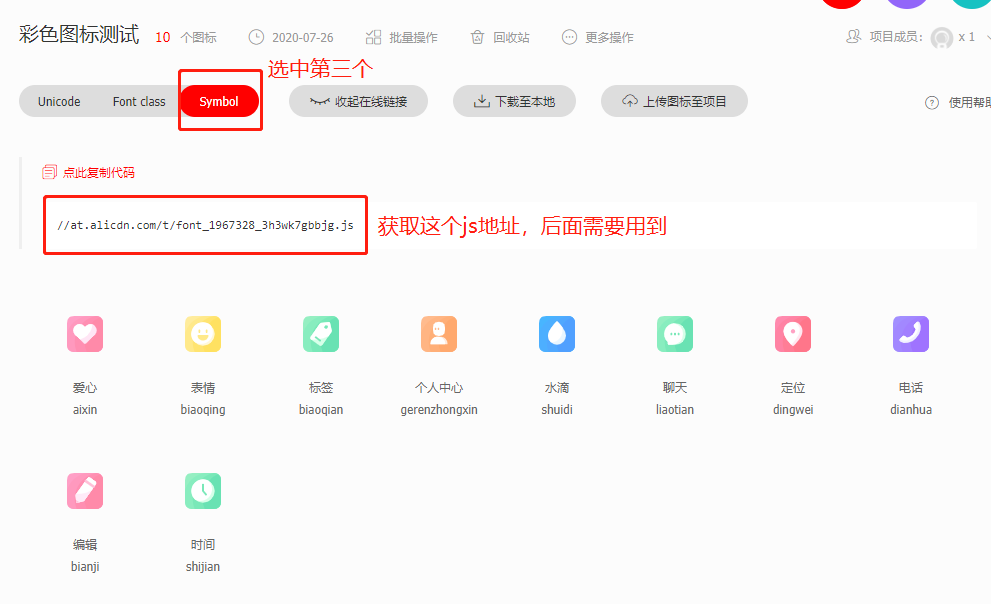
然后参考该教程使用即可:https://github.com/HuaRongSAO/iconfont-tools。
下面简单说下步骤:
1.全局安装iconfont-tools:执行该npm i -g iconfont-tools进行安装
2.在项目根目录,执行下面的命令,将命令中的//at.alicdn.com/t/font_1967328_3h3wk7gbbjg.js换成上图自己的图标的文件 js 地址,一路回车至结束
(备注:如果你是用 HX 编辑器,直接点击启动项目的右侧的新建终端标签卡,输入下面的命令即可)
iconfont-tools --from //at.alicdn.com/t/font_1967328_3h3wk7gbbjg.js --to ./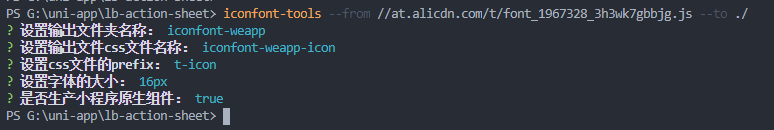
期间也可以按提示修改输出的文件夹名称、css 文件名称等等。
3.删除其他文件,我们只需要保留一个iconfont-weapp-icon.csscss 文件即可,这个文件的位置可以随意放到哪儿,最后只需要在main.js中引入即可
import './iconfont-weapp/iconfont-weapp-icon.css'4.剩下的参考demo6即可,注意需要设置icon-prefix,值为执行iconfont-tools中的设置css文件的prefix
其他
其他功能参考示例 Demo 代码。