
uni-tab-group
v1.0.1
Published
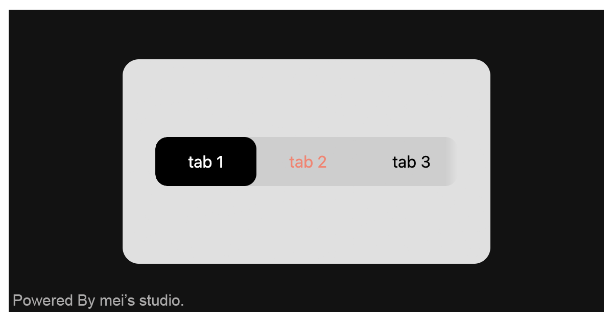
<uni-tab-group /> is a tab component designed to instantly apply uniopen's design elements to any child element assigned with [slot=tab], enabling rapid integration across multiple pages.


Readme
uni-tab-group

<uni-tab-group /> is a tab component designed to instantly apply uniopen's design elements to any child element assigned with [slot=tab], enabling rapid integration across multiple pages.
Basic Usage
<uni-tab-group /> is a web component. All we need to do is put the required script into your HTML document. Then follow <uni-tab-group />'s html structure and everything will be all set.
Required Script
<script
  type="module"
  src="https://unpkg.com/uni-tab-group/mjs/wc-uni-tab-group.js">
</script>
Structure
Put <uni-tab-group /> into HTML document. It will have different functions and looks with attribute mutation.
<uni-tab-group>
  <a href="#tab1" slot="tab" data-active>tab 1</a>
  <a href="#tab2" slot="tab">tab 2</a>
  <a href="#tab3" slot="tab">tab 3</a>
  <a href="#tab4" slot="tab">tab 4</a>
  <a href="#tab5" slot="tab">tab 5</a>
</uni-tab-group>
JavaScript Instantiation
<uni-tab-group /> could also use JavaScript to create DOM element. Here comes some examples.
<script type="module">
import { UniTabGroup } from 'https://unpkg.com/uni-tab-group/mjs/wc-uni-tab-group.js';

const tabsTemplate = document.querySelector('.my-tabs-template');

// use DOM api
const nodeA = document.createElement('uni-tab-group');
nodeA.appendChild(tabsTemplate.content.cloneNode(true));
document.body.appendChild(nodeA);

// new instance with Class
const nodeB = new UniTabGroup();
nodeB.appendChild(tabsTemplate.content.cloneNode(true));
document.body.appendChild(nodeB);
</script>
Style Customization
Developers could apply styles to decorate <uni-tab-group />'s looking.
<style>
uni-tab-group {
  --uni-tab-group-text-color-normal: var(--ct_text_main_general);
  --uni-tab-group-text-color-hover: var(--ct_text_moderate_subtlest);
  --uni-tab-group-text-color-active: var(--ct_text_inverse_general);

  --uni-tab-group-background-color-normal: transparent;
  --uni-tab-group-background-color-hover: transparent;
  --uni-tab-group-background-color-active: var(--ct_tab-segmented_unit_selected);

  --uni-tab-group-mask-size: 12px;
}
</style>
Additionally, a specific tab can be highlighted simply by applying the data-active attribute.
<uni-tab-group>
  <a href="#tab1" slot="tab" data-active>tab 1</a>
  <a href="#tab2" slot="tab">tab 2</a>
  <a href="#tab3" slot="tab">tab 3</a>
</uni-tab-group>
Attribute
<uni-tab-group /> component exposes a curated set of attributes, enabling developers to dynamically adjust the user interface. This provides the flexibility to tailor the component’s appearance to seamlessly adapt to any given context.
size
The size attribute configures the overall dimensions of <uni-tab-group />. The component currently supports three standard options:
large,medium, andsmall, defaulting tomedium.<uni-tab-group size="medium" > <a href="#tab1" slot="tab" data-active>tab 1</a> <a href="#tab2" slot="tab">tab 2</a> <a href="#tab3" slot="tab">tab 3</a> <a href="#tab4" slot="tab">tab 4</a> <a href="#tab5" slot="tab">tab 5</a> </uni-tab-group>
Property
| Property Name | Type | Description |
| ----------- | ----------- | ----------- |
| size | String | Getter / Setter size. size configures the overall dimensions of <uni-tab-group />. The component currently supports three standard options: large, medium, and small, defaulting to medium. |
Method
| Mathod Signature | Description | | ----------- | ----------- | | refresh() | Force a UI refresh on <uni-tab-group />. |