
unicode-emoji-picker
v2.0.1
Published
Customizable emoji picker web component, based on the Unicode Emoji specification

Maintainers
 typhon
Readme
Unicode Emoji Picker






Unicode Emoji Picker is a custom element (Web Component) that allows you to pick an Emoji from the Unicode Emoji specification.
<unicode-emoji-picker></unicode-emoji-picker>Table of contents
Demo
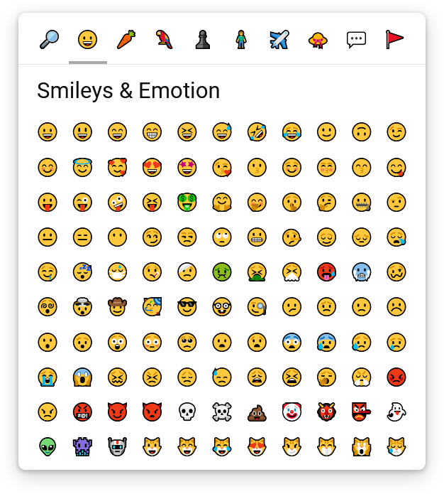
Installation
npm install unicode-emoji-pickerUsage
This package is ESM-only. The recommended way to use it is with a bundler (e.g. webpack, esbuild, ...), which handles module resolution for you.
With a bundler
Define the component:
import { defineUnicodeEmojiPicker } from 'unicode-emoji-picker';
defineUnicodeEmojiPicker();
Then use it in your HTML:
<unicode-emoji-picker></unicode-emoji-picker>Without a bundler
Because unicode-emoji-picker depends on the following packages:
scrollable-componentfor custom scrollbarsunicode-emojifor raw emoji data
You'll need to expose the following files so they are accessible from the web:
/node_modules/scrollable-component/index.js/node_modules/unicode-emoji/index.js/node_modules/unicode-emoji-picker/index.js
And use an Import Map before importing the component from a module script:
<script type="importmap">
  {
    "imports": {
      "scrollable-component": "/node_modules/scrollable-component/index.js",
      "unicode-emoji": "/node_modules/unicode-emoji/index.js",
      "unicode-emoji-picker": "/node_modules/unicode-emoji-picker/index.js"
    }
  }
</script>

<script type="module">
  import { defineUnicodeEmojiPicker } from 'unicode-emoji-picker';
  defineUnicodeEmojiPicker();
</script>
Then use the component in your HTML:
<unicode-emoji-picker></unicode-emoji-picker>Configuration
Unicode Emoji version
You can choose the version of the Unicode Emoji specification to use by setting the version attribute to one of these values:
0.6,0.7,1.0,2.0,3.0,4.0,5.011.0,12.0,12.1,13.0,13.1,14.015.0,15.1,16.0,17.0
It defaults to 12.0 because newer versions are not supported on Windows 10.
<unicode-emoji-picker version="17.0"></unicode-emoji-picker>Default tab
You can choose which tab will be selected by default by setting the default-tab attribute to one of these values:
searchface-emotion(this is the default value)food-drinkanimals-natureactivities-eventsperson-peopletravel-placesobjectssymbolsflags
<unicode-emoji-picker default-tab="search"></unicode-emoji-picker>Tabs position
You can move the tabs bar on every side of the component by setting the tabs-position attribute to one of these values:
top(this is the default value)bottomleftright
<unicode-emoji-picker tabs-position="bottom"></unicode-emoji-picker>Disabling variations
You can disable the variations panel by setting the disable-variations attribute to true:
<unicode-emoji-picker disable-variations="true"></unicode-emoji-picker>When variations are disabled, users won't be able to choose their emoji's skin tone or hairstyle, but they'll save one click when selecting an emoji that would otherwise require choosing a variation.
Custom HTML tag
If you don't like the default <unicode-emoji-picker> tag, you can override it by calling window.customElements.define() instead of calling defineUnicodeEmojiPicker():
import { EmojiPickerElement } from 'unicode-emoji-picker';
window.customElements.define('my-custom-tag', EmojiPickerElement);
And then use it like this:
<my-custom-tag>
  <!-- Your content -->
</my-custom-tag>
JavaScript API
You can use the component's API after the custom <unicode-emoji-picker> element has been defined.
import { defineUnicodeEmojiPicker, whenUnicodeEmojiPickerDefined } from 'unicode-emoji-picker';

defineUnicodeEmojiPicker();

whenUnicodeEmojiPickerDefined().then(() => {
  const emojiPicker = document.querySelector('unicode-emoji-picker');
  // do something
});
Event listener
To retrieve the emoji picked by the user, you can add an event listener:
emojiPicker.addEventListener('emoji-pick', (event) => {
  console.log(event.detail.emoji);
});
Selecting tab
emojiPicker.selectTab('animals-nature');Searching emoji
Only works when the search tab is selected.
emojiPicker.searchEmoji('love face');Clearing search
Only works when the search tab is selected.
emojiPicker.clearSearch();Focusing header
emojiPicker.focusHeader();Focusing content
emojiPicker.focusContent();- If you are on the
searchtab, it will focus the search input - If you are not on the
searchtab, it will focus the first emoji
If you always want to focus the first emoji, no matter the selected tab, you can use focusContent(true).
Translation
You can translate the labels (or change them to whatever you want) using the setTranslation() method after the custom <unicode-emoji-picker> element has been defined:
whenUnicodeEmojiPickerDefined().then(() => {
  emojiPicker.setTranslation({
    'search': {
      emoji: '🔎',
      title: 'Search an Emoji',
      inputPlaceholder: 'Search an Emoji...',
    },
    'face-emotion': {
      emoji: '😀',
      title: 'Smileys & Emotion',
    },
    'food-drink': {
      emoji: '🥕',
      title: 'Food & Drink',
    },
    'animals-nature': {
      emoji: '🦜',
      title: 'Nature & Animals',
    },
    'activities-events': {
      emoji: '♟️',
      title: 'Activities & Events',
    },
    'person-people': {
      emoji: '🧍',
      title: 'People',
    },
    'travel-places': {
      emoji: '✈️',
      title: 'Travel & Places',
    },
    'objects': {
      emoji: '👒',
      title: 'Clothing & Objects',
    },
    'symbols': {
      emoji: '💬',
      title: 'Symbols',
    },
    'flags': {
      emoji: '🚩',
      title: 'Flags',
    },
  });
});
Unfortunately, you cannot translate emoji descriptions or keywords yet.
Customized appearance
You can change the look & feel of the Unicode Emoji Picker using CSS.
Although you can fully customize every part of the component using plain CSS, it may sometimes be easier to override the provided CSS properties first.
CSS properties
Sizing
The Unicode Emoji Picker component is built using the "em" unit, so everything is scaled up from the font-size.
If you want to resize the component, you should override the font-size first (it also directly reflects the font-size for the emoji font).
unicode-emoji-picker {
  font-size: 24px;
}
Density
If you need more control over the density of the component and the font-size isn't precise enough for you, then you can override the following properties:
unicode-emoji-picker {
  /* tabs */
  --tabs-border-width: 1px;
  --tabs-padding: 0.5em;
  --tabs-gap: 0.2em;
  --tab-size: 2em;

  /* title bar */
  --title-bar-height: 3em;
  --title-bar-padding: 1.1em;

  /* emoji grid */
  --emojis-padding: 0.8em;
  --emojis-gap: 0.2em;
  --emoji-size: 1.85em;
  --min-emoji-col-count: 6;
  --max-emoji-col-count: 11;
  --min-emoji-row-count: 4;
  --max-emoji-row-count: 10;
}
You shouldn't go below 6 for --min-emoji-col-count, otherwise it can break the variations panel.
You shouldn't go below 4 for --min-emoji-row-count, otherwise it will make the component hard to use.
Color scheme
You can fully change the color scheme of the component by overriding the following properties:
unicode-emoji-picker {
  /* global */
  --fill-color: #fff;
  --text-color: #111;

  /* tabs */
  --tabs-border-color: #e4e4e4;
  --tab-fill-color-hover: #e9e9e9;
  --tab-active-marker-color: #aaa;

  /* content scrollbar */
  --content-scrollbar-thumb-fill-color: #d7d7d7;
  --content-scrollbar-thumb-fill-color-hover: #aaa;

  /* title bar */
  --title-bar-fill-color: color-mix(in srgb, var(--fill-color), transparent 20%);
  --search-input-border-color: #e4e4e4;
  --search-input-border-color-hover: #222;

  /* emojis */
  --emoji-border-color-hover: #d7d7d7;
  --emoji-variation-marker-color: #d7d7d7;
  --emoji-variation-marker-color-hover: #aaa;

  /* variations panel */
  --variations-backdrop-fill-color: color-mix(in srgb, var(--fill-color), transparent 30%);
  --variations-fill-color: var(--fill-color);
}
Emoji font
You can choose the emoji fonts of your choice (e.g. OpenMoji, Noto Color Emoji, ...) by overriding the following property:
unicode-emoji-picker {
  --emoji-font-family: apple color emoji, segoe ui emoji, noto color emoji, android emoji, emojisymbols, emojione mozilla, twemoji mozilla, segoe ui symbol;
}
Here is an example with the OpenMoji font:
<style>
  @font-face {
    font-family: "OpenMoji";
    src: url("https://cdn.jsdelivr.net/gh/hfg-gmuend/openmoji/font/OpenMoji-color-glyf_colr_0/OpenMoji-color-glyf_colr_0.woff2") format("woff2");
    unicode-range: U+23,U+2A,U+2D,U+30-39,U+A9,U+AE,U+200D,U+203C,U+2049,U+20E3,U+2117,U+2120,U+2122,U+2139,U+2194-2199,U+21A9,U+21AA,U+229C,U+231A,U+231B,U+2328,U+23CF,U+23E9-23F3,U+23F8-23FE,U+24C2,U+25A1,U+25AA-25AE,U+25B6,U+25C0,U+25C9,U+25D0,U+25D1,U+25E7-25EA,U+25ED,U+25EE,U+25FB-25FE,U+2600-2605,U+260E,U+2611,U+2614,U+2615,U+2618,U+261D,U+2620,U+2622,U+2623,U+2626,U+262A,U+262E,U+262F,U+2638-263A,U+2640,U+2642,U+2648-2653,U+265F,U+2660,U+2663,U+2665,U+2666,U+2668,U+267B,U+267E,U+267F,U+2691-2697,U+2699,U+269B,U+269C,U+26A0,U+26A1,U+26A7,U+26AA,U+26AB,U+26B0,U+26B1,U+26BD,U+26BE,U+26C4,U+26C5,U+26C8,U+26CE,U+26CF,U+26D1,U+26D3,U+26D4,U+26E9,U+26EA,U+26F0-26F5,U+26F7-26FA,U+26FD,U+2702,U+2705,U+2708-270D,U+270F,U+2712,U+2714,U+2716,U+271D,U+2721,U+2728,U+2733,U+2734,U+2744,U+2747,U+274C,U+274E,U+2753-2755,U+2757,U+2763,U+2764,U+2795-2797,U+27A1,U+27B0,U+27BF,U+2934,U+2935,U+2B05-2B07,U+2B0C,U+2B0D,U+2B1B,U+2B1C,U+2B1F-2B24,U+2B2E,U+2B2F,U+2B50,U+2B55,U+2B58,U+2B8F,U+2BBA-2BBC,U+2BC3,U+2BC4,U+2BEA,U+2BEB,U+3030,U+303D,U+3297,U+3299,U+E000-E009,U+E010,U+E011,U+E040-E06D,U+E080-E0B4,U+E0C0-E0CC,U+E0FF-E10D,U+E140-E14A,U+E150-E157,U+E181-E189,U+E1C0-E1C4,U+E1C6-E1D9,U+E200-E216,U+E240-E269,U+E280-E283,U+E2C0-E2C4,U+E2C6-E2DA,U+E300-E303,U+E305-E30F,U+E312-E316,U+E318-E322,U+E324-E329,U+E32B,U+E340-E348,U+E380,U+E381,U+F000,U+F77A,U+F8FF,U+FE0F,U+1F004,U+1F0CF,U+1F10D-1F10F,U+1F12F,U+1F16D-1F171,U+1F17E,U+1F17F,U+1F18E,U+1F191-1F19A,U+1F1E6-1F1FF,U+1F201,U+1F202,U+1F21A,U+1F22F,U+1F232-1F23A,U+1F250,U+1F251,U+1F260-1F265,U+1F300-1F321,U+1F324-1F393,U+1F396,U+1F397,U+1F399-1F39B,U+1F39E-1F3F0,U+1F3F3-1F3F5,U+1F3F7-1F4FD,U+1F4FF-1F53D,U+1F549-1F54E,U+1F550-1F567,U+1F56F,U+1F570,U+1F573-1F57A,U+1F587,U+1F58A-1F58D,U+1F590,U+1F595,U+1F596,U+1F5A4,U+1F5A5,U+1F5A8,U+1F5B1,U+1F5B2,U+1F5BC,U+1F5C2-1F5C4,U+1F5D1-1F5D3,U+1F5DC-1F5DE,U+1F5E1,U+1F5E3,U+1F5E8,U+1F5EF,U+1F5F3,U+1F5FA-1F64F,U+1F680-1F6C5,U+1F6CB-1F6D2,U+1F6D5-1F6D7,U+1F6DC-1F6E5,U+1F6E9,U+1F6EB,U+1F6EC,U+1F6F0,U+1F6F3-1F6FC,U+1F7E0-1F7EB,U+1F7F0,U+1F90C-1F93A,U+1F93C-1F945,U+1F947-1F9FF,U+1FA70-1FA7C,U+1FA80-1FA89,U+1FA8F-1FAC6,U+1FACE-1FADC,U+1FADF-1FAE9,U+1FAF0-1FAF8,U+1FBC5-1FBC9,U+E0061-E0067,U+E0069,U+E006C-E0079,U+E007F;
  }

  unicode-emoji-picker {
    --emoji-font-family: "OpenMoji";
  }
</style>
CSS transitions
You can change the CSS transitions globally by overriding the following property:
unicode-emoji-picker {
  --transition: 150ms cubic-bezier(0, 0, 0.2, 0.1);
}
CSS parts
If you need more control over the look of each part of the component, you can use CSS ::part() selectors to directly target the elements you want, and then use plain CSS to fully customize it.
Unicode Emoji Picker exposes the following part selectors:
Tabs
::part(tabs-wrapper)to target the tabs wrapper::part(tabs)to target the tabs container::part(tab-wrapper)to target the wrappers of each tab::part(tab-wrapper active)to target the wrapper of the active tab::part(tab-wrapper active):afterto target the bottom marker for active tab::part(tab)to target each tab::part(tab active)to target the active tab
Content
::part(content)to target the content::part(title-bar)to target the sticky title bar::part(title)to target the title::part(search-input)to target the search input::part(emojis-wrapper)to target the wrapper for the emojis grid::part(emojis)to target the the emojis grid
Emojis
::part(emoji)to target each emoji (this includes both the base & variation emojis)::part(emoji base)to target each base emoji::part(emoji with-variations)to target each emoji that has a variations panel::part(emoji with-variations):afterto target each emoji variation marker::part(emoji variation)to target each variation emoji within a variations panel::part(emoji active)to target the active emoji (when its variations panel is opened)
Variations panel
::part(variations)to target the variations panel of the active emoji::part(backdrop)to target the overlay shown behind the opened variations panel
Scrollbar
::part(scrollbar)to target the content's scrollbar::part(scrollbar-track)to target the scrollbar track::part(scrollbar-thumb)to target the scrollbar thumb::part(scrollbar-thumb active)to target the scrollbar thumb when the user is actively using it
Examples
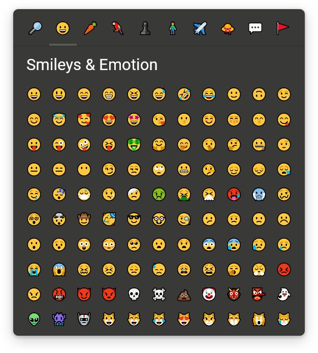
Dark theme (CSS properties only)
unicode-emoji-picker {
  --fill-color: #393938;
  --text-color: #fffffc;
  --tabs-border-color: #30302a;
  --tab-fill-color-hover: #454540;
  --content-scrollbar-thumb-fill-color: #50504a;
  --content-scrollbar-thumb-fill-color-hover: #76766f;
  --tab-active-marker-color: #595955;
  --title-bar-fill-color: color-mix(in srgb, var(--fill-color), transparent 12%);
  --search-input-border-color: #50504a;
  --search-input-border-color-hover: #eee;
  --emoji-border-color-hover: #595955;
  --variations-backdrop-fill-color: color-mix(in srgb, var(--fill-color), transparent 20%);
  --emoji-variation-marker-color: #50504a;
  --emoji-variation-marker-color-hover: #76766f;
}
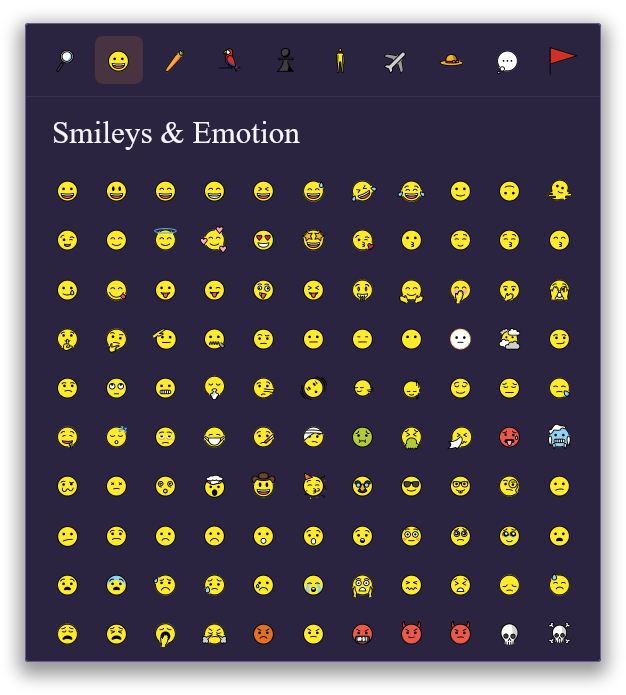
Custom theme (CSS properties & parts)
unicode-emoji-picker {
  --emoji-font-family: "OpenMoji";
  --fill-color: #2b2440;
  --text-color: #f7f4ff;
  --tabs-border-color: #3b3058;
  --tab-fill-color-hover: #46356b;
  --title-bar-fill-color: color-mix(in srgb, var(--fill-color), transparent 25%);
  --search-input-border-color: #6b5b95;
  --search-input-border-color-hover: #ffb454;
  --variations-backdrop-fill-color: color-mix(in srgb, var(--fill-color), transparent 35%);
  --emoji-variation-marker-color: #6b5b95;
  --emoji-variation-marker-color-hover: #ffb454;
  box-shadow: 0 10px 35px rgba(0, 0, 0, 0.45);
  border-radius: 3px;
  outline: 1px solid #6b5b95;
  transition: outline var(--transition);
  font-family: 'Times New Roman', Times, serif;
}
unicode-emoji-picker:focus-within {
  outline: 1px solid #ffb454;
}
unicode-emoji-picker::part(tab-wrapper active):after {
  display: none;
}
unicode-emoji-picker::part(tab active) {
  background-color: #ff9f4322;
}
unicode-emoji-picker::part(tab active):hover,
unicode-emoji-picker::part(tab active):focus-visible {
  background-color: #ff9f4366;
}
unicode-emoji-picker::part(search-input) {
  padding: 0.35em 0.8em;
  border-width: 1px;
  border-radius: 3px;
}
unicode-emoji-picker::part(emoji) {
  border-radius: 3px;
}
unicode-emoji-picker::part(emoji with-variations):after {
  border-bottom-right-radius: 3px;
  border-width: 3px;
}
unicode-emoji-picker::part(emoji active),
unicode-emoji-picker::part(emoji):hover,
unicode-emoji-picker::part(emoji):focus-visible {
  border: 0 none;
  background-color: #ff9f4322;
}
unicode-emoji-picker::part(variations) {
  border-radius: 3px;
  outline: 1px solid #6b5b95;
  transition: outline var(--transition);
  box-shadow: 0 10px 15px rgba(0, 0, 0, 0.45);
}
unicode-emoji-picker::part(variations):focus-within {
  outline: 1px solid #ffb454;
}
unicode-emoji-picker::part(backdrop) {
  backdrop-filter: blur(4px);
}
unicode-emoji-picker::part(scrollbar-thumb) {
  background: linear-gradient(130deg, #56356b, #862c44, #ee9248);
  transition: filter 150ms ease-out;
}
unicode-emoji-picker::part(scrollbar-thumb):hover {
  filter: brightness(1.6) saturate(1.6);
}
Browser compatibility
Every modern browser that supports the following features:
- shadow dom
- custom elements
- javascript resize observer
- javascript private class fields
- css sticky position
- css scrollbar width
- css custom properties
- css part selector
So, basically, all up-to-date browsers since 2025.