
universal-headless-carousel
v1.1.1
Published
Headless, cross-platform (React & React Native) carousel engine with CSS Scroll Snap & FlatList physics

Maintainers
 harsh_metrey
Readme
universal-headless-carousel 🎠


A cross-platform (React & React Native) carousel npm package with ready-to-use drop-in UI components AND headless hooks. Features custom arrows, custom pagination dots, custom card dimensions (cardWidth / cardHeight), CSS Scroll Snap, and native FlatList physics. Zero forced UI, 100% style customization, and production-grade accessibility (A11y).
🎨 Visual Previews
🌐 Web Carousel (CSS Scroll Snap Engine)
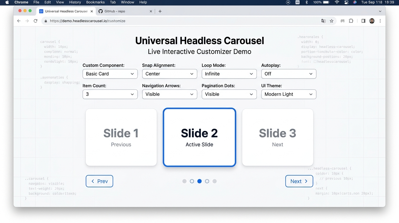
📱 React Native Carousel (FlatList Engine)
📦 Packages
| Package | Version | Description |
| :--- | :--- | :--- |
| universal-headless-carousel-core | 1.1.1 | Framework-agnostic state machine & math engine |
| universal-headless-carousel-web | 1.1.1 | Web engine & <Carousel /> drop-in component |
| universal-headless-carousel-native | 1.1.1 | React Native engine & <NativeCarousel /> drop-in component |
🚀 Installation
# npm
npm install universal-headless-carousel

# pnpm
pnpm add universal-headless-carousel
💡 Quick Start
🌐 1. Custom Web Component (<Carousel />)
Pass custom card dimensions (cardWidth, cardHeight), custom arrow icons (prevArrow, nextArrow), or custom pagination dots (customDot):
import React from 'react';
import { Carousel } from 'universal-headless-carousel/web';

export function WebComponentExample() {
  return (
    <Carousel
      cardWidth={320}
      cardHeight={200}
      items={[
        <div key="1" style={{ padding: 20, background: '#3b82f6', color: '#fff', borderRadius: 12 }}>Product Card 1</div>,
        <div key="2" style={{ padding: 20, background: '#10b981', color: '#fff', borderRadius: 12 }}>Product Card 2</div>,
        <div key="3" style={{ padding: 20, background: '#8b5cf6', color: '#fff', borderRadius: 12 }}>Product Card 3</div>
      ]}
      loop
      autoplay={3000}
      showArrows
      prevArrow={<span>◀ Left</span>}
      nextArrow={<span>Right ▶</span>}
      showDots
      customDot={(index, isActive) => (
        <span style={{ color: isActive ? '#3b82f6' : '#cbd5e1', fontSize: 18 }}>
          {isActive ? '●' : '○'}
        </span>
      )}
    />
  );
}
📱 2. Custom React Native Component (<NativeCarousel />)
import React from 'react';
import { View, Text } from 'react-native';
import { NativeCarousel } from 'universal-headless-carousel/native';

export function NativeComponentExample() {
  return (
    <NativeCarousel
      cardWidth={300}
      cardHeight={180}
      items={[
        <View key="1" style={{ height: 180, backgroundColor: '#3b82f6', borderRadius: 12, justifyContent: 'center', alignItems: 'center' }}>
          <Text style={{ color: '#fff', fontSize: 20 }}>Native Slide 1</Text>
        </View>,
        <View key="2" style={{ height: 180, backgroundColor: '#10b981', borderRadius: 12, justifyContent: 'center', alignItems: 'center' }}>
          <Text style={{ color: '#fff', fontSize: 20 }}>Native Slide 2</Text>
        </View>
      ]}
      loop
      showArrows
      prevArrow={<Text style={{ fontSize: 16 }}>◀ Prev</Text>}
      nextArrow={<Text style={{ fontSize: 16 }}>Next ▶</Text>}
      showDots
      customDot={(index, isActive) => (
        <Text style={{ color: isActive ? '#3b82f6' : '#cbd5e1', fontSize: 16, marginHorizontal: 4 }}>
          {isActive ? '★' : '☆'}
        </Text>
      )}
    />
  );
}
🛠 3. Headless Web Hook (useWebCarousel)
For custom layouts or DOM-level control:
import React from 'react';
import { useWebCarousel } from 'universal-headless-carousel/web';

const items = ['Slide 1', 'Slide 2', 'Slide 3'];

export function CustomWebCarousel() {
  const { activeIndex, next, prev, getContainerProps, getItemProps } = useWebCarousel({
    itemsCount: items.length,
    loop: true,
    autoplay: 3000
  });

  return (
    <div>
      <div {...getContainerProps()}>
        {items.map((item, i) => (
          <div key={i} {...getItemProps(i)}>
            {item} (Active: {i === activeIndex ? 'Yes' : 'No'})
          </div>
        ))}
      </div>
      <button onClick={prev}>Prev</button>
      <button onClick={next}>Next</button>
    </div>
  );
}
♿️ Accessibility (A11y)
Both Web and React Native components auto-inject compliant WAI-ARIA Attributes:
- Container:
role="region",aria-roledescription="carousel",aria-label="Carousel". - Keyboard Navigation:
ArrowLeft: Navigate to previous slide.ArrowRight: Navigate to next slide.Home: Navigate to first slide.End: Navigate to last slide.
- Auto-Pause on Hover: Pauses autoplay on
mouseenterand resumes onmouseleave. - Items:
role="group",aria-roledescription="slide",aria-label="Slide X of Y",aria-hidden={!isActive}.
🛠 License
Distributed under the MIT License. See LICENSE for details.