
universal-toast-message
v1.0.3
Published
A lightweight toast notification plugin for Vue 3
Maintainers
 mrhrao
Readme
universal-toast-message
A lightweight and customizable toast notification plugin for Vue 3.
🚀 Installation
npm install universal-toast-messageor
yarn add universal-toast-message🎯 Live Demo
Try it out instantly on CodeSandbox:
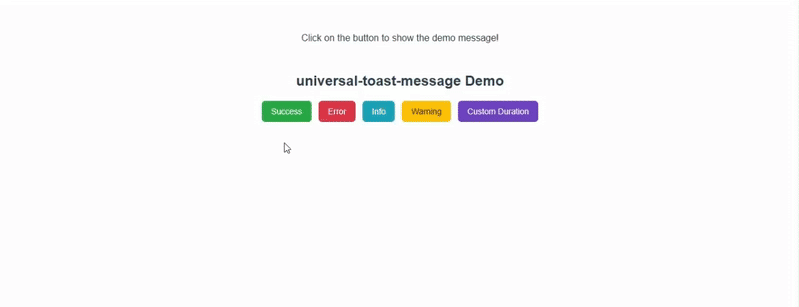
🎥 Demo Preview
🔧 Usage
1. Register the plugin in main.js
import { createApp } from "vue";
import App from "./App.vue";
import ToastPlugin from "universal-toast-message";

const app = createApp(App);

// Use the plugin
app.use(ToastPlugin);

app.mount("#app");
2. Show Toasts Anywhere in Your App
Now you can use $toast globally inside Vue components:
<script setup>
import { getCurrentInstance } from "vue";

const { proxy } = getCurrentInstance();

function showSuccess() {
  proxy.$toast.success("This is a success toast!");
}
function showError() {
  proxy.$toast.error("This is an error toast!", "Error", 5000);
}
function showInfo() {
  proxy.$toast.info("This is an error toast!", "info", 5000);
}
function showWarning() {
  proxy.$toast.warning("This is an error toast!", "warning", 5000);
}
function showCustom() {
  proxy.$toast.success("Custom 3s toast", "Quick Notice", 3000);
}
</script>

<template>
  <div class="demo-wrapper">
    <h2>universal-toast-message Demo</h2>
    <div class="btn-group">
      <button class="button success" @click="showSuccess">Success</button>
      <button class="button error" @click="showError">Error</button>
      <button class="button info" @click="showInfo">Info</button>
      <button class="button warning" @click="showWarning">Warning</button>
      <button class="btn custom" @click="showCustom">Custom Duration</button>
    </div>
  </div>
</template>
<style scoped>
.demo-wrapper {
  text-align: center;
  margin-top: 50px;
  font-family: sans-serif;
}

h2 {
  margin-bottom: 20px;
}

.btn-group {
  display: flex;
  flex-wrap: wrap;
  gap: 12px;
  justify-content: center;
}

button {
  padding: 10px 16px;
  border: none;
  border-radius: 6px;
  font-size: 14px;
  cursor: pointer;
  color: #fff;
  transition: transform 0.2s;
}

button:hover {
  transform: scale(1.05);
}

.success {
  background: #28a745;
}
.error {
  background: #dc3545;
}
.info {
  background: #17a2b8;
}
.warning {
  background: #ffc107;
  color: #212529;
}
.custom {
  background: #6f42c1;
}
</style>
✅ Features
- 4 types of toast:
- ✅ Success
- ❌ Error
- ℹ️ Info
- ⚠️ Warning
- Auto-dismiss with configurable duration
- Manual close button
- Smooth animations
- Plug-and-play installation
⚙️ API
$toast.success(message, title?, duration?)
message(string, required): The body text of the toasttitle(string, optional, default:"Success")duration(number, optional, default:8000ms)
Similarly for:
$toast.error(message, title?, duration?)$toast.info(message, title?, duration?)$toast.warning(message, title?, duration?)
🖼️ Example
<template>
  <button @click="$toast.success('Profile updated!')">
    Show Success Toast
  </button>
</template>
📜 License
MIT © Hemant Rao