
uxcore-grid
v1.3.1
Published
uxcore-grid component for uxcore.


Readme
uxcore-grid 

TL;DR
uxcore-grid ui component for react
setup develop environment
$ git clone https://github.com/uxcore/uxcore-grid
$ cd uxcore-grid
$ npm install
$ gulp server
Usage
let Grid = require('uxcore-grid');
let {Row, Col} = Grid;
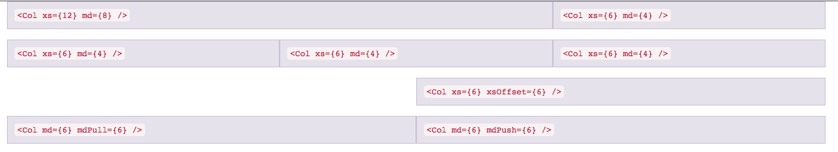
<Grid>
<Row className="show-grid">
<Col xs={12} md={8}><code><{'Col xs={12} md={8}'} /></code></Col>
<Col xs={6} md={4}><code><{'Col xs={6} md={4}'} /></code></Col>
</Row>
<Row className="show-grid">
<Col xs={6} md={4}><code><{'Col xs={6} md={4}'} /></code></Col>
<Col xs={6} md={4}><code><{'Col xs={6} md={4}'} /></code></Col>
<Col xs={6} md={4}><code><{'Col xs={6} md={4}'} /></code></Col>
</Row>
<Row className="show-grid">
<Col xs={6} xsOffset={6}><code><{'Col xs={6} xsOffset={6}'} /></code></Col>
</Row>
<Row className="show-grid">
<Col md={6} mdPush={6}><code><{'Col md={6} mdPush={6}'} /></code></Col>
<Col md={6} mdPull={6}><code><{'Col md={6} mdPull={6}'} /></code></Col>
</Row>
</Grid>demo
http://uxcore.github.io/
API
Props
Grid
| 配置项 | 类型 | 必填 | 默认值 | 功能/备注 |
|---|---|---|---|---|
|componentClass|elementType|optional|'div'|You can use a custom element for this component|
|fluid|boolean|optional|false|Turn any fixed-width grid layout into a full-width layout by this property. Adds container-fluid class.|
Row
通过
Grid.Row取得。
| 配置项 | 类型 | 必填 | 默认值 | 功能/备注 | |---|---|---|---|---| |componentClass|elementType|optional|'div'|You can use a custom element for this component|
Col
通过
Grid.Col取得。
| 配置项 | 类型 | 功能/备注 |
|---|---|---|
|lg|number|The number of columns you wish to span for Large devices Desktops (≥1200px) class-prefix col-lg-|
|lgOffset|number|Move columns to the right for Large devices Desktops class-prefix col-lg-offset-|
|lgPull|number|Change the order of grid columns to the left for Large devices Desktops class-prefix col-lg-pull-|
|lgPush|number|Change the order of grid columns to the right for Large devices Desktops class-prefix col-lg-push-|
|md|number|The number of columns you wish to span for Medium devices Desktops (≥992px) class-prefix col-md-|
|mdOffset|number|Move columns to the right for Medium devices Desktops class-prefix col-md-offset-|
|mdPull|number|Change the order of grid columns to the left for Medium devices Desktops class-prefix col-md-pull-|
|mdPush|number|Change the order of grid columns to the right for Medium devices Desktops class-prefix col-md-push-|
|sm|number|The number of columns you wish to span for Small devices Tablets (≥768px) class-prefix col-sm-|
|smOffset|number|Move columns to the right for Small devices Tablets class-prefix col-sm-offset-|
|smPull|number|Change the order of grid columns to the left for Small devices Tablets class-prefix col-sm-pull-|
|smPush|number|Change the order of grid columns to the right for Small devices Tablets class-prefix col-sm-push-|
|xs|number|The number of columns you wish to span for Extra small devices Phones (<768px) class-prefix col-xs-|
|xsOffset|number|Move columns to the right for Extra small devices Phones class-prefix col-xs-offset-|
|xsPull|number|Change the order of grid columns to the left for Extra small devices Phones class-prefix col-xs-pull-|
|xsPush|number|Change the order of grid columns to the right for Extra small devices Phones class-prefix col-xs-push-|