
v-cpicker
v2.0.3
Published

Maintainers
 thewebkid
Readme
v-cpicker 


(a Vue 3 colorpicker)

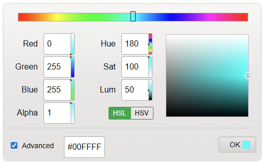
A modern, feature-rich color picker component for Vue 3, built with Vite. Rewritten from the ground up with the Composition API and modern best practices.
What's New in v2.0
- Vue 3 - Full rewrite using Composition API
- Vite - Lightning-fast builds and HMR
- Modern Architecture - Inspired by Lit-based color pickers with centralized state management
- Latest Dependencies:
[email protected]- Color parsing and conversion (incl. HWB)[email protected]- Drag and drop interactions (Vue 3 wrapper around lit-movable)[email protected]- Range slider inputs
- No Bootstrap - Removed Bootstrap/BootstrapVue dependencies
- TypeScript-ready - JSDoc annotations throughout
- Improved UX - Modern "All Formats" dialog with clipboard API
- Themeable - Fully driven by
--vcp-*CSS custom properties - HWB support - Via modern-color 1.4.0
Installation
npm i --save v-cpickerInitialize in main.js
import { createApp } from 'vue';
import App from './App.vue';
import VCpicker from 'v-cpicker';
import 'v-cpicker/style.css';

createApp(App).use(VCpicker).mount('#app');
Or import the component directly:
<script setup>
import { ColorPicker } from 'v-cpicker';
import 'v-cpicker/style.css';
</script>

<template>
  <ColorPicker v-model="color" :options="options" />
</template>
Usage
Basic Example
<script setup>
import { ref } from 'vue';
import { ColorPicker } from 'v-cpicker';
import 'v-cpicker/style.css';

const color = ref('#4682B4');
const options = ref({
  compact: false,
  light: true,
  allowModeChange: true,
  advanced: true,
  previewBars: true,
  formatsPopup: true,
  hslToggle: true
});
</script>

<template>
  <div>
    <div class="preview">
      Preview <span class="swatch" :style="{ background: color }"></span> ({{ color }})
    </div>
    <ColorPicker v-model="color" :options="options" />
  </div>
</template>

<style>
.swatch {
  margin-left: 5px;
  display: inline-block;
  vertical-align: middle;
  height: 15px;
  width: 15px;
  border-radius: 2px;
  box-shadow: 0 0 1px #111;
}
</style>
Options (set as :options="optionsObject")
- compact: (default=false) Compact layout
- light: (default=true) Use light theme
- allowModeChange: (default=true) Allow simple/advanced mode change (checkbox on UI)
- advanced: (default=false) Start in advanced mode
- previewBars: (default=true) Preview gradient bars next to channel values
- formatsPopup: (default=true) Show link to all formats
- hslToggle: (default=true) Show HSL/HSV toggle
- alphaHidden: (default=false) Hide alpha channel
- sticky: (default=true) Keep flyout open
v-model
The v-model can be any CSS color string (hex, rgb, hsl, named color, etc.). The component uses modern-color under the hood for parsing and conversion.
<script setup>
import { ref } from 'vue';

const color = ref('aqua'); // or '#00FFFF' or 'rgb(0,255,255)' etc.
</script>

<template>
  <ColorPicker v-model="color" />
</template>
Events
- @update:modelValue: Fires continuously whenever the preview color is modified (for v-model)
- @preview: Fires continuously whenever the preview color is modified (with Color instance)
- @picked: Fires when the user clicks OK (with Color instance)
<template>
  <ColorPicker
    v-model="color"
    @preview="onPreview"
    @picked="onPicked"
  />
</template>

<script setup>
const onPreview = (colorInstance) => {
  console.log('Preview:', colorInstance.hex);
};

const onPicked = (colorInstance) => {
  console.log('Picked:', colorInstance.rgbString);
};
</script>
Architecture
v2.0 features a completely rewritten architecture inspired by modern Lit-based color pickers:
Centralized State Management
The useColorState composable manages all color state in a single, immutable model:
const {
  model,        // ColorModel { color, space, source, hsx }
  mode,         // 'hsl' | 'hsv'
  advanced,     // boolean
  color,        // computed Color instance
  hsx,          // computed polar coords {h,s,l} or {h,s,v}
  isHsl,        // computed boolean
  hsw,          // computed {h,s,w,wl} for dynamic labels
  setHue,       // hue bar handler
  onColorIntent, // child component intent handler
  setColorFromInput, // hex input handler
  pickColor     // OK button handler
} = useColorState(modelValue, options, emit);
Key Concepts
- ColorModel: Immutable state object containing
color,space,source, andhsx - Sticky Hue: Preserves hue when saturation is 0 (grayscale)
- Polar Coords: HS* values stored separately from Color instance to prevent mutation
- Source Tracking: Knows where changes originated (canvas, hue, channel, input, external)
- Validation: Guards against NaN colors from invalid HSL/HSV values
Component Structure
ColorPicker.vue          - Main component (uses useColorState)
├── HueBar.vue           - Hue slider (v-movable)
├── ChannelInput.vue     - RGB/HSL channel inputs (v-range-flyout)
├── VariantSquare.vue    - Saturation/Value canvas (v-movable)
├── SimpleCanvas.vue     - Simple mode canvas (v-movable)
├── ValueSlider.vue      - Value slider for simple mode (v-movable)
└── AllFormatsPopover.vue - Formats dialog with clipboard
Theming
Every visual in the picker is driven by a --vcp-* CSS custom property. Set them on the component or any ancestor to re-skin the picker — no !important, no deep selectors needed.
.my-brand {
  --vcp-bg: #1e293b;
  --vcp-text: #e2e8f0;
  --vcp-input-bg: #0f172a;
  --vcp-input-color: #e2e8f0;
  --vcp-input-border: #475569;
  --vcp-input-focus-border: #818cf8;
  --vcp-link-color: #7dd3fc;
  --vcp-accent: #6366f1;
  --vcp-accent-text: #ffffff;
  --vcp-btn-bg: #312e81;
  --vcp-btn-color: #e0e7ff;
  --vcp-border-color: #334155;
}
<section class="my-brand">
<ColorPicker v-model="color" />
</section>Or apply directly to the component via inline style:
<ColorPicker v-model="color" :style="{ '--vcp-accent': '#f97316' }" />Available CSS variables
| Variable | Default (dark) | Description |
| --- | --- | --- |
| --vcp-bg | dark gradient | Picker surface background |
| --vcp-text | #eee | Label / text color |
| --vcp-input-bg | dark gradient | Channel & hex input background |
| --vcp-input-color | #eee | Input text color |
| --vcp-input-border | #777 | Input border color |
| --vcp-input-focus-border | #fff | Focus ring border |
| --vcp-input-focus-shadow | #fff | Focus ring shadow |
| --vcp-link-color | #6cf | Link color ("All formats", "+ Alpha") |
| --vcp-accent | #28a745 | Accent (HSL/HSV toggle, copy button) |
| --vcp-accent-text | #fff | Text on accent |
| --vcp-btn-bg | dark gradient | OK button background |
| --vcp-btn-color | #eee | OK button text |
| --vcp-btn-border | #444 | OK button border |
| --vcp-border-color | #444 | Canvas / variant square borders |
| --vcp-hr-color | #555 | Divider color |
| --vcp-toggle-border | #666 | HSL/HSV toggle border |
| --vcp-radius | 8px | Picker corner radius |
The light option flips the picker to a light default theme by setting these same variables — you can override individual variables on top of either base theme.
Development
# Install dependencies
npm install

# Start dev server
npm run dev

# Run unit tests
npm test

# Run tests with coverage report
npm run test:coverage

# Build library
npm run build:lib

# Build demo
npm run build
CI runs npm run test:coverage on every push and pull request to master / main via .github/workflows/test.yml.
Demo page
The dev server (npm run dev) serves a demo with two tabs:
- Demo — static + flyout pickers with all options toggleable. The Options panel includes a WYSIWYG usage block: a live, copyable
<script setup>snippet that reflects exactly the options you've toggled (only non-default values are shown). - Themer — a live theme editor. Pick a
--vcp-*variable, edit it with the colorpicker (it restyles itself live), choose from presets (Midnight, Paper, Forest, Sunset), and copy the generated CSS block.
Migration from v1.x (Vue 2)
Breaking Changes
- Vue 3 required - Upgrade your app to Vue 3.4+
- No Bootstrap - Bootstrap/BootstrapVue dependencies removed
- Import style - Import CSS separately:
import 'v-cpicker/style.css' - v-model behavior - Now emits string values (hex/css) instead of Color instances
- Plugin install - Auto-registers v-movable internally
Migration Steps
// v1.x (Vue 2)
import Vue from 'vue';
import colorpicker from 'v-cpicker';
Vue.use(colorpicker);

// v2.x (Vue 3)
import { createApp } from 'vue';
import VCpicker from 'v-cpicker';
import 'v-cpicker/style.css';
createApp(App).use(VCpicker);
Browser Support
Modern browsers supporting ES2020+ and Vue 3:
- Chrome/Edge 88+
- Firefox 78+
- Safari 14+
Credits
Built with:
License
MIT