
v-range-flyout
v2.0.2
Published
A Vue 3 component that wraps an input[type=number] with a customizable range slider flyout.

Maintainers
 thewebkid
Readme
v-range-flyout 

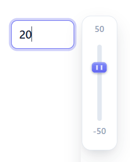
A Vue 3 component that wraps an input[type=number] with a customizable range slider flyout.
v2 is a Vue 3 rewrite. For Vue 2, stay on
[email protected].
Installation
npm i v-range-flyoutRequires Vue 3.4+ (peer dependency).
Usage
Register globally as a plugin:
// main.js
import { createApp } from 'vue';
import App from './App.vue';
import RangeFlyout from 'v-range-flyout';
import 'v-range-flyout/style.css';

createApp(App).use(RangeFlyout).mount('#app');
Then use <range-flyout> (also registered as <v-range-flyout>) anywhere:
<range-flyout :min="-50" :max="50" v-model="chosenVal" />Or import the component locally:
<script setup>
import { ref } from 'vue';
import { RangeFlyout } from 'v-range-flyout';
import 'v-range-flyout/style.css';

const chosenVal = ref(50);
</script>

<template>
  <range-flyout :min="-50" :max="50" v-model="chosenVal" />
</template>
Props
| Prop | Type | Default | Description |
| --- | --- | --- | --- |
| v-model (modelValue) | Number \| String | — | Current value. Strings are converted to numbers. |
| min | Number | 0 | Minimum allowed value. |
| max | Number | 100 | Maximum allowed value. |
| disabled | Boolean | false | Disable the control. |
| sliderHeight | Number | — | Height (px) of the slideable area of the flyout. |
| incr | Number | — | Increment the value snaps to (maps to the input step attribute). |
| slideBackground | String | — | CSS background for the track (e.g. gradients for color scales). |
| handleBg | String | — | CSS background for the drag handle. |
| inputClass | String \| Array \| Object | — | Class(es) added to the input element. |
| wrapperClass | String \| Array \| Object | — | Class(es) added to the outer wrapper div. |
| flyoutClass | String \| Array \| Object | — | Class(es) added to the flyout wrapper div. |
| hideFlyout | Boolean | false | Hide the flyout (input-only mode). |
| sticky | Boolean | false | Keep the flyout open even when the input loses focus. |
| scheme | String | 'light' | Surface scheme: 'light' or 'dark'. Independent of the color theme. |
| val / value | Number \| String | — | Deprecated. Use v-model instead. |
Theming
Every visual is driven by a --vrf-* CSS custom property, read through a var(--vrf-x, <default>) fallback. Nothing is declared on the component's own root, so the variables inherit down the DOM — set them once on any container and every control inside picks them up; put a class on a single control to override just that one. Normal cascade rules, no !important:
Set a default once (on any ancestor):
.my-brand {
  --vrf-accent: #e11d48;   /* the only line needed for a new color */
  --vrf-accent-hover: #fb7185;
  --vrf-input-radius: 4px;
}
<section class="my-brand">
<range-flyout :min="0" :max="100" v-model="level" /> <!-- rose accent -->
</section>Override a single control (a closer class always wins over the inherited default):
<section class="my-brand">
  <range-flyout v-model="a" />                                  <!-- rose    -->
  <range-flyout wrapper-class="vrf-theme-ocean" v-model="b" />  <!-- cyan    -->
  <range-flyout wrapper-class="my-other-skin" v-model="c" />    <!-- yours   -->
</section>
Note:
wrapper-classapplies a class to the component's root (this is where a theme class goes). The deprecatedclassattribute also lands on the root, butwrapper-classis the explicit, supported API.
CSS variables
Grouped by the part they style. Set any of these on an ancestor (or the component) to override.
Accent (the one most people change — drive handle, focus ring):
| Variable | Default | Description |
| --- | --- | --- |
| --vrf-accent | #6366f1 | Accent color: handle gradient base. |
| --vrf-accent-hover | #818cf8 | Accent hover / gradient highlight. |
| --vrf-accent-contrast | #ffffff | Handle grip-line color (needs contrast against --vrf-accent). |
| --vrf-accent-dark | lightened accent | Accent used on dark surfaces (derived automatically). |
| --vrf-accent-ring | 30% accent | Focus-ring color (derived automatically). |
Input (<input type="number">):
| Variable | Default | Description |
| --- | --- | --- |
| --vrf-input-bg | #ffffff | Background. |
| --vrf-input-color | #1e293b | Text color. |
| --vrf-input-border | #cbd5e1 | Border color. |
| --vrf-input-radius | 8px | Corner radius. |
| --vrf-input-padding | 0.45em 0.65em | Padding. |
| --vrf-input-width | 5.5em | Width. |
| --vrf-input-font-size | 0.9375rem | Font size. |
| --vrf-input-font-weight | 500 | Font weight. |
| --vrf-input-hover-border | accent-hover | Border color on hover. |
| --vrf-focus-border | var(--vrf-accent) | Border color while focused. |
| --vrf-accent-ring | 30% accent | Focus ring shadow color. |
| --vrf-font-family | inherit | Font family (inherits the app's font by default). |
Flyout panel (the popup box):
| Variable | Default | Description |
| --- | --- | --- |
| --vrf-flyout-bg | #ffffff | Background. |
| --vrf-flyout-border | #e2e8f0 | Border color. |
| --vrf-flyout-shadow | soft layered | Box shadow. |
| --vrf-flyout-radius | 12px | Corner radius. |
| --vrf-flyout-padding | 4px | Inner padding. |
Min/max labels:
| Variable | Default | Description |
| --- | --- | --- |
| --vrf-label-color | #94a3b8 | Text color. |
| --vrf-label-font-size | 11px | Font size. |
| --vrf-label-font-weight | 600 | Font weight. |
Track (the slideable rail):
| Variable | Default | Description |
| --- | --- | --- |
| --vrf-track-width | 6px | Rail width, clamped to 1–8px. |
| --vrf-track-bg | #e2e8f0 | Rail background (overridden by the slideBackground prop). |
| --vrf-track-radius | 999px | Rail corner radius. |
Handle (the drag grip):
| Variable | Default | Description |
| --- | --- | --- |
| --vrf-handle-width | 20px | Width. |
| --vrf-handle-height | 14px | Height. |
| --vrf-handle-bg | accent gradient | Background (overridden by the handleBg prop). |
| --vrf-handle-bg-hover | solid accent | Background on hover. |
| --vrf-handle-radius | 5px | Corner radius. |
| --vrf-handle-shadow | subtle | Box shadow. |
Motion:
| Variable | Default | Description |
| --- | --- | --- |
| --vrf-transition | 160ms … | Shared timing for hover/focus states. |
Beyond variables: styling the internals directly
CSS variables cover the common knobs. For anything else, target the internal parts with a deep selector — because the component's styles are scoped, a rule in your own scoped <style> won't reach inside unless you use ::v-deep (or write it in a global stylesheet):
<style scoped>
/* recolor the track fill and the flyout's min/max labels */
.my-wrap ::v-deep(.inner) {
  background: linear-gradient(#fde68a, #f59e0b);
}
.my-wrap ::v-deep(.flyout label) {
  text-transform: uppercase;
}
</style>
Internal selectors you can target: .flyout (panel), .inner (track), .flyout-handle-grip (handle), .flyout label (min/max), and the input itself via input or the inputClass prop.
Does the input pick up your app's number-input CSS? Partially:
- Inherited properties (
font-family,letter-spacing, etc.) flow in — the input usesfont-family: var(--vrf-font-family, inherit), so it takes your app's font unless you set the var. - Global rules (
input { … }in a plain/global stylesheet) reach it. - Scoped rules (
input { … }in your SFC's<style scoped>) do not — there's no data attribute linking them. Use::v-deepor a global stylesheet for those. - Properties the component sets explicitly (
padding,border,border-radius,font-size) come from the--vrf-input-*vars, so set those rather than fighting specificity.
Shipped themes
Each preset is a distinct accent — apply via wrapper-class, or to any ancestor to theme a group. Dark/light surfaces are controlled separately by the scheme prop, so themes stay visible in both modes:
<range-flyout wrapper-class="vrf-theme-ocean" scheme="dark" v-model="level" />| Class | Flavor |
| --- | --- |
| vrf-theme-dark | Deep navy accent ("Midnight"). |
| vrf-theme-ocean | Cyan accent. |
| vrf-theme-sunset | Orange accent. |
| vrf-theme-forest | Emerald accent. |
| vrf-theme-mono | Near-black, squared corners, no shadows — shows radii/shadows are themeable too. |
Dark mode
Dark surfaces are opt-in via the scheme prop — independent of the accent theme, so you compose the two:
<range-flyout scheme="dark" v-model="level" />To follow the user's OS automatically, drive the prop from a media query:
<script setup>
import { usePreferredDark } from '@vueuse/core'; // or your own matchMedia
const dark = usePreferredDark();
</script>

<template>
  <range-flyout :scheme="dark ? 'dark' : 'light'" v-model="level" />
</template>
How it works (for the curious)
Token defaults ship in the component's CSS as a :root { --vrf-*: … } block, and every read is var(--vrf-x, <same-default>). Because no value is hard-set on the component root, a theme class or custom rule anywhere above the control inherits down and wins; :root is the least-specific source, so your rules always override it. The vrf-theme-* presets are plain global classes that only set --vrf-* vars, so they compose with your own styles.
Events
| Event | Payload | Description |
| --- | --- | --- |
| @update:modelValue | Number | Fires on keyboard or slider input ( backs v-model). |
| @input | Number | Fires on keyboard or slider input. |
| @change | Number | Fires when the value changes and the control is no longer in focus. |
| @active | Boolean | Fires when the flyout is toggled / input focus state changes. |
Example
<script setup>
import { ref } from 'vue';
import { RangeFlyout } from 'v-range-flyout';
import 'v-range-flyout/style.css';

const chosenVal = ref(50);
</script>

<template>
  <div class="wrap">
    <div class="control">
      <label>Choose a value between -50 and 50</label>
      <range-flyout :min="-50" :max="50" v-model="chosenVal" />
    </div>
    <p>You chose: {{ chosenVal }}</p>
  </div>
</template>

<style lang="scss">
.wrap {
  .control {
    display: inline-block;
    padding: 12px;
    margin-right: 50px;
    label {
      display: block;
    }
  }
}
</style>
Migrating from v1 (Vue 2)
- Vue 3 is now a peer dependency (no more bundled Vue 2).
- Use
v-modelinstead of thevalueprop +@inputlistener (val/valueare still accepted for back-compat). - The drag library changed from
v-movabletolit-movable(the web-component successor by the same author) — no action needed unless you styled the old.--movable-baseclass. The handle is now.flyout-handle. - The built files moved from
dist/index.jstodist/v-range-flyout.js(ESM) /dist/v-range-flyout.umd.cjs(UMD). If you imported deep paths, update them or rely on the packageexports.
Note:
lit-movableis a web component that registers itself viawindow.customElementsat import time. Like the oldv-movable, it runs in the browser only — guard the import if you're doing SSR (e.g. Nuxt) so it isn't evaluated on the server.
Developing
npm install
npm run dev    # Vite playground (index.html + src/App.vue)
npm run build  # library build into dist/
Disclaimer
This is in active development. Stability not guaranteed. Please file GitHub issues for bugs/features.