
v-tmline
v1.5.0
Published
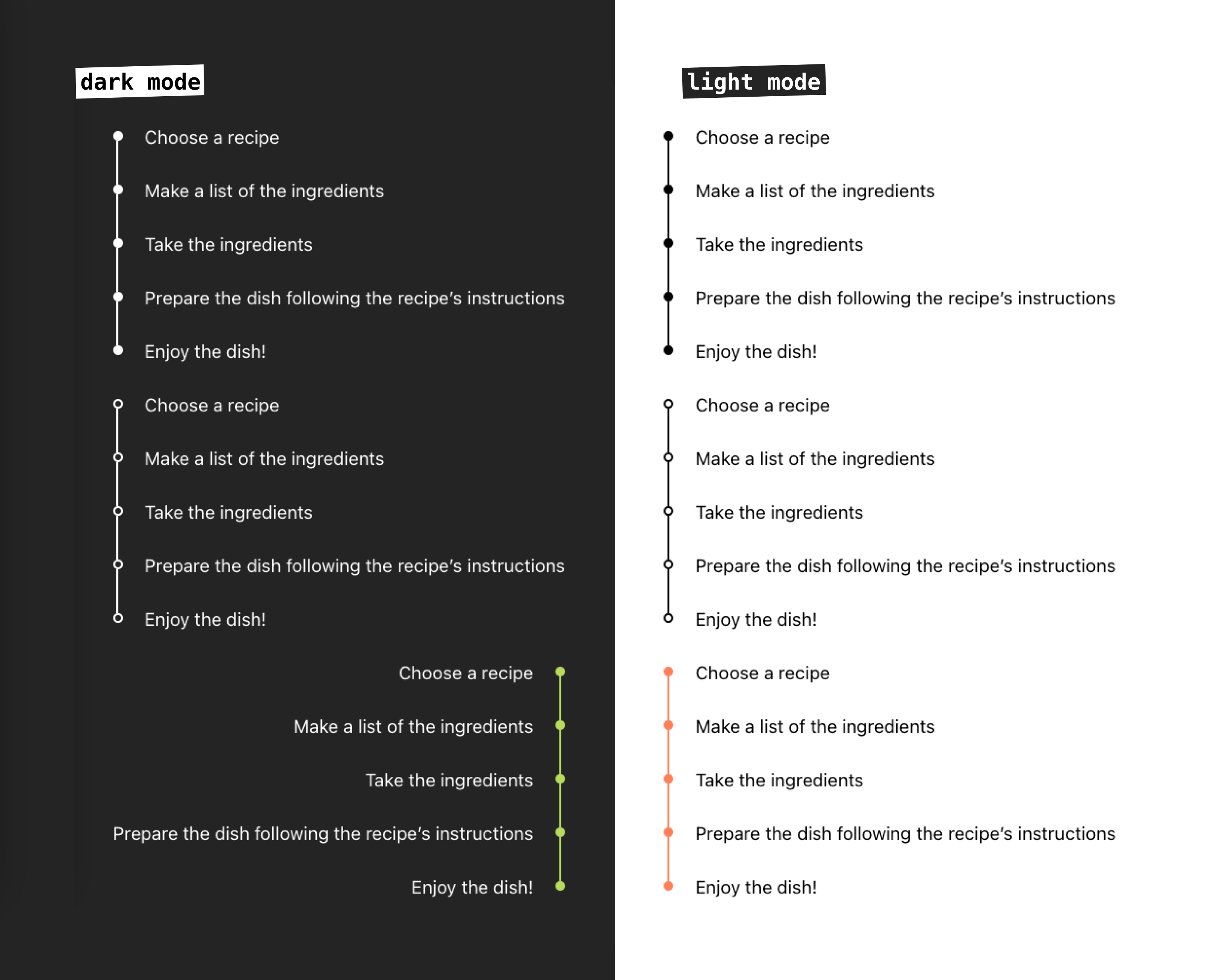
A timeline component for Vue 3. It provides a simple and easy-to-use interface for creating custom timelines for light or dark themes.
Maintainers
 ir3ne
ir3neReadme
Live demo
Npm package page
Features
- Customizable bullets style: filled or outlined
- Custom colors
- Left and right alignment
- Support slots and named slots
- Support for light and dark mode
Installation
npm install v-tmlineUsage
Import and use the component in your Vue application:
<script setup>
import { Timeline } from 'v-tmline'

const timelineItems = [
  {
	id: 1,
	label: 'First Point'
  },
  {
	id: 2,
	label: 'Second Point'
  },
  {
	id: 3,
	label: 'Third Point'
  }
]
</script>

<template>
  <Timeline :items="timelineItems" />
</template>
Props
| Prop | Type | Default | Description | Available Options |
|------|------|---------|-------------|-------------------|
| items | Array | required | Array of timeline items. Each item must be an object with at least a label property | - |
| mode | String | 'light' | Theme mode of the timeline | 'light', 'dark' |
| fill | String | 'filled' | Style of timeline dots | 'filled', 'outlined' |
| colored | String | '' | Custom color for the timeline (CSS color value) | Any valid CSS color |
| align | String | 'left' | Alignment of the timeline | 'left', 'right' |
Timeline Items
Each item in the items array should have the following structure:
{
  id?: string | number, // Optional unique identifier
  label: string        // Required text to display
}
Customization
Basic Timeline
<template>
  <Timeline :items="[
    { label: 'Started project' },
    { label: 'Released v1.0' },
    { label: 'Added new features' }
  ]" />
</template>
Custom Colored Timeline
<template>
  <Timeline
    :items="timelineItems"
    colored="#2196F3"
  />
</template>
Dark Mode Timeline
<template>
  <Timeline
    :items="timelineItems"
    mode="dark"
  />
</template>
Right-Aligned Timeline
<template>
  <Timeline
    :items="timelineItems"
    align="right"
  />
</template>
Custom Content using Slots
You can customize the content of each timeline item using the slot feature: default or named slot.
Default Slot
<template>
  <Timeline :items="timelineItems">
    <!-- Default slot -->
	<template #item="{ item }">
		<div>Default: {{ item.label }}</div>
	</template>
  </Timeline>
</template>
Named Slot
<template>
  <!-- Custom slot for work items -->
	<template #work="{ item }">
		<div class="work-item">
			<h3>💫 {{ item.label }}</h3>
			<p>{{ item.company }}</p>
		</div>
	</template>

		<!-- Custom slot for education items -->
	<template #education="{ item }">
		<div class="education-item">
			<h3>📚 {{ item.label }}</h3>
			<p>{{ item.school }}</p>
		</div>
	</template>
</template>
Styling
The component uses the following CSS classes that you can override:
.re-timeline- Main timeline container.re-timeline-item- Individual timeline item.re-timeline-item-tail- Timeline connector line.re-timeline-item-head- Timeline dot.re-timeline-item-content- Content container
Full Example
<script setup>
import { Timeline } from 'v-tmline'

const timelineItems = [
  {
    id: 1,
    label: 'Project Started',
  },
  {
    id: 2,
    label: 'First Milestone',
  },
  {
    id: 3,
    label: 'Project Completed',
  }
]
</script>

<template>
  <Timeline
    :items="timelineItems"
    mode="light"
    fill="filled"
    colored="#2196F3"
    align="left"
  >
    <template #item="{ item }">
      <div class="custom-timeline-content">
        <h3>{{ item.label }}</h3>
        <p>Custom content here</p>
      </div>
    </template>
  </Timeline>
</template>

<style scoped>
.custom-timeline-content {
  padding: 10px;
  border-radius: 4px;
  background-color: #f5f5f5;
}
</style>
License
Contributing
Contributions are welcome! Please feel free to submit a Pull Request.