
vc-chart
v0.3.17
Published
图表组件
Downloads
107

Readme
vc-chart
安装
npm i vc-chart echarts echarts-liquidfill使用
import Vue from 'vue'
import App from './App.vue'
import VcChart from 'vc-chart'

Vue.use(VcChart)
new Vue({
  render: h => h(App),
}).$mount('#app')
<template>
<div id="app">
<vc-chart :data='chartData'
type='histogram'
:extend='extend'
:setting='chartSetting'
ref="reHistogramChart" />
</div>
</template>
<script>
export default {
data(){
return{
chartSetting:{},
extend:{},
chartData:{
columns:['date','test1'],
rows:[
{'date':'1/1','test1':150,'test2':100,'test3':100,'test4':100},
{'date':'1/2','test1':100,'test2':150,'test3':150,'test4':150},
{'date':'1/3','test1':200,'test2':250,'test3':250,'test4':250},
{'date':'1/4','test1':200,'test2':300,'test3':300,'test4':300},
{'date':'1/1','test1':150,'test2':100,'test3':100,'test4':100},
]
}
}
},
}
</script>图表配置项
| 配置项 | 简介 | 类型 | 默认值 | | --- | --- | --- | --- | | colors | 设置图表的系列颜色 | array | - | | height | 设置图表的高度 | string | 400px | | setting | 配置项 | object | - | | extend | 更方便的设置图表的属性,对配置项设置的属性进行并和 | object | - | | type | 设置图片类型 | string | line | | isDark | 是否设置黑暗模式 | boolean | false | | data | 数据 | object,number,string,array | - |
extend
为了能够更方便的设置属性配置项等,可以通过extend属性实现对已配置好的内部属性进行单独的设置, extend为对象类型,对象内的属性可以是函数,也可以对象,也可以是其他类型的值
- 当属性为函数时,设置的是函数的返回值
- 当属性为对象时,如果在options中对应的属性为对象(eg: tooltip)或包含对象的数组(eg: series), 对应的配置会被合并,否则将直接覆盖对应的配置
data
针对不同的的图表data的数据结构是多变的,但一般情况都会使用下面的结构进行
data:{
    columns:['date','test1','test2','test3'],
    rows:[
          {'date':'1/1','test1':150,'test2':100,'test3':1000,'test4':100},
          {'date':'1/2','test1':100,'test2':150,'test3':150,'test4':150},
          {'date':'1/3','test1':200,'test2':250,'test3':250,'test4':250},
          {'date':'1/4','test1':200,'test2':300,'test3':300,'test4':300},
          {'date':'1/1','test1':150,'test2':100,'test3':100,'test4':100},
          {'date':'1/2','test1':100,'test2':150,'test3':150,'test4':150},
         ]
}- columns 中是维度和指标的集合,vc-chart 中的大部分图表都是单维度多指标,所以默认第一个值为 维度,剩余的值为指标
- rows 中是数据的集合。
一些特殊的图表则会以其他的数据结构进行
环形进度条图(ring-progress-bar) 、仪表板(gauge)、栅格占比仪表板(grid-gauge)这三种图表的data形式则会通过填写数字的形式进行
data:20水球图(liquidfill) 则是通过传递一个数组来展示数据
data:[0.6,0.4,0.2]获取图表的dom
// xxxx代表自己定义的名称
this.$ref['xxxxx'].getDom()
折线图
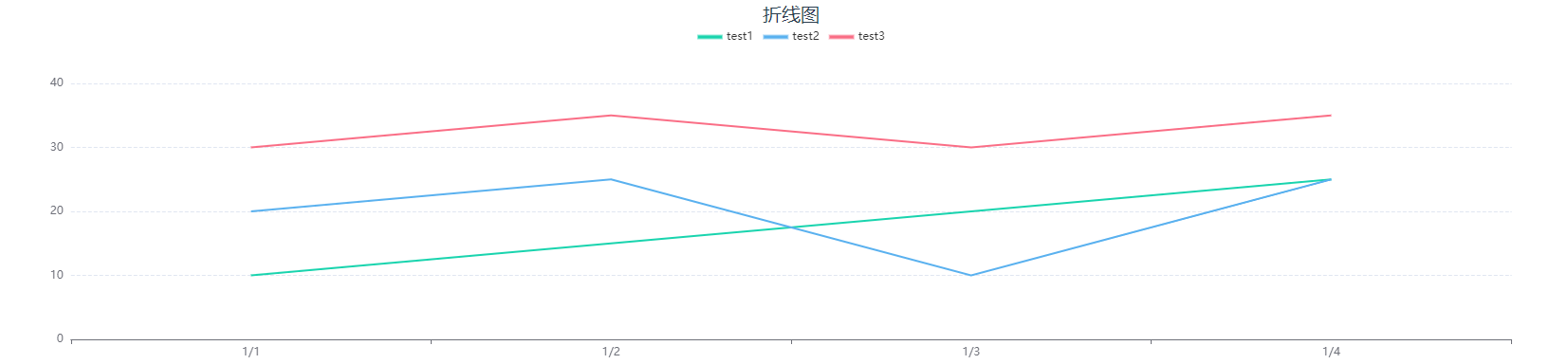
标识 line
配置项
| 配置项 | 简介 | 类型 | 备注 | | --- | --- | --- | --- | | legend | 是否显示图例组件 | boolean | - | | dataZoom | 是否显示缩放工具 | boolean | - | | area | 是否显示为面积图 | boolean | - | | forecast | 是否显示为预测图 | boolean | 虚线为预测值,实线为实际值 | | forecastPoint | 预测点 | number | 当forecast为true时生效 | | label | 是否显示每个点的数值 | boolean | - | | smooth | 设置曲线是否圆滑 | boolean | - | | boundaryGap | 坐标两边是否要要留白 | boolean | 默认为true | | legendName | 设置图表上方图例的别名 | object | - | | yAxisName | 纵坐标的标题 | array | - | | stack | 是否展示堆叠层 | boolean | 当forecas为true时无效,且该配置项配合area使用 | | itemStyle | 设置图表的样式 | object | forecast 值为true是失效 |
itemStyle
| 配置项 | 简介 | 类型 | 备注 | | --- | --- | --- | --- | | label | 指定类型 | string | - | | backgroundColor | 设置线条颜色 | array | 一种颜色是时候为单色,多于一种颜色的时候为渐变色 | | borderColor | 设置转折点的颜色 | string | - | | borderWidth | 设置转折点大小 | number/string | - |
legendName 可以设置 图表上的图例别名 例如:legendName :{ 'test1': '测试1' } 即将test1的图例名称修改为‘测试1’
柱状图
标识 histogram
配置项
| 配置项 | 简介 | 类型 | 备注 | | --- | --- | --- | --- | | dataZoom | 设置是否显示缩放条 | boolean | - | | legend | 是否显示图例组件 | boolean | - | | legendName | 设置图表上方图例的别名 | object | - | | yAxisName | 设置纵坐标的标题 | array | - | | stack | 是否展示堆叠层 | boolean | - | | dataOrder | 设置排序 | object | 默认不排序 | | label | 是否显示数据的文本 | boolean | - | | radius | 设置柱状图的圆角 | number | - | | isAllRadius | 是否四个角都使用圆角 | boolean | 当radius有值时生效 | | itemStyle | 设置柱状图的样式 | array | - | | zebraCrossing | 是否添加斑马线 | boolean | 当stack为true时失效 | | zebraCrossingStyle | 设置斑马线的样式 | object | 当zebraCrossing为true时生效 | | groupColor | 以组为单位进行颜色设置 | boolean | 默认为false | | groupColorStyle | 设置组的颜色 | array | 在groupColor开启时生效 | | showLine | 设置一个或者几个指标以折线图的形式展示 | array | - |
dataOrder 可以设置 desc 和 acs 设置 dataOrder: { label: 'test1',order: 'acs' } 即将test1的数据从小到大排序
legendName 可以设置 图表上的图例别名 例如:legendName :{ 'test1': '测试1' } 即将test1的图例名称修改为‘测试1’
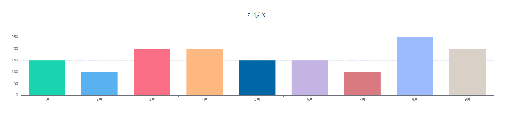
groupColor 设置为true后柱状图中的,将为每一组数据设置为同一种颜色,不同组的数据颜色将不一样,可以通过groupColorStyle属性对每一组数据的颜色进行设置。
以下为 groupColor 关闭 和 开启 后柱状图的显示情况
可以通过groupColorStyle属性对柱状图的颜色进行修改,groupColorStyle:['red',['#01EAED','#029ED9'],'green'],如果填入的是一个数组的话就会以渐变的形式进行展示
itemStyle
| 配置项 | 简介 | 类型 | 备注 | | --- | --- | --- | --- | | label | 指定类型 | string | - | | backgroundColor | 设置柱状图颜色 | array | 一种颜色是时候为单色,多于一种颜色的时候为渐变色 | | borderColor | 设置柱状图边框颜色 | string | - | | borderWidth | 设置柱状图边框大小 | number/string | - |
zebraCrossingStyle
| 配置项 | 简介 | 类型 | 备注 | | --- | --- | --- | --- | | backgroundColor | 设置斑马线状态下的背景颜色 | string | - | | lineColor | 设置斑马线的颜色 | string | - |
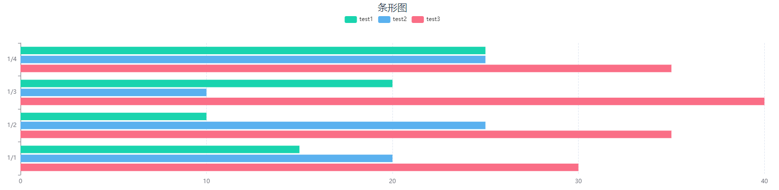
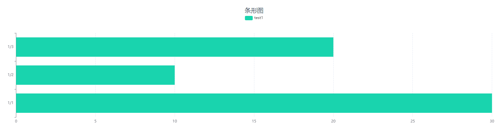
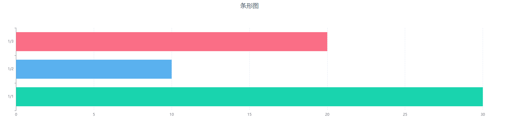
条形图
标识 bar
配置项
| 配置项 | 简介 | 类型 | 备注 | | --- | --- | --- | --- | | dataZoom | 设置是否显示缩放条 | boolean | - | | legend | 是否显示图例组件 | boolean | - | | legendName | 设置图表上方图例的别名 | object | - | | yAxisName | 设置纵坐标的标题 | array | - | | stack | 是否展示堆叠层 | boolean | - | | dataOrder | 设置排序 | object | 默认不排序 | | label | 是否显示数据的文本 | boolean | - | | radius | 设置柱状图的圆角 | number | - | | isAllRadius | 是否四个角都使用圆角 | boolean | 当radius有值时生效 | | itemStyle | 设置柱状图的样式 | array | - | | zebraCrossing | 是否添加斑马线 | boolean | 当stack为true时失效 | | zebraCrossingStyle | 设置斑马线的样式 | object | 当zebraCrossing为true时生效 | | groupColor | 以组为单位进行颜色设置 | boolean | 默认为false | | groupColorStyle | 设置组的颜色 | array | 在groupColor开启时生效 |
dataOrder 可以设置 desc 和 acs 设置 dataOrder: { label: 'test1',order: 'acs' } 即将test1的数据从小到大排序
legendName 可以设置 图表上的图例别名 例如:legendName :{ 'test1': '测试1' } 即将test1的图例名称修改为‘测试1’
groupColor 设置为true后柱状图中的,将为每一组数据设置为同一种颜色,不同组的数据颜色将不一样,可以通过groupColorStyle属性对每一组数据的颜色进行设置。
以下为 groupColor 关闭 和 开启 后柱状图的显示情况
可以通过groupColorStyle属性对柱状图的颜色进行修改,groupColorStyle:['red',['#01EAED','#029ED9'],'green'],如果填入的是一个数组的话就会以渐变的形式进行展示
itemStyle
| 配置项 | 简介 | 类型 | 备注 | | --- | --- | --- | --- | | label | 指定类型 | string | - | | backgroundColor | 设置柱状图颜色 | array | 一种颜色是时候为单色,多于一种颜色的时候为渐变色 | | borderColor | 设置柱状图边框颜色 | string | - | | borderWidth | 设置柱状图边框大小 | number/string | - |
zebraCrossingStyle
| 配置项 | 简介 | 类型 | 备注 | | --------------- | -------------------------- | ------ | ---- | | backgroundColor | 设置斑马线状态下的背景颜色 | string | - | | lineColor | 设置斑马线的颜色 | string | - |
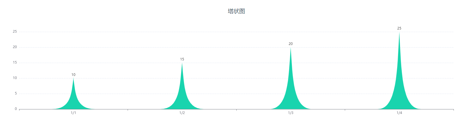
塔状图
标识 tower
配置项
| 配置项 | 简介 | 类型 | 备注 | | --- | --- | --- | --- | | dataZoom | 设置是否显示缩放条 | boolean | - | | yAxisName | 设置纵坐标的标题 | array | - | | label | 是否显示数据的文本 | boolean | 默认true | | itemStyle | 设置柱状图的样式 | array | - |
itemStyle
| 配置项 | 简介 | 类型 | 备注 | | --- | --- | --- | --- | | label | 指定类型 | string | - | | backgroundColor | 设置柱状图颜色 | array | 一种颜色是时候为单色,多于一种颜色的时候为渐变色 | | borderColor | 设置柱状图边框颜色 | string | - | | borderWidth | 设置柱状图边框大小 | number/string | - |
双向图
标识 biaxial
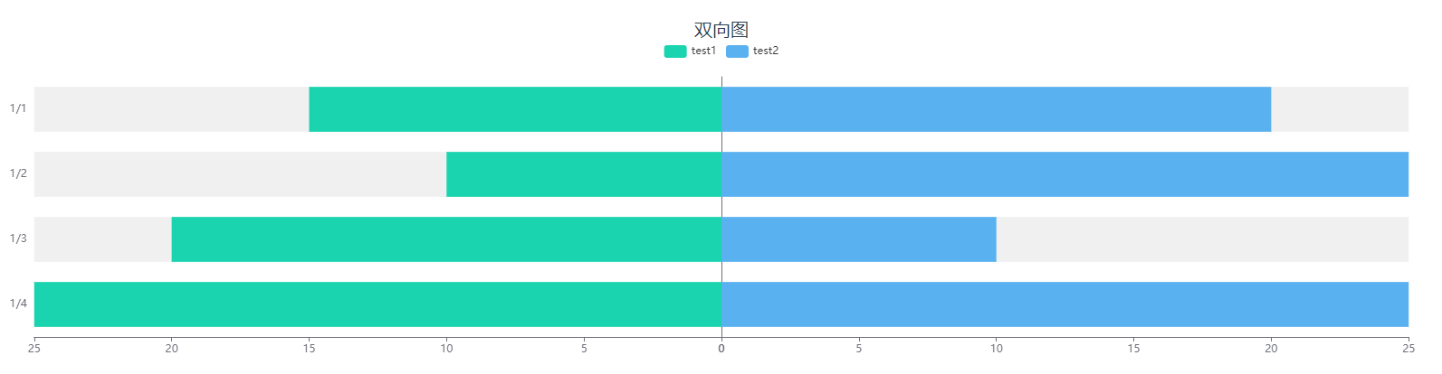
配置项
| 配置项 | 简介 | 类型 | 备注 | | --- | --- | --- | --- | | dataZoom | 设置是否显示缩放条 | boolean | - | | yAxisName | 设置纵坐标的标题 | array | - | | legendName | 设置图表上方图例的别名 | object | - | | label | 是否显示数据的文本 | boolean | 默认true | | itemStyle | 设置柱状图的样式 | array | - |
legendName 可以设置 图表上的图例别名 例如:legendName :{ 'test1': '测试1' } 即将test1的图例名称修改为‘测试1’
itemStyle
| 配置项 | 简介 | 类型 | 备注 | | --- | --- | --- | --- | | label | 指定类型 | string | - | | backgroundColor | 设置柱状图颜色 | array | 一种颜色是时候为单色,多于一种颜色的时候为渐变色 | | borderColor | 设置柱状图边框颜色 | string | - | | borderWidth | 设置柱状图边框大小 | number/string | - |
饼图
标识 pie
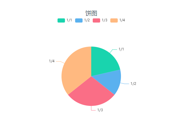
配置项
| 配置项 | 简介 | 类型 | 备注 | | --- | --- | --- | --- | | legend | 是否显示图例组件 | boolean | - | | radius | 设置半径 | number | 默认100 | | center | 设置圆心位置 | array | 默认['50%','50%'] | | level | 设置多圆饼图 | array | - | | hoverAnimation | 是否开启 hover 在扇区上的放大动画效果 | boolean | 默认值为true | | roseType | 设置为玫瑰图图 | string | 可选值:'radius'和'area' | | legendName | 设置图表上方图例的别名 | object | - | | label | 是否显示数据的文本 | boolean | 默认true | | itemStyle | 设置饼图的样式 | array | - |
level 的值接受二维数组,例如:[['a', 'b'], ['c', 'd']], 表示的含义是内层展示的是维度中的'a', 'b'的指标加在一起组成的饼图,外层为'c', 'd'的指标加在一起组成的环图。
roseType 接收两个值 'radius' 和 'area'
- 'radius' 扇区圆心角展现数据的百分比,半径展现数据的大小。
- 'area' 所有扇区圆心角相同,仅通过半径展现数据大小。
legendName 可以设置 图表上的图例别名 例如:legendName :{ '1/1': '测试1' } 即将 1/1 的图例名称修改为‘测试1’ 注意:上面所描述的 '1/1' 为 rows 中的维度里的值
itemStyle
| 配置项 | 简介 | 类型 | 备注 | | --- | --- | --- | --- | | label | 指定类型 | string | - | | backgroundColor | 设置饼图颜色 | array | 一种颜色是时候为单色,多于一种颜色的时候为渐变色 | | borderColor | 设置饼图边框颜色 | string | - | | borderWidth | 设置饼图边框大小 | number/string | - |
雷达图
标识 radar
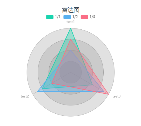
配置项
| 配置项 | 简介 | 类型 | 备注 | | -------------- | -------------------- | ------- | ----------------- | | legend | 是否显示图例组件 | boolean | - | | radius | 设置半径 | array | 默认[70,100] | | center | 设置圆心位置 | array | 默认['50%','50%'] | | indicatorName | 设置指标名称 | object | - | | symbolSize | 设置数据标记的大小 | number | 默认为0 | | indicatorColor | 设置指标的颜色 | string | - | | axisLineColor | 设置坐标轴轴线的颜色 | string | - | | splitLineColor | 设置分隔线的颜色 | string | - | | splitArea | 设置分隔区域的颜色 | array | - | | itemStyle | 设置区域填充的颜色 | array | - |
indicatorName可以设置图表上的指标别名 例如:indicatorName :{ 'test1': '测试1' } 即将 test1 的指标名称修改为‘测试1’
splitArea通过在数组中加入设置的颜色即可修改分隔区域的颜色,例如:splitArea:['red','blue','green']
itemStyle
| 配置项 | 简介 | 类型 | 备注 | | --------------- | ------------------ | ------ | ------------------------------------------------ | | label | 指定类型 | string | 例如上图的 '1/1' | | backgroundColor | 设置区域填充的颜色 | array | 一种颜色是时候为单色,多于一种颜色的时候为渐变色 | | x | 渐变圆心的横坐标 | number | 默认0.5 | | y | 渐变圆心的纵坐标 | number | 默认0.5 | | r | 渐变圆心的半径 | number | 默认0.5 |
环形图
标识 ring
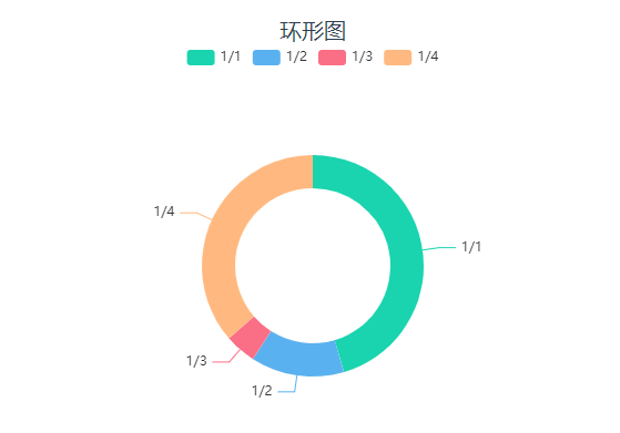
配置项
| 配置项 | 简介 | 类型 | 备注 | | --- | --- | --- | --- | | legend | 是否显示图例组件 | boolean | - | | radius | 设置半径 | array | 默认[70,100] | | center | 设置圆心位置 | array | 默认['50%','50%'] | | hoverAnimation | 是否开启 hover 在扇区上的放大动画效果 | boolean | 默认为true | | roseType | 设置为玫瑰图图 | string | 可选值:'radius'和'area' | | interval | 开启饼图的间隔 | boolean | 默认为false | | outerRing | 显示外环 | boolean | 默认为false | | innerRing | 显示内环 | boolean | 默认为false | | innerRingAnimation | 是否开启内环的旋转动画 | boolean | 默认为false | | borderRadius | 设置圆角 | number | 默认为0 | | legendName | 设置图表上方图例的别名 | object | - | | label | 是否显示数据的文本 | boolean | 默认true | | itemStyle | 设置饼图的样式 | array | - |
roseType 接收两个值 'radius' 和 'area'
- 'radius' 扇区圆心角展现数据的百分比,半径展现数据的大小。
- 'area' 所有扇区圆心角相同,仅通过半径展现数据大小。
legendName 可以设置 图表上的图例别名 例如:legendName :{ '1/1': '测试1' } 即将 1/1 的图例名称修改为‘测试1’ 注意:上面所描述的 '1/1' 为 rows 中的维度里的值
itemStyle
| 配置项 | 简介 | 类型 | 备注 | | --- | --- | --- | --- | | label | 指定类型 | string | - | | backgroundColor | 设置环形图颜色 | array | 一种颜色是时候为单色,多于一种颜色的时候为渐变色 | | borderColor | 设置环形图边框颜色 | string | - | | borderWidth | 设置环形图边框大小 | number/string | - |
当 innerRing 为 true 时backgroundColor只会取数组中的第一位作为背景颜色
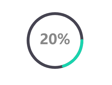
环形进度条
标识 ring-progress-bar
配置项
| 配置项 | 简介 | 类型 | 备注 | | --- | --- | --- | --- | | radius | 设置半径 | array | 默认[70,100] | | center | 设置圆心位置 | array | 默认['50%','50%'] | | label | 是否显示数据的文本 | boolean | 默认true | | labelSize | 设置文本的大小 | number | 默认50 | | labelColor | 设置文字的颜色 | string | 默认'#888888' | | labelShadowColor | 设置文字的阴影颜色 | string | - | | labelShadowBlur | 设置文字的阴影大小 | number | - | | pieces | 自定义进度条的颜色 | array | - | | backgroundStyle | 设置圆环的底色 | string | 默认'#464451' | | itemStyle | 设置饼图的样式 | array | 当pieces启用时,itemStyle的backgroundColor样式失效 |
pieces 属性可以设置圆环在处于不同数值下是颜色状态,例如:pieces:[{ min: 10, max: 50, color: 'red' }] 这里表示当数值处于10-50之间时圆环的颜色为红色,而在这个区间之外的数值因为没有设置的将为默认颜色展示。 具体设置可以参照 echart的分段式视觉映射组件
itemStyle
| 配置项 | 简介 | 类型 | 备注 | | --- | --- | --- | --- | | backgroundColor | 设置圆环的颜色 | array | 一种颜色是时候为单色,多于一种颜色的时候为渐变色 | | borderColor | 设置圆环边框颜色 | string | - | | borderWidth | 设置圆环边框大小 | number/string | - |
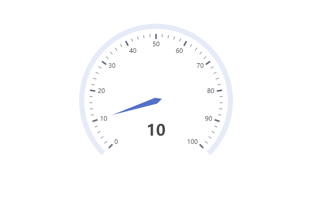
仪表板
标识 gauge
配置项
| 配置项 | 简介 | 类型 | 备注 | | --- | --- | --- | --- | | radius | 设置半径 | array | 默认[70,100] | | center | 设置圆心位置 | array | 默认['50%','50%'] | | label | 是否显示数据的文本 | boolean | 默认true | | name | 设置名称 | string | - | | unifiedColor | 设置是否样式统一 | boolean | 默认false | | axisTickLabel | 是否显示轴刻度文字 | boolean | 默认true | | axisTickLabelColor | 设置轴刻度文字的颜色 | string | - | | axisTick | 设置是否显示轴刻度 | boolean | 默认true | | axisTickStyle | 设置仪表盘轴刻度样式 | object | - | | progress | 设置是否显示进度条 | boolean | 默认false | | progressStyle | 设置进度条样式 | object | 当progress启用时,生效 | | lineStyle | 设置仪表盘轴线样式 | object | - | | pointerStyle | 设置指针样式 | object | - |
unifiedColor 启动时仪表盘的样式以轴线样式的样式为准,将轴刻度和指针的样式统一。
axisTickStyle
| 配置项 | 简介 | 类型 | 备注 | | --- | --- | --- | --- | | backgroundColor | 设置轴刻度的颜色 | array | 一种颜色是时候为单色,多于一种颜色的时候为渐变色 |
progressStyle
| 配置项 | 简介 | 类型 | 备注 | | --- | --- | --- | --- | | backgroundColor | 设置进度条的颜色 | array | 一种颜色是时候为单色,多于一种颜色的时候为渐变色 | | borderColor | 设置进度条边框颜色 | string | - | | borderWidth | 设置进度条边框大小 | number/string | - |
lineStyle
| 配置项 | 简介 | 类型 | 备注 | | --- | --- | --- | --- | | backgroundColor | 设置进度条的颜色 | array | 一种颜色是时候为单色,多于一种颜色的时候为渐变色 | | value | 设置轴线分段的位置 | number | 值的范围 0-1 之间 |
pointerStyle
| 配置项 | 简介 | 类型 | 备注 | | --- | --- | --- | --- | | backgroundColor | 设置指针的颜色 | array | 一种颜色是时候为单色,多于一种颜色的时候为渐变色 | | borderColor | 设置指针边框颜色 | string | - | | borderWidth | 设置指针边框大小 | number/string | - |
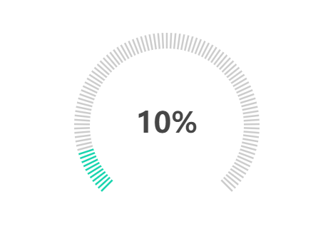
栅格占比仪表板
标识 grid-gauge
配置项
| 配置项 | 简介 | 类型 | 备注 | | --- | --- | --- | --- | | radius | 设置半径 | array | 默认[70,100] | | center | 设置圆心位置 | array | 默认['50%','50%'] | | label | 是否显示数据的文本 | boolean | 默认true | | name | 设置名称 | string | - | | fontSize | 文本的大小 | number | 默认40 | | labelColor | 设置文本的颜色 | string | 默认'#464646' | | labelShadowColor | 设置文本的阴影颜色 | string | - | | labelShadowBlur | 设置文本阴影大小 | number | - | | splitNumber | 设置栅格的数量 | number | 默认100 | | backgroundColor | 设置栅格背景颜色样式 | array | 一种颜色是时候为单色,多于一种颜色的时候为渐变色 | | lineColor | 设置栅格颜色样式 | array | 一种颜色是时候为单色,多于一种颜色的时候为渐变色 |
水球图
标识 liquidfill

配置项
| 配置项 | 简介 | 类型 | 备注 | | --- | --- | --- | --- | | label | 是否显示数据的文本 | boolean | 默认true | | fontSize | 设置文本的字体大小 | number | 默认50 | | colors | 设置波浪的颜色 | array | - | | opacity | 设置波浪的透明度 | number | 默认0.95 | | hoverOpacity | 设置波浪hover效果的透明度 | number | 默认0.8 | | animation | 设置是否启用动画 | boolean | 默认true | | amplitude | 设置波浪的幅度 | string | 默认:'8%' | | direction | 设置波浪的方向 | string | 默认'right' | | outlineShow | 设置外轮廓是否显示 | boolean | 默认true | | shape | 设置水球的形状 | string | 默认'circle' | | itemStyle | 设置水球图的样式 | object | - | | outlineStyle | 设置水球图外框的样式 | object | - | | waveStyle | 设置波浪的样式 | object | - |
itemStyle
| 配置项 | 简介 | 类型 | 备注 | | --- | --- | --- | --- | | backgroundColor | 设置水球图的颜色 | array | 一种颜色是时候为单色,多于一种颜色的时候为渐变色 | | borderColor | 设置水球图边框颜色 | string | - | | borderWidth | 设置水球图边框大小 | number/string | - | | shadowColor | 控制水球图阴影颜色 | string | - | | shadowBlur | 控制阴影大小 | number | - |
outlineStyle
| 配置项 | 简介 | 类型 | 备注 | | --- | --- | --- | --- | | backgroundColor | 设置水球图外框的颜色 | array | 一种颜色是时候为单色,多于一种颜色的时候为渐变色 | | borderColor | 设置水球图外框边框颜色 | string | - | | borderWidth | 设置水球图外框边框大小 | number/string | - | | shadowColor | 控制水球图外框阴影颜色 | string | - | | shadowBlur | 控制外框阴影大小 | number | - | | borderDistance | 控制图表外框的边界距离 | number | - |
waveStyle
| 配置项 | 简介 | 类型 | 备注 | | --- | --- | --- | --- | | shadowColor | 控制波浪阴影颜色 | string | - | | shadowBlur | 控制波浪阴影大小 | number | - |
3d柱状图
标识 histogram-3d
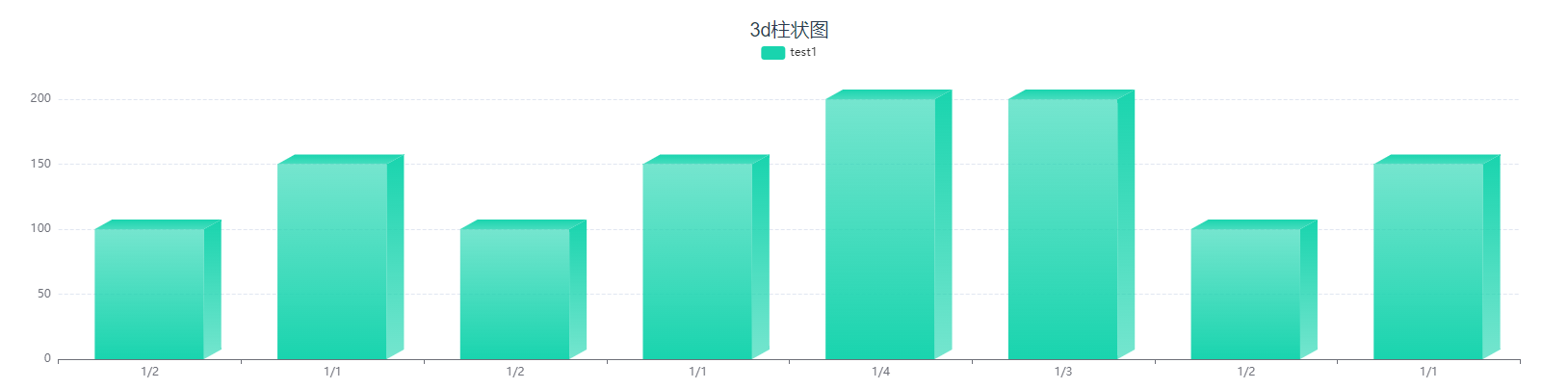
注意:该图表在宽度狭窄或者数量过多的情况下会出现柱状图重叠或者变形的情况
配置项
| 配置项 | 简介 | 类型 | 备注 | | --- | --- | --- | --- | | legend | 是否显示图例组件 | boolean | 默认true | | legendName | 设置图例名称 | object | - | | yAxisName | 设置纵坐标的标题 | array | - | | stack | 是否展示堆叠层 | boolean | 默认false | | backrgoundStyle | 设置图表的样式 | object | - |
legendName 可以设置 图表上的图例别名 例如:legendName :{ 'test1': '测试1' } 即将test1的图例名称修改为‘测试1’
只有在stack开启时才会展示多组数据,当该属性为关闭状态时只会展示第一组数据
chartData:{
            columns:['date','test1','test2','test3','test4'],
            rows:[
                {'date':'1/1','test1':150,'test2':100,'test3':100,'test4':100},
                {'date':'1/2','test1':100,'test2':150,'test3':150,'test4':150},
                {'date':'1/3','test1':200,'test2':250,'test3':250,'test4':250},
                {'date':'1/4','test1':200,'test2':300,'test3':300,'test4':300},
                {'date':'1/1','test1':150,'test2':100,'test3':100,'test4':100},
                {'date':'1/2','test1':100,'test2':150,'test3':150,'test4':150},
                {'date':'1/1','test1':150,'test2':100,'test3':100,'test4':100},
                {'date':'1/2','test1':100,'test2':150,'test3':150,'test4':150},
              ]
            }

// 当stack开启时会展示 test1到test4的数据,关闭时只会展示test1的数据
itemStyle
| 配置项 | 简介 | 类型 | 备注 | | --- | --- | --- | --- | | label | 指定类型 | string | - | | frontBg | 控制柱状图正面颜色 | array | - | | rightBg | 控制柱状图右侧面颜色 | array | - | | topBg | 控制柱状图顶部面颜色 | array | - |
以上的颜色设置都是一种颜色是时候为单色,多于一种颜色的时候为渐变色
自定义图表
标识 custom
当设置了该标识符后只需要在 extend 这个属性中填写echarts配置即可,例如配置一个散点图
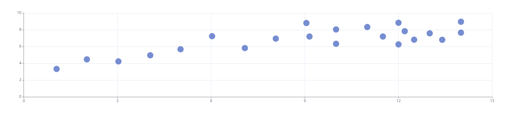
<template>
  <div id="app">
    <div class="title">自定义</div>
    <vc-chart type='custom'
              :extend='extend'
              ref="reCustomChart" />
  </div>
</template>

<script>

export default {
  data(){
    return{
      extend:{
         xAxis: {},
         yAxis: {},
         series: [
           {
             symbolSize: 20,
             data: [
               [10.0, 8.04],
               [8.07, 6.95],
               [13.0, 7.58],
               [9.05, 8.81],
               [11.0, 8.33],
               [14.0, 7.66],
               [13.4, 6.81],
               [10.0, 6.33],
               [14.0, 8.96],
               [12.5, 6.82],
               [9.15, 7.2],
               [11.5, 7.2],
               [3.03, 4.23],
               [12.2, 7.83],
               [2.02, 4.47],
               [1.05, 3.33],
               [4.05, 4.96],
               [6.03, 7.24],
               [12.0, 6.26],
               [12.0, 8.84],
               [7.08, 5.82],
               [5.02, 5.68]
             ],
             type: 'scatter'
           }
         ]
      },
    }
  },
}
</script>