
vitepress-editorial-modernist
v0.1.2
Published
Editorial-modernist theme for VitePress — warm paper, hairline rules, Didone display type, one accent.

Maintainers
 valeryverkhoturov
Readme
vitepress-editorial-modernist
An editorial-modernist theme layer for VitePress: warm paper, ink-black type, a single vermilion accent, hairline rules instead of boxes, and a high-contrast Didone display face against a neutral grotesque and a technical mono.
Nothing is rounded, nothing has a shadow. Hierarchy comes from scale, weight, spacing and rules — the way it does on paper.
It is CSS only: it extends the default theme without replacing a single component, so VitePress upgrades keep working.
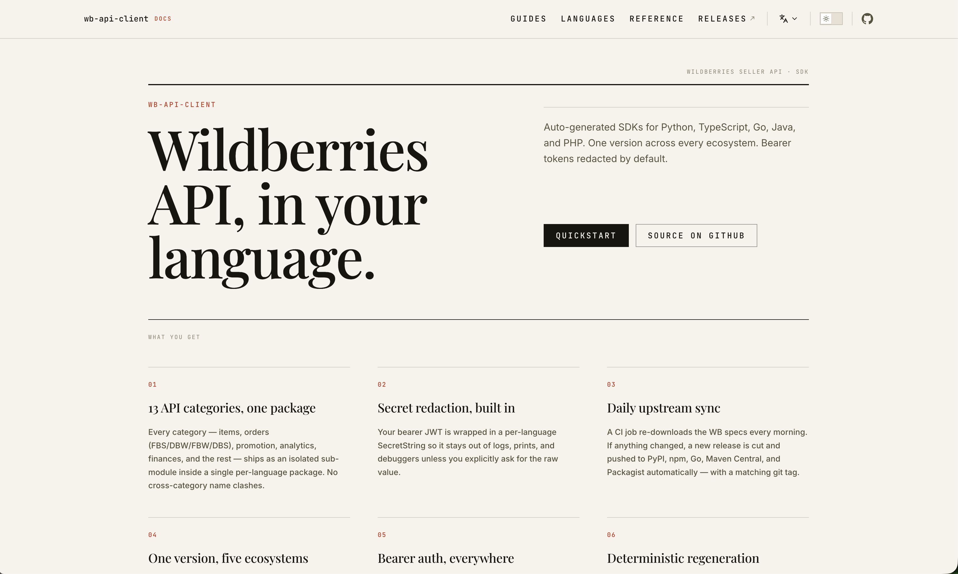
What it changes
| Area | Treatment |
| --- | --- |
| Hero | name becomes a letterspaced kicker, text a 96px display headline, tagline a lede in a second column under a hairline — an asymmetric spread below a 2px masthead rule |
| Features | Cards become rule-separated grid columns, numbered 01–06 by CSS counters (icons are hidden) |
| Body copy | Display serif h1/h2, a rule above every h2, the first paragraph after h1 set as a lede, ordered lists numbered in the accent, pull-quote blockquotes |
| Tables | Horizontal rules only — no striping, no cell borders, letterspaced column heads |
| Code | Square blocks on tinted paper, code-group tabs as a letterspaced contents strip |
| Chrome | Mono letterspaced nav, sidebar, outline and footer labels; accent active states |
Install

npm install -D vitepress-editorial-modernistVitePress itself is a peer dependency — ^1.0.0 — so install the two together in a
site that has neither:
npm install -D vitepress vitepress-editorial-modernistUse
The theme is a stylesheet: keep VitePress's default theme and load the
CSS over it in .vitepress/theme/index.ts.
import DefaultTheme from "vitepress/theme";
import "vitepress-editorial-modernist/style.css";

export default DefaultTheme;
Your own rules go in a file imported after it, so they win the cascade:
import DefaultTheme from "vitepress/theme";
import type { Theme } from "vitepress";

import "vitepress-editorial-modernist/style.css";
import "./labels.css";

export default {
  extends: DefaultTheme,
} satisfies Theme;
Shipping CSS rather than a theme object is what keeps this a one-line
install: a package that imported vitepress/theme itself would be
externalised by Vite's SSR build, leaving Node to load a .css file and
fail — and every consumer would need an ssr.noExternal entry to undo
that.
Fonts
The theme sets type in Playfair Display (display) and JetBrains Mono
(labels and code), with Inter — which VitePress already self-hosts — for
body copy. All three carry Cyrillic. Load the two web fonts by spreading
the exported head entries into .vitepress/config:
import { defineConfig } from "vitepress";
import { editorialFonts } from "vitepress-editorial-modernist/config";

export default defineConfig({
  head: [...editorialFonts],
});
Skip that export if you self-host the fonts or point
--ed-font-display / --ed-font-mono at something else.
Customise
Every decision is a custom property on :root, redefined under .dark.
Override what you want in your own CSS, loaded after the theme:
:root {
  --ed-accent: #1a4fd6;
  --ed-paper: #fbfbfa;
  --ed-font-display: "Lora", Georgia, serif;
}
| Token | Role |
| --- | --- |
| --ed-paper, --ed-paper-2, --ed-paper-3 | Page, tinted panels, active fills |
| --ed-ink, --ed-ink-2, --ed-ink-3 | Body type, secondary copy, labels |
| --ed-rule, --ed-rule-soft, --ed-rule-strong | Hairlines |
| --ed-accent, --ed-accent-deep, --ed-accent-soft | The single accent |
| --ed-font-display, --ed-font-sans, --ed-font-mono | Type families |
| --ed-label-size, --ed-label-tracking | The small-caps label style |
The VitePress variables (--vp-c-*, --vp-button-*, --vp-code-*, …)
are bound to those tokens, so changing a token carries through the whole
default theme.
Labels
Three decorative strings are set in CSS, and default to English:
| Token | Where it appears | Default |
| --- | --- | --- |
| --ed-label-runhead | Running head above the hero rule | "" (hidden) |
| --ed-label-features | Above the feature grid | "What you get" |
| --ed-label-docs | After the site title in the nav | "docs" |
Set them per locale off the lang attribute VitePress writes:
:root {
  --ed-label-runhead: "Wildberries Seller API · SDK";
  --ed-label-features: "Что внутри";
}

html[lang^="en"] {
  --ed-label-features: "What you get";
}
Home page frontmatter
Feature icons are replaced by set numerals, so drop icon: from the
frontmatter — anything left there is hidden. Headlines are set at up to
96px: keep hero.text to a few words and let hero.tagline carry the
explanation.
hero:
  name: your-package        # kicker
  text: A short headline.   # display type
  tagline: The sentence that explains it.
features:
  - title: First thing
    details: …