
vitrina
v0.4.1
Published
A finite, draggable plane of cut-out objects for React — pan with inertia, discrete zoom, staggered reveal, grid view, detail flight.

Maintainers
 mikealvarado
Readme
vitrina
A React library that renders a finite, draggable plane of cut-out objects — pan with inertia and elastic edges, discrete zoom, a staggered reveal as objects enter the frame, a grid view the objects Flip into, and a detail panel one object flies into while the plane stays alive beside it.
Interaction reference: Palmer Dinnerware. This is an independent implementation of the interaction pattern; no code, assets, or copy of theirs were used.
In the wild
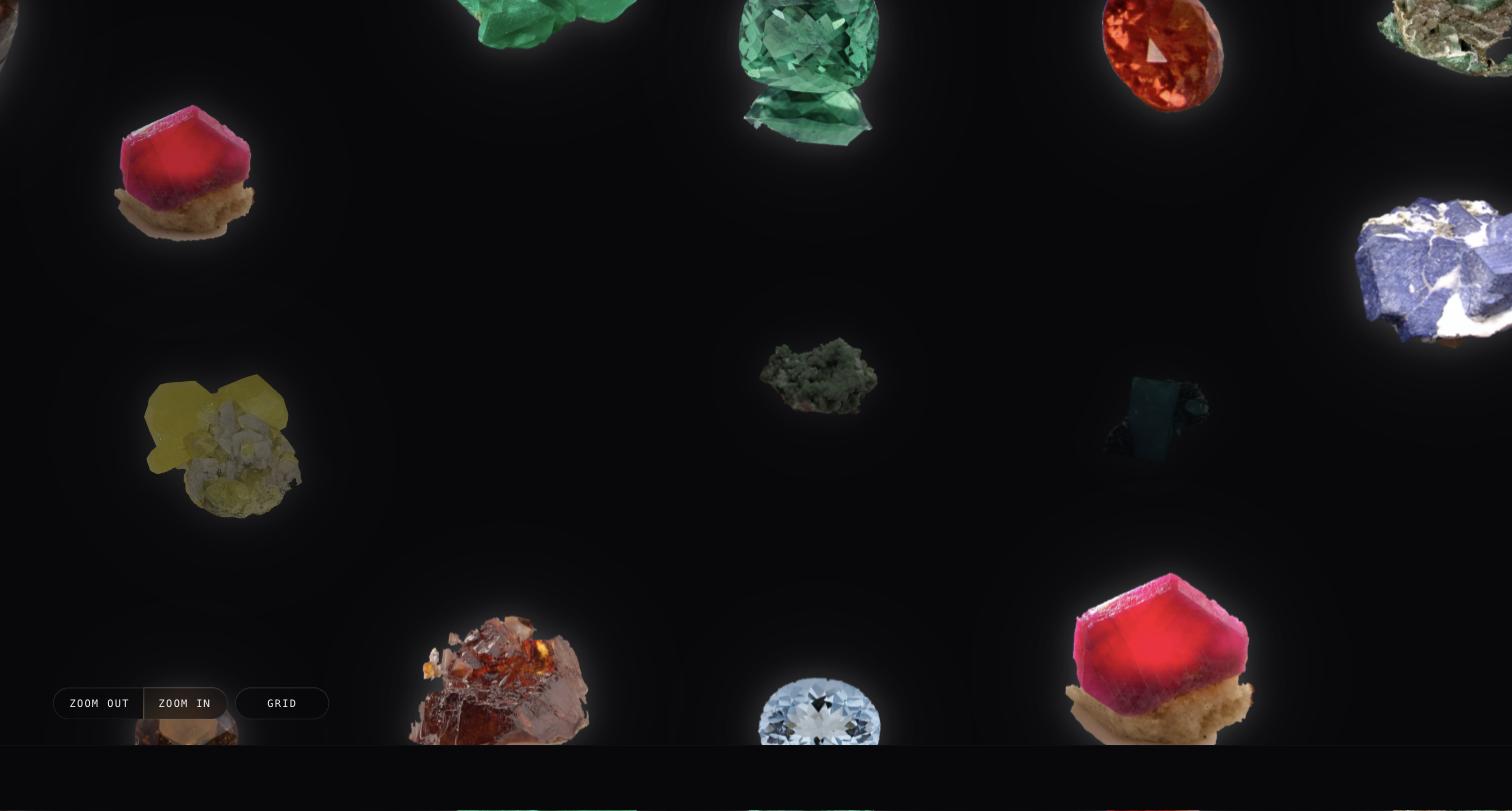
The demo — every prop on a live plane, over 24 CC0 mineral specimens from the Smithsonian and 24 Twemoji SVGs, one toggle apart.
Mediterra — the shop, in production: a plane of product cut-outs, the detail panel on the left, the grid as the catalogue. That is the layout written out under A complete panel.
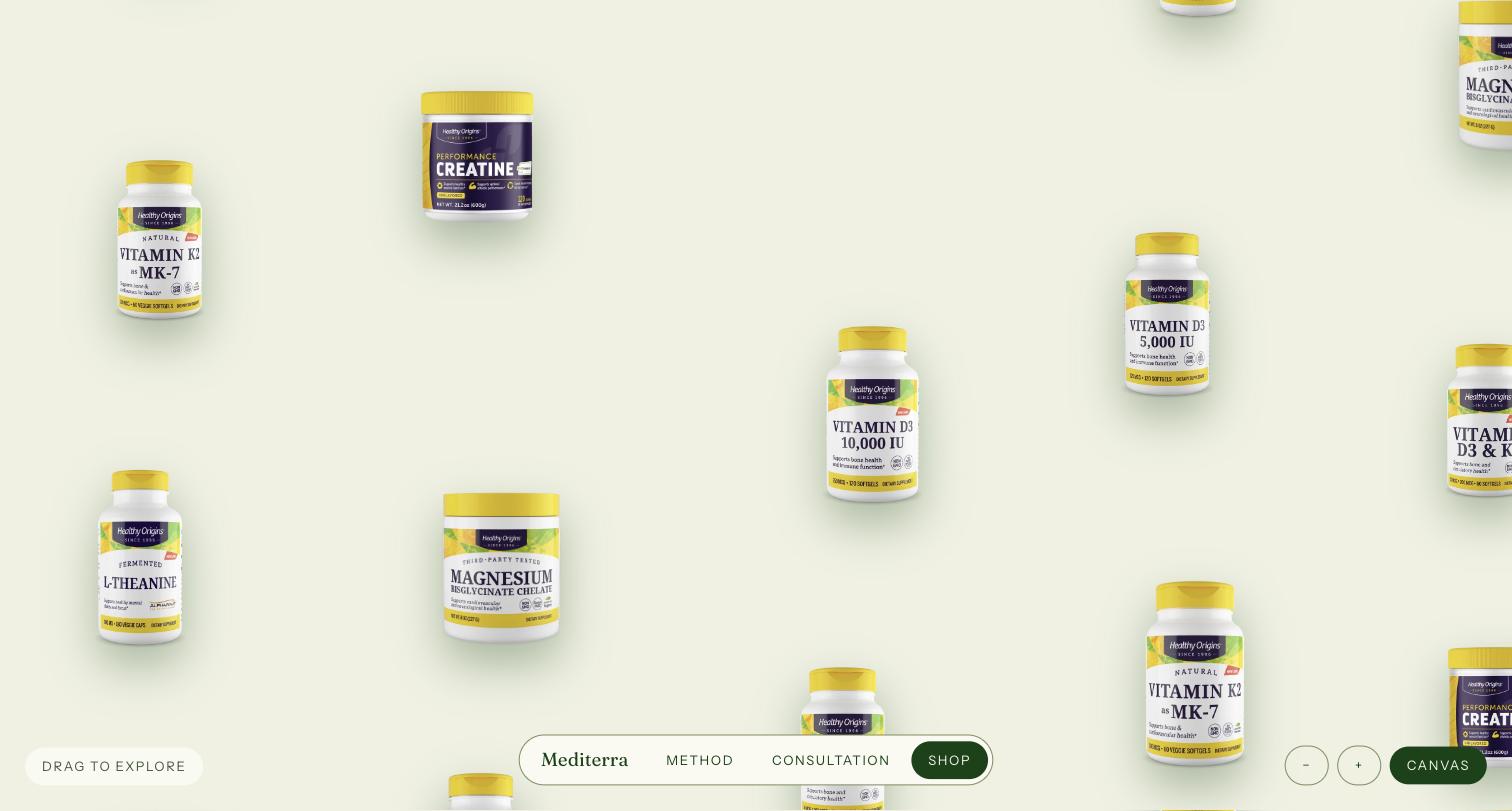
Both are the same component; the two shots are the two themes the library ships — void
above, paper below.
Install
npm i vitrina gsapreact, react-dom (≥18) and gsap (≥3.13) are peer dependencies — see
why GSAP is a peer.
Quick start
Three lines — what exists, what to call it, how to draw it — plus a real height: the widget fills its container, and an unsized container is an invisible widget.
import { Vitrina } from 'vitrina';
import type { VitrinaEntity, VitrinaLabels } from 'vitrina';
import 'vitrina/styles.css'; // required: structure, stacking, focus geometry
import 'vitrina/themes/paper.css'; // exactly one theme

const labels: VitrinaLabels = {
  viewport: 'Explorable collection',
  objectLabel: (e) => String(e.id),
  closeDetail: 'Close',
  zoomIn: 'Zoom in',
  zoomOut: 'Zoom out',
  toGrid: 'Grid view',
  toPlane: 'Plane view',
};

export function Gallery({ entities }: { entities: VitrinaEntity[] }) {
  return (
    <Vitrina
      entities={entities}
      labels={labels}
      renderObject={(e) => <span>{String(e.data)}</span>}
      style={{ height: '100dvh' }}
    />
  );
}
Every user-visible string arrives through labels — the library ships no copy and no
default language, and renders those strings as aria-labels only.
What renderObject receives
Whatever renderObject returns lands in a ready-sized, centred box — and the same
box in every place a copy of the object appears: the plane instance, the grid card, the
panel's slot, the flying copy. You never size the box; you fill it.
- An image (or inline SVG) fills it on its own —
width/height: 100%withobject-fit: contain, so the aspect is kept. This is the intended case: a cut-out PNG with real transparency, so the theme'sdrop-shadowfollows the silhouette. - Any other content is centred and capped to the box (
max-width/max-height: 100%on the direct child). - Text or emoji content needs a type size — a box cannot tell type how big to be.
The box is a CSS size container and
--vitrina-object-font-size(default60cqmin, 60% of the box's smaller side) is applied to the direct child; retune the token on[data-vitrina-root]rather than styling the child by hand. - The box paints no surface of its own — no background, no native button face. Give your content a background and the shadow wraps that rectangle instead of the cut-out; leave it transparent.
Keeping the render props stable
Every object on the plane is memoised. The default plane mounts 114 of them, and the
library re-runs renderObject only for the copies whose own answer changed — the object
the panel is about, the ones that just popped. A zoom step, a panel opening, or your own
page re-rendering above <Vitrina> reaches none of them.
That bail-out rests on two identities the library cannot own: renderObject and
labels.objectLabel. Define them outside your component (or memoise them). Passed
inline, they are new functions on every render and all 114 objects redraw with your
page:
// ✗ a new function each render — every object redraws
<Vitrina renderObject={(entity) => <img src={src(entity)} alt="" />} … />

// ✓ defined once
const renderObject = (entity) => <img src={src(entity)} alt="" />;
<Vitrina renderObject={renderObject} … />
Changing them on purpose — swapping in another dataset — redraws everything, which is exactly what should happen.
Two datasets, the same three lines
The library never looks inside entity.data; it hands it back to your render props
verbatim. Whatever renderObject returns is the cut-out. Images:
type Mineral = { src: string; name: string };
const minerals: VitrinaEntity[] = [
  { id: 'quartz', data: { src: '/minerals/quartz.png', name: 'Quartz' } },
  { id: 'fluorite', data: { src: '/minerals/fluorite.png', name: 'Fluorite' } },
  // … at least 8 — see “How many entities”
];

<Vitrina
  entities={minerals}
  labels={{ ...labels, objectLabel: (e) => (e.data as Mineral).name }}
  renderObject={(e) => <img src={(e.data as Mineral).src} alt="" draggable={false} />}
/>;
Plain text:
const emoji: VitrinaEntity[] = ['🌋', '🪐', '🦑', '🌵', '🎈', '🪞', '🧊', '🐚'].map(
  (glyph) => ({ id: glyph, data: glyph }),
);

<Vitrina
  entities={emoji}
  labels={labels}
  renderObject={(e) => <span>{String(e.data)}</span>}
/>;
The glyph takes its size from the box (--vitrina-object-font-size); the images fill
theirs. Neither render prop mentions a dimension.
Emoji as text is fine to ship and useless for judging a scale animation — on macOS. Chrome draws emoji characters from Apple Color Emoji, a bitmap (sbix) font with pre-generated strikes at fixed sizes. Under an animated scale — the reveal's 0.6 → 1 pop, the zoom step, the flight into the panel — the glyph snaps from one strike to the next, and what you see is a crisp size jump mid-animation that looks exactly like a broken tween. The DOM, the tween's own frames and the geometry will all measure perfect, because nothing is wrong: the font simply has no in-between size. Verify motion with images or inline SVG (
apps/demoships its emoji dataset as Twemoji SVG files for this reason) and keep emoji-as-text for the content test it is good at.
Entities are what exists; instances are where copies appear. Each entity is
repeated across the plane (a plane with 15 objects reads as empty), deterministically
from layout.seed — same seed, same plane, on the server and on every client. The
detail panel keys off the entity, so every copy opens the same thing.
Props
| Prop | Type | Default | What it does |
| ------------------ | ------------------------------------------------ | ------------------- | ----------------------------------------------------------------------------------------------------------------------------------------------- |
| entities | VitrinaEntity[] | required | What exists: { id, size?, data? }. size is the reference diameter at zoom 1; data is yours, handed back verbatim. Duplicate ids throw. |
| renderObject | (entity, ctx) => ReactNode | required | The object itself, called once per instance. ctx: { instanceId, isActive, isRevealed, view }. Must be pure and cheap. |
| labels | VitrinaLabels | required | Every user-visible string (see below). Rendered as aria-labels; the one visible use is <VitrinaControls>' button text. |
| renderCard | (entity, ctx) => ReactNode | — | The grid card's content, under the object. Grid view only, once per entity. See “The grid is a catalogue”. |
| renderGridHeader | () => ReactNode | — | A full-row header inside the grid's scroll container. Grid view only — children mounts outside it and would stay pinned. |
| renderAbove | (entity, ctx) => ReactNode | — | First hole of the panel column, above the object. See “The detail panel is composable”. |
| renderBeside | (entity, ctx) => ReactNode | — | Sits in the object's row, beside the landing slot. besidePlacement picks which side. |
| renderDetail | (entity, ctx) => ReactNode | — | The main content hole, below the object. The library owns the shell, the order and the flight, and renders nothing else inside. |
| renderBelow | (entity, ctx) => ReactNode | — | Last hole. margin-top: auto on its root pushes it to the panel's foot. |
| renderClose | (ctx) => ReactNode | — | The close control, mounted in a region that never scrolls. Shape and position are yours; the region is the library's. |
| panelSide | 'left' \| 'right' \| 'top' \| 'bottom' | 'right' | Which edge the panel occupies. Can change with the panel open — the mask and the flight re-aim. Coverage is --vitrina-panel-size (CSS). |
| besidePlacement | 'start' \| 'end' | 'start' | Whether renderBeside comes before or after the object in the row. |
| dismissOn | ('escape' \| 'outside' \| 'planeDrag')[] | ['escape'] | What closes an open panel. An explicit array — see “Dismissal”. |
| modal | boolean | false | Traps focus in the panel (aria-modal). Tie it to the breakpoint where --vitrina-panel-size reaches 100% — see “modal”. |
| instances | VitrinaInstance[] | generated | Provide to skip generation entirely (e.g. precomputed with generateInstances). Explicit positions also turn compactWorld off — see below. |
| layout | VitrinaLayout | measured defaults | World size, instance count, columns, base size, jitter, separation, seed, compact breakpoint. Omitted fields fall back to the defaults. |
| activeId | string \| null | — | Controlled active entity. Omit for uncontrolled. |
| defaultActiveId | string \| null | null | Initial active entity (uncontrolled). Mounts the panel open, settled, no flight — and steals no focus. |
| onActiveChange | (id: string \| null) => void | — | Fires on open/close/switch, controlled or not. |
| openCollision | 'serialize' \| 'crossfade' \| 'none' | 'serialize' | Opening B with A open: serialize flies A home first, then B in; crossfade runs both at once on two layers; none swaps in one commit, no flight. The first open always flies. |
| view | 'plane' \| 'grid' | — | Controlled view. Omit for uncontrolled. |
| defaultView | 'plane' \| 'grid' | 'plane' | Initial view (uncontrolled). |
| onViewChange | (view) => void | — | Fires on every toggle. |
| zoomSteps | number[] | [0.75, 1, 1.25] | The discrete zoom scales. |
| defaultZoomIndex | number | 1 | Which step is the resting state. |
| reducedMotion | 'respect' \| 'grid' \| 'ignore' | 'respect' | What the OS preference means — see “Reduced motion”. |
| className | string | — | On the root. |
| style | CSSProperties | — | On the root. |
| children | ReactNode | — | Optional chrome, rendered inside the root — the subtree where useVitrina() resolves. |
VitrinaLabels: viewport (aria-label of the plane region), grid (optional, falls
back to viewport), objectLabel(entity) (accessible name of each object button),
closeDetail, zoomIn, zoomOut, toGrid, toPlane.
Also exported: useVitrina() (the full API for your own chrome: zoom state and
transitions, view, openDetail/closeDetail, detailPhase, viewLocked, the
labels passed through), <VitrinaControls> (below), generateInstances(entities,
resolveLayout(layout)) and resolveLayout/DEFAULT_LAYOUT — generation is a feature,
not an internal: precompute instances at build time and pass them via instances.
Placing the instances yourself
instances skips generation entirely — and with it layout.compactWorld. Instance
coordinates are absolute world pixels, and the pan is clamped so the world always
covers the viewport: swapping in a narrower world below compactBreakpoint would put
every instance past the compact width outside the pan bounds, permanently
unreachable on exactly the devices with the least room to spare. So when you hand the
library positions, the positions win: layout.world is the world at every viewport
width, and compactWorld/compactSizeFactor are ignored.
Two consequences worth planning for:
- Size your world for the smallest viewport you support. A 4645×3044 world on a 390px phone is a lot of panning; if you want a denser plane there, generate (the generator re-places into whichever world is in use) or swap the list yourself at your own breakpoint.
- In development, anything outside the world is reported. Any instance whose box
falls outside
layout.worldgets aconsole.warnnaming it, whatever the cause — because an object out there can never be panned to, and the plane looks perfectly fine while missing it.
Styles and themes
Two imports: the structural stylesheet (required) and exactly one theme.
import 'vitrina/styles.css'; // REQUIRED: layers, stacking, overflow, focus geometry
import 'vitrina/themes/paper.css'; // the factory default — or vitrina/themes/void.css
styles.css (base) owns the mechanic's structure and carries no color; without it
the plane does not clip, stack, or scroll correctly. A theme is custom properties on
[data-vitrina-root] plus the paint that consumes them — paper is a light plane with
a dark diffuse shadow under each object, void is near-black with a halo of light
instead. Both define the same token set, so swapping themes is a one-line change; your
own theme is the same file shape with your values.
Your own theme (Tailwind 4 example)
The token set is: --vitrina-page, --vitrina-ink, --vitrina-muted,
--vitrina-focus, --vitrina-panel-surface, --vitrina-seam,
--vitrina-object-shadow. With a shipped theme imported, override the tokens alone.
Without one, a theme is tokens plus the paint — with Tailwind 4's CSS-first theme
variables:
@import 'tailwindcss';
@import 'vitrina/styles.css';

[data-vitrina-root] {
  color: var(--vitrina-ink);
  --vitrina-page: var(--color-stone-100);
  --vitrina-ink: var(--color-stone-900);
  --vitrina-muted: var(--color-stone-400);
  --vitrina-focus: var(--color-stone-900);
  --vitrina-panel-surface: var(--color-stone-100);
  --vitrina-seam: var(--color-stone-400);
  /* The COMPLETE filter value in ONE token — composing drop-shadow() lists across
     several tokens is how shadows silently die. */
  --vitrina-object-shadow: drop-shadow(0 18px 32px rgb(0 0 0 / 0.25));
}

[data-vitrina-viewport],
[data-vitrina-grid] {
  background: var(--vitrina-page);
  color: var(--vitrina-ink);
}

/* Every copy of an object gets the same treatment — the plane instance, the grid
   card, the panel slot, and both flying visuals — so nothing changes weight
   mid-flight. drop-shadow follows the cut-out alpha, not the box. */
[data-vitrina-object],
[data-vitrina-slot],
[data-vitrina-flight],
[data-vitrina-relay] {
  filter: var(--vitrina-object-shadow);
}

[data-vitrina-panel-card] {
  background: var(--vitrina-panel-surface);
  color: var(--vitrina-ink);
}

/* The seam sits on whichever edge faces the plane — one rule per `panelSide`
   you actually use. */
[data-vitrina-panel-side='right'] [data-vitrina-panel-card] {
  border-left: 1px solid var(--vitrina-seam);
}
Every element the library renders carries a data-vitrina-* attribute; there are no
class names to collide with and nothing to configure in tailwind.config.
Motion tokens live on [data-vitrina-root] and are read once at mount with one
getComputedStyle call — never per frame. Retuning one applies on the next mount.
| Token | Drives | Default |
| ----------------------------- | --------------------------------------------------- | -------------- |
| --vitrina-dur-micro | the wheel chase | 0.16s |
| --vitrina-dur-ui | one zoom step (and its pan re-clamp) | 0.32s |
| --vitrina-dur-flight | the detail flight | 0.6s |
| --vitrina-dur-panel | the panel wipe, each content line, the height tween | 0.45s |
| --vitrina-ease-micro | the wheel chase (a GSAP ease string) | power3.out |
| --vitrina-ease-flight | the flights and the view Flip (a GSAP ease string) | power3.inOut |
| --vitrina-stagger-line | gap between content-line entrances | 0.07s |
| --vitrina-stagger-line-exit | the tighter exit gap | 0.04s |
The ease tokens hold GSAP ease strings, not CSS timing functions — they drive
tweens. The panel wipe's own curves stay CSS (--vitrina-panel-ease-in/-out). Layout
knobs (--vitrina-grid-cell, --vitrina-grid-gap, --vitrina-card-gap, --vitrina-detail-object,
--vitrina-panel-size, --vitrina-panel-fixed-inset, --vitrina-object-font-size)
are ordinary custom properties a theme — or your own stylesheet — may retune under
media queries.
The focus ring is four tokens: --vitrina-focus (its colour, part of every
theme's set) plus --vitrina-focus-width (2px), --vitrina-focus-offset (2px) and
--vitrina-focus-radius (0px) for its geometry. The defaults are deliberately
conservative — the library cannot know how much air your content leaves around an
object's box — and the ring is the one piece of chrome a keyboard visitor looks at, so
retuning them is expected rather than exotic. They inherit, so scoping them to a
subtree gives that subtree its own ring with no specificity fight against the
stylesheet:
[data-vitrina-root] {
  --vitrina-focus-offset: 7px; /* off a cut-out with air around it */
  --vitrina-focus-radius: 13px;
}

[data-vitrina-controls] {
  --vitrina-focus-offset: 3px; /* a 34px button has no air to spare */
}
Controls
The library renders no chrome on its own. useVitrina() exposes the state and
transitions to build yours; <VitrinaControls> is the unstyled convenience on top —
three buttons (zoom out, zoom in, view toggle) whose text comes from your labels,
each carrying a data-vitrina-* attribute to style and position. It renders nothing
when the view is locked (see below). Mount it as a child of <Vitrina>.
The strip belongs to the plane, not the panel: it sits on its own stacking rung
(--vitrina-z-controls, between the objects and the panel), so a dragged object passes
behind the buttons and an open detail panel covers them where it overlaps — position it,
but don't give it a z-index of your own. The container takes no pointer events (only
the buttons do), so a drag starting in the gap between buttons still pans the plane.
Chrome over a plane in motion (data-vitrina-gesture)
While the plane is actually moving — dragging, coasting on the inertia throw, or
chasing the wheel — the root carries data-vitrina-gesture. It is gone the moment
everything is at rest.
It exists for one thing: chrome painted over the plane whose cost is paid per
frame. A backdrop-filter is the usual offender — its backdrop is exactly the layer
that changes on every frame of the gesture, so the compositor re-blurs the region under
your controls for the whole drag. Key off the attribute and hand it something cheaper
while it matters:
[data-vitrina-root][data-vitrina-gesture] [data-vitrina-controls] button {
  backdrop-filter: none;
  background: var(--vitrina-page); /* solid: cheaper AND more legible */
}
Two things it deliberately is not:
- Not on
useVitrina(). It flips at both ends of every gesture, and re-rendering the widget there would cost more than the effect it turns off. It is a DOM write, so CSS is where it is read. - Not tied to reduced motion. A visitor who prefers reduced motion still drags the
plane, and chrome over it still pays. (
will-change, which rides the same predicate internally, is skipped there — nothing to promote for when every movement is an instant set.)
A zoom step is not a gesture: it moves the other layer, briefly, and the buttons that trigger it are usually the chrome in question — dropping their treatment under the pointer that is clicking them trades a visible flicker for 300 ms of saving. The grid view never carries it either; it scrolls natively.
The grid is a catalogue
The grid view is the plane's list with another layout — one card per entity, not
per copy — and it is the accessible alternative to the plane: every card is in the tab
order, revealed or not, and under reducedMotion: 'grid' it is the ONLY view a visitor
who prefers reduced motion ever sees. A grid of unnamed objects tells that visitor
nothing, so it has two holes of its own.
<Vitrina
  entities={minerals}
  labels={labels}
  renderObject={(e) => <img src={(e.data as Mineral).src} alt="" draggable={false} />}
  renderCard={(e) => (
    <>
      <p className="card-name">{(e.data as Mineral).name}</p>
      <p className="card-sub">{(e.data as Mineral).locality}</p>
    </>
  )}
  renderGridHeader={() => <h2>Mineral specimens</h2>}
/>
The DOM of one cell:
<div data-vitrina-grid>
  <div data-vitrina-grid-header>…renderGridHeader()…</div>
  <div data-vitrina-grid-item>
    <button data-vitrina-object data-vitrina-card>   <!-- the object, and the only control -->
      <span data-vitrina-object-content>…renderObject(entity, ctx)…</span>
    </button>
    <div data-vitrina-card-content>…renderCard(entity, ctx)…</div>
  </div>
  …
</div>
Three things follow from that shape, and each of them is the reason for it:
renderCardis not actx.viewbranch ofrenderObject. The button is the element that Flips to and from the plane, and it measures exactly--vitrina-grid-cell. Anything rendered inside it sits ON the object and travels with it into the plane. WhatrenderCardreturns is a sibling of that button.- The card's only control is the object button, named by
labels.objectLabel.renderCard's content is not a hit target; it cannot be nested inside a button, so if you want a link in a card, put it there and it will be a control of its own, beside the object's. renderGridHeadermounts inside the scrolling container, spanning every column, so it scrolls away with the cards.childrenis a sibling of the whole view — a heading placed there stays pinned over a catalogue moving underneath it.
renderCard receives the same ctx as renderObject ({ instanceId, isActive,
isRevealed, view }, with view: 'grid'); the instance is the copy the card stands for
and flies from. Both holes are optional and grid-only: without them the grid renders
exactly what it always did, and neither function is ever called in plane view. The gap
between an object and its card content is --vitrina-card-gap (12px).
The detail panel is composable
The library decides the order and where the object lands; you fill the holes. The column, always in this order:
| Hole | Receives | Where |
| -------------- | --------------- | ------------------------------------------------------------------------------------------------- |
| renderAbove | (entity, ctx) | Top of the column. |
| renderBeside | (entity, ctx) | In the object's row, besidePlacement: 'start' (before the object) or 'end' (after). |
| object slot | — | The library's: where the flight lands, drawn with renderObject. Always present. |
| renderDetail | (entity, ctx) | Below the object. |
| renderBelow | (entity, ctx) | Bottom. The column is a flex column with min-height: 100%, so margin-top: auto on your root pushes it to the foot. |
| renderClose | (ctx) | A fixed region overlaying the card — never scrolls, outside the wipe's mask. Position within it is yours. |
Every hole is optional and receives the same ctx:
close()— close the panel.step(delta)— relay to the entitydeltaplaces away inentitiesorder, circular (step(1)/step(-1)are next/previous). What the relay looks like isopenCollision's (below).activeId— the entity the panel is rendering for.view—'plane' | 'grid'.objectSettled—trueonly once the flight has landed and the panel's copy is the visible one. If you render your own copy of the object (a hero image, the first thumbnail of a rail), hide it while this isfalse— the clone is still travelling.
Your nodes are direct flex children of the column: no wrapper boxes to fight, your
own flex/margin tricks work as written. The object slot carries min-width: 0, so it
shrinks alongside a wide renderBeside in a narrow panel instead of collapsing.
Switching objects with the panel open (openCollision)
The panel never moves for a switch: it is uncovered once and covered once, and clicking
another object — or calling ctx.step(1) — changes what is inside it, not the container.
openCollision decides only how the OBJECT changes over, and it says nothing about the
first open, which always flies:
'serialize'(default) — the object in the panel flies home first, then the new one flies in from its copy on the plane. One object in flight at a time.'crossfade'— both fly at once, opposite directions, on two layers. Faster; the two are always different entities, so no frame shows two copies of one object.'none'— no flight at all: the outgoing object is back on the plane and the incoming one is in the slot in the same commit. Pick it when the two objects are typically far apart — astep(1)between neighbours in your list can be a trip across the whole world, and watching an object cross a plane nobody is looking at is slower than the swap it illustrates.
Side and size
panelSide ('right' default) picks the edge; how much the panel covers is CSS, not
a prop — --vitrina-panel-size applies to the axis the side dictates (width for
left/right, height for top/bottom). The library ships no breakpoints; make it yours:
[data-vitrina-root] {
  --vitrina-panel-size: 100%;
}
@media (min-width: 640px) {
  [data-vitrina-root] {
    --vitrina-panel-size: 50%;
  }
}
panelSide can change with the panel open, mid-flight included: the wipe's direction
and the flight's destination re-aim; nothing breaks, nothing re-wipes.
The close control and --vitrina-panel-fixed-inset
renderClose mounts in a region that does not scroll. On a short phone the content
overflows, and a ✕ that leaves with the scroll strands the panel with no visible exit —
so the library guarantees the region and you decide the shape and position (absolute
positioning within it, media queries and all). The content column's padding is the
token --vitrina-panel-fixed-inset (a full padding shorthand, default 0px): set it
to e.g. 64px 20px 24px to reserve the top band your ✕ occupies, and retune it under
your own media query alongside the ✕'s position — the content never guesses.
Dismissal
dismissOn is an explicit array, default ['escape']:
'escape'— the Escape key.'outside'— a click that is neither in the panel nor on an object. Deliberately not in the default: clicking another object switches the panel without closing, and dragging the plane does not close either.'planeDrag'— the drag that starts a pan.
modal
With false (default) there is no overlay, no focus trap, nothing frozen — the plane
stays alive beside the panel. With true focus is trapped in the panel (and the dialog
is aria-modal). It exists because a panel at 100% leaves no plane visible, and free
focus sends Tab into a plane nobody sees. Tie it to the same breakpoint as
--vitrina-panel-size — two lines:
const compact = useMediaQuery('(max-width: 639.98px)'); // your hook, your breakpoint
<Vitrina modal={compact} … />;
In development, a panel covering ≥95% of the plane with modal={false} logs a console
warning, once.
A complete panel (the Mediterra layout)
The layout Mediterra runs, in full: panel on the left; full width under 640 px and half above (CSS above); code and tag on top; a vertical thumbnail rail beside the object; name and price below it; arrows at the foot; a ✕ that under 640 px moves to the top-right corner:
<Vitrina
  entities={entities}
  labels={labels}
  panelSide="left"
  modal={compact}
  renderObject={(e) => <img src={(e.data as Item).src} alt="" draggable={false} />}
  renderAbove={(e) => (
    <header data-vitrina-line="">
      <span>{(e.data as Item).code}</span> <span className="tag">objeto</span>
    </header>
  )}
  renderBeside={(e, ctx) => (
    <ul className="rail" data-vitrina-line="">
      {(e.data as Item).thumbs.map((src, n) => (
        <li key={src}>
          {/* The first thumb is OUR copy of the object: hidden until the clone lands. */}
          <img src={src} alt="" style={n === 0 && !ctx.objectSettled ? { opacity: 0 } : undefined} />
        </li>
      ))}
    </ul>
  )}
  renderDetail={(e) => (
    <div>
      <h2 data-vitrina-line="">{(e.data as Item).name}</h2>
      <strong data-vitrina-line="">{(e.data as Item).price}</strong>
    </div>
  )}
  renderBelow={(_, ctx) => (
    <footer data-vitrina-line="" style={{ marginTop: 'auto' }}>
      <button onClick={() => ctx.step(-1)}>←</button>
      <button onClick={() => ctx.step(1)}>→</button>
    </footer>
  )}
  renderClose={(ctx) => (
    <button className="close" onClick={ctx.close} aria-label={labels.closeDetail}>×</button>
  )}
/>
[data-vitrina-root] {
--vitrina-panel-size: 100%;
--vitrina-panel-fixed-inset: 64px 20px 24px; /* the band the ✕ occupies */
}
.close {
position: absolute;
top: 12px;
right: 12px;
}
@media (min-width: 640px) {
[data-vitrina-root] {
--vitrina-panel-size: 50%;
--vitrina-panel-fixed-inset: 32px 28px 28px;
}
.close {
top: 16px;
right: -20px; /* sticks past the seam: the fixed region is outside the mask */
}
}Detail content entrance (data-vitrina-line)
The detail panel's content is yours (the render props above), so the library cannot
animate markup whose structure it does not know. Mark the blocks you want
choreographed with data-vitrina-line — in any hole:
renderDetail={(entity) => (
  <article>
    <h2 data-vitrina-line>…</h2>
    <p data-vitrina-line>…</p>
    <footer data-vitrina-line>…</footer>
  </article>
)}- Open: the card is uncovered first; then the lines enter staggered (opacity plus a short rise), in document order, while the object flies in alongside — the text never waits for the landing.
- Switching objects with the panel open re-runs the entrance for the new content —
every hole that receives the entity (
renderAbove,renderBeside,renderDetail,renderBelow). The panel itself does not move, and the content is never remounted (nokey), so a crossfade you run on it survives. Lines inrenderClose's fixed region are entity-blind: they enter with the panel once and never re-arm. - Close plays the same animation mirrored — inverted order, a tighter step, since its only job is avoiding a flat blink — and the panel unmounts only when the last line has finished.
- No
data-vitrina-lineanywhere → no content animation; nothing else changes.
The steps are the custom properties --vitrina-stagger-line (default 70 ms) and
--vitrina-stagger-line-exit (default 40 ms) on [data-vitrina-root]; each line's own
duration follows the panel's --vitrina-dur-panel.
Reduced motion
The reducedMotion prop arbitrates what the OS preference means:
'respect'(default): no intro, no pops, no inertia, no staggers — objects simply appear; drag, wheel, zoom and the panel keep working.'grid': additionally lock the view to the grid — no toggle, no zoom.api.viewLockedtells chrome to hide both (<VitrinaControls>already does). This is the mode that makesrenderCardmatter: the grid becomes the only view that visitor ever sees, and it should read as a catalogue, not as a wall of anonymous objects. See “The grid is a catalogue”.'ignore': animate regardless; that accessibility decision is yours.
Tab order is identical in all three modes — focus is not decoration. The stylesheet
follows the same arbitration: base.css keys its reduced rules on the
data-vitrina-reduced attribute the root stamps, never on the media query.
Smooth-scroll libraries
The plane's viewport carries data-lenis-prevent unconditionally.
Lenis decides whether to take over a
wheel event by walking composedPath() — it ignores defaultPrevented — so without
the attribute a page running Lenis swallows every trackpad pan over the plane. With no
Lenis on the page the attribute is inert. Other smooth-scroll libraries need whatever
their own exclusion mechanism is, aimed at [data-vitrina-viewport].
How many entities
The generator balances unconditionally (instance counts per entity never differ by more than one) and keeps copies of the same entity apart — full separation for roughly 15 entities and up on the default layout, and even below that adjacent duplicates are repaired away. It never throws on hard input: 3 entities across 114 instances render fine. But below ~8 entities the plane starts reading as wallpaper — repetition becomes the texture instead of the discovery. Recommendation, not a limit.
Server rendering
No window, document, or matchMedia is touched at module scope — renderToString
works in plain Node. The server emits every object at its generated position, plain and
untransformed; the client hydrates and takes over pan, zoom, and reveal. Positions are
deterministic from layout.seed (no Math.random() anywhere), so the server and the
client generate the same plane and hydration matches.
Next.js (App Router)
renderToString working in Node is not the same as <Vitrina> being a Server
Component, and what separates them is the props: renderObject, renderDetail,
renderCard, renderGridHeader and labels.objectLabel are all functions, and
functions do not cross the server→client boundary. The boundary therefore sits above
them — the client wrapper is yours, and it is what carries the directive:
// app/gallery.tsx
'use client';

import { Vitrina } from 'vitrina';
import type { VitrinaEntity } from 'vitrina';
import 'vitrina/styles.css';
import 'vitrina/themes/paper.css'; // same file, right after base — see below

export function Gallery({ entities }: { entities: VitrinaEntity[] }) {
  return (
    <Vitrina
      entities={entities}
      labels={labels}
      renderObject={(e) => <img src={String(e.data)} alt="" draggable={false} />}
      style={{ height: '100dvh' }}
    />
  );
}
// app/page.tsx — stays a Server Component
import { Gallery } from './gallery';
export default async function Page() {
const entities = await loadEntities(); // plain data crosses; functions do not
return <Gallery entities={entities} />;
}- The package ships no
'use client'of its own, deliberately. The directive on the library would not save the render props — you would still need a client module of your own to define them — and it would plant a boundary inside a library that most of its consumers build without React Server Components at all. - Both stylesheets are imported from the same file, in that order. The theme overrides base.css's custom properties, so it has to come second; split across two modules, the order becomes the bundler's to decide.
- The plane is still server-rendered. A client component is prerendered on the
server too, so the objects reach the HTML at their generated positions exactly as
described above —
'use client'marks the hydration boundary, not "browser only". There is no reason to reach fordynamic(…, { ssr: false })here: nothing in the library touches a browser global at module scope, so it would drop the plane out of the HTML for nothing.
Why GSAP is a peer dependency
GSAP is free — including for commercial use — but it is not MIT-licensed. Bundling
it would ship GSAP's code inside this package's MIT grant, a conflict; as a peer
dependency you install it directly and its license applies to it on its own terms. The
peer range is >=3.13, the release where every plugin (including the formerly paid
ones) became public. Only the GSAP core is imported statically; the plugins the
mechanic uses (Draggable, InertiaPlugin, Flip, Observer) load via dynamic
import() inside an effect — nothing GSAP-related runs on the server, and ~21 KB gzip
stays off the critical path.
Credits
The interaction pattern — the finite draggable plane, the reveal, the grid toggle, the detail flight — is referenced from Palmer Dinnerware, whose site is its finest expression. This library is an independent implementation: no code, no assets, and no copy from that site were used. Measured values used as defaults (world size, instance count, reveal rhythm) are noted as such in the source.
License
MIT. GSAP is licensed separately under its own terms — see the peer-dependency note above.