
vue-avatar-sdh
v1.0.4
Published
An avatar component for vue.js same as vue-avatar only written on Vue3 and TypeScript. It now supports many different styles. It can also be heavily customized as per design needs.
Maintainers
 soumyadip001
Readme


vue-avatar-sdh
Inspired from vue-avatar
An avatar component for vue.js same as vue-avatar only written on Vue3 and TypeScript. It now supports many different styles. It can also be heavily customized as per design needs.
This component display an avatar image and if none is provided fallback to the user initials.
Rules used to compute user initials:
- divide the username on space and hyphen
- use the first letter of each parts
- letters as initials can be controlled from outside
- if the username is divided in more than three parts, can be rendered differently
- can be customized heavily
- custom style can be passed
You can find a few examples and the documentation here
Installation
npm install vue-avatar-sdh
Version
| Vuejs version | vue-avatar-sdh version | | ------------- | ---------------------- | | ^3.0.5 | ^1.0.3 | | ^3.0.5 | ^1.0.1 | | ^3.0.5 | ^1.0.0 |
Usage
vue-avatar-sdh is a UMD module, which can be used as a module in both CommonJS and AMD modular environments. When in non-modular environment, Avatar will be registered as a global variable.
ES6
import Avatar from 'vue-avatar-sdh'

export default {
  ...
  components: {
    Avatar
  },
  ...
}
After that, you can use it in your templates:
<avatar username="Soumyadip Hazra"></avatar>Basic Usage with username
By default it creates 2 letter initials. But you can customize it as per your need. maxAllowedLength allows you to pass any number. It also automatically checks for number of words available and it omit middle names if needed.
<div class="row">
	<div class="items">
		<Avatar username="Rickdev" :inline="true" />
	</div>
	<div class="items">
		<Avatar username="Rickdev Hazra" :inline="true" />
	</div>
	<div class="items">
		<Avatar
			username="Rickdev Kumar Hazra"
			:inline="true"
			:maxAllowedLength="3"
		/>
	</div>
</div>
Also the initials are automatically removed from initials. It automatically detects the abbreviations and remove them from initials.
<div class="items">
	<Avatar username="Dr. Soumyadip Hazra" :inline="true" />
</div>
Basic Usage
How to pass name to generate initials? It very simple actually. Just pass the username attribute to the <Avatar /> component and it's done. You can also control how many initials will the shown in the avatar.
<Avatar username="Rickdev" :inline="true" />
<Avatar username="Rickdev Hazra" :inline="true" />
<Avatar username="Dr. Soumyadip Hazra" :inline="true" />
<Avatar username="Rickdev Kumar Hazra" :inline="true" :maxAllowedLength="3" />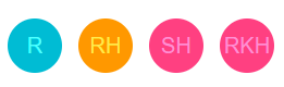
Name with abbreviations
What if the username can contain abbreviations? No worries we have got you covered. It'll automatically be parsed out and the name will be taken to generate the Avatar. Also notice the different between the two Dr and Dr.
<Avatar username="Dr Soumyadip Hazra" :inline="true" />
<Avatar username="Dr. Soumyadip Hazra" :inline="true" />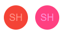
Background Color backgroundColor
<Avatar username="Soumyadip Hazra" :inline="true" backgroundColor="#F44336" />
<Avatar username="Soumyadip Hazra" :inline="true" backgroundColor="#FF4081" />
<Avatar username="Soumyadip Hazra" :inline="true" backgroundColor="#9C27B0" />
<Avatar username="Soumyadip Hazra" :inline="true" backgroundColor="#673AB7" />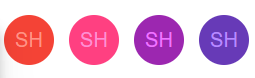
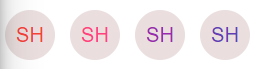
Foreground Color color
<Avatar
	username="Soumyadip Hazra"
	:inline="true"
	color="#F44336"
	backgroundColor="#eadede"
/>
<Avatar
	username="Soumyadip Hazra"
	:inline="true"
	color="#FF4081"
	backgroundColor="#eadede"
/>
<Avatar
	username="Soumyadip Hazra"
	:inline="true"
	color="#9C27B0"
	backgroundColor="#eadede"
/>
<Avatar
	username="Soumyadip Hazra"
	:inline="true"
	color="#673AB7"
	backgroundColor="#eadede"
/>
Lighten Color lighten
<Avatar username="Soumyadip Hazra" :inline="true" :lighten="20" />
<Avatar username="Soumyadip Hazra" :inline="true" :lighten="40" />
<Avatar username="Soumyadip Hazra" :inline="true" :lighten="60" />
<Avatar username="Soumyadip Hazra" :inline="true" :lighten="80" />
<Avatar username="Soumyadip Hazra" :inline="true" :lighten="100" />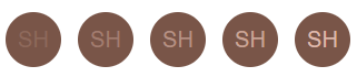
Border Radius rounded
<Avatar username="Soumyadip Hazra" :inline="true" :rounded="true" />
<Avatar username="Soumyadip Hazra" :inline="true" :rounded="false" />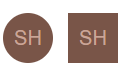
Sizes size
<Avatar username="Soumyadip Hazra" :inline="true" :size="40" />
<Avatar username="Soumyadip Hazra" :inline="true" :size="60" />
<Avatar username="Soumyadip Hazra" :inline="true" :size="70" />
<Avatar username="Soumyadip Hazra" :inline="true" :size="80" />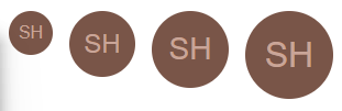
Custom Style customStyle
<div class="items">
	<Avatar username="Soumyadip Hazra" :customStyle="customstyle1" />
</div>
.customstyle1: {
borderRadius: '10px',
color: '#fff',
backgroundColor: '#ff4081',
border: '3px solid #d6054c',
}
Props
Looking for all the supported props and there use cases? We have got you covered here.
| Prop Name | Type | Description |
| --------- | ---- | ----------- |
| backgroundColor | String | Any valid hex string will work. ex: backgroundColor="#F44336" |
| color | String | Any valid hex string will work. ex: color="#F44336" |
| customStyle | Object | Any valid object with style definations ex: customStyle |
| maxAllowedLength | Number | Number of characters in the avatar. default: 2. ex: Basic Usage |
| initials | String | Initials with name which should be ignore while generating the avatar. |
| inline | Boolean | Show inline avatar |
| lighten | Number | Lighen the color automatically as per background color. default: 80 |
| rounded | Boolean | Rounded border(borderRadius of 50%) or square(false). default: true |
| size | Number | width and height of the avatar in pixels. default: 50 |
| src | String | User provided thumbnail if any |
| theme | String | User provided theme. For now we only support ROBO |
| username | Boolean | (required) The name of the user |
Configs
Supported Abbreviations
'Dr', 'Esq', 'Hon', 'Er', 'Jr', 'Mr', 'Mrs', 'Ms', 'Messrs',
'Mmes', 'Msgr', 'Prof', 'Rev', 'Rt', 'Sr', 'St',
Supported background colors
If you do not want to pass any backgroundColor or color as props then a random background color will be applied from the below list of colors. They also supports lighten props. It'll get adjusted automatically.
color names collected from: artyclick.com