
vue-element-highlight
v1.0.4
Published
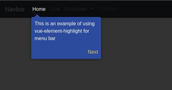
This pack is a component for highlighting links, text, paragraphs or whatever. This package run very well on vue 2 and nuxt 2. You can see the usage of this package in the screenshots and the link below for the demo
Downloads
40

Readme
Vue Element Highlight
This pack is a component for highlighting links, text, paragraphs or whatever. This package run very well on vue 2 and nuxt 2. You can see the usage of this package in the screenshots and the link below for the demo
Screenshots
Demo
You can show the demo in here
Installation
Install this package with
npm i vue-element-highlightOr if you using yarn, you can execute command
yarn add vue-element-highlightUsage/Examples
<template>
  <div id="app">
    <nav class="navbar navbar-dark bg-dark navbar-expand-lg">
      <div class="collapse navbar-collapse" id="navbarSupportedContent">
        <ul class="navbar-nav mr-auto">
          <li class="nav-item">
            <VueElementHighlight :is-active="step === 1" :is-close-label="true"
              label="You can view the Link menu here"
              @nextButtonClick="step= 1+1" @closeButtonClick="step = 0">
              <a class="nav-link" href="#">Link</a>
            </VueElementHighlight>
          </li>
        </ul>
      </div>
    </nav>
  </div>
</template>

import VueElementHighlight from 'vue-element-highlight';
export default {
  name: 'App',
  components: {
    VueElementHighlight
  },
  data() {
    return {
      step: 1
    }
  },
}
Props & Event
List all props
you can write this props with kebab-case or camelCase
| Props | Type | Default | Description |
| :-------- | :------- | :-------| :------------------------- |
| isActive | Boolean | false | is active is main props to show or hidden this component |
| isExitOnOutside | Boolean | false | if the value is true, when user click outside of component, event closeButtonClick will triggered |
| isCloseLabel | Boolean | false | if the value is true, button close and event closeButtonClick will running |
| isNextLabel | Boolean | false | if the value is true, button next and event nextButtonClick will running |
| label | String | Lorem ipsum... | Main label displayed |
| nextLabel | String | Next | Label for next button |
| closeLabel | String | Close | Label for close button |
| boxClassCustom | String | | Default '', but you can add css custom class and this class will show beside hgl-box |
| position | String | left | We have top and right position |
List all event
you must catch this event by @nextButtonClick="" for example
| Parameter | Value | Description |
| :-------- | :------- | :-------------------------------- |
| nextButtonClick | Boolean | Event when next button on click |
| closeButtonClick | Boolean | Event when close button on click |
Custom styling
You can custom styling of this component by override and mix css class
Tech Stack
Client: Vue 2, Nuxt 2
Origin Repository
See origin repository in here:
let's discuss or contribute for this package
Authors
Support
support me through:
thank you