
vue-gallery-layout
v0.0.5
Published
Using css3 realize like Google Photo layout vue component

Readme
vue-gallery-layout 
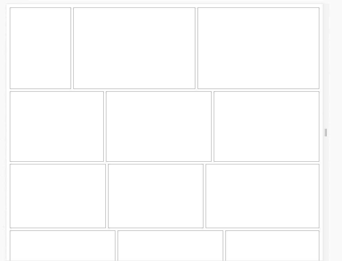
自适应画廊布局组件
这是一个使用(近乎)纯 CSS 实现类似 Google Photo 图片列表的自适应布局组件;这里 近乎 实际上是指需要提前获知图片的比例或者宽高。具体原理请参照此处
例子
另可参考 example 文件夹的 gallery-layout-example.html
特点
- 每个 box 等比拉伸
- box 在水平方向将占满每行,无多余空白
- 每行的高度保持相同,底部对齐
PS: 自适应指:高宽均不可控
安装
npm install vue-gallery-layout -s
用法
局部引入
import VueGalleryLayout from 'vue-gallery-layout';

// demo.vue
...
export default {
  components: {
    VueGalleryLayout
  }
}
全局引入
import VueGalleryLayout from 'vue-gallery-layout';
import Vue from 'vue';

Vue.use(VueGalleryLayout);
Broswer 引入
// 全局暴露变量 VueGalleryLayout
<script src="../dist/vue-gallery-layout.js"></script>
<script>
  new Vue({
    el: '#app',
    components: {
      GalleryLayout
    }
  })
</script>
具体使用
<template>
  <div>
    <gallery-layout
      :items="items"
      :box-container-class="boxContainerClass"
      :box-init-ratio="boxInitRatio">
      <template slot-scope="scope">
        <div>{{ scope.item.width }}</div>
      </template>
    </gallery-layout>
  </div>
</template>

<script>
export default {
  //...

  data() {
    return {
      items: [
        {
          {
            id: 1,
            width: 200,
            height: 100
            // ratio: 2
          },
          {
            id: 2,
            width: 300,
            height: 200
            // ratio: 1.5
          }
        }
      ],
      boxContainerClass: 'box-container-margin',
      boxInitRatio: 100
    }
  }
}
</script>

<style>
  .box-container-margin {
    margin: 4px;
  }
</style>
props
items: Array<[item...]>
- item: Object<{width, height, ratio, id}>
- id: Any 标识符
- width: Number 宽,必需
- height: Number 高,必需
- ratio: Number, width / height,有 ratio 则不需要 width 以及 height
- item: Object<{width, height, ratio, id}>
boxContainerClass: String,默认为''; box 容器 class
boxInitRatio: Number,默认 200;
假设大部分 box 的比例 2: 1,初始屏幕宽度为 1600px,你希望可以大部分情况下可以容纳 4 个 box,那么你的 boxInitRatio 小于 200。注意:由于自适应的存在,每行容纳 box 实际上是由 boxInitRatio, item 的 ratio,每行宽度决定的。
扩展(高层)组件
- vue-gallery-images:画廊组件
LICENSE
MIT