
vue-material-year-calendar
v1.2.6
Published
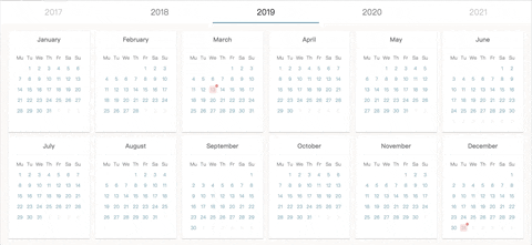
A full 12-Month view calendar made by vue.js
Downloads
695


Readme
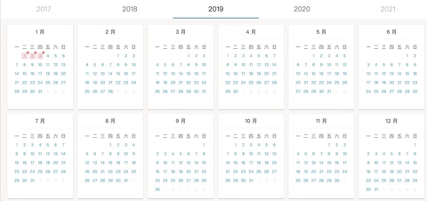
English | 繁體中文

There is no full year (12 months on a page) calendar right now, the Vue-material-year-calendar is designed to solve this problem.
- 🔥 12 Months on a page
- 🌈 Material style
- 🕒 depend on dayjs
- 🍀 by Vue.js
Simple Live Demo
Basic usage
Draggable
Classification
 ---
---
Getting Started
📚 Installation
npm install vue-material-year-calendar --save📚 Example
<template>
<YearCalendar
v-model="year"
:activeDates.sync="activeDates"
@toggleDate="toggleDate"
prefixClass="your_customized_wrapper_class"
:activeClass="activeClass"
></YearCalendar>
</template>
<script>
import YearCalendar from 'vue-material-year-calendar'
export default {
components: { YearCalendar },
data () {
return {
year: 2019,
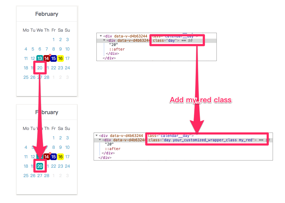
activeDates: [
{ date: '2019-02-13' },
{ date: '2019-02-14', className: 'red' },
{ date: '2019-02-15', className: 'blue' },
{ date: '2019-02-16', className: 'your_customized_classname' }
],
activeClass: '',
}
},
methods: {
toggleDate (dateInfo) {
console.log(dateInfo) // { date: '2010-10-23', selected: true }
}
}
}
</script>
<style lang="stylus">
.your_customized_wrapper_class
background-color: #0aa
color: white
&.red
background-color: red
color: white
&:after
background-image url('./assets/baseline-remove_circle-24px.svg')
background-size 100% 100%
&.blue
background-color: #0000aa
color: white
&.your_customized_classname
background-color: yellow
color: black
</style>📚 props
v-model
- Type:
String|Number - Required:
true
The year to be display.
activeDates.sync
- Type:
Array of objects - Required:
true - Default:
[]Your selected dates.
If you set className attributes, you can customize it style in CSS.
ex:
  [
    { date: '2019-02-13' },
    { date: '2019-02-14', className: 'red' },
    { date: '2019-02-15', className: 'blue' },
    { date: '2019-02-16', className: 'your_customized_classname' }
  ],
prefixClass
- Type:
String - Default:
calendar--active - Required:
true
A wrapper classname for customized css. Set prefixClass's value, then use it value as a class wrapper in CSS.
ex:
<template>
<year-calendar
  ...
  prefixClass="your_customized_wrapper_class"
></year-calendar>
</template>

<style lang="stylus">

.your_customized_wrapper_class
  background-color: #0aa
  color: white
  &.red
    background-color: #a00
    color: white
    &:after
      background-image url('./assets/baseline-remove_circle-24px.svg')
      background-size 100% 100%
  &.blue
    background-color: #0000aa
    color: white
  &.your_customized_classname
    background-color: yellow
    color: black

</style>
activeClass
- Type:
String(default class: info or warning ) - Default:
''(empty string)
The classname you want to toggle. For example, set activeClass to my_red first. Then you click a date on calendar, the date will be add/remove with my_red class.
lang
- Type:
String - Default:
en
Choose language to displayed.
en: English, tw: 繁體中文, pt: Português, de: Deutsch, pl: Polish, ru: Русский
showYearSelector
- Type:
Boolean - Default:
true
Show or hide the years selector on top of the calendar.
ex:
:showYearSelector="false"hideSunday
- Type:
Boolean - Default:
false
Hide or show all sundays in the calendar.
ex:
:hideSunday="true"hideWeekend
- Type:
Boolean - Default:
false
Hide or show all weekends (saturdays and sundays) in the calendar.
ex:
:hideWeekend="true"📚 event
@toggleDate
- Type:
function
Function will be called when you select/unselect a date.
ex:
<template>
  <YearCalendar
    @toggleDate="myToggleDate"
  ></YearCalendar>
</template>

<script>
  .....
  methods: {
    myToggleDate (dateInfo) {
      console.log(dateInfo) // { date: '2010-10-23', selected: true }
    }
  }
</script>
@monthClick
- $event:
{ year: 2021, month: 1, monthTitle: 'January' }
Trigger when user click month title.
ex:
<template>
  <YearCalendar
    @monthClickEvent="monthClick"
  ></YearCalendar>
</template>

<script>
  .....
  methods: {
    monthClick (monthYearInfo) {
      console.log(monthYearInfo) // { year: 2021, month: 1, monthTitle: 'January' }
    }
  }
</script>