
vue-multiselect-with-duplicates
v2.0.10
Published
Multiselect component with duplicates for vue.js based on Damian Dulisz Multi Select Plugin

Readme
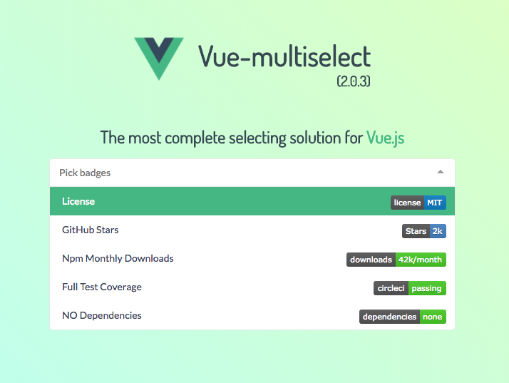
vue-multiselect 


Probably the most complete selecting solution for Vue.js 2.0, without jQuery.
Features & characteristics:
- NO dependencies
- Single select
- Multiple select
- Tagging
- Dropdowns
- Filtering
- Search with suggestions
- Logic split into mixins
- Basic component and support for custom components
- V-model support
- Vuex support
- Async options support
- > 95% test coverage
- Fully configurable (see props list below)
Breaking changes:
- Instead of Vue.partial for custom option templates you can use a custom render function.
- The
:keyprops has changed to:track-by, due to conflicts with Vue 2.0. - Support for
v-model @updatehas changed to@inputto also work with v-model:selectedhas changed to:valuefor the same reason- Browserify users: if you wish to import
.vuefiles, please addvueifytransform.
Install & basic usage
npm install vue-multiselect<template>
<div>
<multiselect
v-model="selected"
:options="options">
</multiselect>
</div>
</template>
<script>
import Multiselect from 'vue-multiselect'
export default {
components: { Multiselect },
data () {
return {
selected: null,
options: ['list', 'of', 'options']
}
}
}
</script>
<style src="vue-multiselect/dist/vue-multiselect.min.css"></style>JSFiddle
Example JSFiddle – Use this for issue reproduction.
Examples
in jade-lang/pug-lang
Single select / dropdown
multiselect(
  :value="value",
  :options="source",
  :searchable="false",
  :close-on-select="false",
  :allow-empty="false",
  @input="updateSelected",
  label="name",
  placeholder="Select one",
  track-by="name"
)
Single select with search
multiselect(
  v-model="value",
  :options="source",
  :close-on-select="true",
  :clear-on-select="false",
  placeholder="Select one",
  label="name",
  track-by="name"
)
Multiple select with search
multiselect(
  v-model="multiValue",
  :options="source",
  :multiple="true",
  :close-on-select="true",
  placeholder="Pick some",
  label="name",
  track-by="name"
)
Tagging
with @tag event
multiselect(
  v-model="taggingSelected",
  :options="taggingOptions",
  :multiple="true",
  :taggable="true",
  @tag="addTag",
  tag-placeholder="Add this as new tag",
  placeholder="Type to search or add tag",
  label="name",
  track-by="code"
)
addTag (newTag) {
  const tag = {
    name: newTag,
    code: newTag.substring(0, 2) + Math.floor((Math.random() * 10000000))
  }
  this.taggingOptions.push(tag)
  this.taggingSelected.push(tag)
},
Asynchronous dropdown
multiselect(
  v-model="selectedCountries",
  :options="countries",
  :multiple="multiple",
  :searchable="searchable",
  @search-change="asyncFind",
  placeholder="Type to search",
  label="name"
  track-by="code"
)
  span(slot="noResult").
    Oops! No elements found. Consider changing the search query.
methods: {
asyncFind (query) {
this.countries = findService(query)
}
}Props config
// multiselectMixin.js

props: {
  /**
   * Array of available options: Objects, Strings or Integers.
   * If array of objects, visible label will default to option.label.
   * If `label` prop is passed, label will equal option['label']
   * @type {Array}
   */
  options: {
    type: Array,
    required: true
  },
  /**
   * Equivalent to the `multiple` attribute on a `<select>` input.
   * @default false
   * @type {Boolean}
   */
  multiple: {
    type: Boolean,
    default: false
  },
  /**
   * Presets the selected options value.
   * @type {Object||Array||String||Integer}
   */
  value: {},
  /**
   * Key to compare objects
   * @default 'id'
   * @type {String}
   */
  track-by: {
    type: String,
    default: false
  },
  /**
   * Label to look for in option Object
   * @default 'label'
   * @type {String}
   */
  label: {
    type: String,
    default: false
  },
  /**
   * Enable/disable search in options
   * @default true
   * @type {Boolean}
   */
  searchable: {
    type: Boolean,
    default: true
  },
  /**
   * Clear the search input after select()
   * @default true
   * @type {Boolean}
   */
  clearOnSelect: {
    type: Boolean,
    default: true
  },
  /**
   * Hide already selected options
   * @default false
   * @type {Boolean}
   */
  hideSelected: {
    type: Boolean,
    default: false
  },
  /**
   * Equivalent to the `placeholder` attribute on a `<select>` input.
   * @default 'Select option'
   * @type {String}
   */
  placeholder: {
    type: String,
    default: 'Select option'
  },
  /**
   * Sets maxHeight style value of the dropdown
   * @default 300
   * @type {Integer}
   */
  maxHeight: {
    type: Number,
    default: 300
  },
  /**
   * Allow to remove all selected values
   * @default true
   * @type {Boolean}
   */
  allowEmpty: {
    type: Boolean,
    default: true
  },
  /**
   * Reset this.value, this.search, this.selected after this.value changes.
   * Useful if want to create a stateless dropdown, that fires the this.onChange
   * callback function with different params.
   * @default false
   * @type {Boolean}
   */
  resetAfter: {
    type: Boolean,
    default: false
  },
  /**
   * Enable/disable closing after selecting an option
   * @default true
   * @type {Boolean}
   */
  closeOnSelect: {
    type: Boolean,
    default: true
  },
  /**
   * Function to interpolate the custom label
   * @default false
   * @type {Function}
   */
  customLabel: {
    type: Function,
    default: false
  },
  /**
   * Disable / Enable tagging
   * @default false
   * @type {Boolean}
   */
  taggable: {
    type: Boolean,
    default: false
  },
  /**
   * String to show when highlighting a potential tag
   * @default 'Press enter to create a tag'
   * @type {String}
  */
  tagPlaceholder: {
    type: String,
    default: 'Press enter to create a tag'
  },
  /**
   * By default new tags will appear above the search results.
   * Changing to 'bottom' will revert this behaviour
   * and will proritize the search results
   * @default 'top'
   * @type {String}
  */
  tagPosition: {
    type: String,
    default: 'top'
  },
  /**
   * Number of allowed selected options. No limit if false.
   * @default False
   * @type {Number}
  */
  max: {
    type: Number,
    default: false
  },
  /**
   * Will be passed with all events as second param.
   * Useful for identifying events origin.
   * @default null
   * @type {String|Integer}
  */
  id: {
    default: null
  },
  /**
   * Limits the options displayed in the dropdown
   * to the first X options.
   * @default 1000
   * @type {Integer}
  */
  optionsLimit: {
    type: Number,
    default: 1000
  }
}

// pointerMixin.js

props: {
  /**
   * Enable/disable highlighting of the pointed value.
   * @type {Boolean}
   * @default true
   */
  showPointer: {
    type: Boolean,
    default: true
  }
},

// Multiselect.vue

props: {
  /**
   * String to show when pointing to an option
   * @default 'Press enter to select'
   * @type {String}
   */
  selectLabel: {
    type: String,
    default: 'Press enter to select'
  },
  /**
   * String to show next to selected option
   * @default 'Selected'
   * @type {String}
  */
  selectedLabel: {
    type: String,
    default: 'Selected'
  },
  /**
   * String to show when pointing to an alredy selected option
   * @default 'Press enter to remove'
   * @type {String}
  */
  deselectLabel: {
    type: String,
    default: 'Press enter to remove'
  },
  /**
   * Decide whether to show pointer labels
   * @default true
   * @type {Boolean}
  */
  showLabels: {
    type: Boolean,
    default: true
  },
  /**
   * Limit the display of selected options. The rest will be hidden within the limitText string.
   * @default 'label'
   * @type {String}
   */
  limit: {
    type: Number,
    default: 99999
  },
  /**
   * Function that process the message shown when selected
   * elements pass the defined limit.
   * @default 'and * more'
   * @param {Int} count Number of elements more than limit
   * @type {Function}
   */
  limitText: {
    type: Function,
    default: count => `and ${count} more`
  },
  /**
   * Set true to trigger the loading spinner.
   * @default False
   * @type {Boolean}
  */
  loading: {
    type: Boolean,
    default: false
  },
  /**
   * Disables the multiselect if true.
   * @default false
   * @type {Boolean}
  */
  disabled: {
    type: Boolean,
    default: false
  }
}
Contributing
# serve with hot reload at localhost:8080
npm run dev

# distribution build with minification
npm run bundle

# build the documentation into docs
npm run docs

# run unit tests
npm run test

# run unit tests watch
npm run unit-watch
For detailed explanation on how things work, checkout the guide and docs for vue-loader.