
vue-page-composer
v0.7.1
Published
Visual page editor and renderer for Vue. Register the components you already ship, compose pages on a canvas, and save a portable JSON document that renders on any route. Friendly alias for @page-composer/vue.

Maintainers
 virgilvox
Readme
vue-page-composer
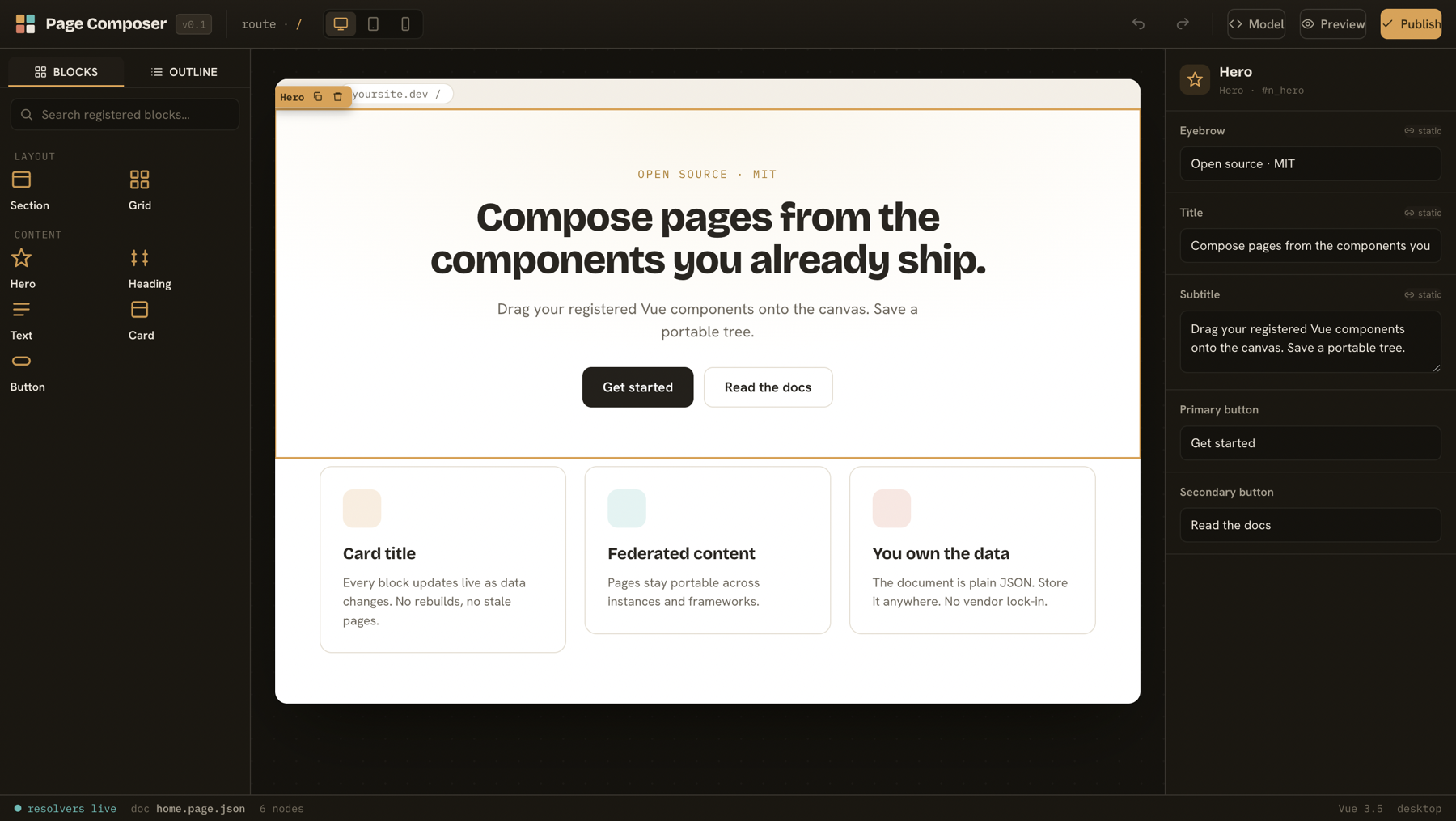
A visual page editor you embed in your own Vue or Nuxt app. Register the components you already ship, drag them onto a canvas, and save a portable JSON document that renders on any route. MIT, no backend assumptions, no vendor lock-in.
This is the friendly alias for @page-composer/vue. Installing it pulls in the editor and renderer and re-exports everything, so import { PageComposer, ComposedPage } from 'vue-page-composer' works.
Why
Puck set the bar for visual page building in React. There was no equivalent for Vue with the same decoupled model. Page Composer fills that gap: author with your real components, save plain JSON, render it anywhere. Your $bind expressions read live from the host data layer, a binding model that otherwise only the closed-source tools offer.
Install
pnpm add vue-page-composerImport the stylesheet once in your app:
import 'vue-page-composer/styles.css'Render a saved page
<script setup lang="ts">
import { ComposedPage, definePageConfig } from 'vue-page-composer'
import { Hero, Card, Grid } from '@/components'
import doc from './home.page.json'

const config = definePageConfig({
  components: {
    Hero: { label: 'Hero', render: Hero, fields: { title: { type: 'text' } } },
    Grid: { label: 'Grid', render: Grid, zones: ['items'] },
    Card: { label: 'Card', render: Card, fields: { title: { type: 'text', bindable: true } } },
  },
})
</script>

<template>
  <ComposedPage :config="config" :model="doc" :data="{ feature: { title: 'Live' } }" />
</template>
ComposedPage walks the document, mounts each node with <component :is>, maps zones to slots, and resolves bound props through the data context. It is the same renderer the editor canvas runs, so what you author is what ships.
Author pages
<script setup lang="ts">
import { ref } from 'vue'
import { PageComposer } from 'vue-page-composer'
import type { ComposedDocument } from 'vue-page-composer'
import { config } from './page-config'

const doc = ref<ComposedDocument>(/* load from your store */)
</script>

<template>
  <PageComposer v-model="doc" :config="config" @change="save" />
</template>
PageComposer is a controlled component. It emits the document on every change and leaves persistence to you. Drafts, autosave, and history live in your app, not the library.
What is in the editor
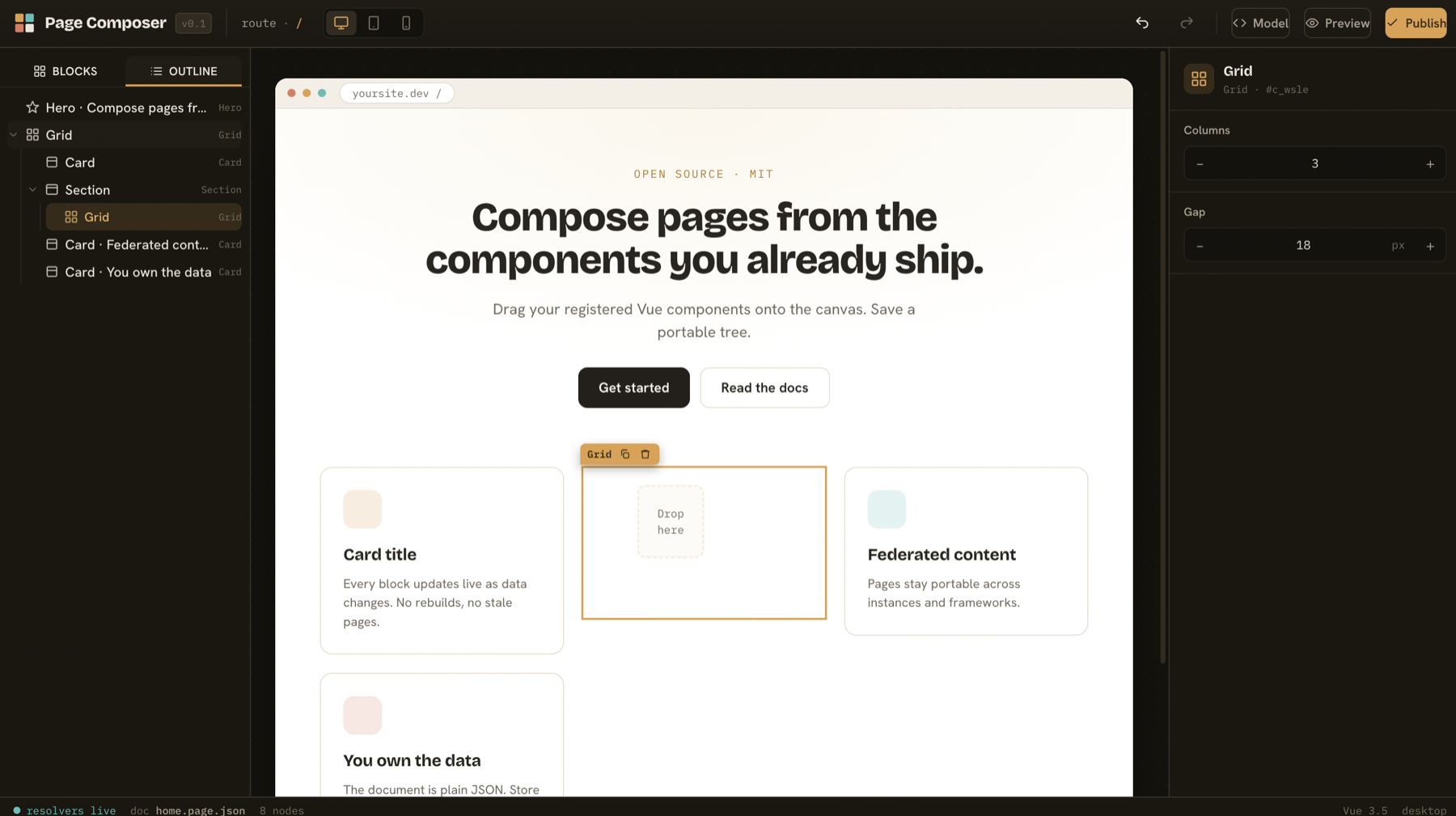
- Palette of your registered components, grouped by category and searchable. Click to add or drag onto the canvas.
- Live canvas that mounts the real components, with selection, a drag handle, and an axis-aware drop indicator that shows exactly where a block lands.
- Auto-generated inspector: a form built from each component's field definitions, with a per-field toggle to switch a value between a literal and a data binding.
- Outline tree that follows the WAI-ARIA tree pattern, kept in sync with canvas selection.
- Undo and redo, copy and paste of a whole subtree, duplicate, viewport preview, and a live view of the portable JSON document.
- Optional isolated canvas (
:isolate="true"): renders the page in an iframe for true CSS isolation, where media queries respond to the device width rather than the editor window.
Keyboard shortcuts
Press ? in the editor for the full list. Highlights: Cmd/Ctrl Z undo, Cmd/Ctrl D duplicate, Cmd/Ctrl C / V copy and paste, Cmd/Ctrl Shift ↑ / ↓ reorder, Delete remove, Esc deselect.
Field types
text, textarea, number, boolean, select, segment, color, nested object and array (with add, remove, and reorder), and custom for your own inspector components. Any scalar field marked bindable: true gets the binding toggle.
Repeaters
Mark a component repeat: { zone, source } and it renders that zone's children as a per-item template, cloned once per record in the bound list. Static layout becomes a data-driven template. See data binding.
Theming
Every value comes from a CSS token in one place. Components consume var(--pc-*). Apply the pc-theme-light class next to the editor root to flip the chrome to a light palette by swapping token values, with no component changes.
Documentation
License
MIT. Copyright Moheeb Zara.